Title

Magnum Chocolate Ice Cream Packaging


Topics

Ice CreamMagnum

Details

Uploaded user: Leo

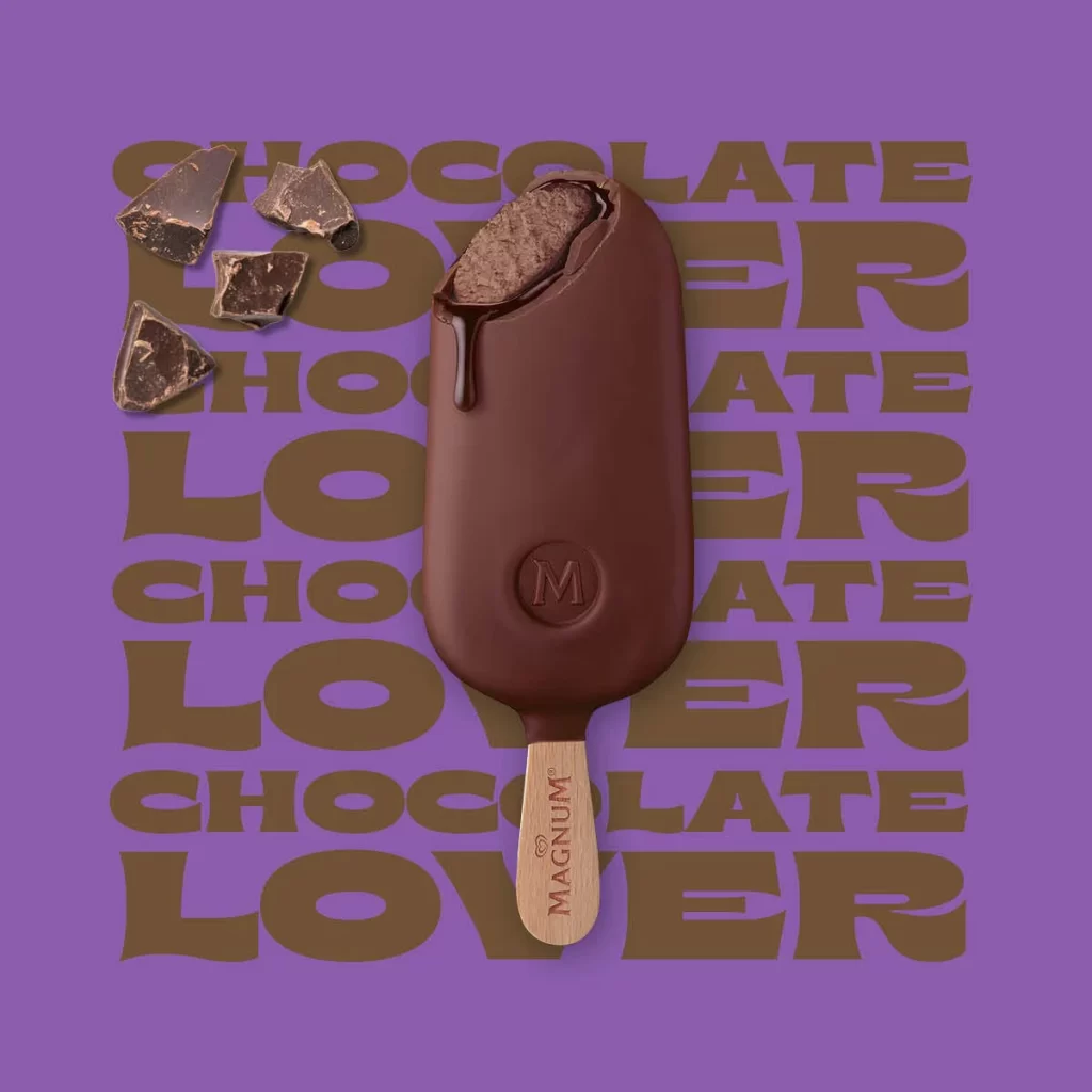
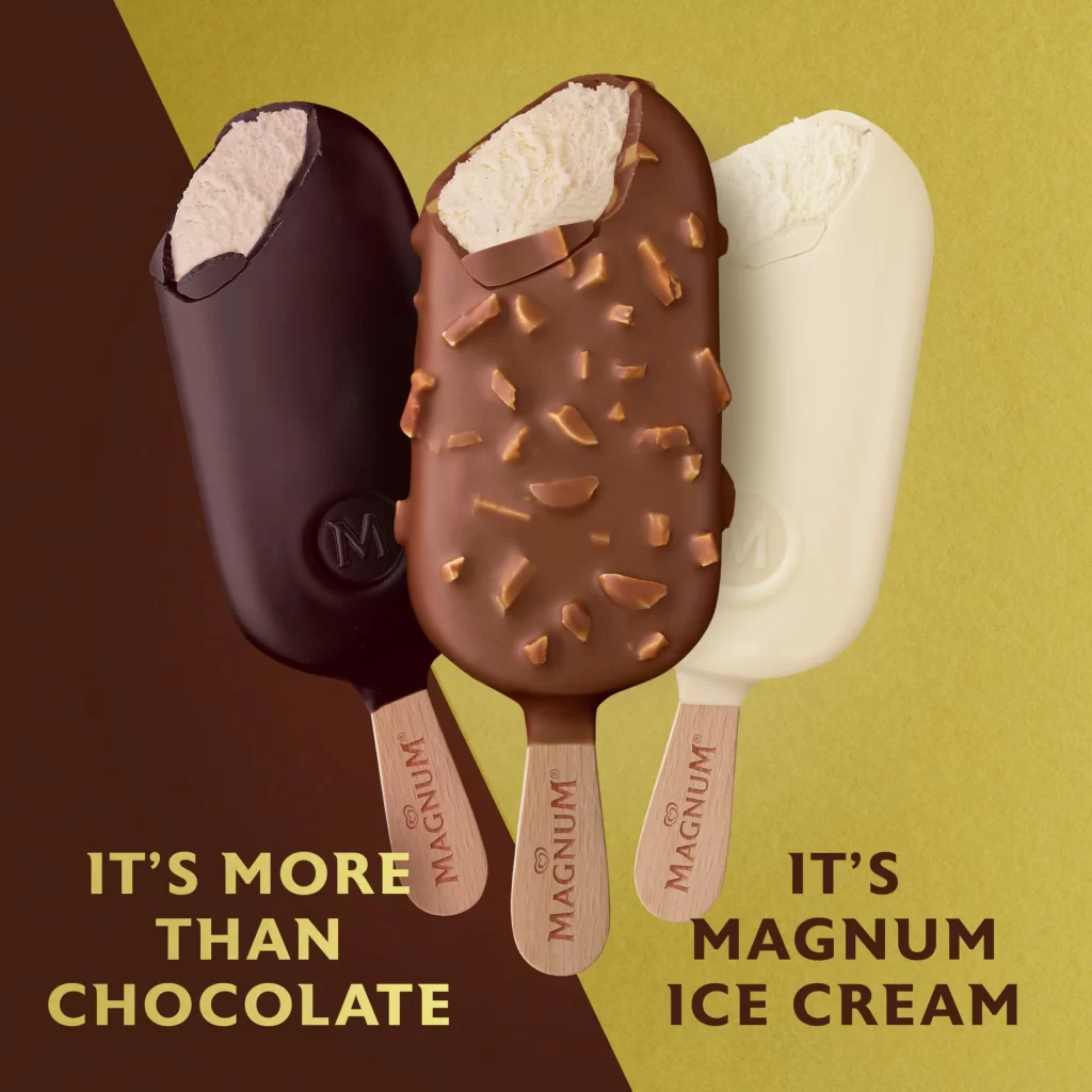
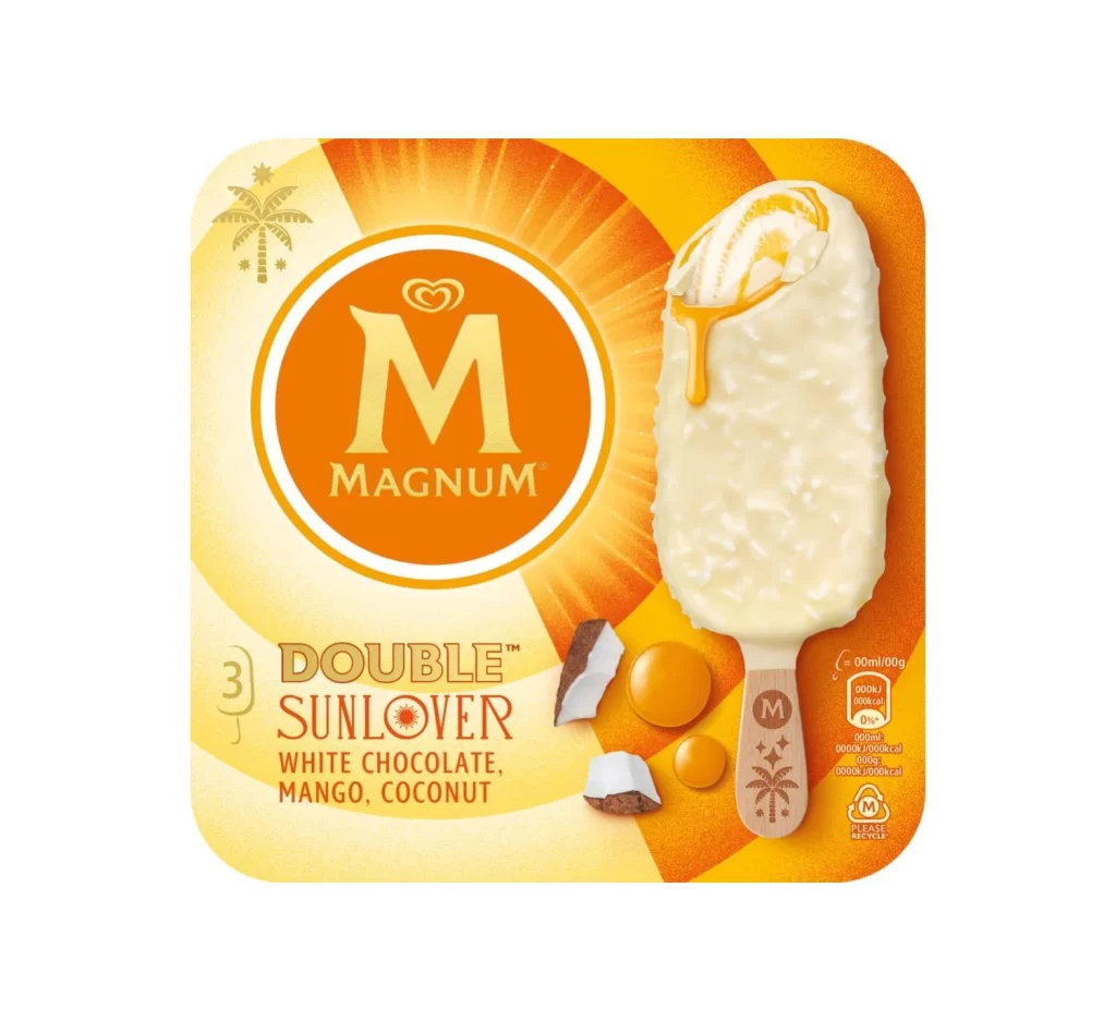
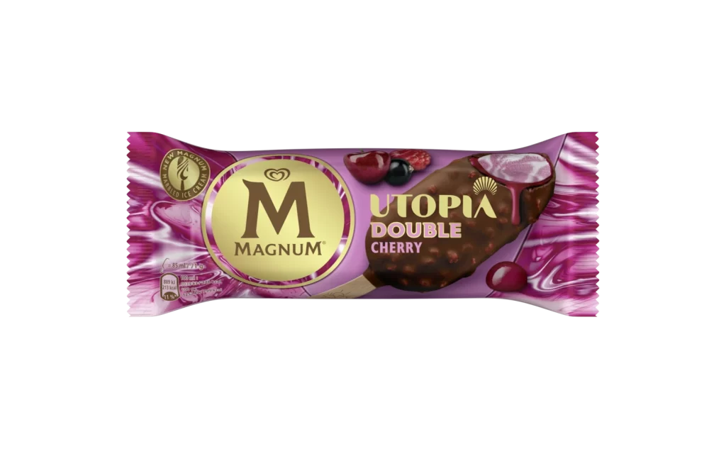
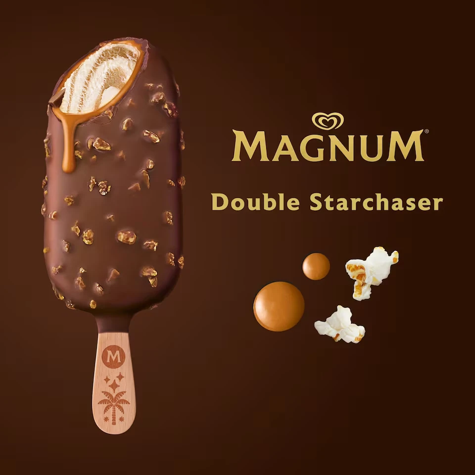
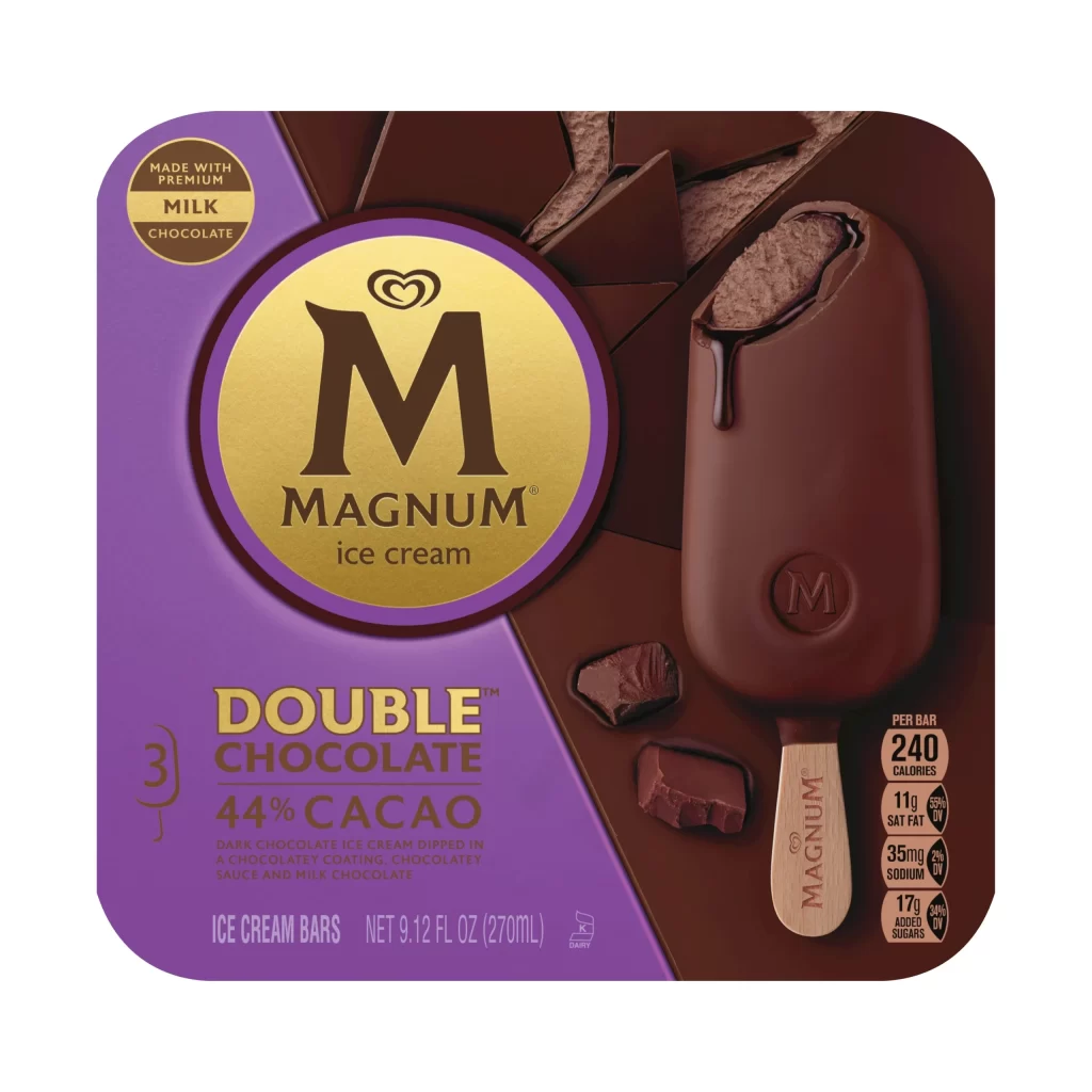
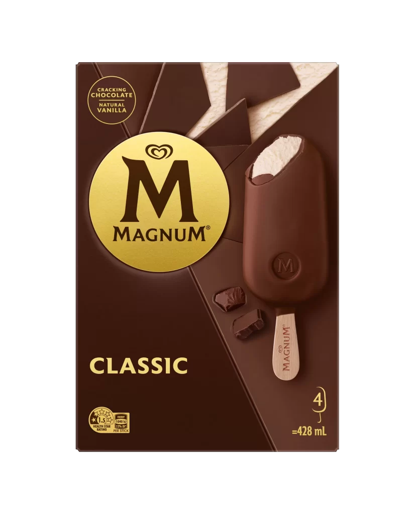
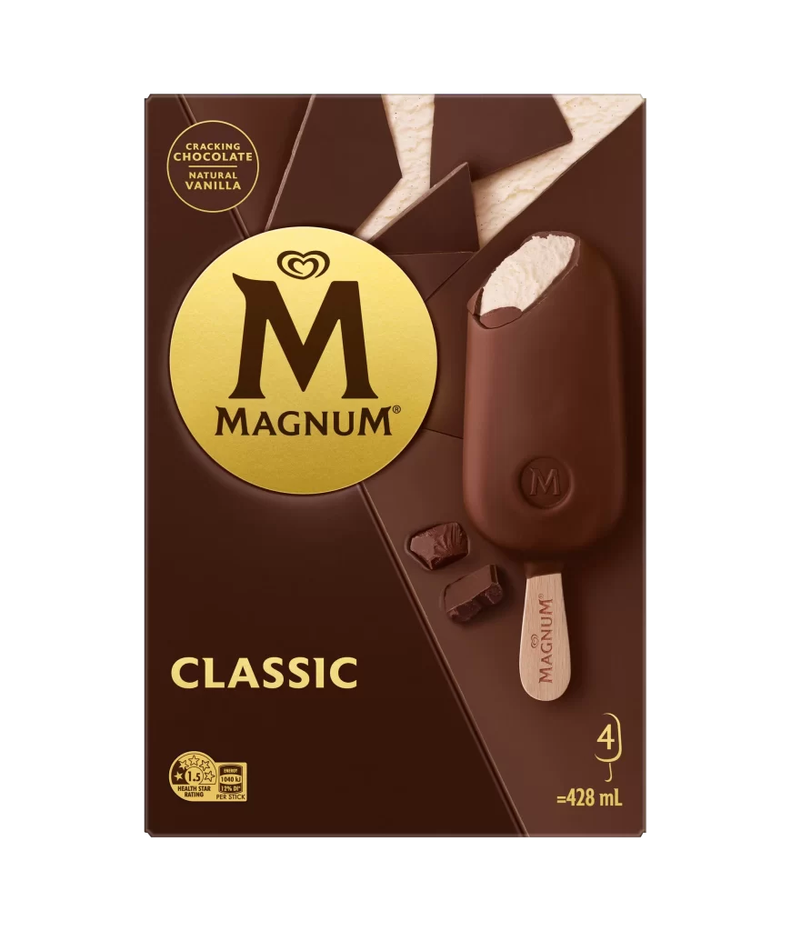
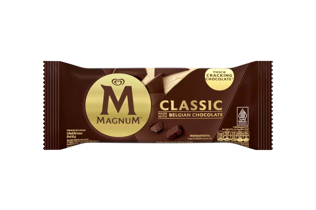
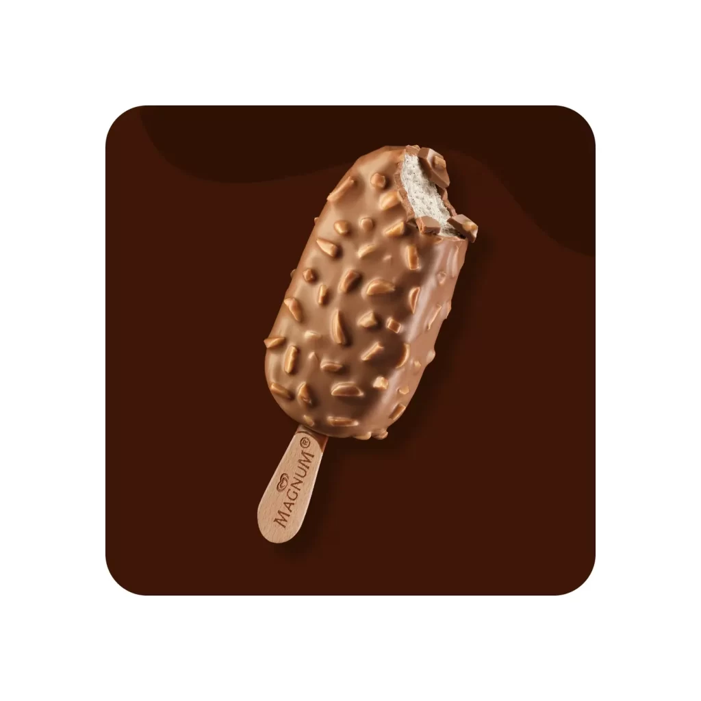
A Magnum chocolate ice cream bar stands vertically at the center of the frame, its smooth milk chocolate coating partially bitten to reveal the dense cocoa interior. The wooden stick bears the brand name in vertical red lettering, while an embossed 'M' logo sits prominently on the bar's lower surface. Four irregular chocolate chunks scatter to the left against a solid violet background, where the repeated text 'CHOCOLATE LOVER' appears in bold brown typography.
Visual distinction emerges from the strategic interplay between the rich brown confectionery and the unexpected purple field, creating a color contrast that defies typical food photography conventions. The repetitive typographic backdrop transforms a simple product shot into a rhythmic graphic statement, while the deliberate placement of broken chocolate pieces adds textural variety and suggests indulgence. This composition balances minimalist product clarity with maximalist background energy, making the packaging design feel both luxurious and playfully modern.

Food photographers might study this arrangement to understand how complementary colors enhance appetite appeal without overwhelming the primary subject. Packaging designers could analyze the typographic layering technique for applying branded messaging in promotional materials. Marketing teams developing campaigns for premium frozen desserts would find the styling approach useful for conceptualizing visual assets that emphasize texture and brand identity simultaneously.