Title

Magnum Double Sea Salt Caramel Ice Cream Packaging


Topics

Ice CreamMagnum

Details

Uploaded user: Leo

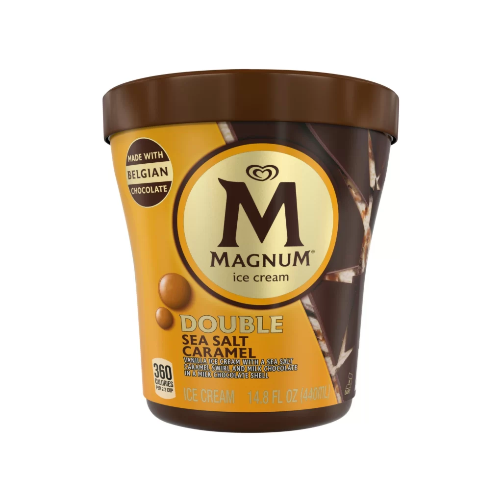
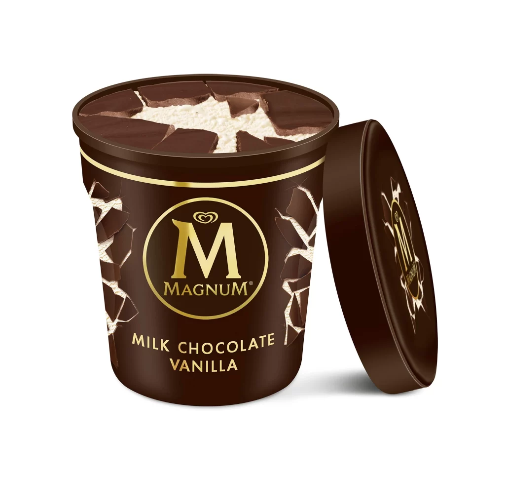
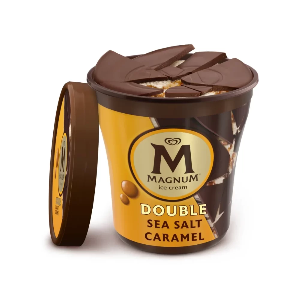
A tub of Magnum Double Sea Salt Caramel ice cream dominates the frame with its rich, warm palette and distinctive split design, where a vibrant golden-yellow gradient on the left transitions into deep chocolate imagery on the right. The curved container features a prominent gold oval logo with a bold 'M' above 'DOUBLE SEA SALT CARAMEL' text, while a detached brown plastic lid leans against its left edge. Broken chocolate shards crown the open top, revealing creamy white filling beneath, all set upon a clean white surface.
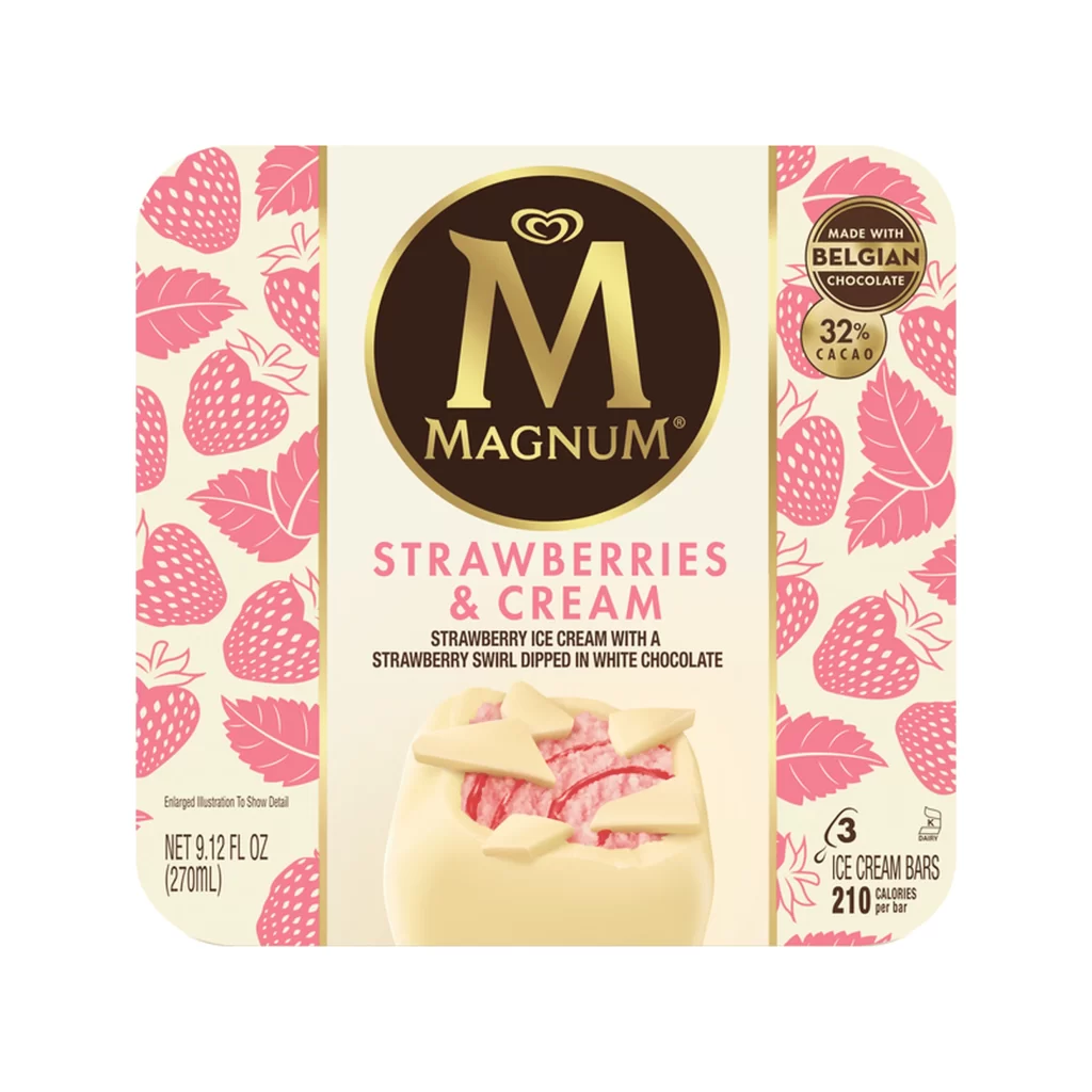
Visual hierarchy is established by the iconic gold oval emblem housing the bold ‘M’ logo and brand name, which sits prominently above the flavor text rendered in a sturdy, cream-colored sans-serif typeface. What distinguishes this specific presentation is the dramatic ‘broken’ chocolate layer on top, serving as a tactile promise of the product’s signature texture and indulgence. Subtle caramel droplet graphics on the yellow panel reinforce the flavor profile without cluttering the sophisticated, high-contrast aesthetic.

Food photographers might study the lighting setup used to create soft shadows beneath the tub, while packaging analysts could examine how the color blocking guides the consumer’s eye toward the premium branding elements. 3D artists tasked with creating realistic product renders would find value in observing the specular highlights on the glossy lid and the matte finish of the cardboard sleeve. Marketing teams could also reference this composition when planning e-commerce listings that require the packaging to appear both appetizing and luxurious.