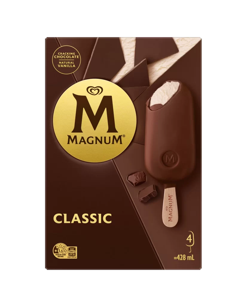
Magnum Classic Chocolate Vanilla Ice Cream Stick Packaging
Topics
Details
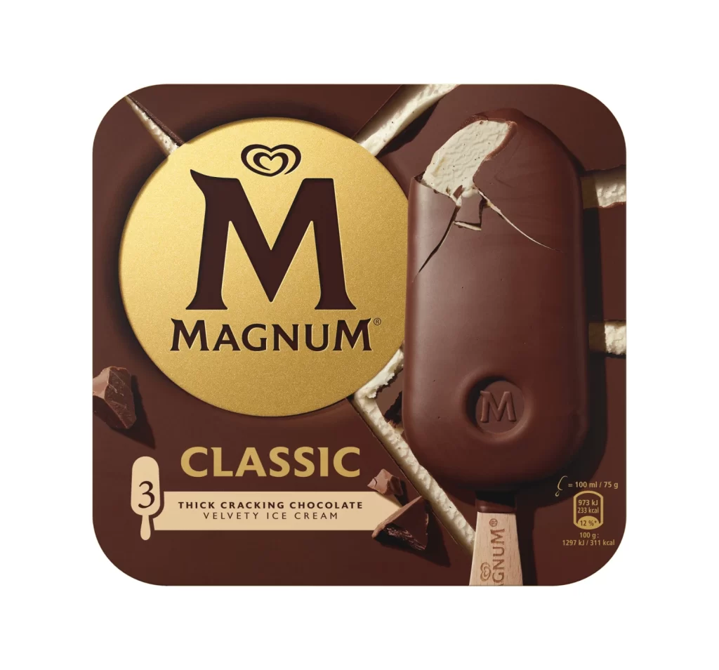
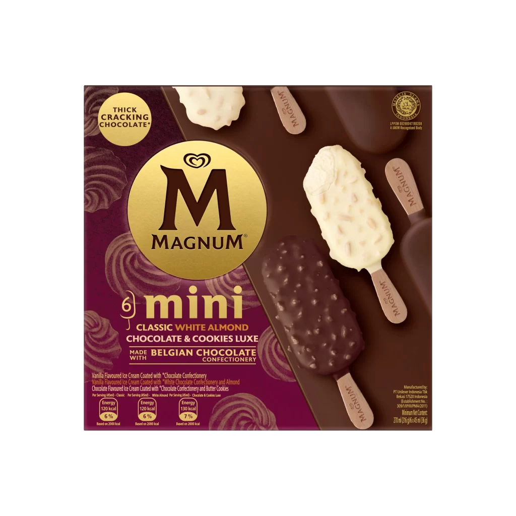
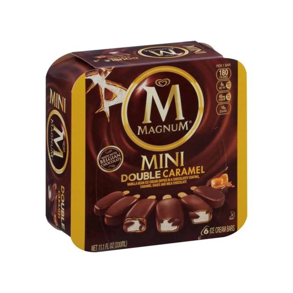
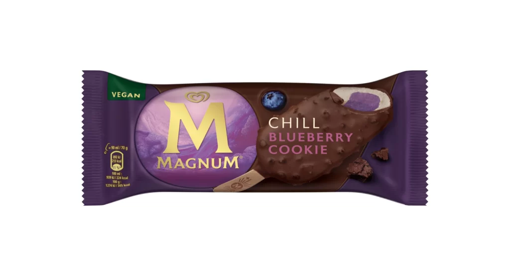
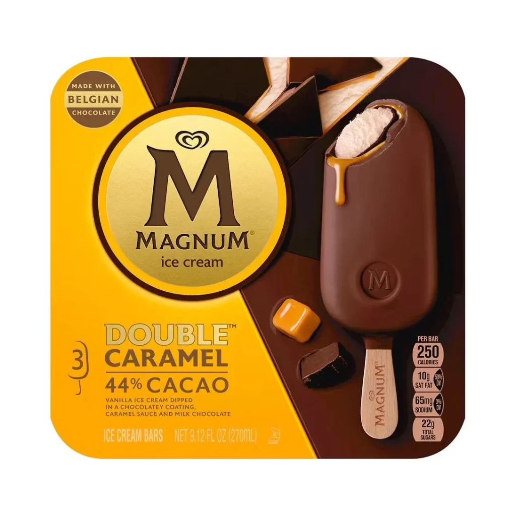
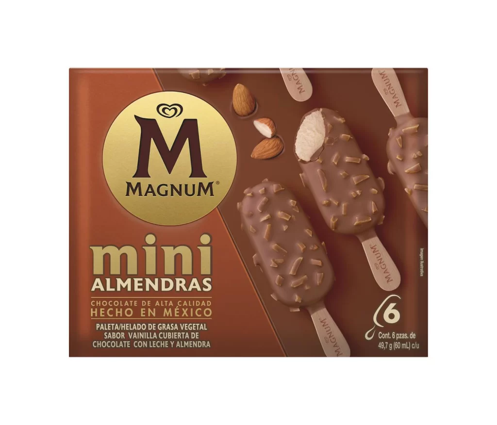
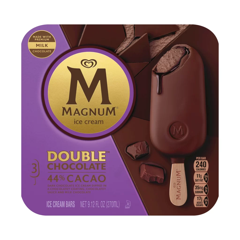
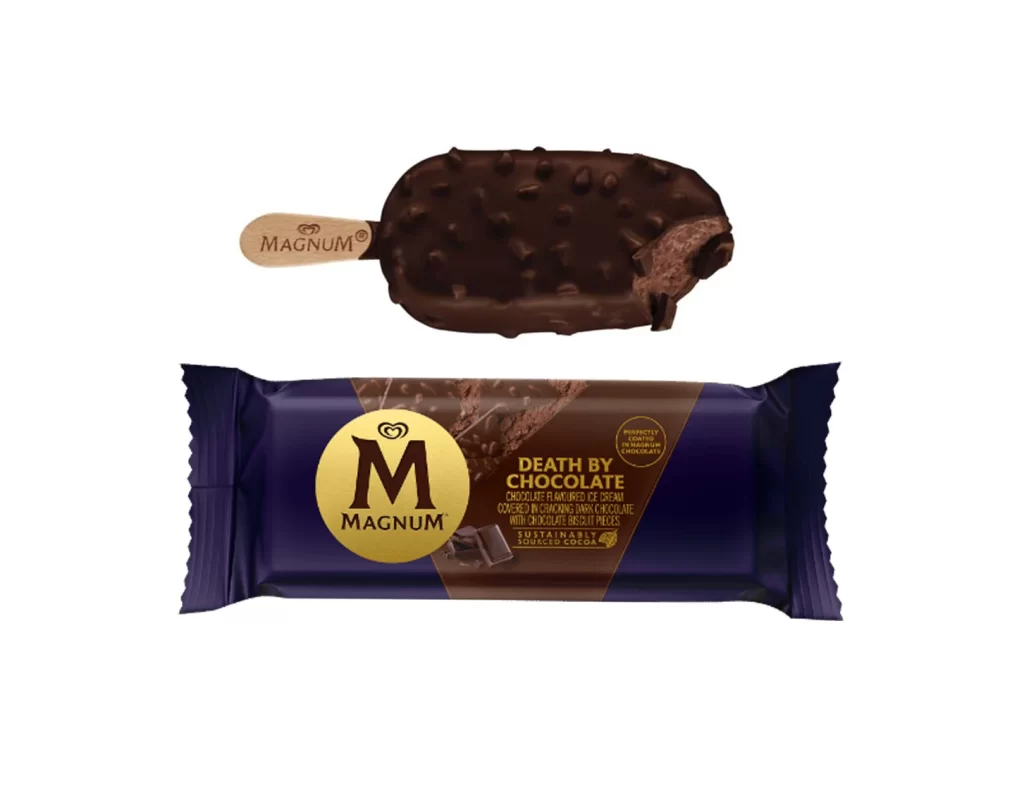
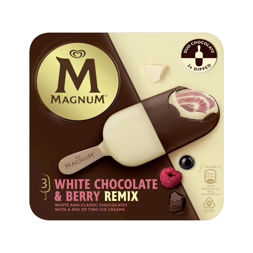
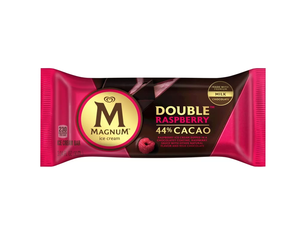
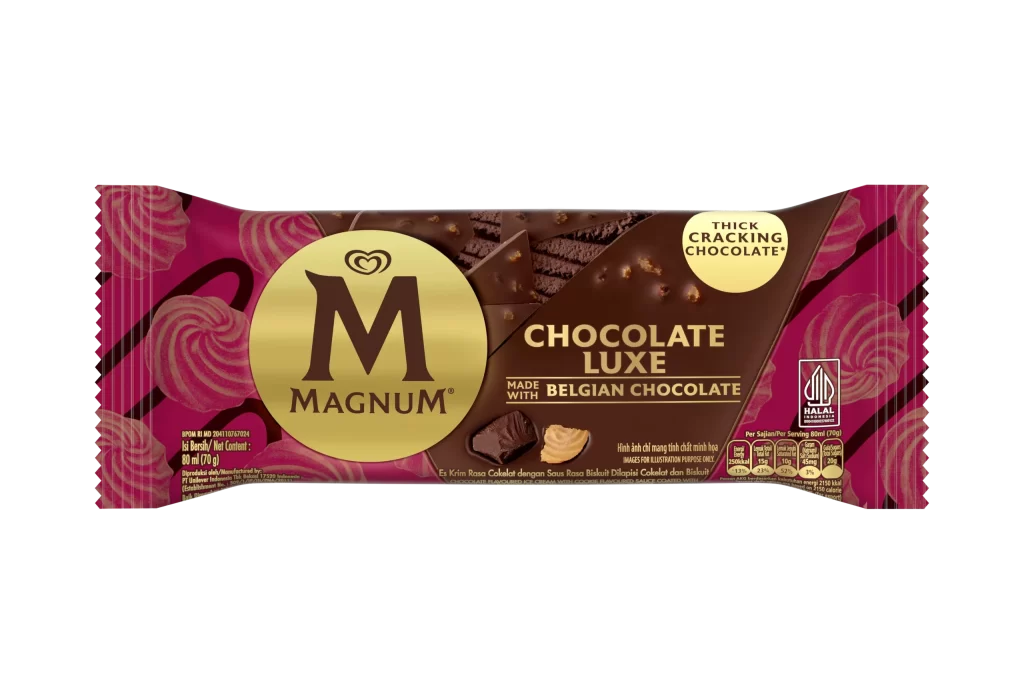
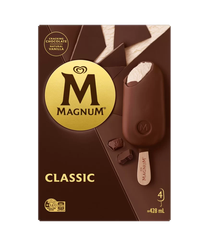
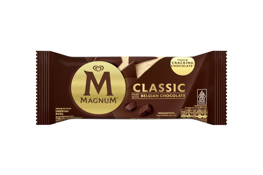
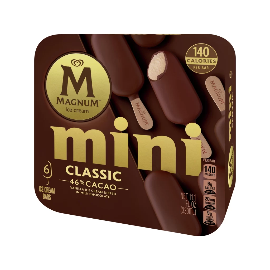
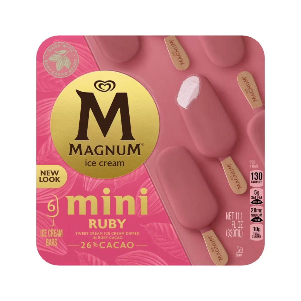
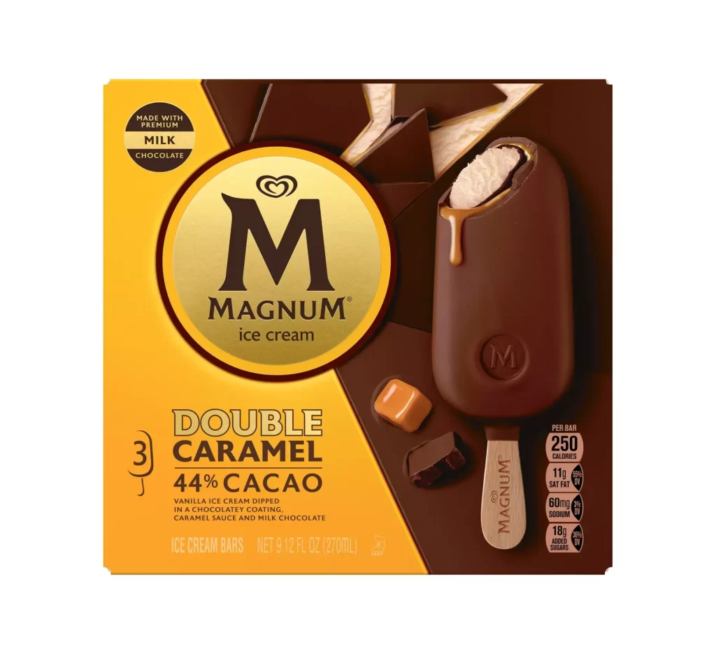
Deep chocolate brown dominates the rectangular packaging, accented by a prominent circular gold emblem bearing the Magnum 'M' logo and brand name. A realistic photograph of the ice cream stick occupies the right side, revealing the creamy white vanilla interior through a bite taken out of the thick chocolate coating. Visible text includes 'CRACKING CHOCOLATE NATURAL VANILLA' in the upper left, 'CLASSIC' in bold gold lettering below the logo, and volume information indicating 4 units totaling 428 mL in the bottom right corner.
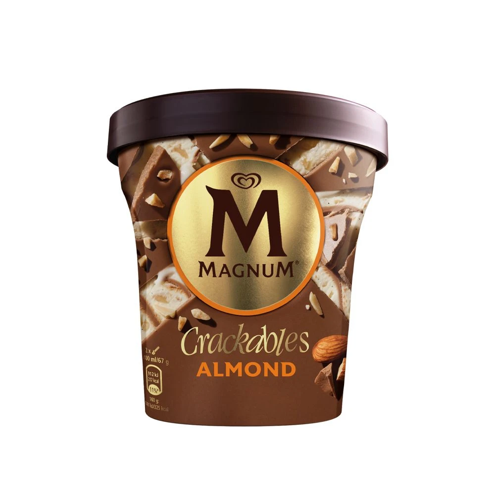
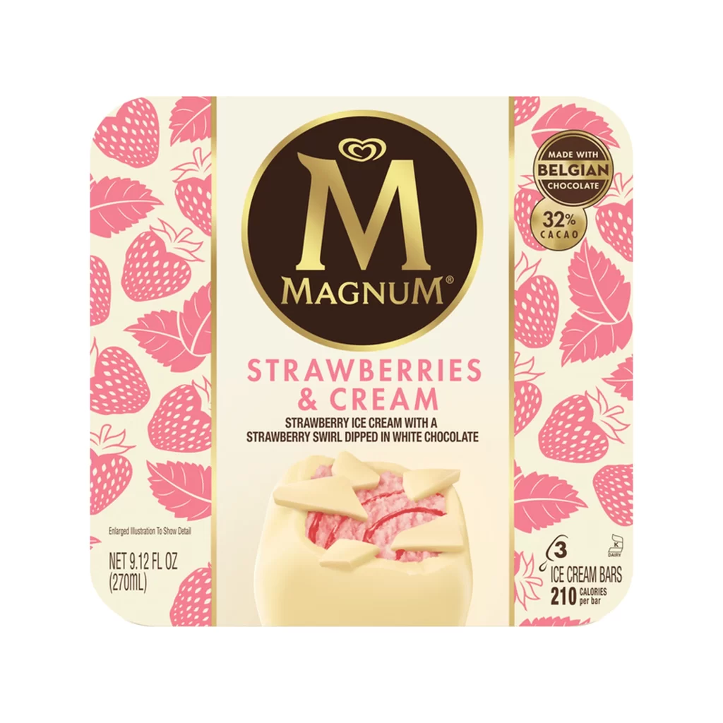
Geometric chocolate shard patterns create dynamic diagonal lines across the background, adding visual texture that complements the product's signature cracking shell feature. The luxurious gold and brown color palette establishes a premium aesthetic, while the embossed 'M' on both the stick and the chocolate coating reinforces brand identity through tactile visual cues. Strategic placement of broken chocolate pieces near the main product image subtly emphasizes the textural experience without cluttering the composition.
Packaging designers studying premium frozen dessert branding can analyze the hierarchy between the circular logo lockup and product photography placement. Food photographers might reference the lighting technique used to highlight the contrast between matte chocolate surfaces and glossy cream textures. Marketing teams developing luxury FMCG products could examine how nutritional information badges integrate into sophisticated dark-themed layouts without disrupting visual flow.