Title

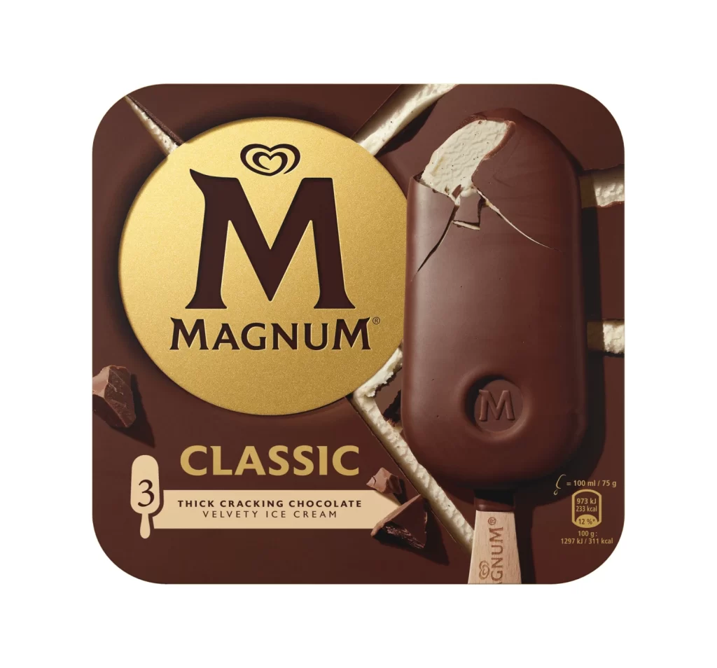
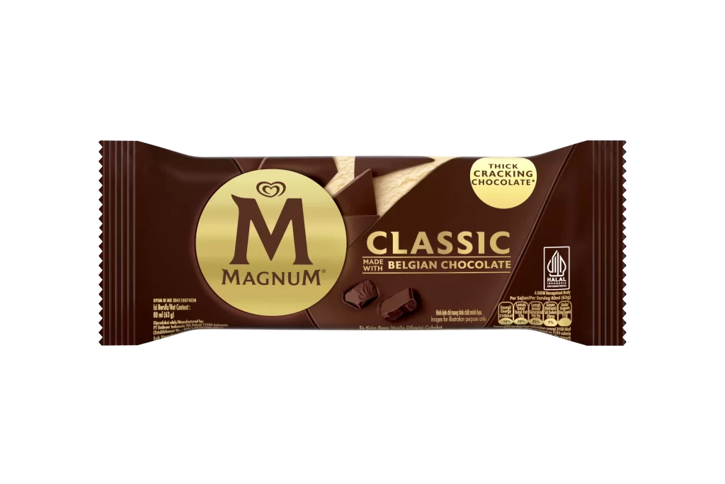
Magnum Classic Belgian Chocolate Ice Cream Packaging


Topics

Ice CreamMagnum

Details

Uploaded user: Leo

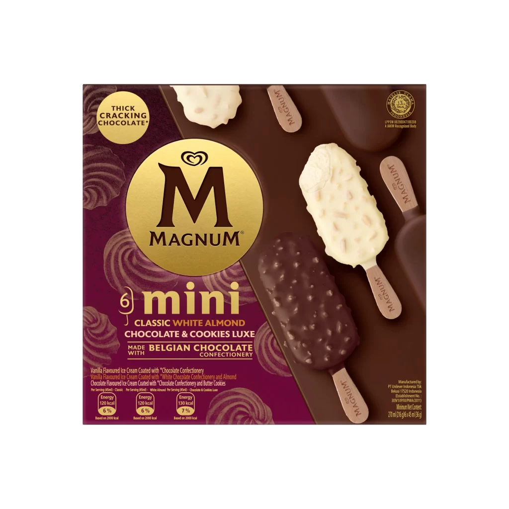
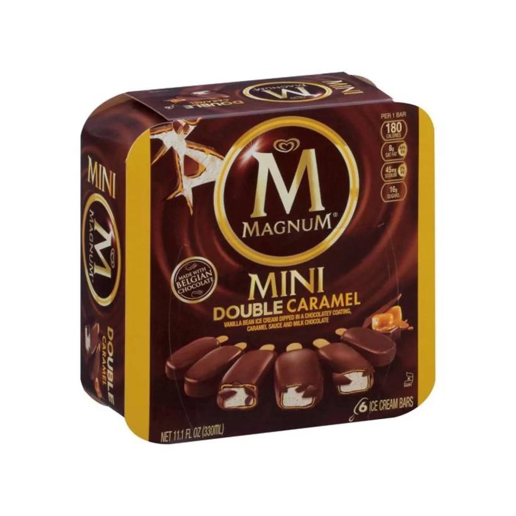
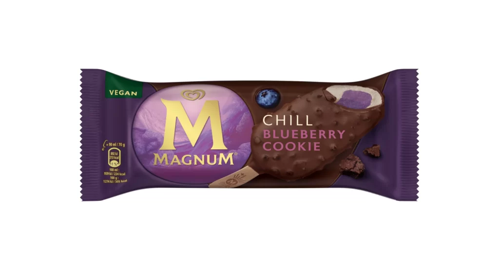
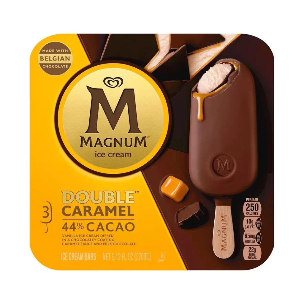
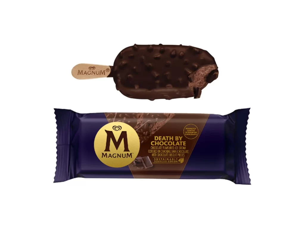
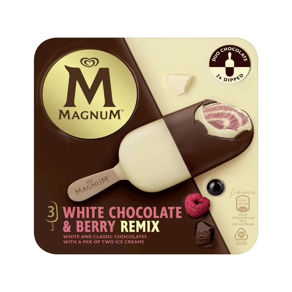
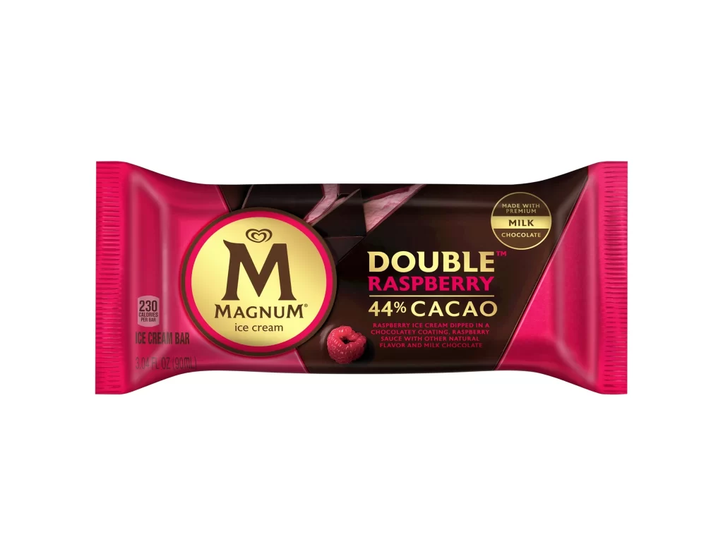
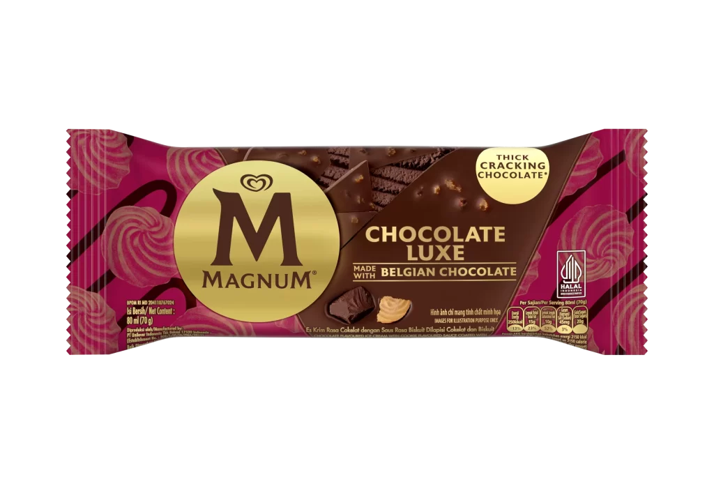
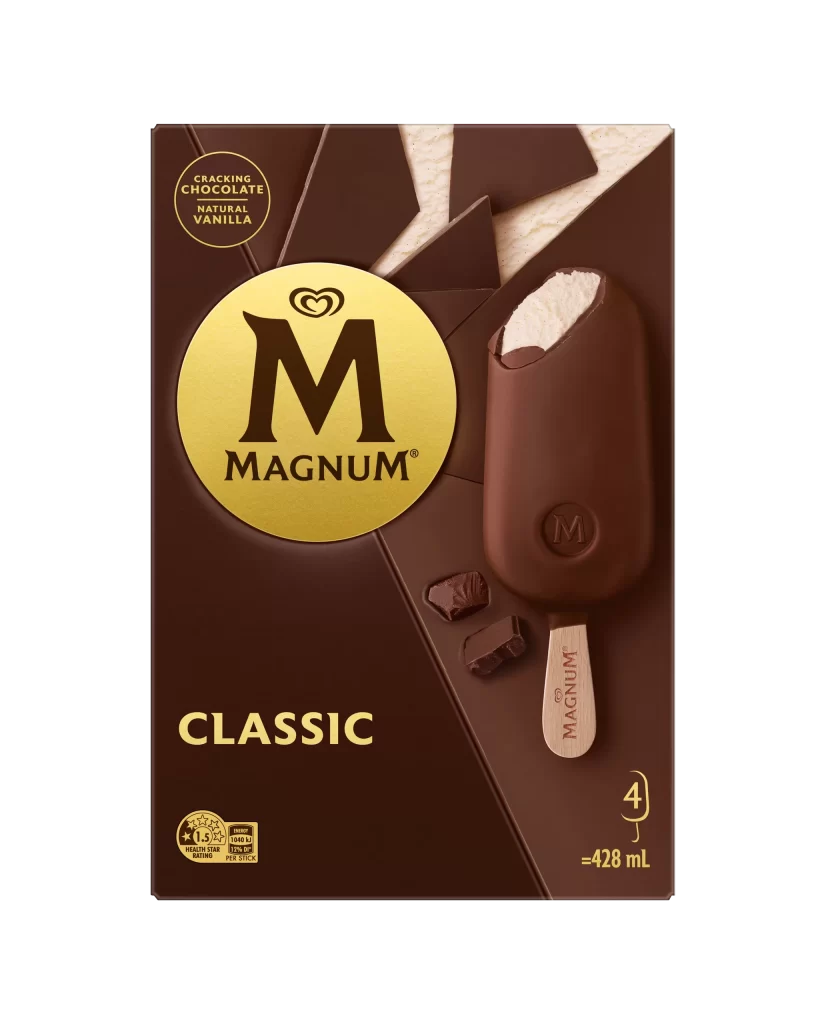
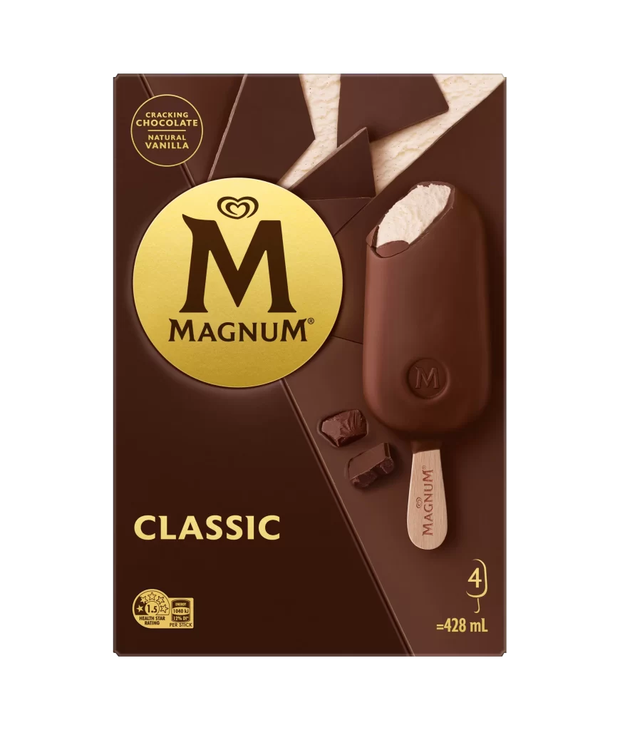
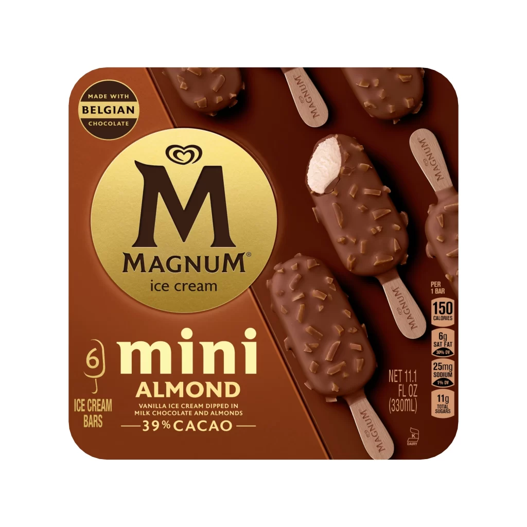
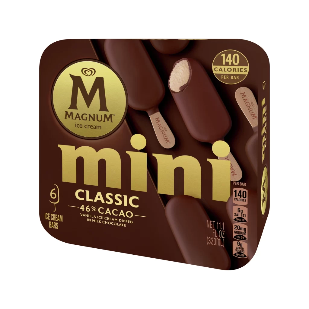
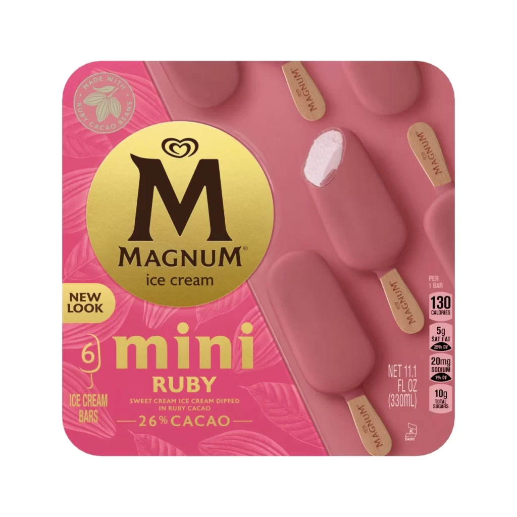
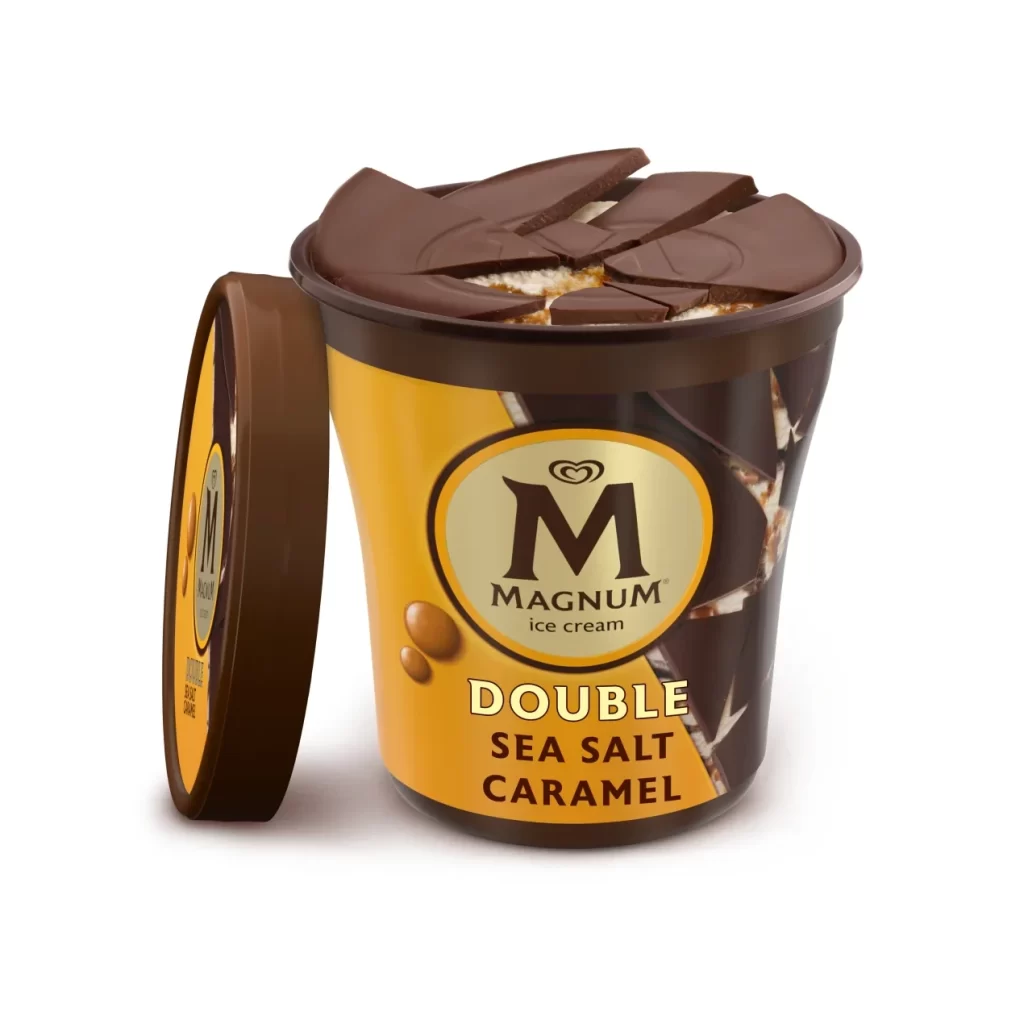
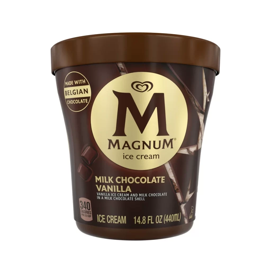
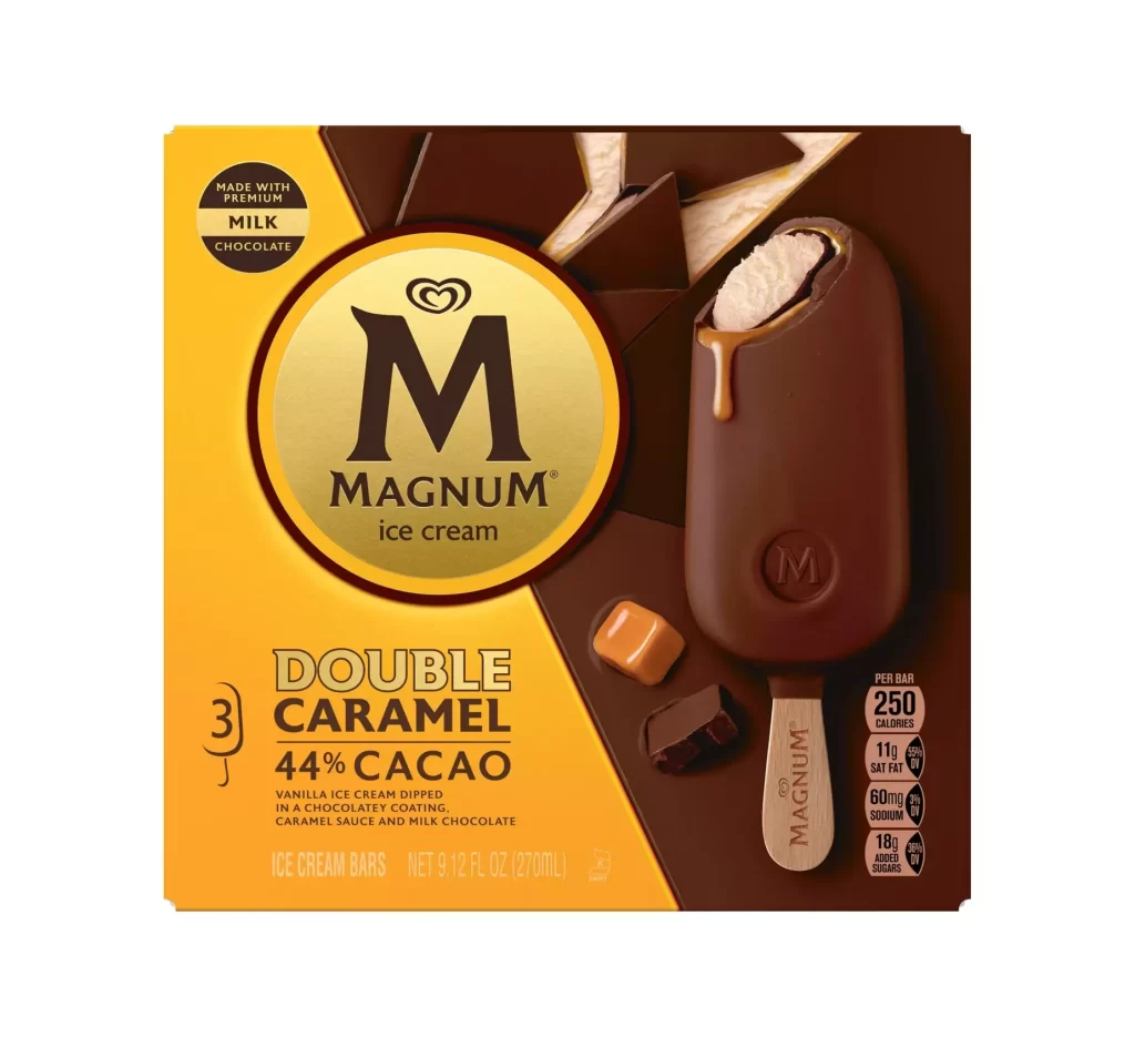
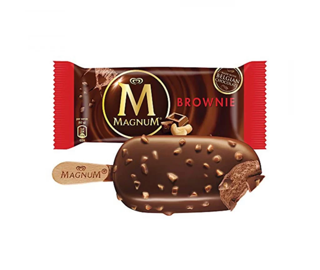
Deep matte cocoa browns and metallic gold accents define the Magnum Classic wrapper, which features a large circular gold foil emblem on the left containing the iconic 'M' heart logo and 'MAGNUM' wordmark in a serif typeface. Bold gold sans-serif text reading 'CLASSIC' sits to the right of this central anchor, while 'MADE WITH BELGIAN CHOCOLATE' appears in smaller capitals beneath it on a white surface.

Visual hierarchy is strictly enforced through the contrast between the dark substrate and the reflective gold elements, drawing immediate attention to the brand’s premium positioning. The use of geometric abstraction—specifically the angular chocolate shard graphics—breaks the monotony of the rectangular form while reinforcing the product’s texture. Furthermore, the inclusion of the Halal certification mark and nutritional information grid on the far right indicates a design that balances aesthetic luxury with necessary regulatory compliance.
Brand strategists might utilize this layout to analyze how color psychology is employed to signal indulgence within the frozen dessert category. Packaging engineers could examine the placement of functional elements like the tear-notch indicators versus marketing copy. Additionally, typography students may find value in deconstructing the interplay between the classic serif logo and the modern sans-serif product descriptors to understand visual weight distribution.