Magnum mini Ruby Ice Cream Packaging
Topics
Details
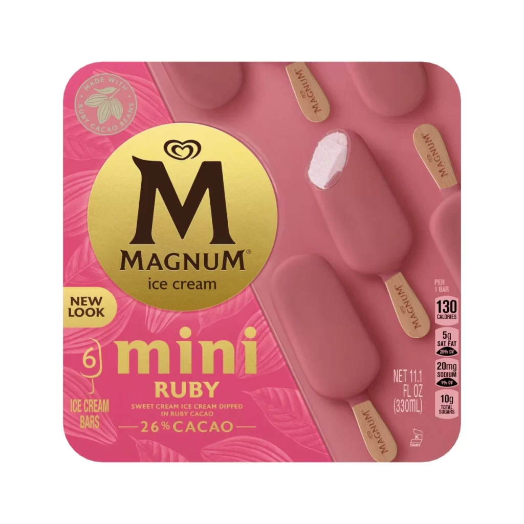
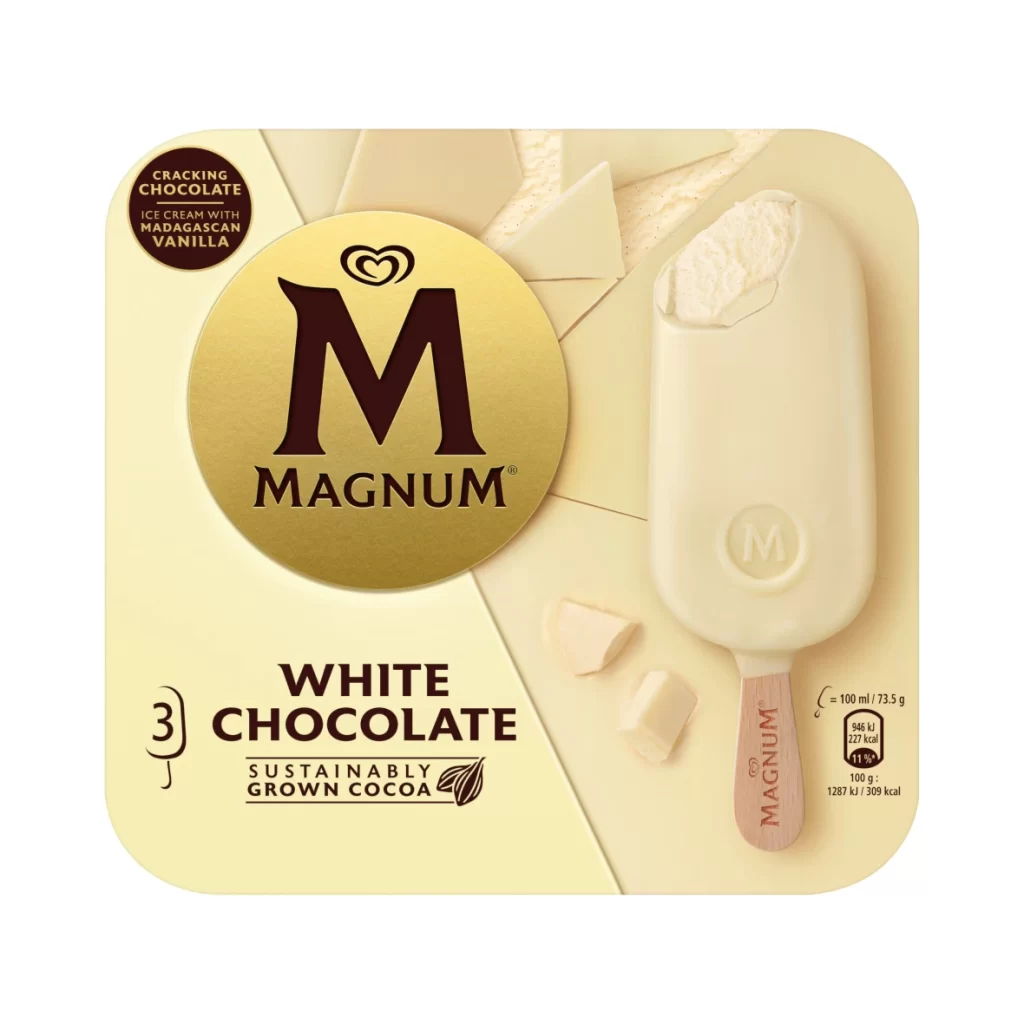
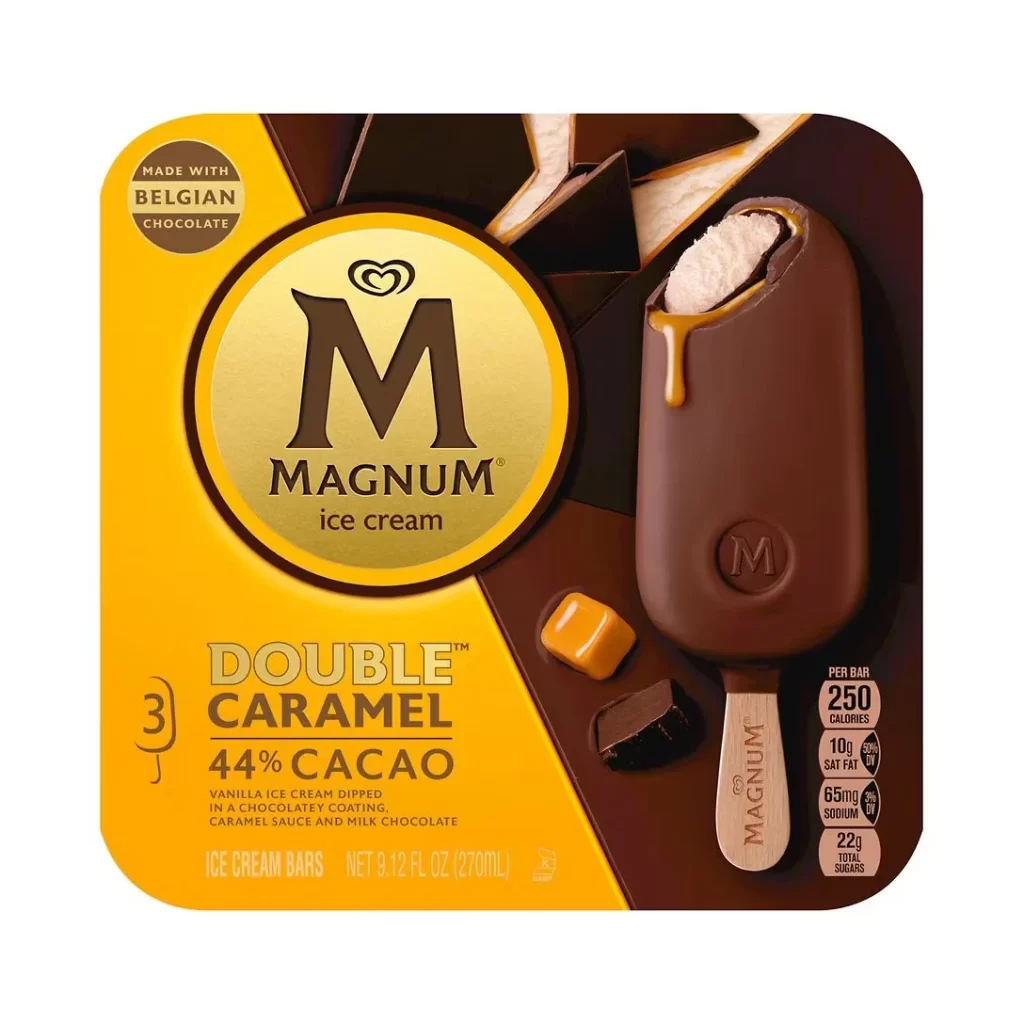
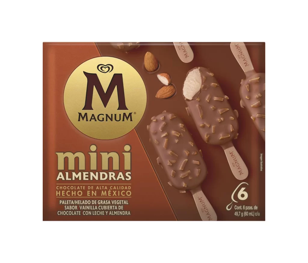
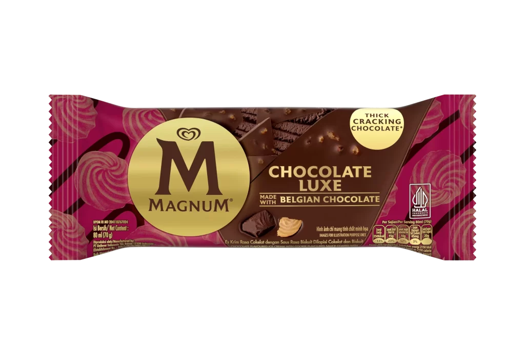
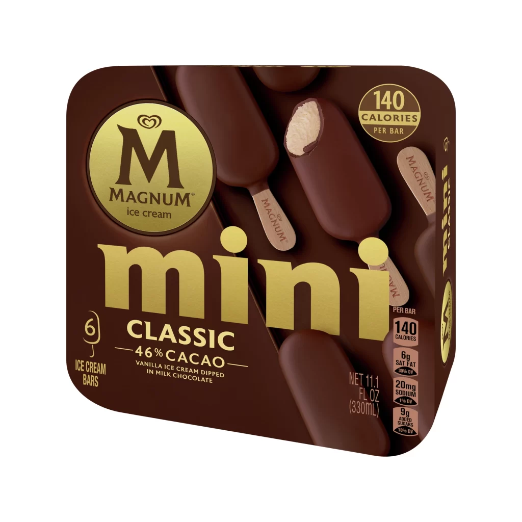
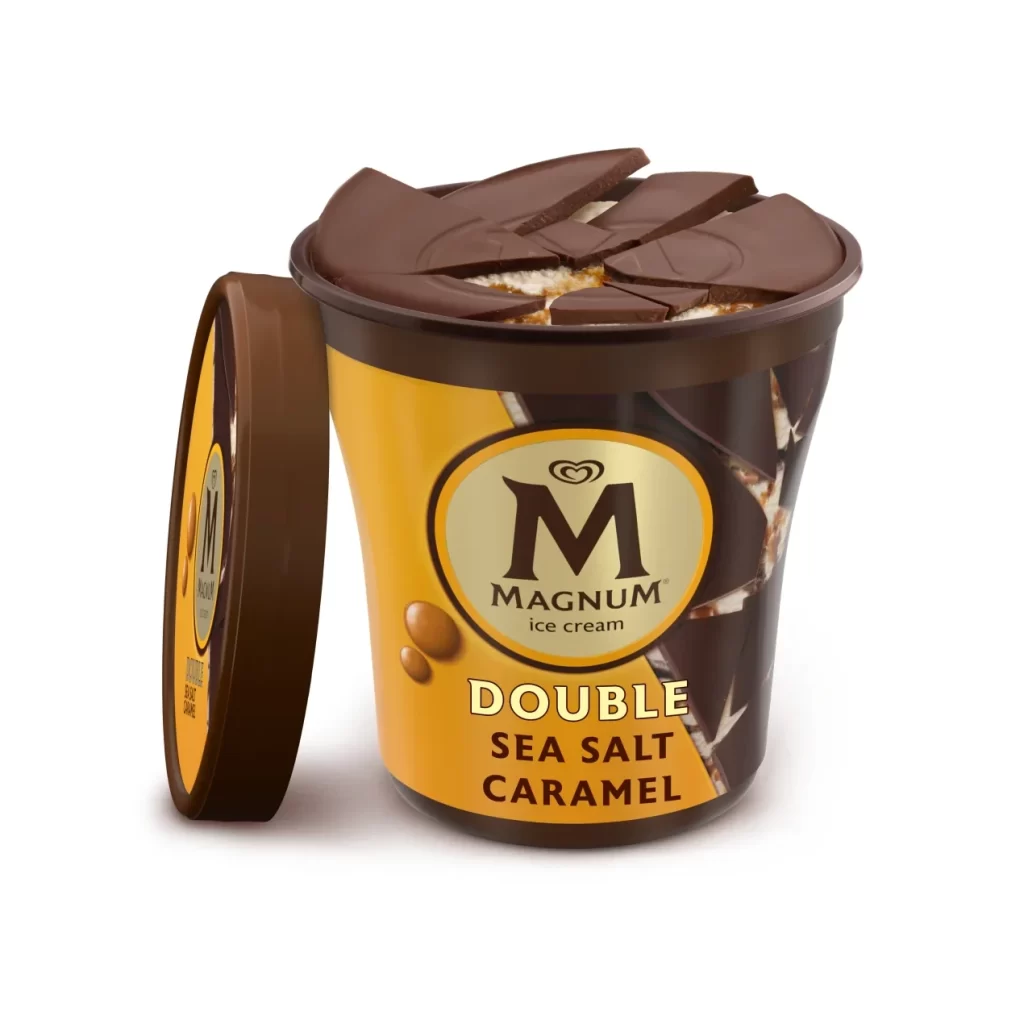
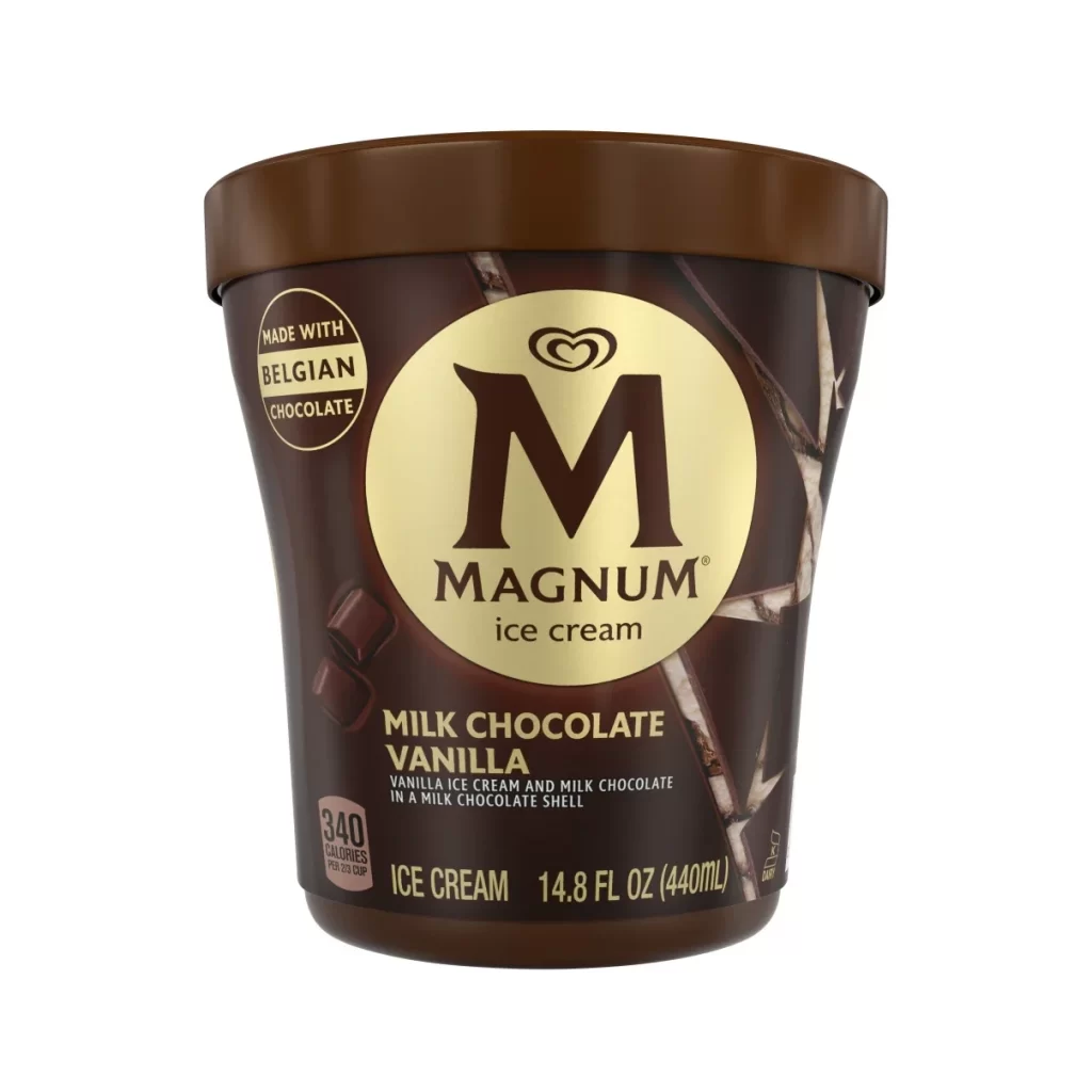
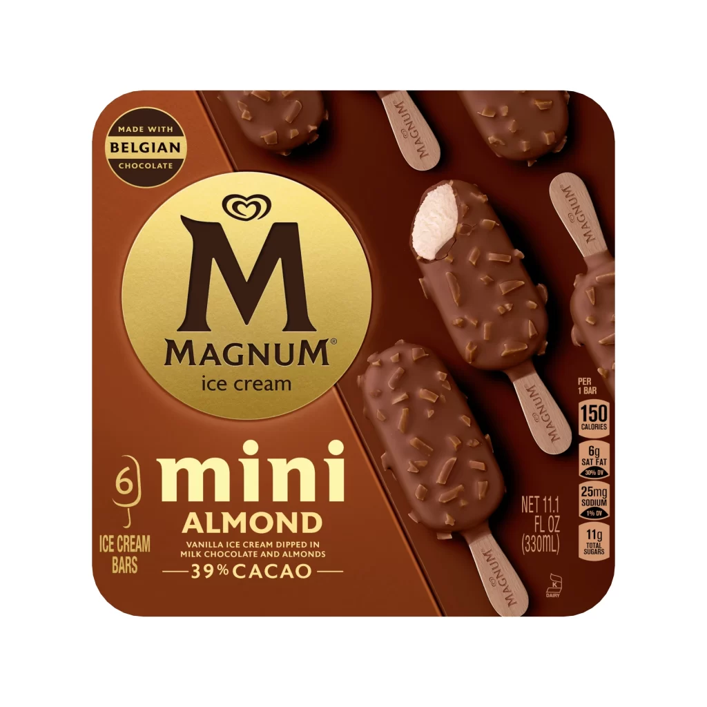
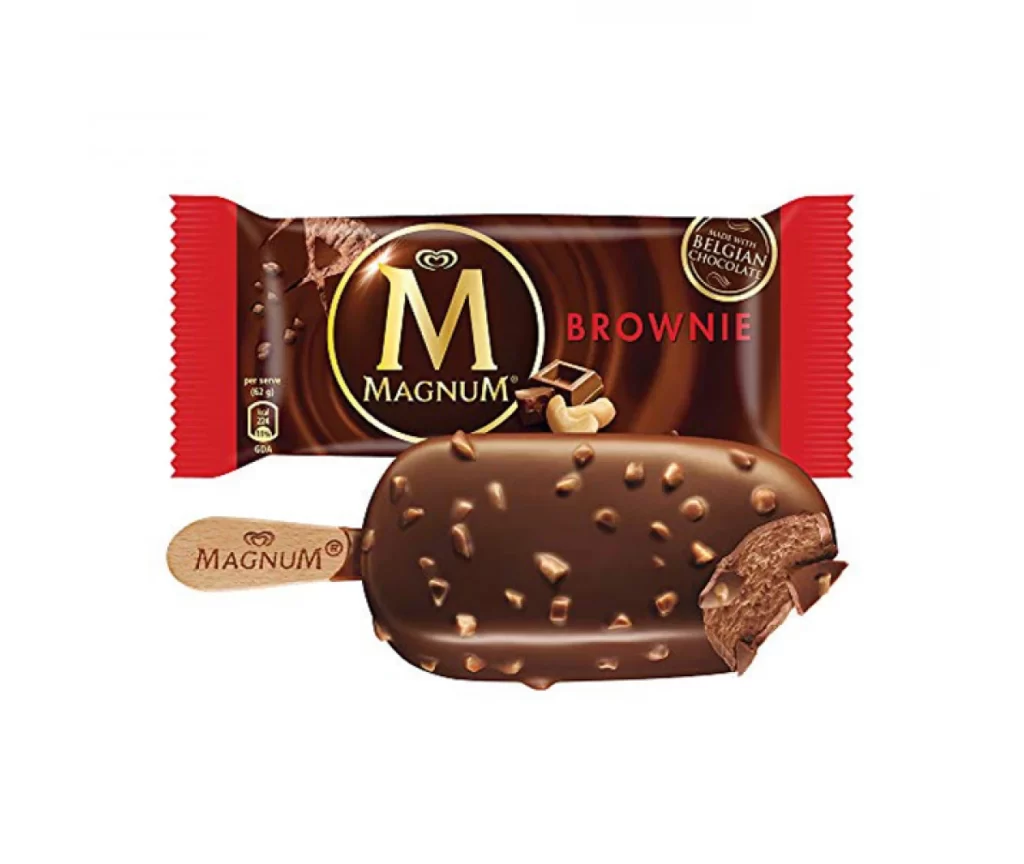
Vibrant pink dominates the rectangular packaging, which features rounded corners and a split composition between a graphic left panel and a photographic right side. A large golden circle anchors the center, displaying the bold black 'M' logo and the word MAGNUM in serif lettering above the phrase 'ice cream.' To the right, several dusty rose-colored ice cream bars appear with wooden sticks bearing the brand name, while one bar reveals a white interior where a bite has been taken. Nutritional information and volume measurements occupy the bottom right corner in clean typography against the pink background.
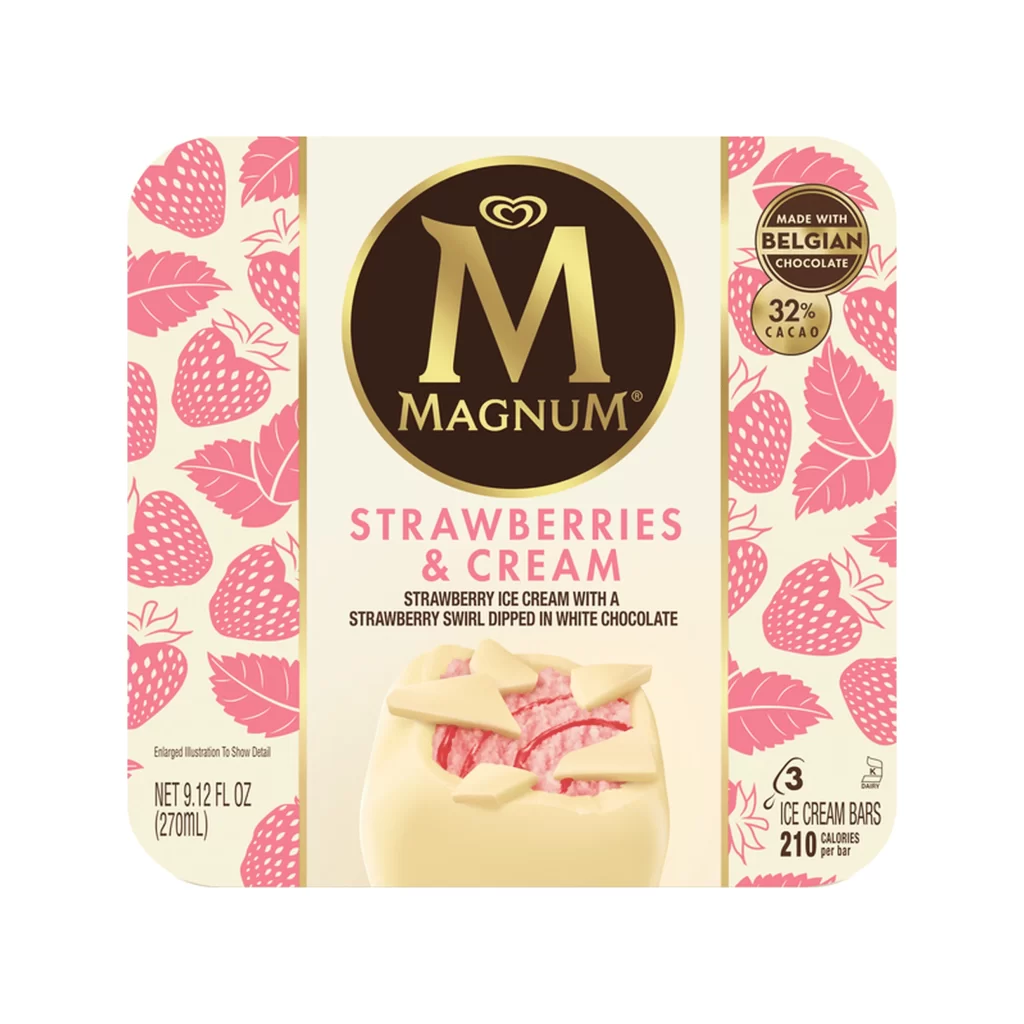
The distinctive ruby cacao hue sets this variant apart from traditional chocolate packaging, utilizing an unusual color palette that signals a premium, fruit-forward flavor profile. Graphic elements like the circular gold badge and leaf motifs create visual hierarchy, drawing attention to the '26% CACAO' claim and 'NEW LOOK' label. The photograph of actual product bars provides tactile realism through visible texture on both the coating and the wooden sticks, bridging the gap between illustration and reality.
Brand strategists analyzing color psychology in frozen dessert categories would examine how the pink-to-rose gradient communicates indulgence without relying on conventional brown tones. Packaging engineers could reference the layout when balancing nutritional disclosure requirements with aesthetic branding space. Food photographers might study the lighting technique used to highlight the contrast between the matte exterior and creamy interior of the bitten bar.