Magnum White Chocolate & Berry Remix Ice Cream Packaging
Topics
Details
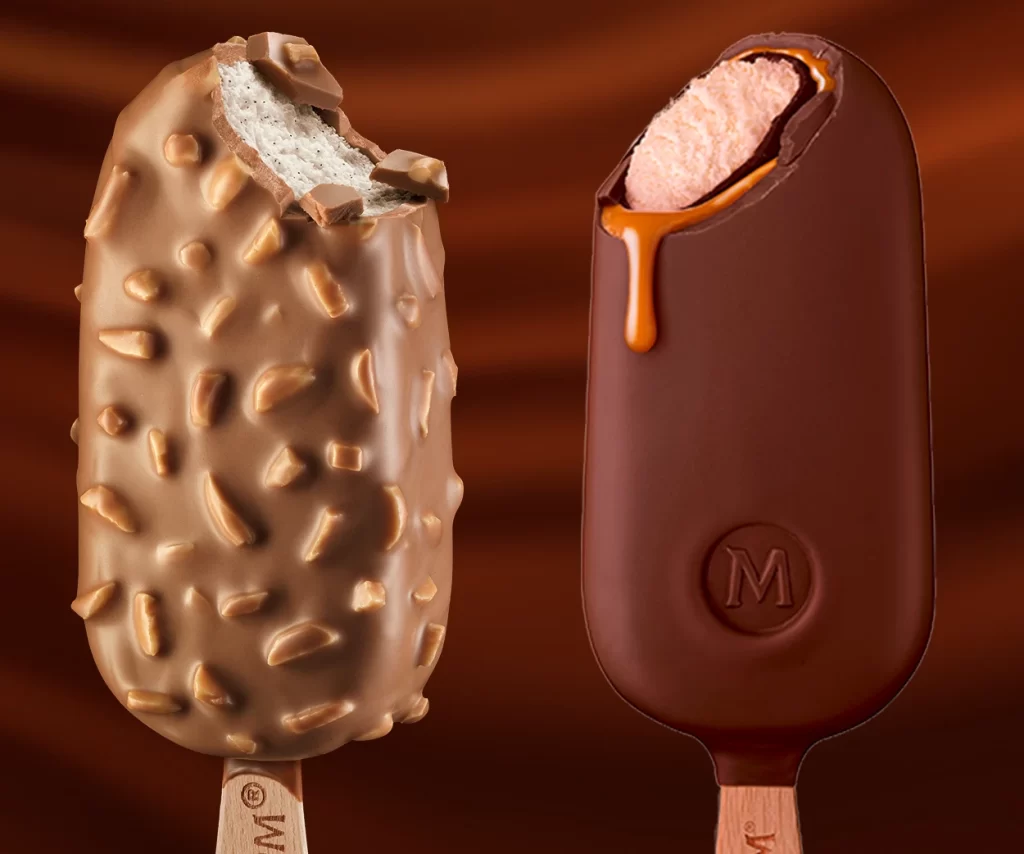
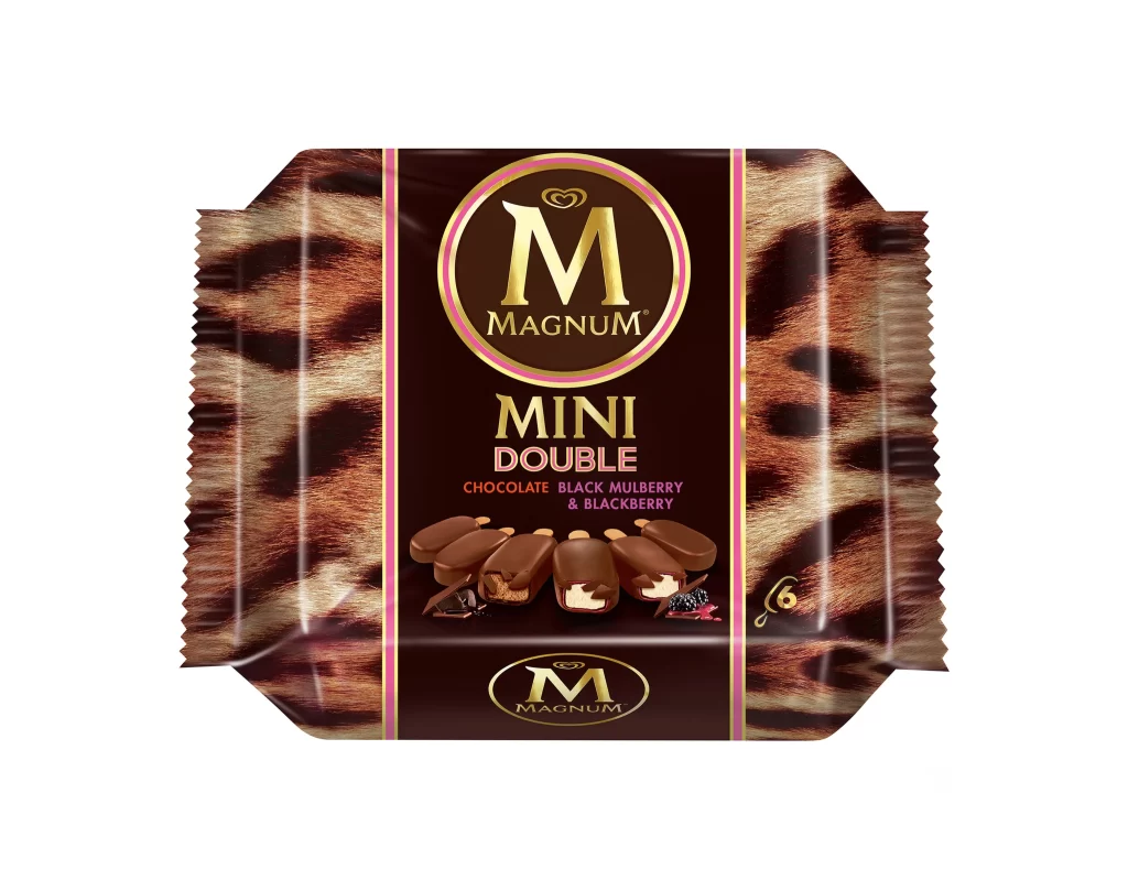
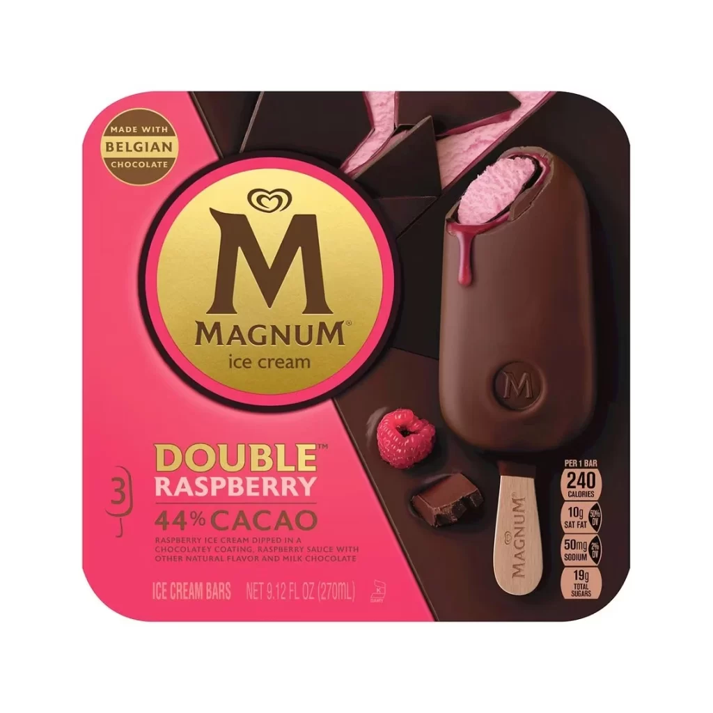
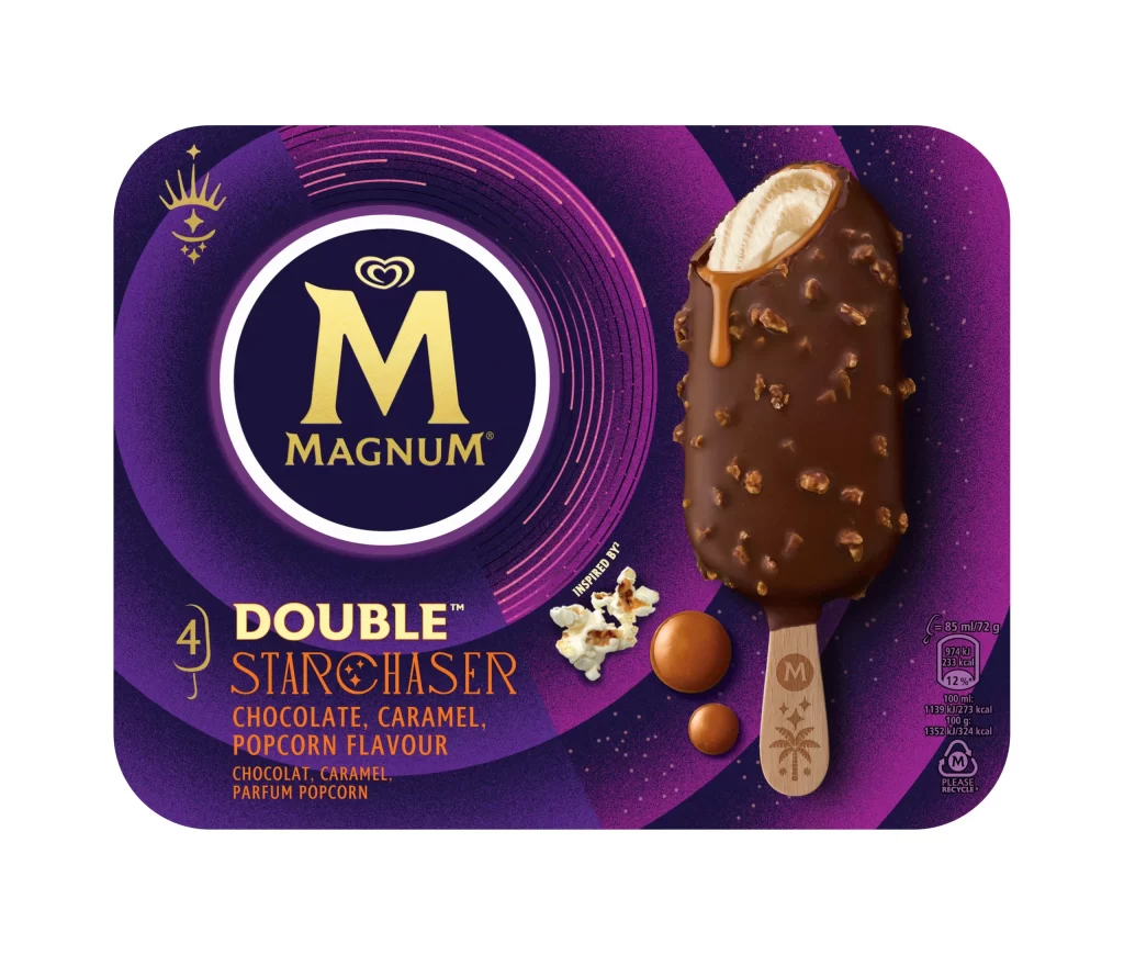
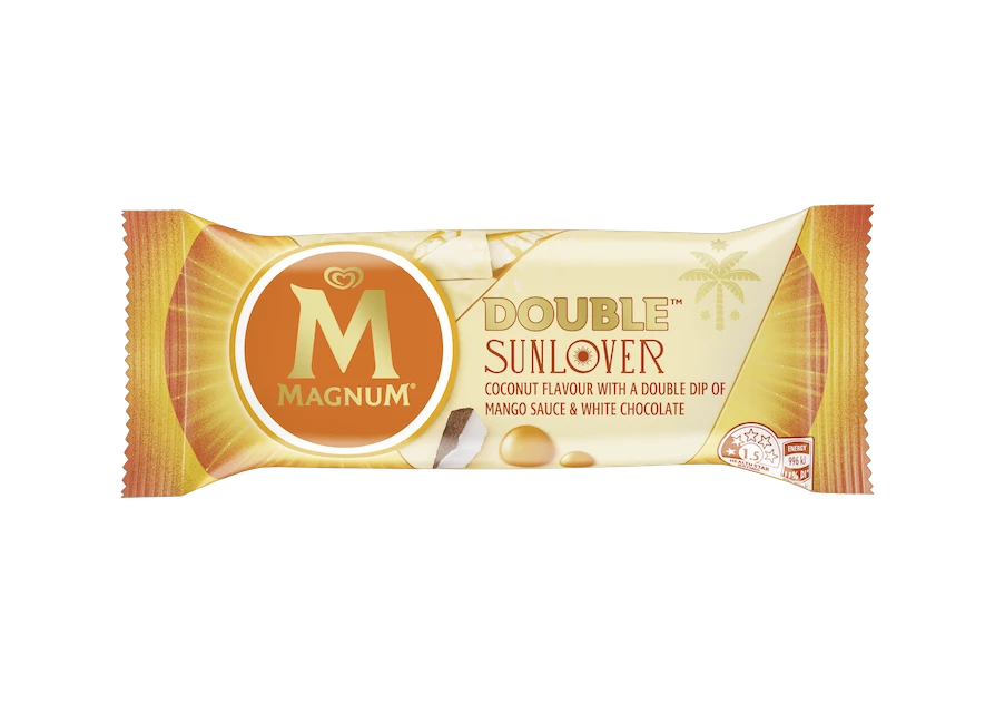
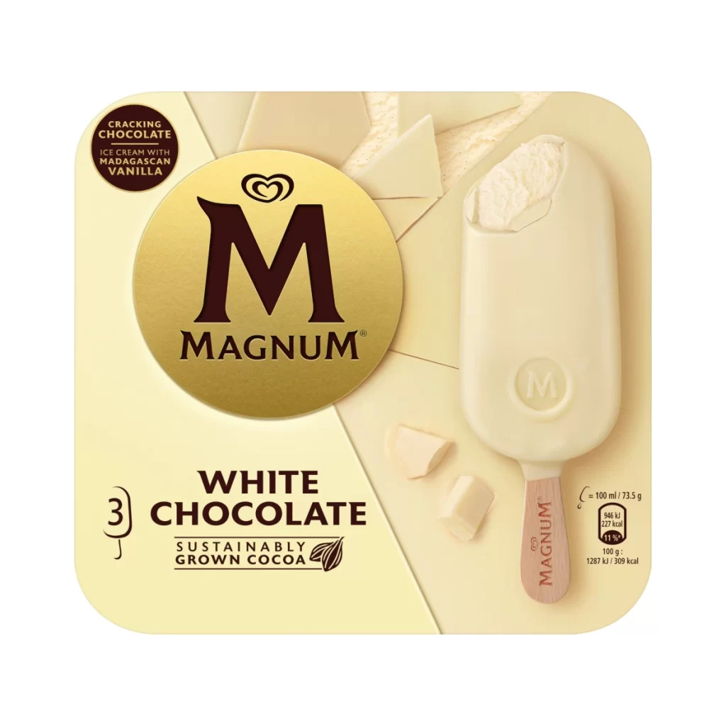
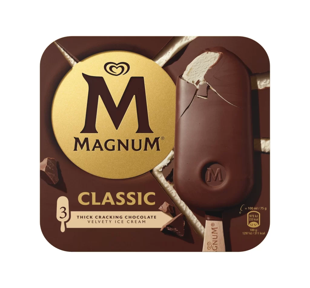
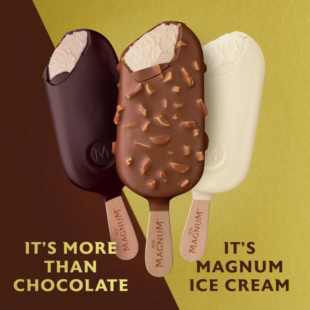
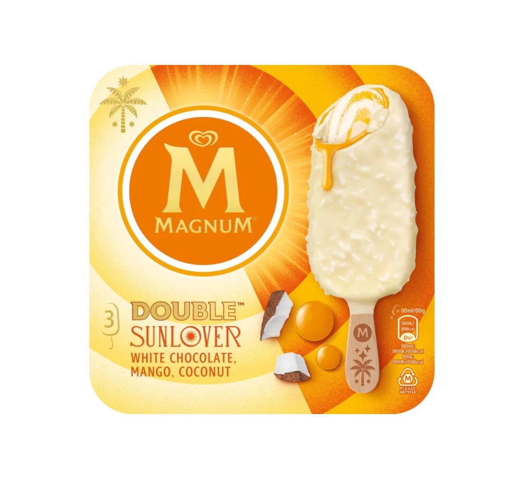
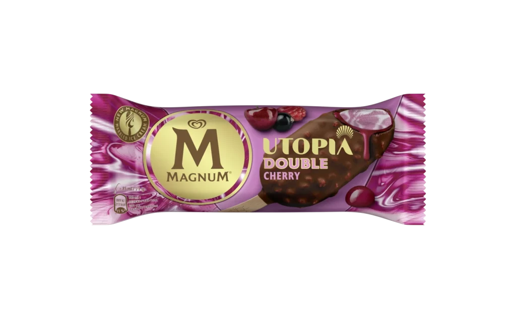
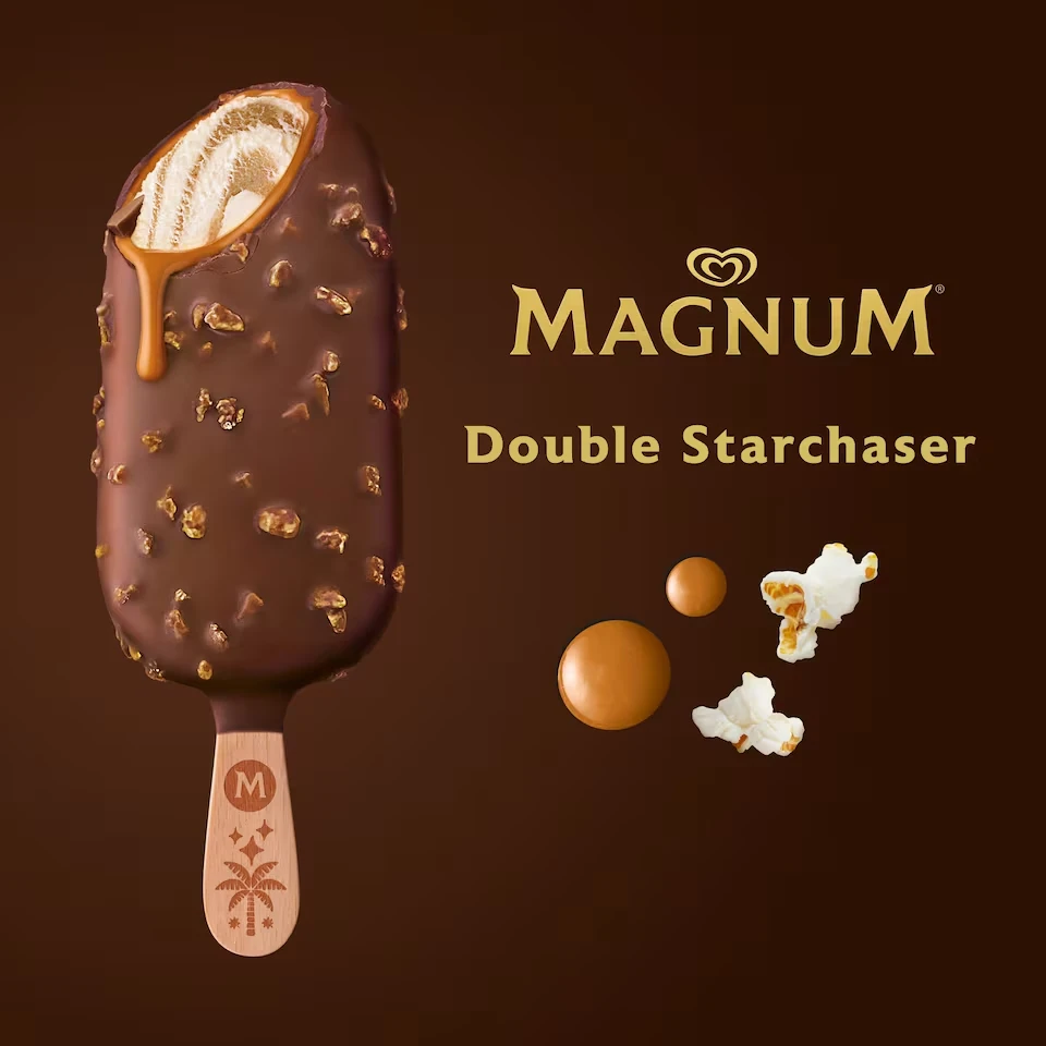
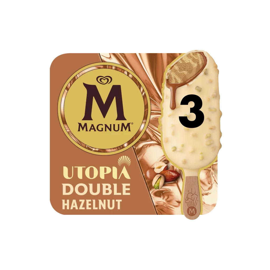
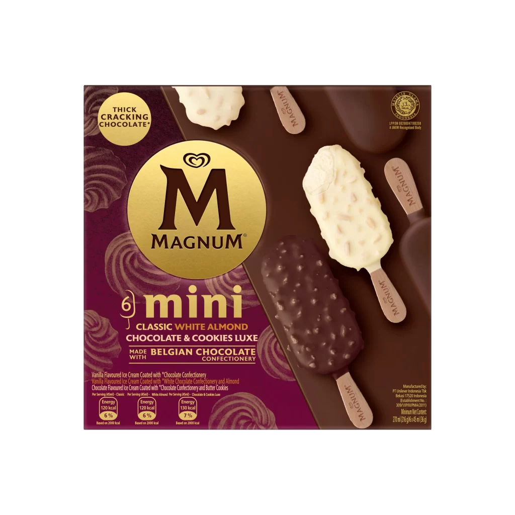
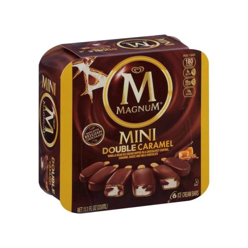
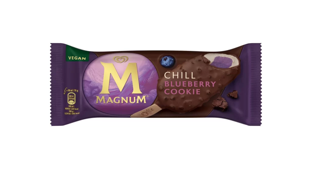
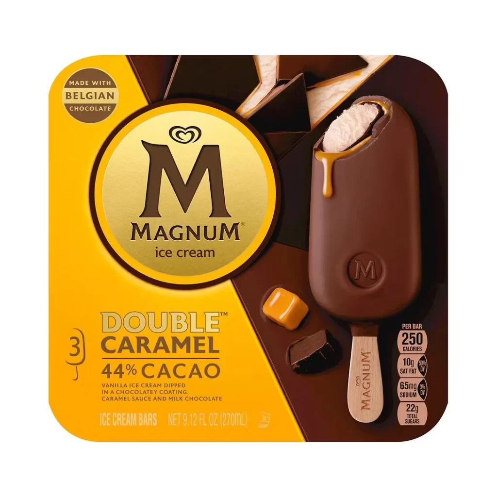
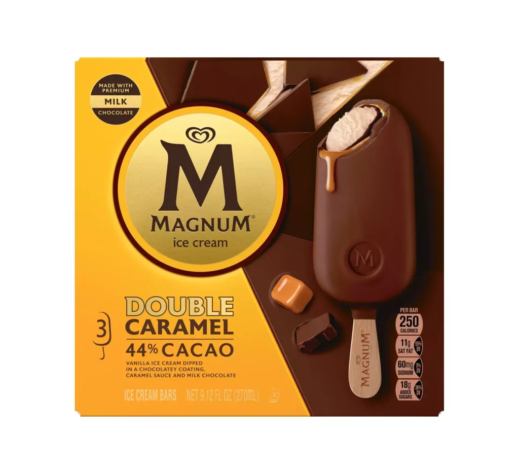
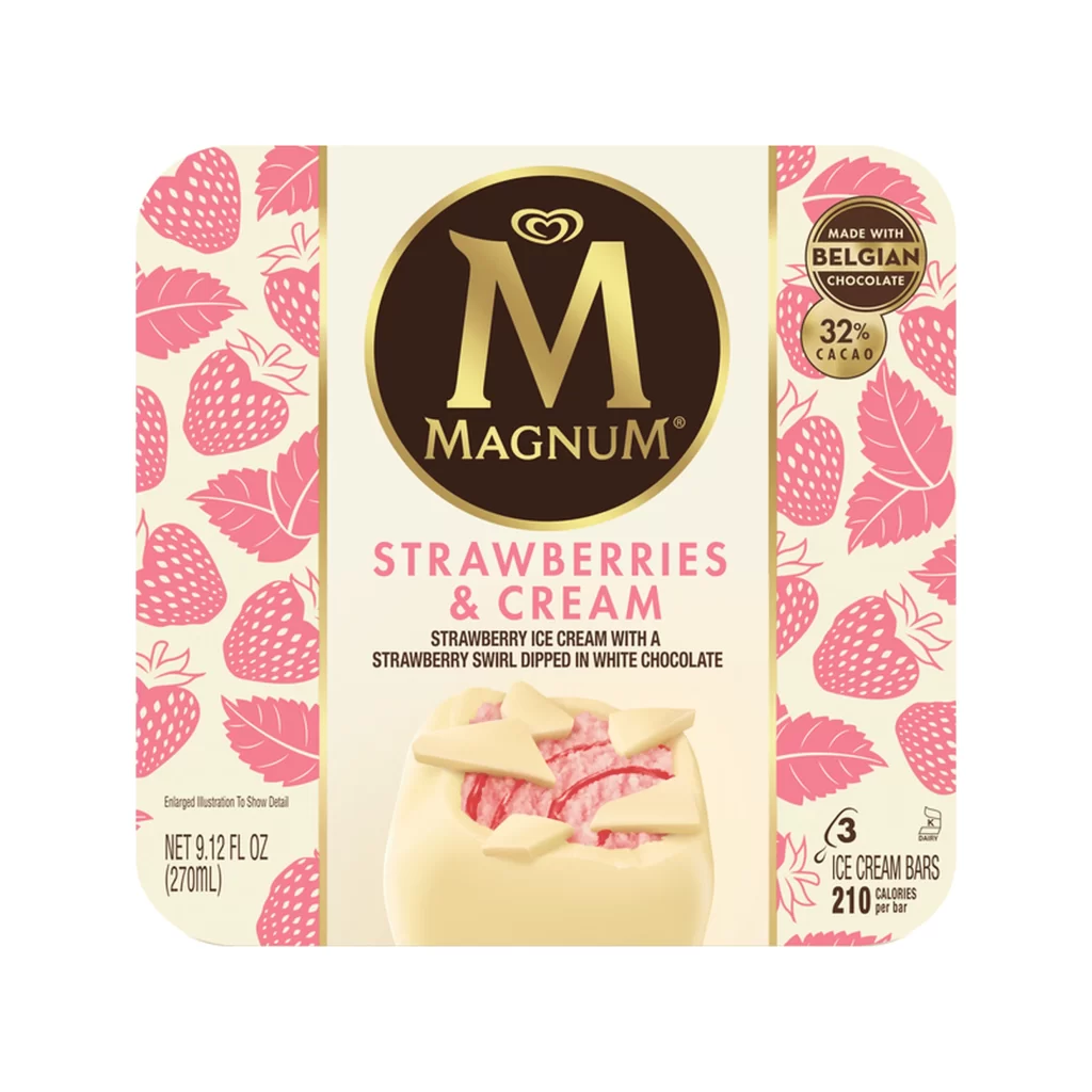
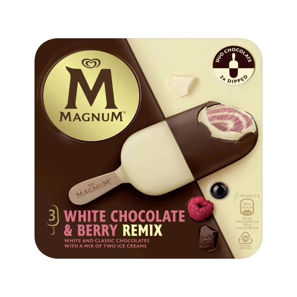
Split diagonally between deep espresso brown and pale cream, the Magnum packaging presents a high-contrast field for its central product photography. A single bar dominates the composition, featuring a dual-dipped coating of white and dark chocolate that reveals a pink-and-white swirled berry core at the snapped end. The iconic gold circular logo anchors the upper left, while a 'Duo Chocolate 2x Dipped' badge occupies the upper right corner alongside nutritional data and recycling symbols.
Visual tension arises from the bisected background mirroring the dual-chocolate construction of the ice cream itself, creating a cohesive thematic link between container and contents. Typography employs a hierarchy where the flavor name 'White Chocolate & Berry Remix' appears in bold magenta and yellow, drawing immediate attention against the darker substrate. Small photographic elements of raspberry, blueberry, and chocolate chunks ground the abstract color palette in tangible ingredient reality.
Brand strategists might analyze this layout to understand how diagonal division can effectively communicate hybrid product features without cluttering the visual field. Packaging engineers could reference the spatial arrangement of mandatory legal text versus marketing copy to optimize their own label designs. Food photographers may study the lighting on the chocolate coating to replicate similar appetizing sheen in their own commercial shoots.