Title

Magnum Double Caramel 44% Cacao Ice Cream Packaging


Topics

Ice CreamMagnum

Details

Uploaded user: Leo

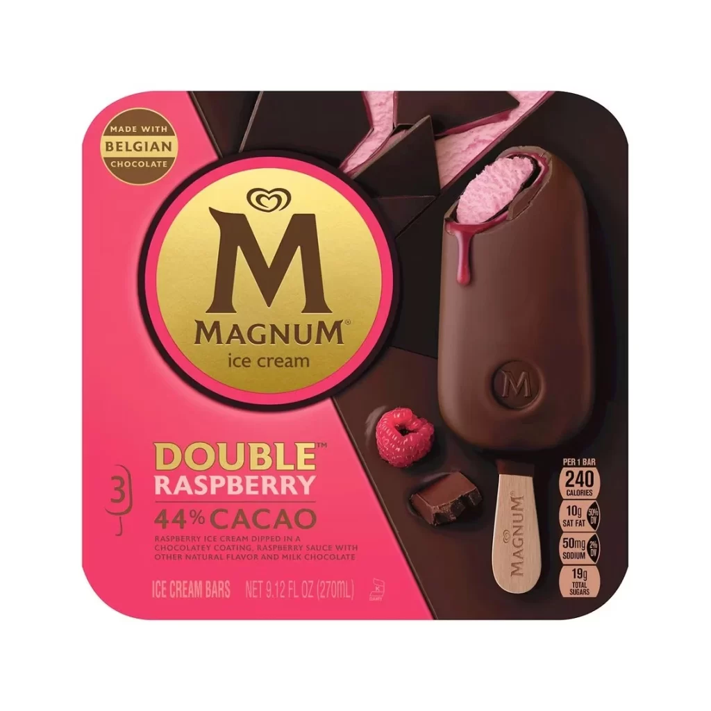
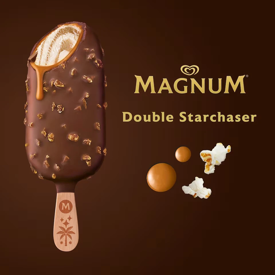
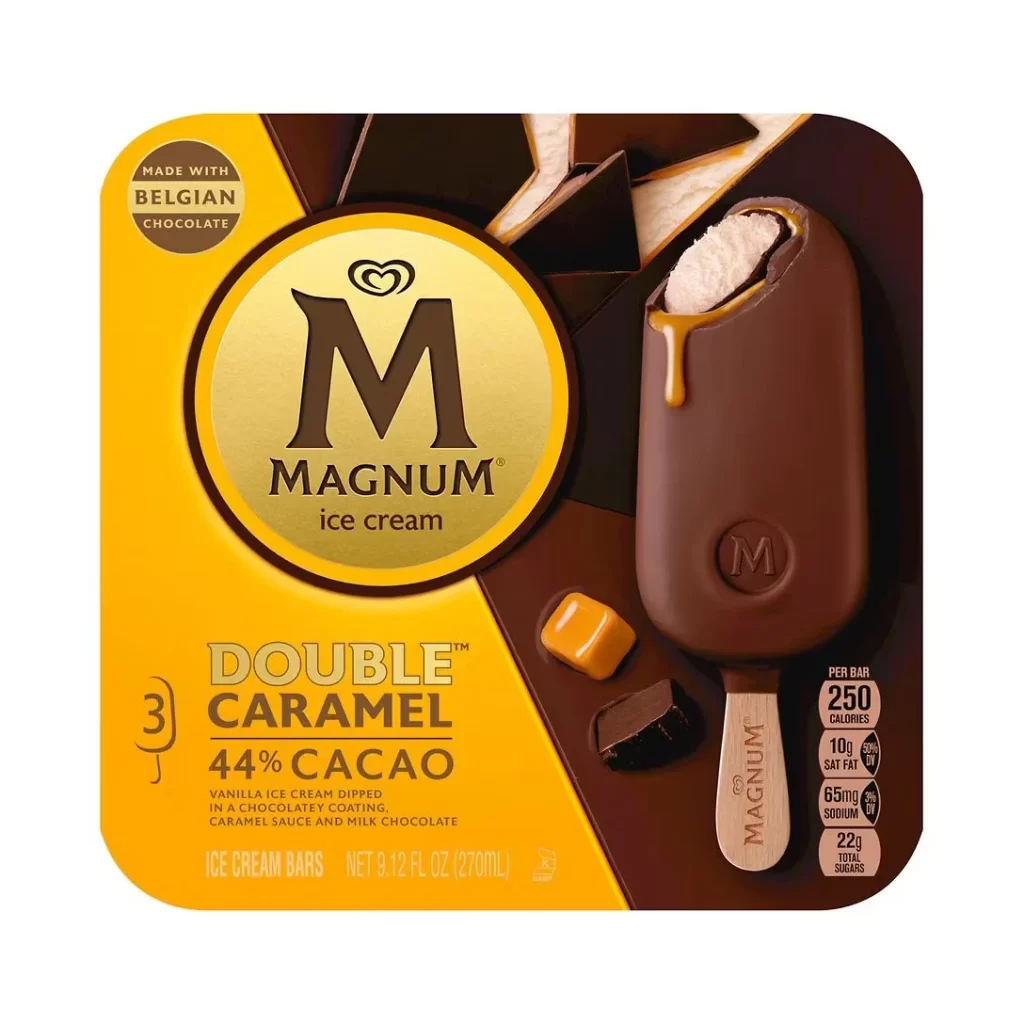
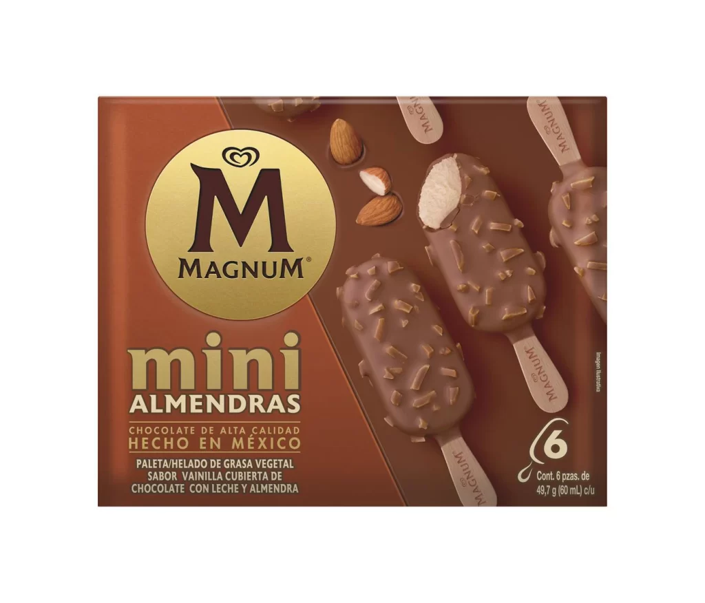
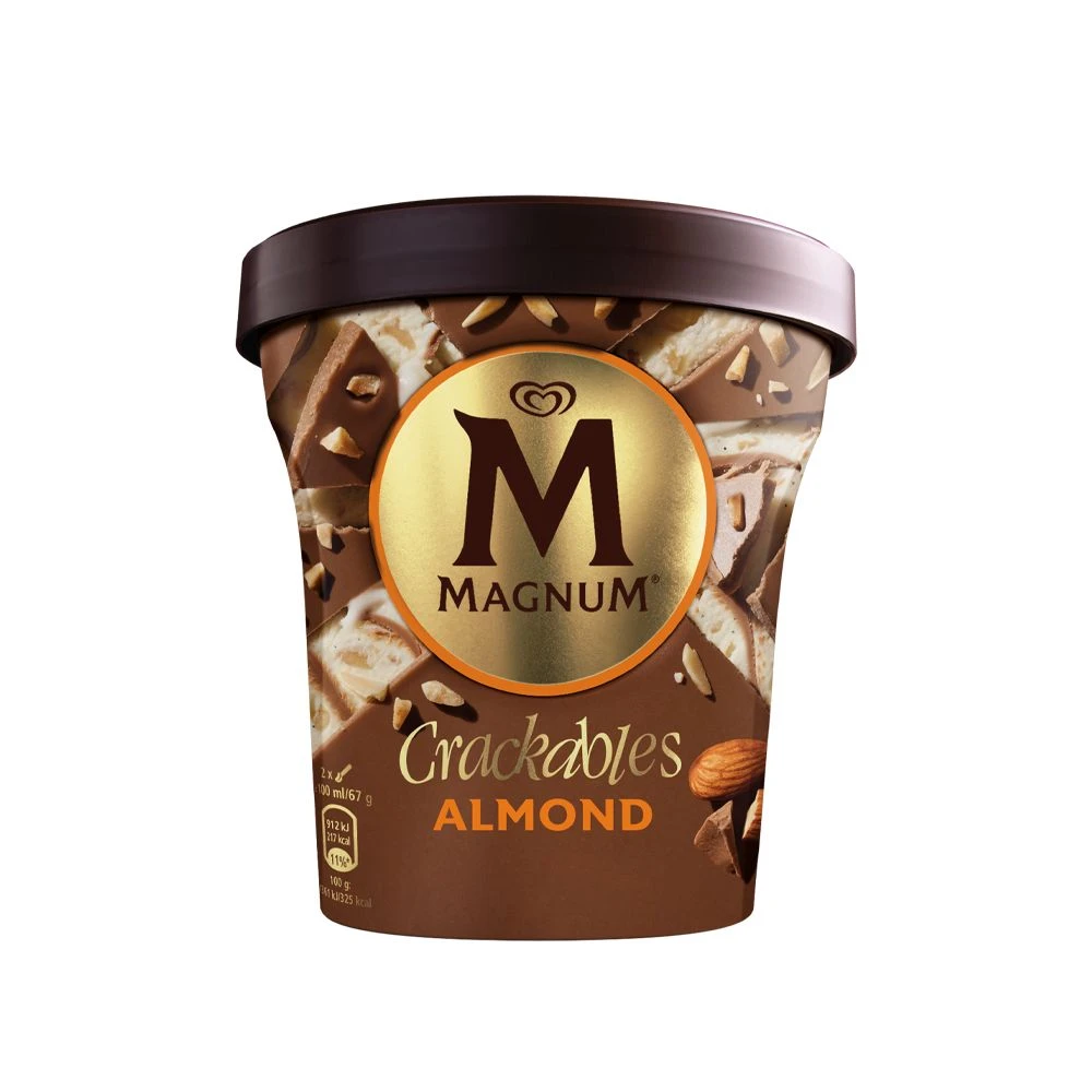
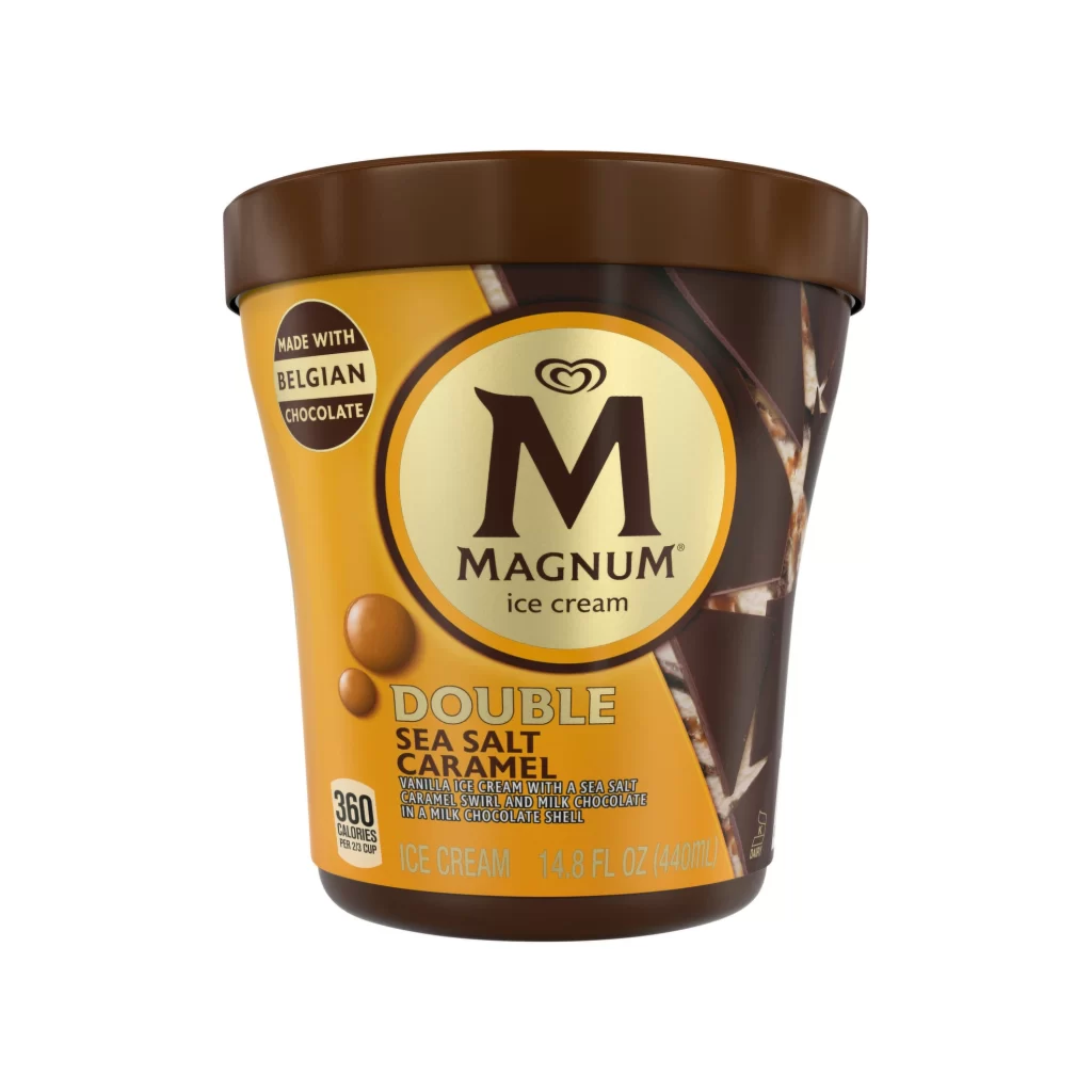
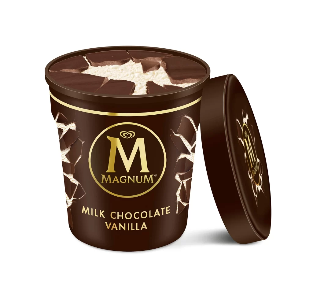
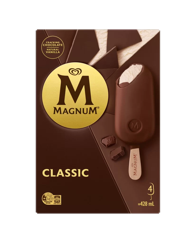
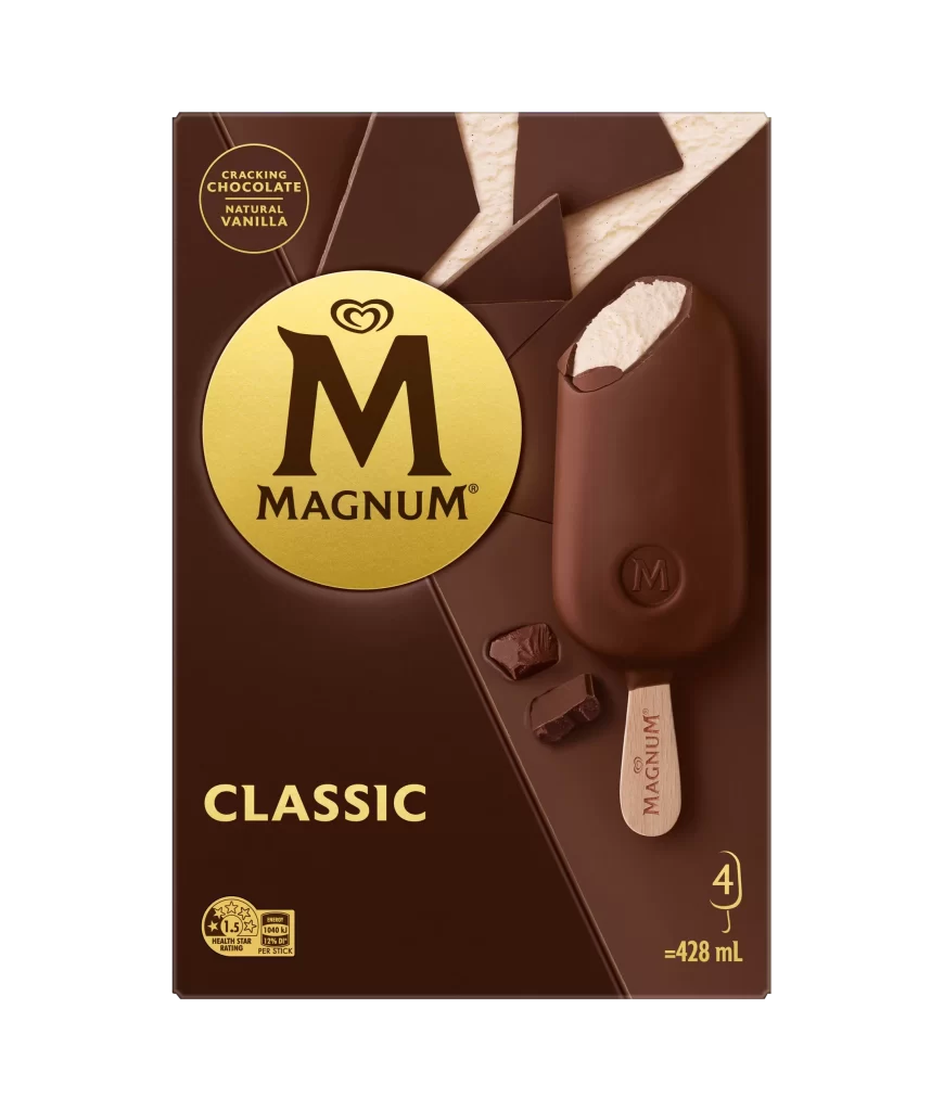
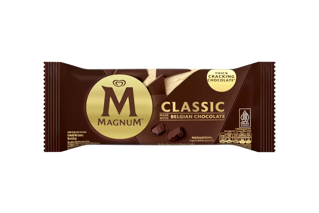
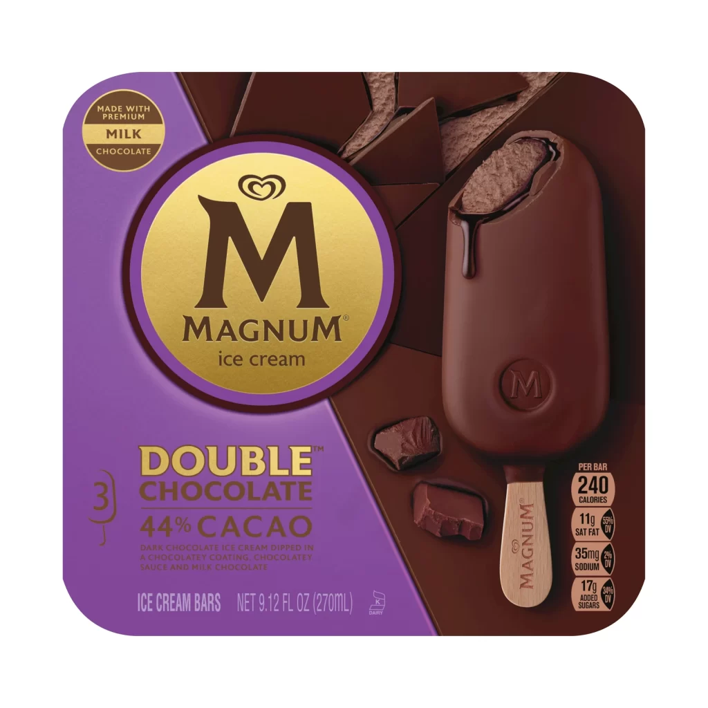
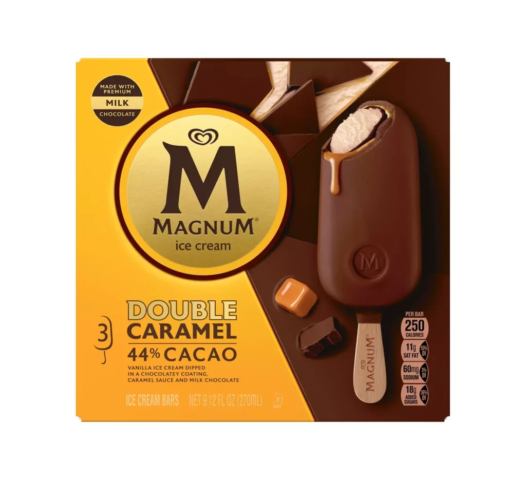
A bold diagonal split divides the composition between a vibrant golden-yellow field and a deep chocolate-brown background. Centered on the yellow section sits a large circular gold emblem containing the Magnum 'M' logo and brand name, while the right side features a single ice cream bar with a wooden stick, coated in dark chocolate and dripping with caramel sauce. Visible text includes 'Double Caramel,' '44% Cacao,' and nutritional details listing 250 calories per bar, all rendered in clean sans-serif typography against the contrasting color blocks.
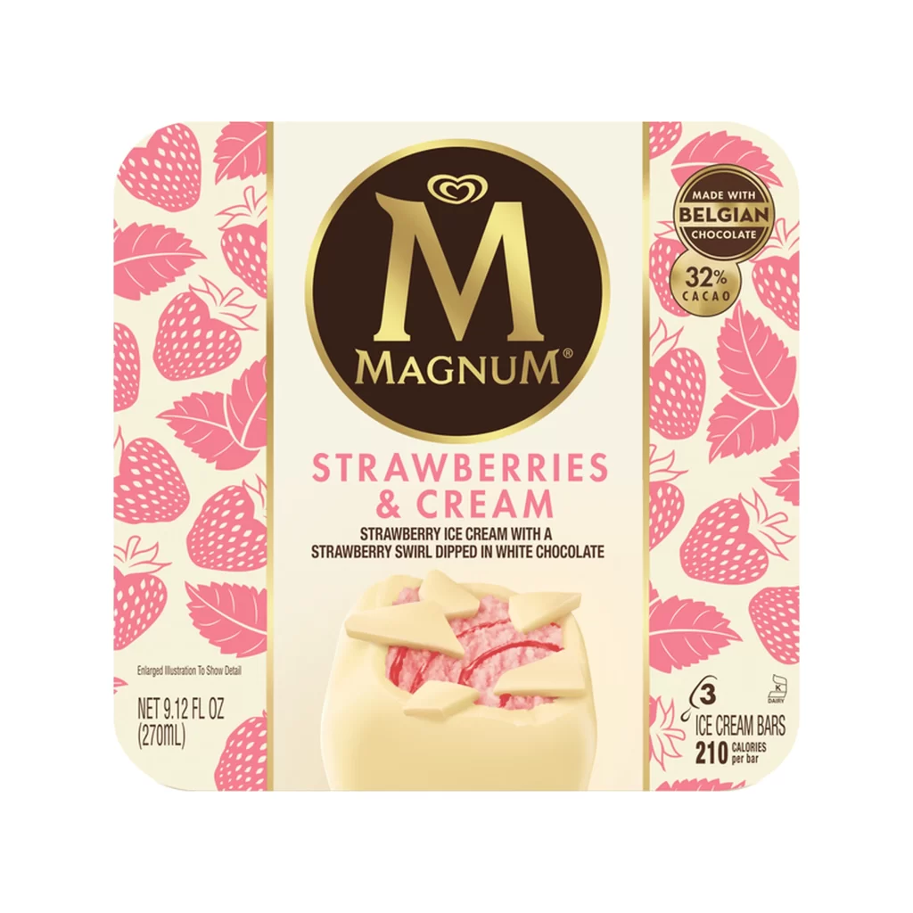
The packaging leverages a sophisticated two-tone palette to emphasize the premium nature of the product, using metallic gold accents to suggest luxury within the frozen dessert category. Geometric chocolate shard graphics create depth behind the main product shot, while the specific callout of cocoa percentage and caramel elements provides clear flavor differentiation from standard variants.

Brand strategists might examine this layout to understand how color blocking can organize complex nutritional information without cluttering the visual hierarchy. Packaging designers could reference the balance between photographic realism and graphic elements when developing concepts for indulgent food products that require both appetite appeal and regulatory compliance.