Magnum mini Almond Ice Cream Packaging
Topics
Details
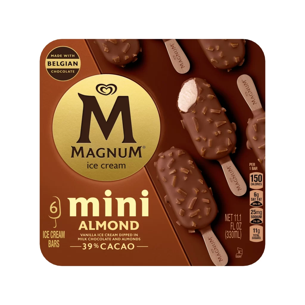
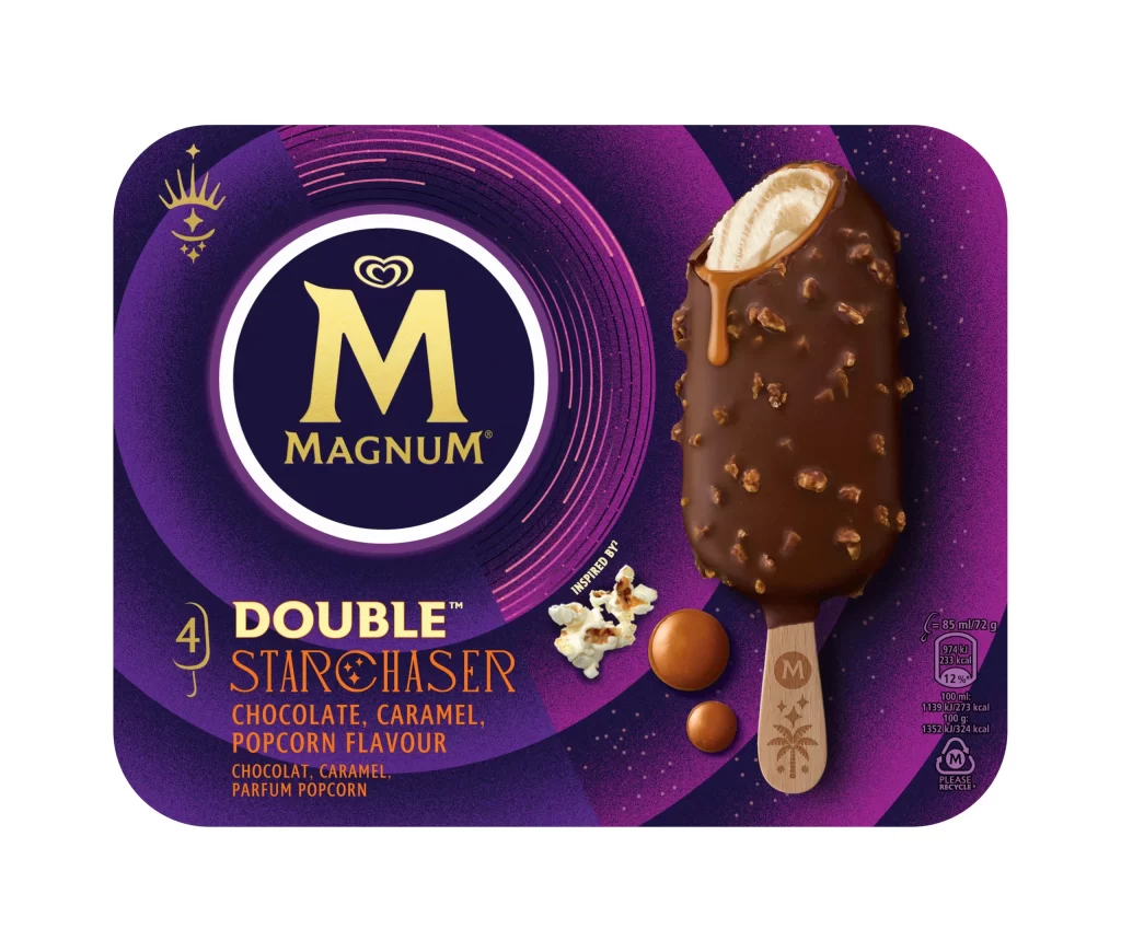
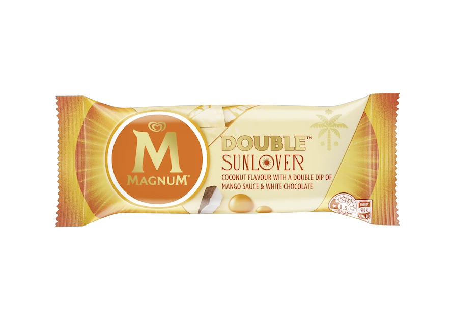
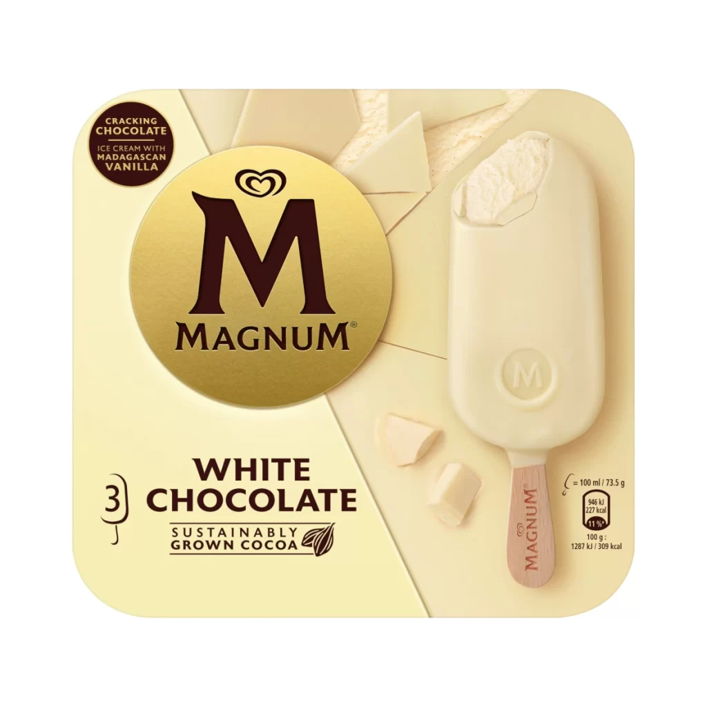
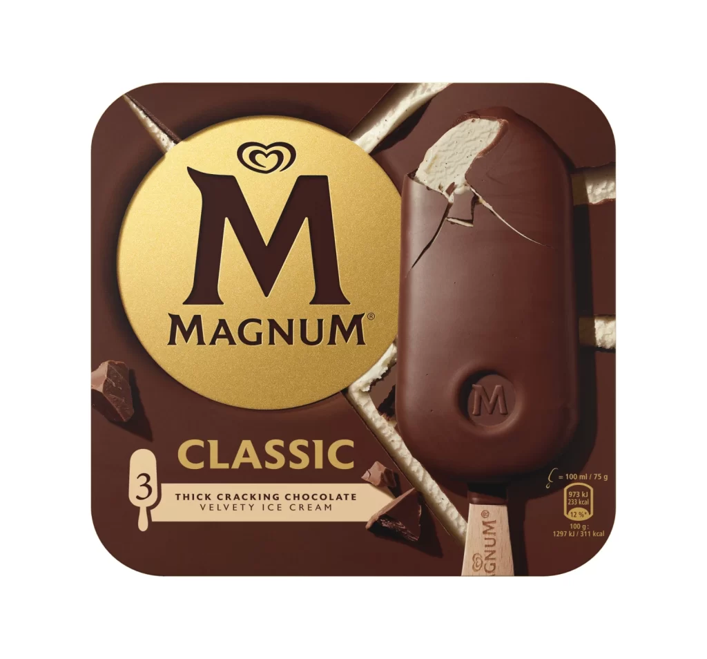
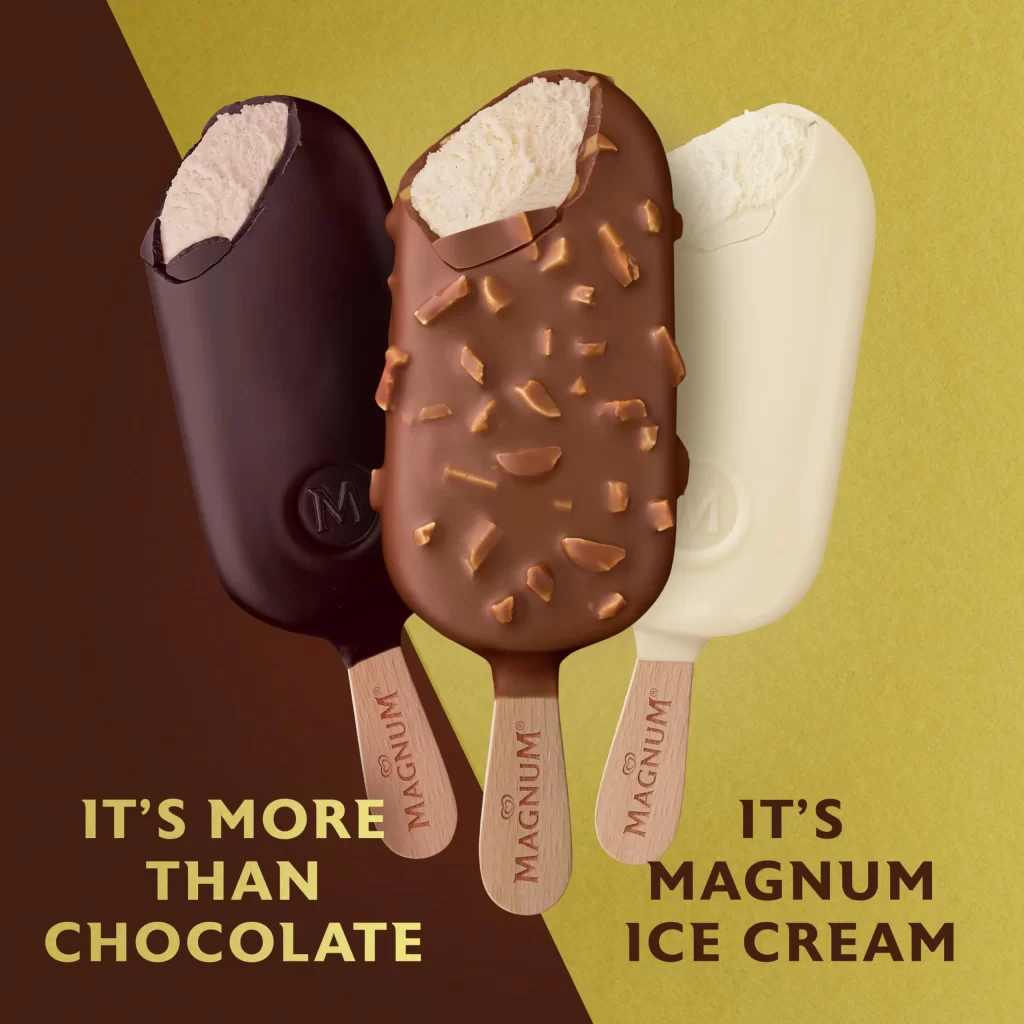
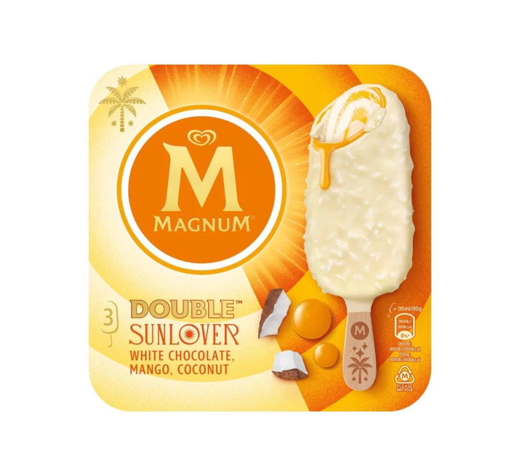
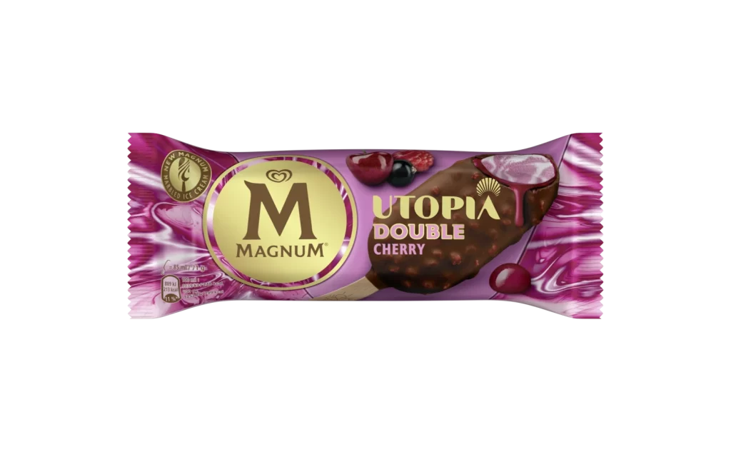
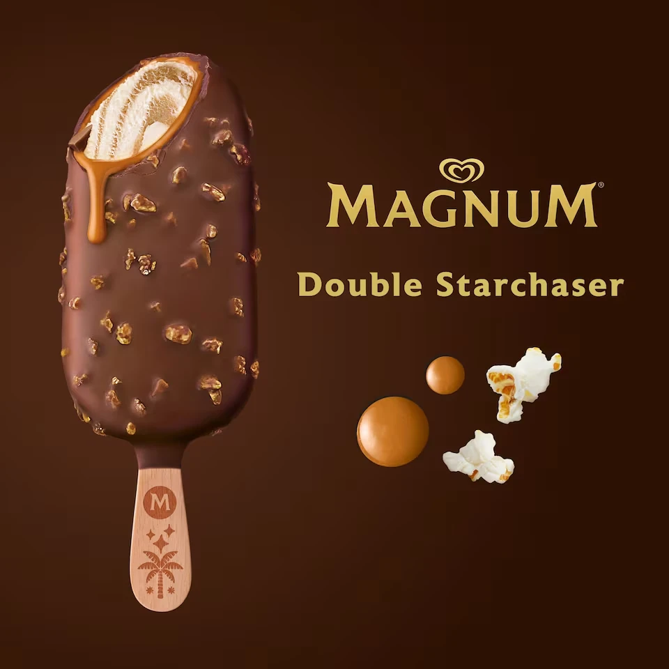
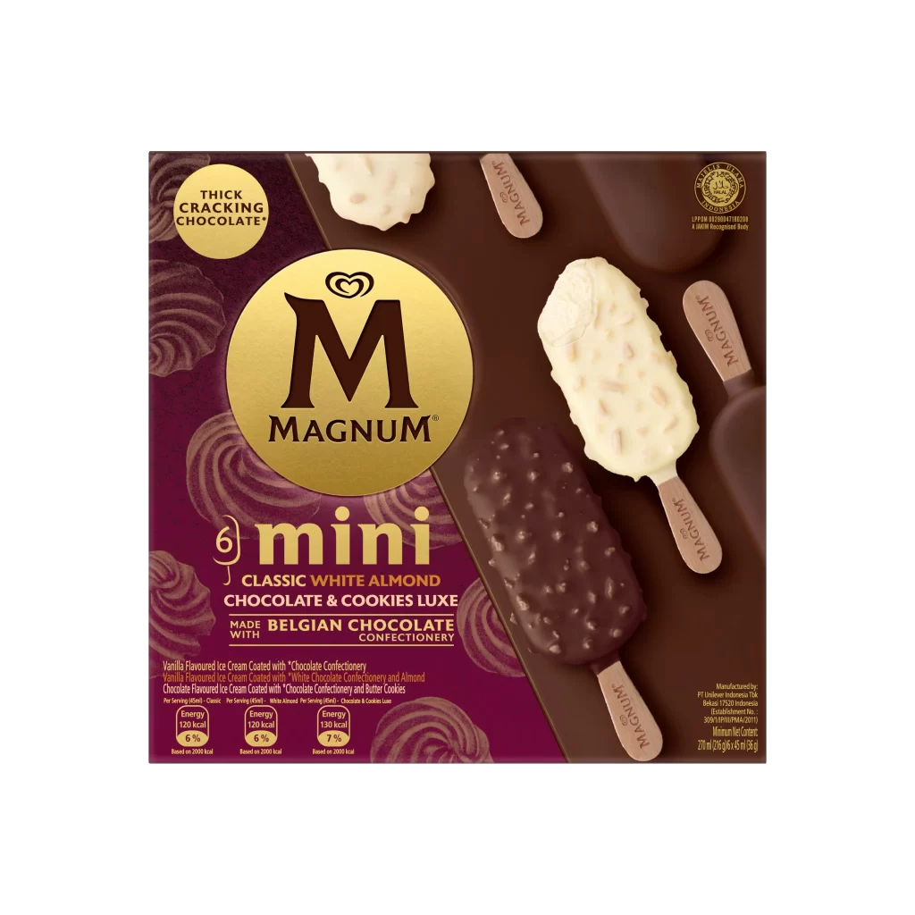
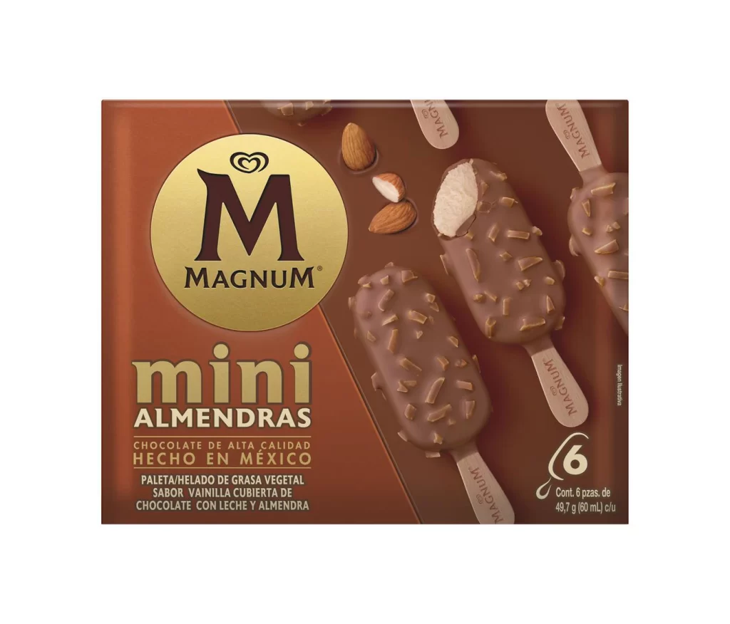
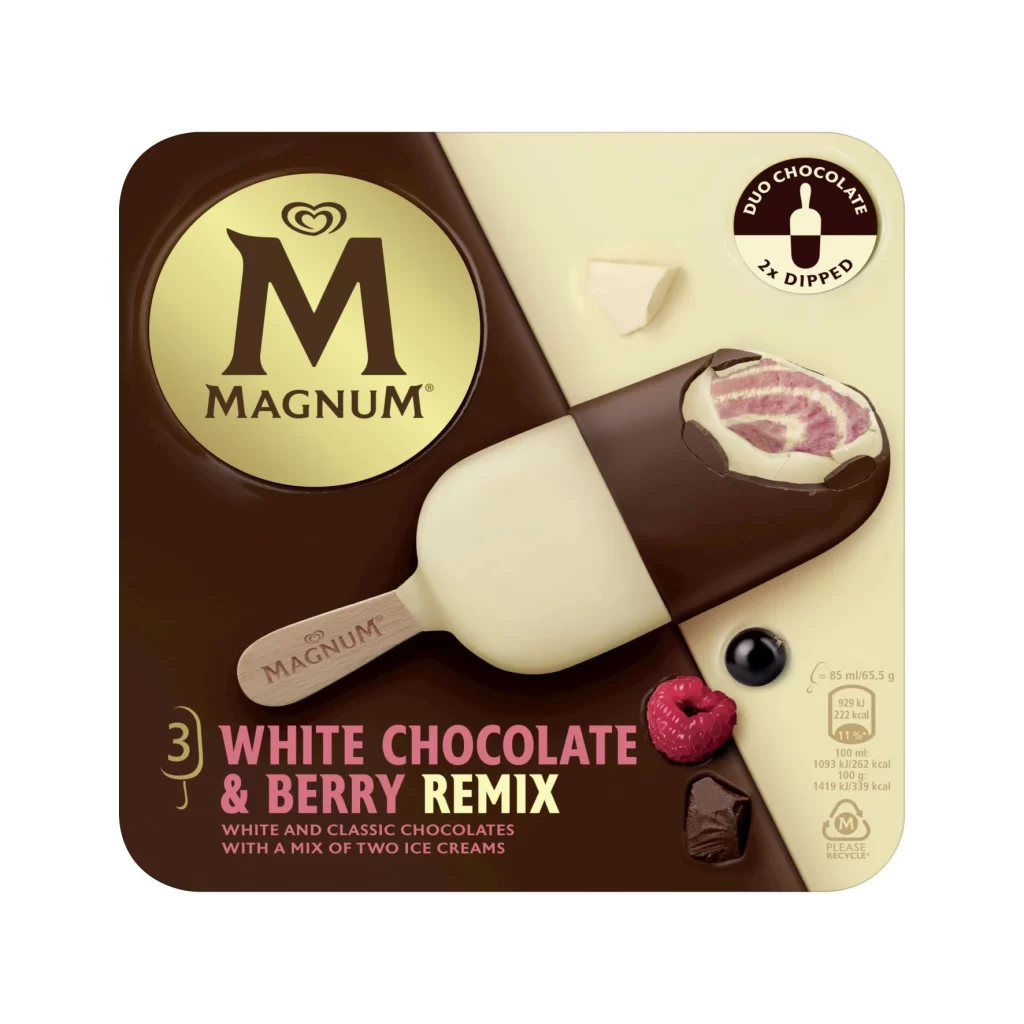
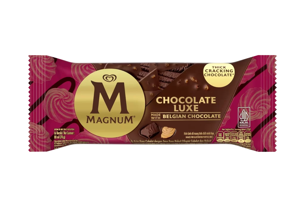
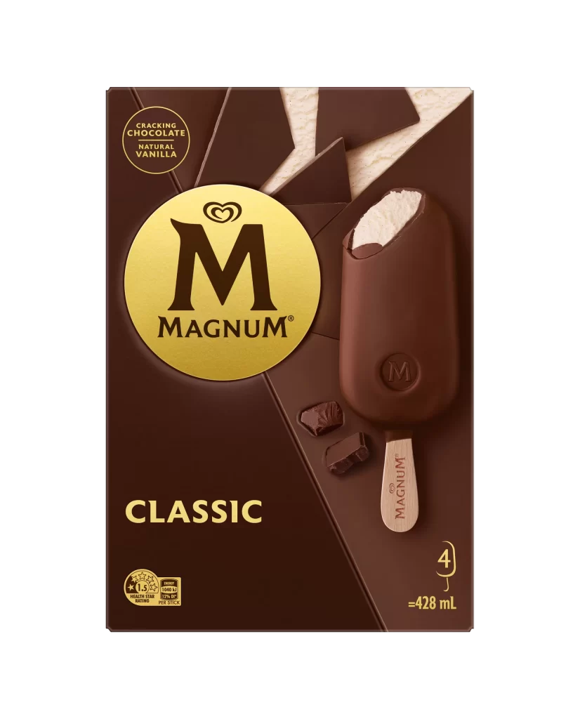
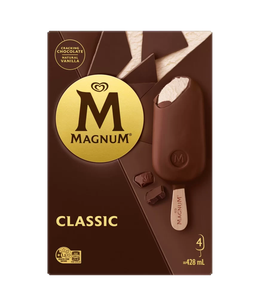
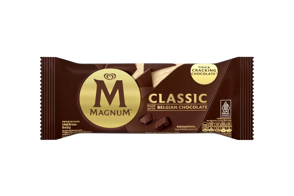
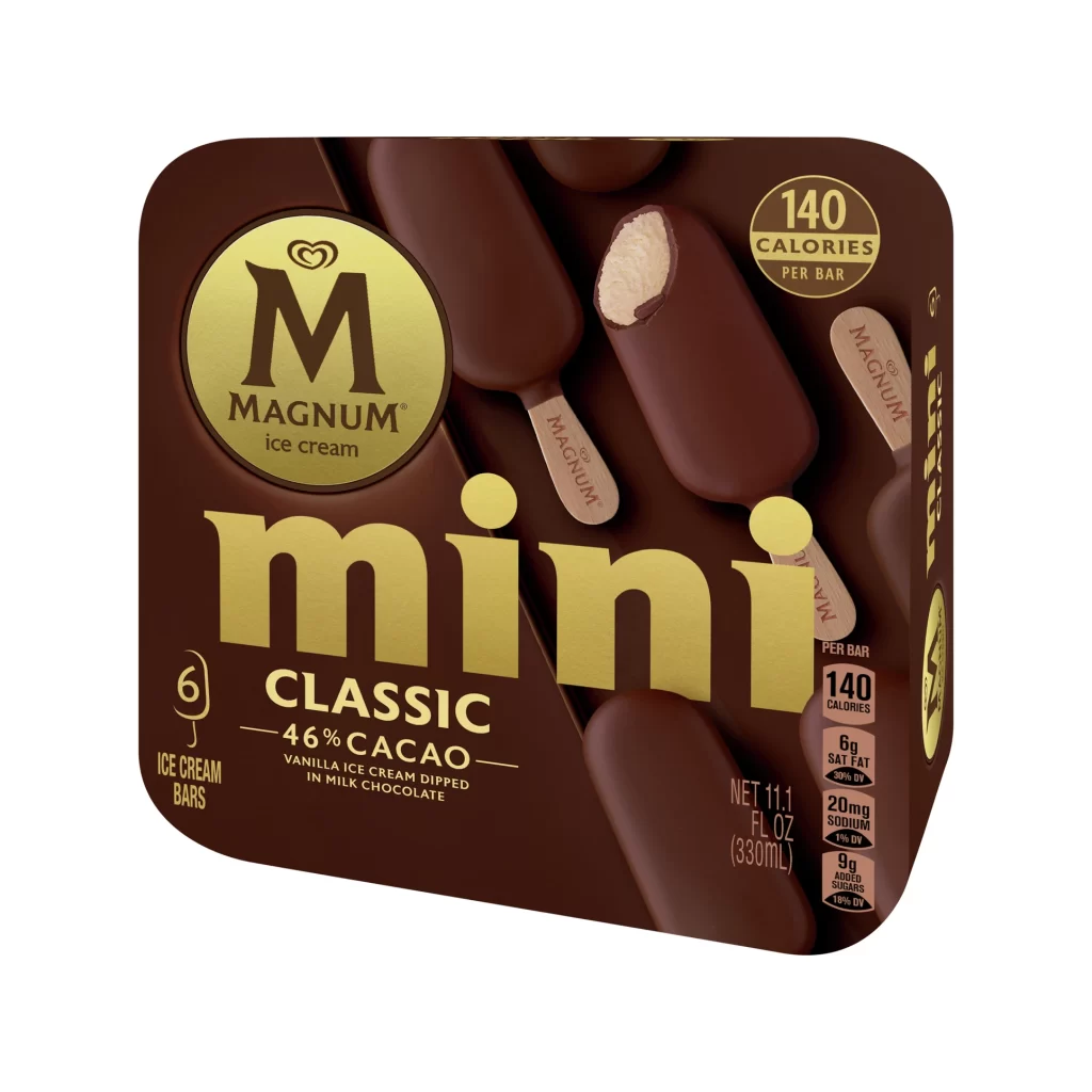
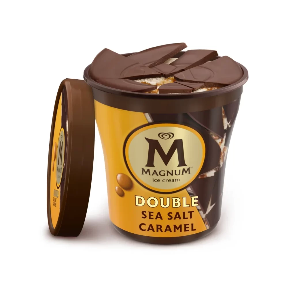
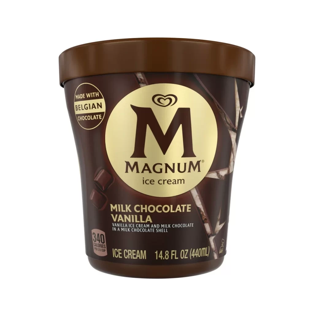
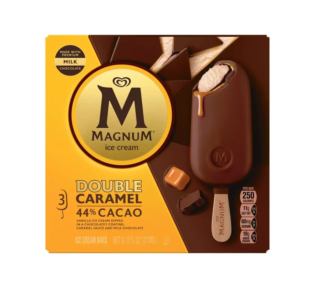
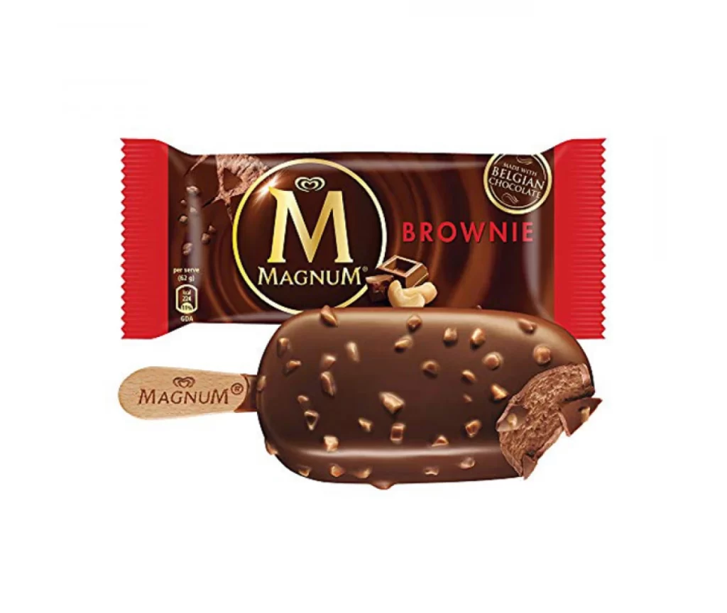
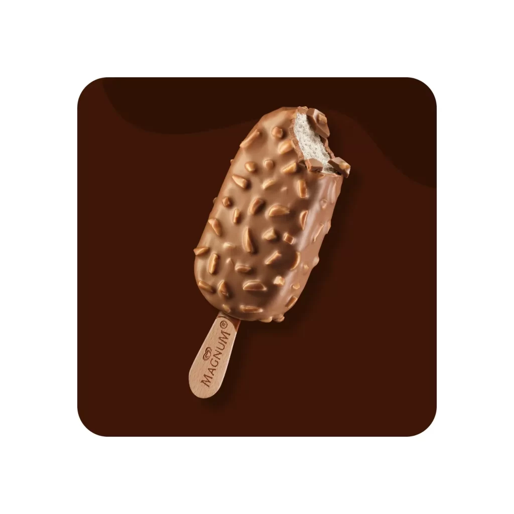
Rich chocolate browns and metallic golds dominate the rectangular packaging, which features rounded corners and a split-background composition. A large, circular gold emblem anchors the left side, displaying the iconic Magnum 'M' logo in dark brown above the brand name. To the right, several almond-topped ice cream bars appear against the darker background, with one bar bitten to reveal the creamy white interior.
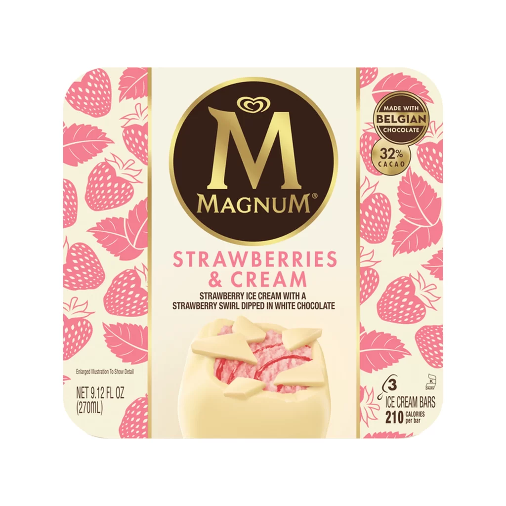
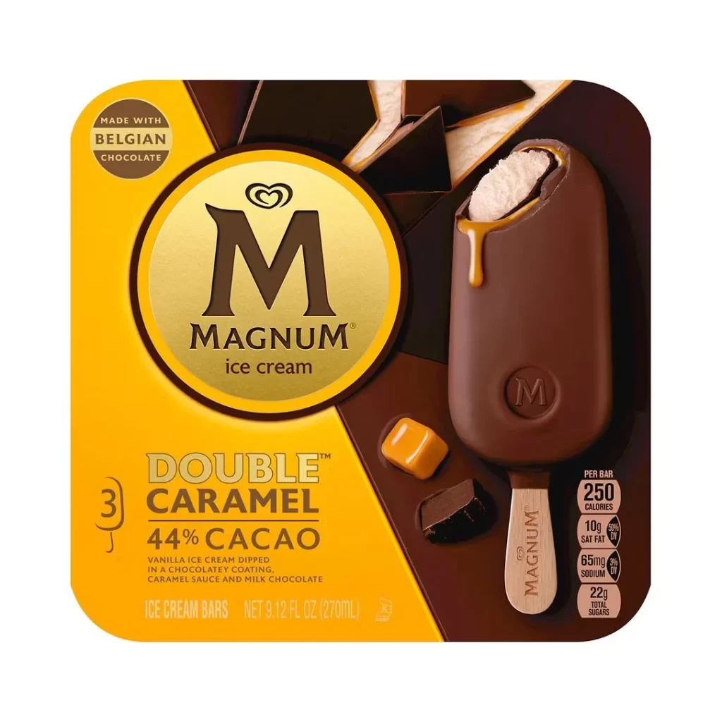
Visual hierarchy is established through the contrast between the matte brown fields and the reflective gold foil of the central badge. The scattered arrangement of the product photography creates a sense of abundance while the specific 'mini' sizing is emphasized by bold, cream-colored typography. Nutritional data and the 'Made with Belgian Chocolate' seal are tucked into the corners to maintain focus on the indulgent imagery.
Food stylists might study this layout to understand how premium frozen desserts are presented for retail appeal. Brand managers could analyze the color palette when developing new lines within an existing luxury ice cream identity. Packaging engineers may also find value in examining how nutritional information is integrated without disrupting the primary visual flow.