Magnum Double Starchaser Ice Cream Packaging
Topics
Details
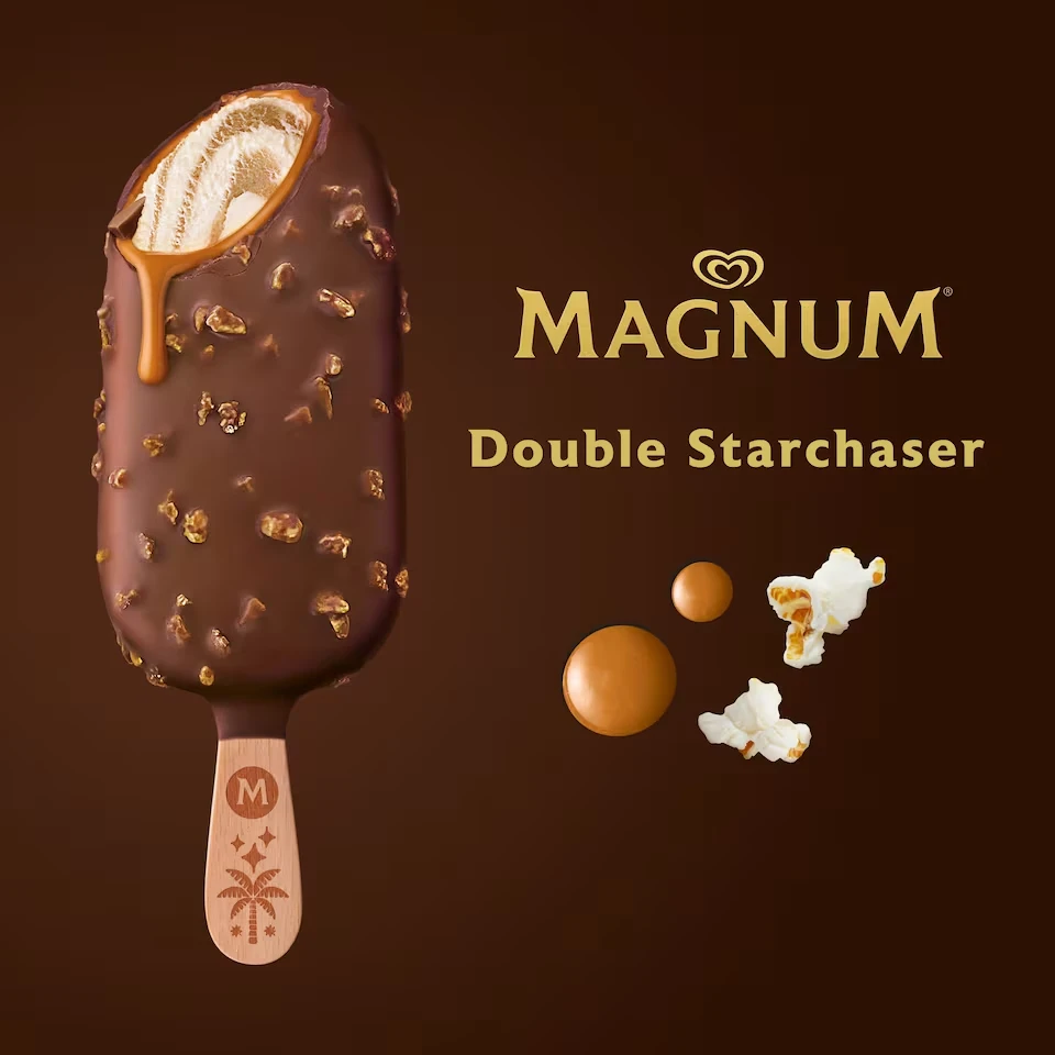
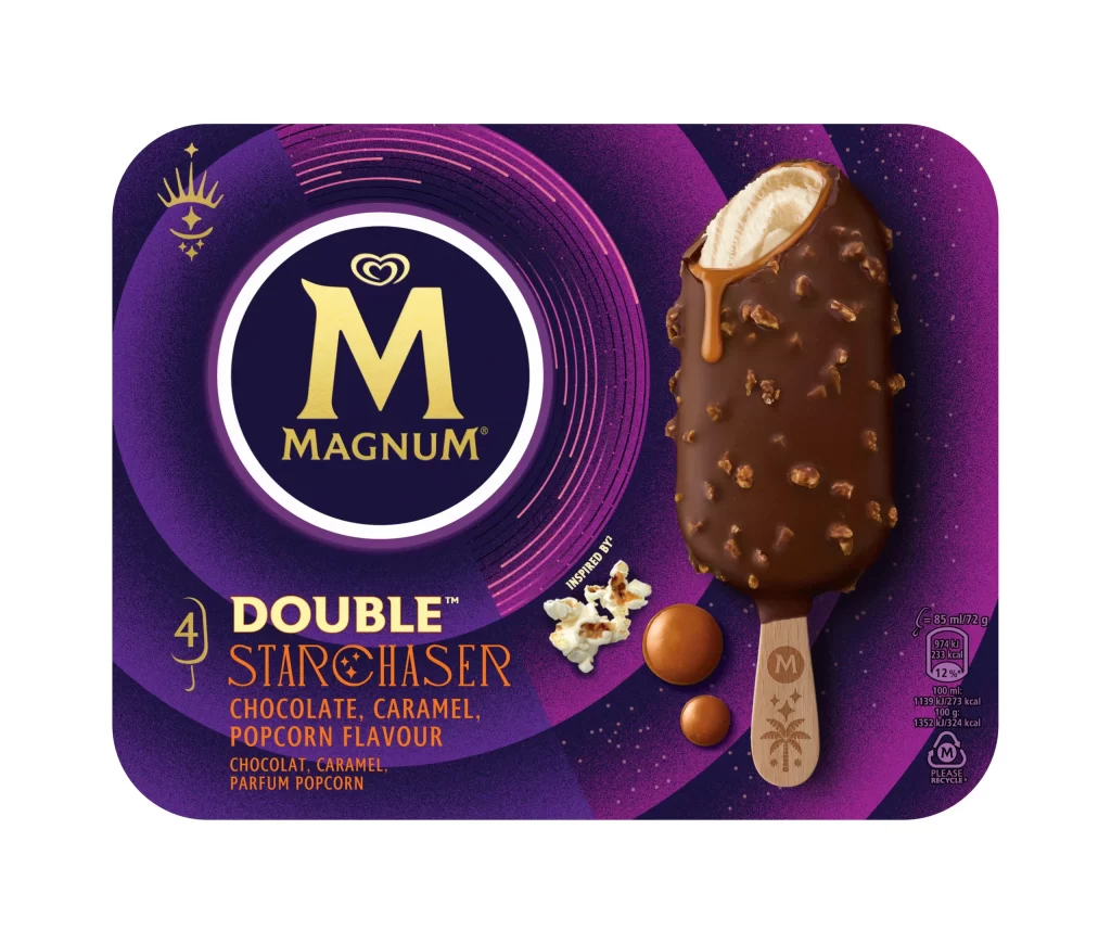
A single Magnum Double Starchaser bar commands the left side of the frame, angled slightly to reveal a cross-section of creamy, swirled vanilla ice cream beneath a thick, glossy milk chocolate shell studded with irregular, golden-brown caramelized fragments that catch the light. A viscous drip of amber sauce trails from the top bite mark down the chocolate coating, while the wooden stick below bears a circular 'M' logo above an embossed palm tree and star motif. The golden Magnum wordmark and 'Double Starchaser' subtitle occupy the right side of the composition alongside scattered caramel discs and popcorn pieces, all set against a deep monochromatic chocolate-brown backdrop.
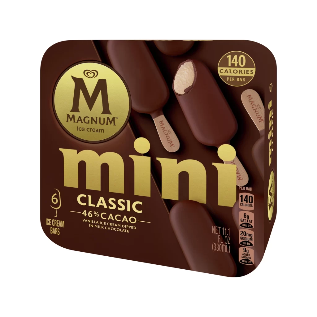
Visual distinction emerges from the playful juxtaposition of textures, contrasting the smooth, reflective chocolate coating against the crunchy, crystalline inclusions and the airy, organic shapes of the scattered popcorn. The wooden stick serves as a branding canvas, bearing an embossed ‘M’ within a circle above a stylized palm tree and star motif that reinforces the tropical, cinematic theme implied by the ‘Starchaser’ nomenclature. Warm, directional lighting enhances the three-dimensional quality of the coating, making the golden toppings appear almost jewel-like against the darker base.
Food photographers might study this composition to understand how to balance hero products with floating ingredient elements without cluttering the visual field. Packaging designers could analyze the color palette integration, noting how the warm gold typography harmonizes with both the caramel accents and the rich brown background to create a cohesive luxury aesthetic. Advertising art directors may reference the spatial arrangement when storyboarding campaigns that require highlighting specific flavor components through strategic placement.