Magnum Double Raspberry 44% Cacao Ice Cream Packaging
Topics
Details
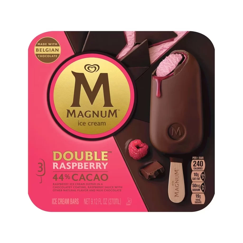
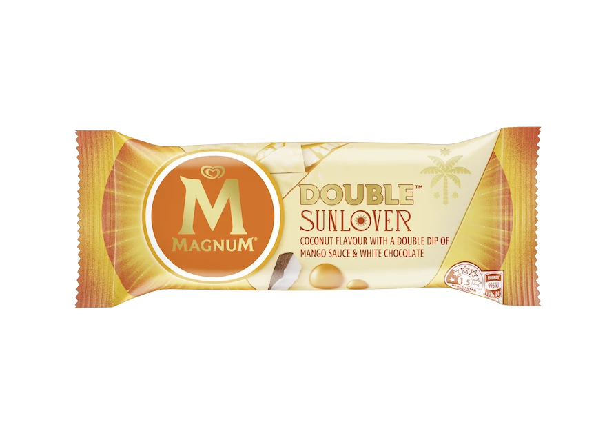
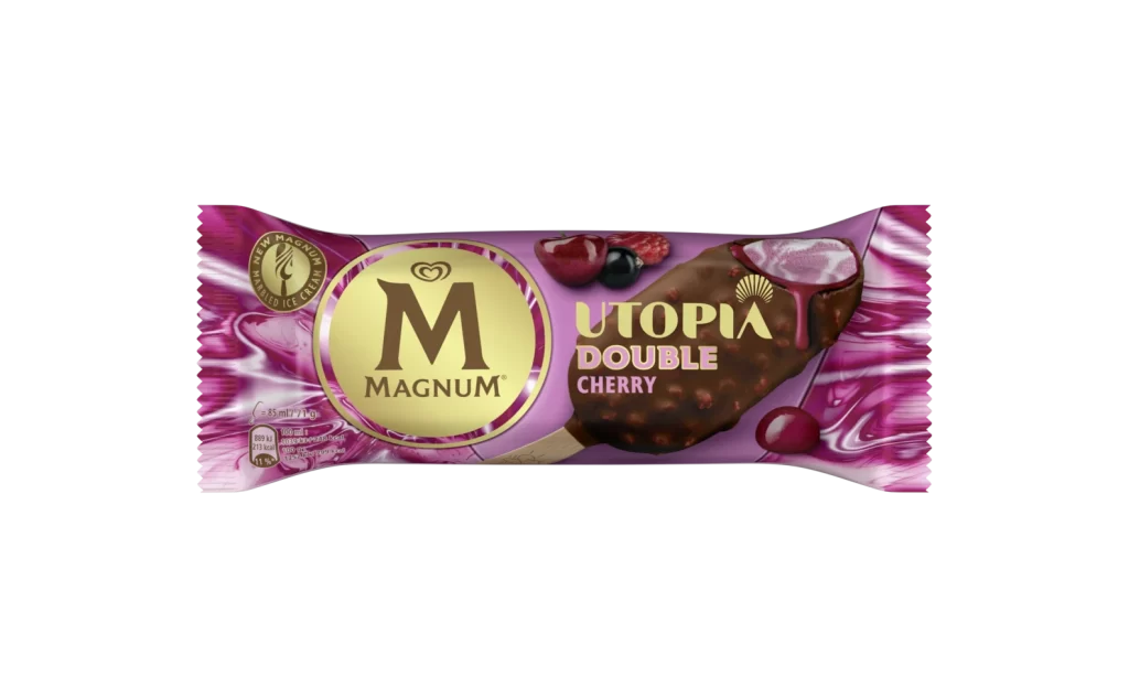
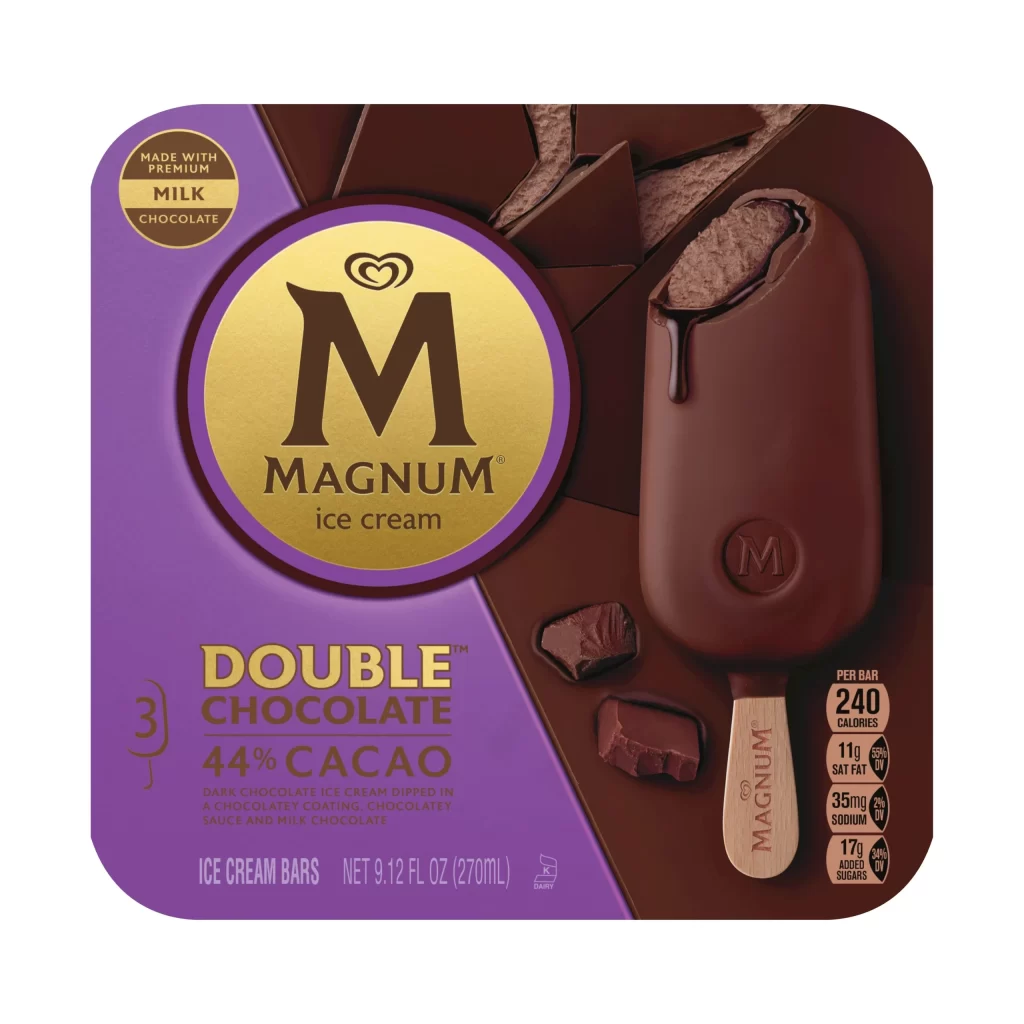
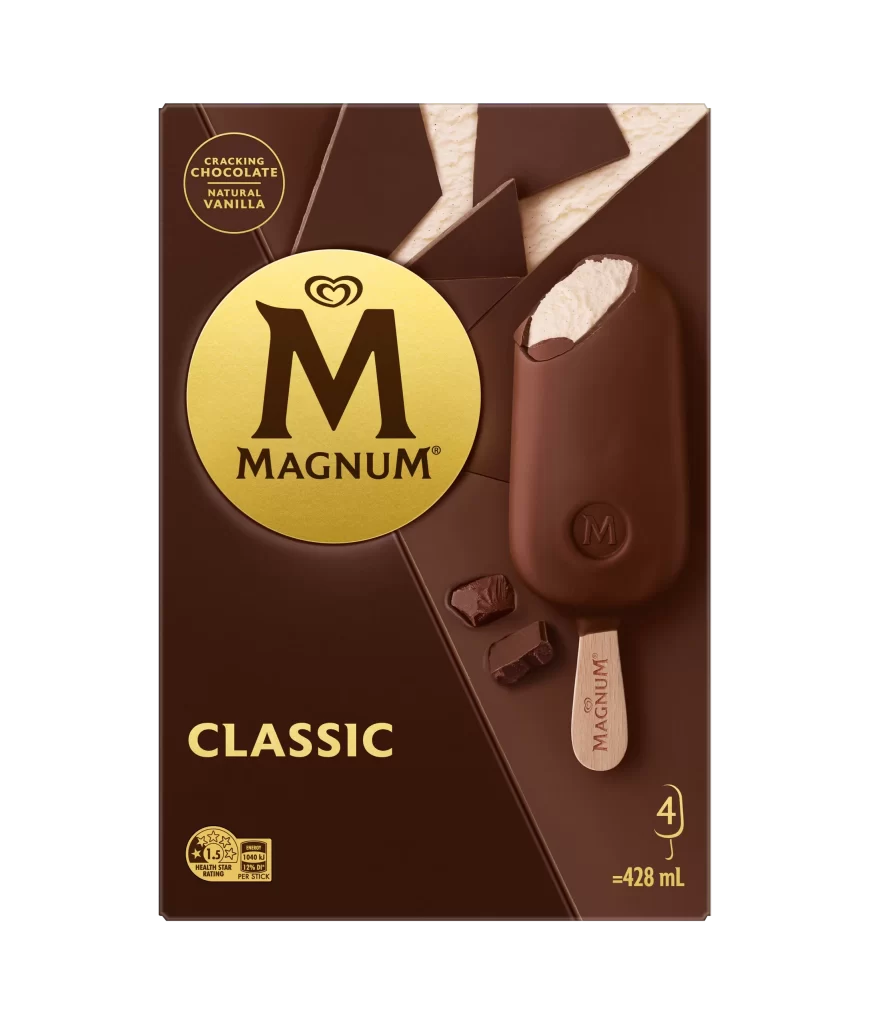
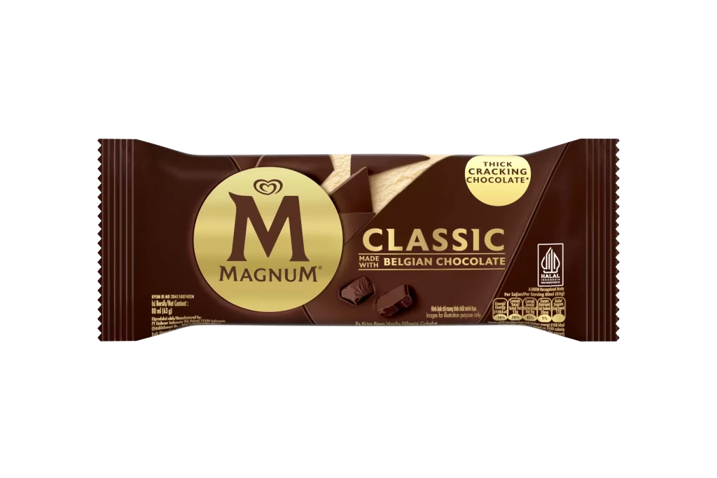
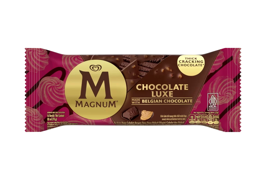
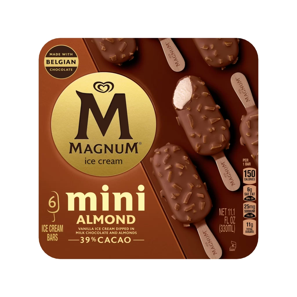
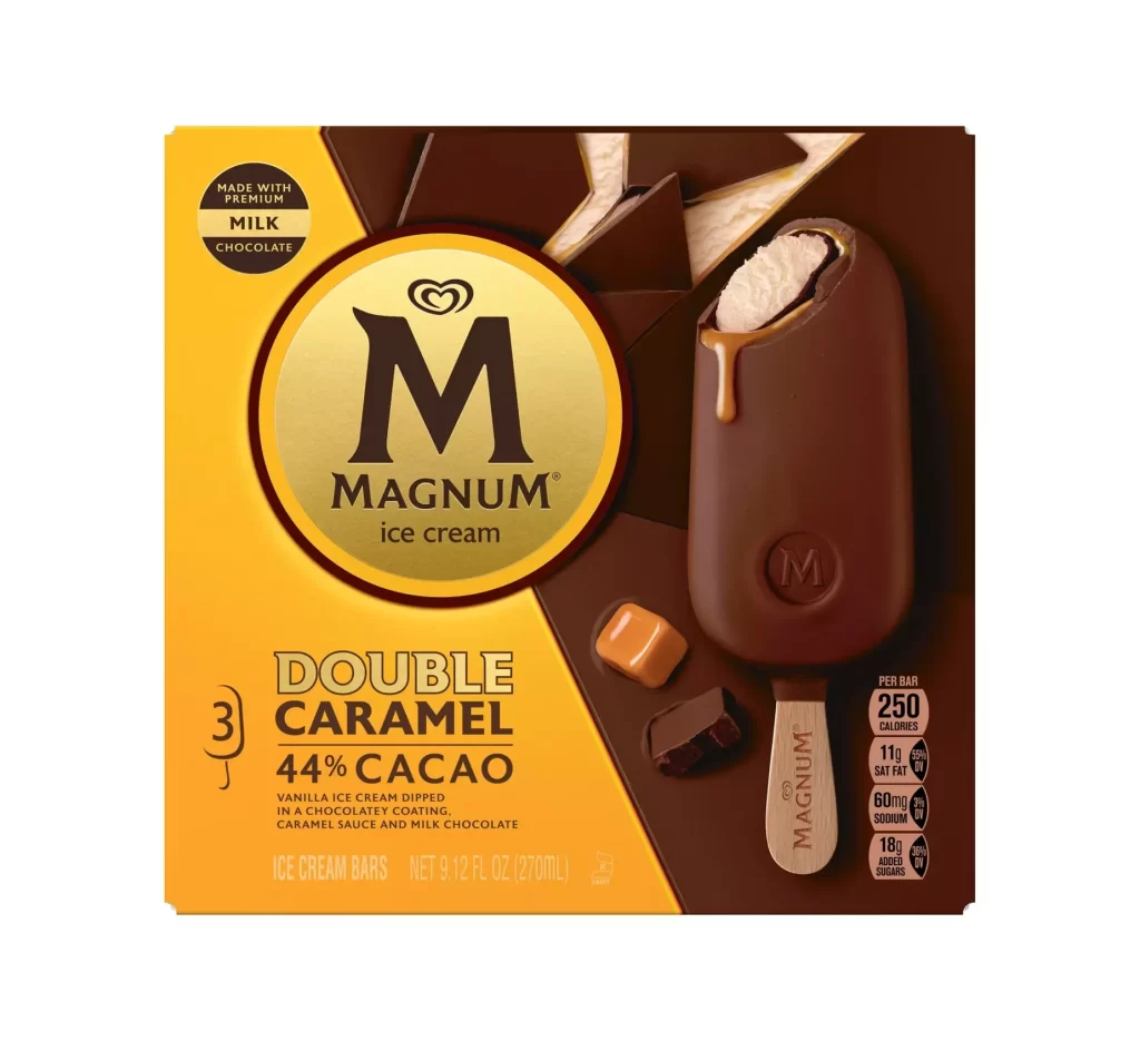
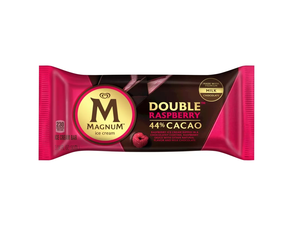
Vibrant magenta end panels frame a central dark chocolate field on this rectangular wrapper, creating a bold color-blocked composition. The iconic Magnum 'M' logo sits within a gold circle on the left, while the right side displays 'DOUBLE RASPBERRY' in gold and pink typography above '44% CACAO' in white. A single raspberry graphic anchors the lower center, and a circular badge confirms the use of premium milk chocolate. The packaging is photographed straight-on against a pure white background with even studio lighting that eliminates shadows.
High-contrast color choices between the saturated pink borders and deep brown interior immediately signal the raspberry-chocolate flavor profile. Typography hierarchy effectively separates brand identity from product specifics, using size and color weight to guide the eye across nutritional information, flavor claims, and ingredient details. The combination of photographic food elements with clean geometric shapes creates a modern retail aesthetic that balances indulgence with premium positioning.
Brand managers analyzing competitive confectionery packaging can study how this layout balances regulatory text requirements with visual appeal. Packaging engineers might reference the specific Pantone-like color relationships when developing similar frozen dessert lines. Food photographers could examine the lighting setup used to render glossy wrapper textures without distracting reflections.