Magnum VS Midnight Berry Protein Bottle Packaging
Topics
Details
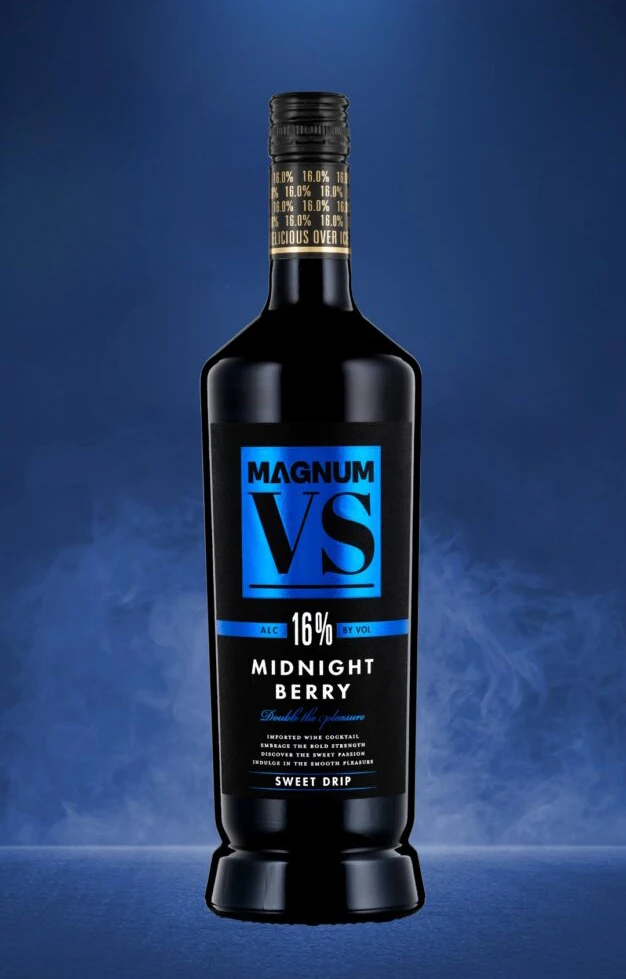
A sleek black glass bottle with a heavy, weighted bottom stands as the central focal point, sealed by a dark cap wrapped in gold foil that repeats the 16.0% alcohol volume text. Dominating the label is a vibrant cyan square containing the bold white typography 'MAGNUM' above an oversized 'VS', with 'MIDNIGHT BERRY' and 16% ALC BY VOL printed below on a deep navy backdrop that fades into a smoky, atmospheric base.
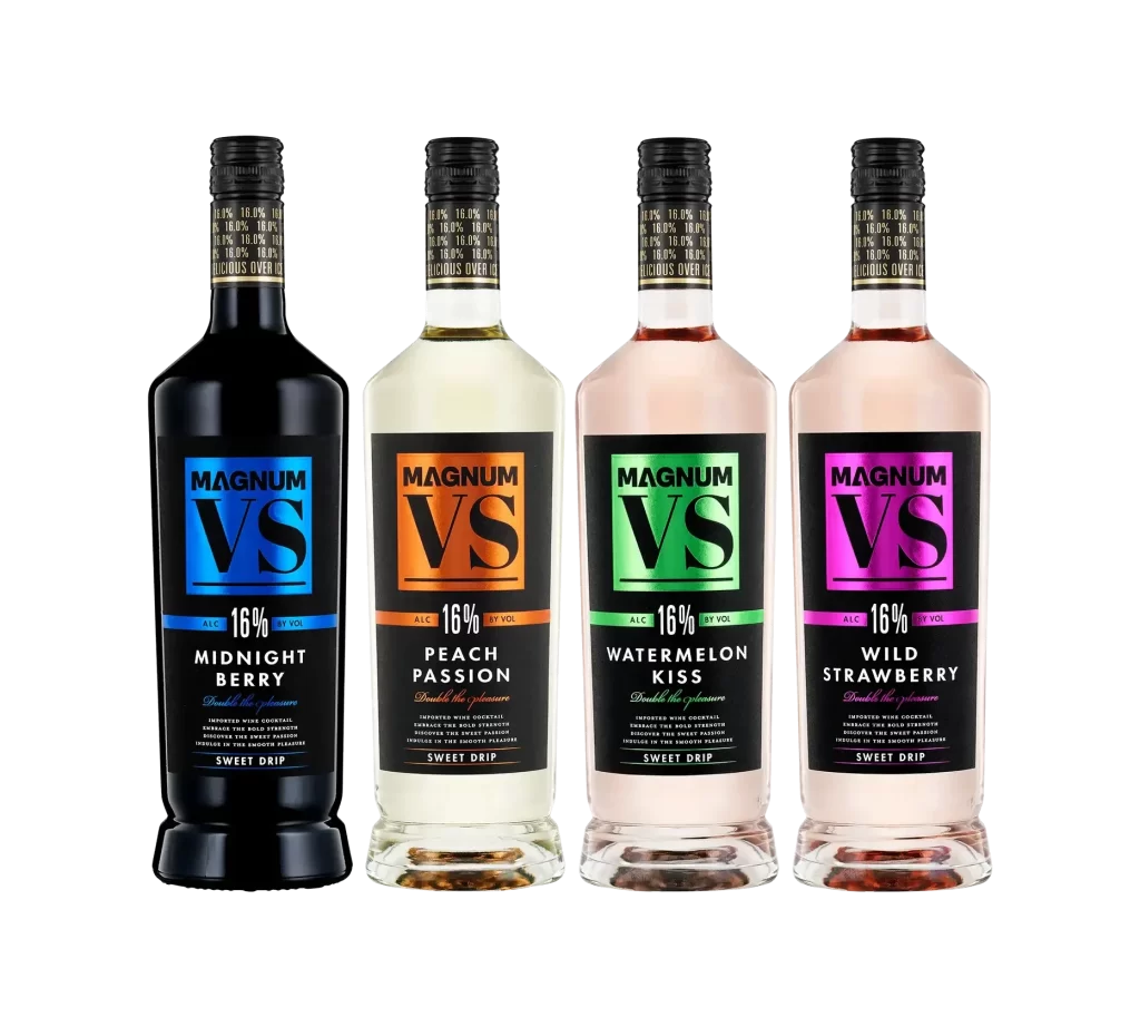
Visual tension emerges from the striking contrast between the matte black substrate and the electric blue graphic element, creating immediate shelf presence through color blocking. The typographic hierarchy deliberately emphasizes the ‘VS’ monogram, suggesting a competitive or premium tier positioning within the product line. Subtle details like the ‘SWEET DRIP’ descriptor and the gold neck foil add tactile luxury cues that differentiate this variant from standard packaging.
Brand strategists might analyze this composition to understand how bold color accents can elevate dark-packaged beverages in low-light retail environments. Packaging engineers could study the bottle’s silhouette and weight distribution for similar high-ABV wine cocktail containers. Marketing teams reviewing this reference would likely focus on how the label’s geometric layout balances modern minimalism with legible product information.