Magnum Crackables Almond Ice Cream Packaging
Topics
Details
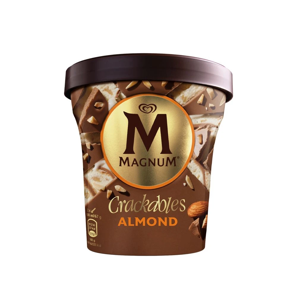
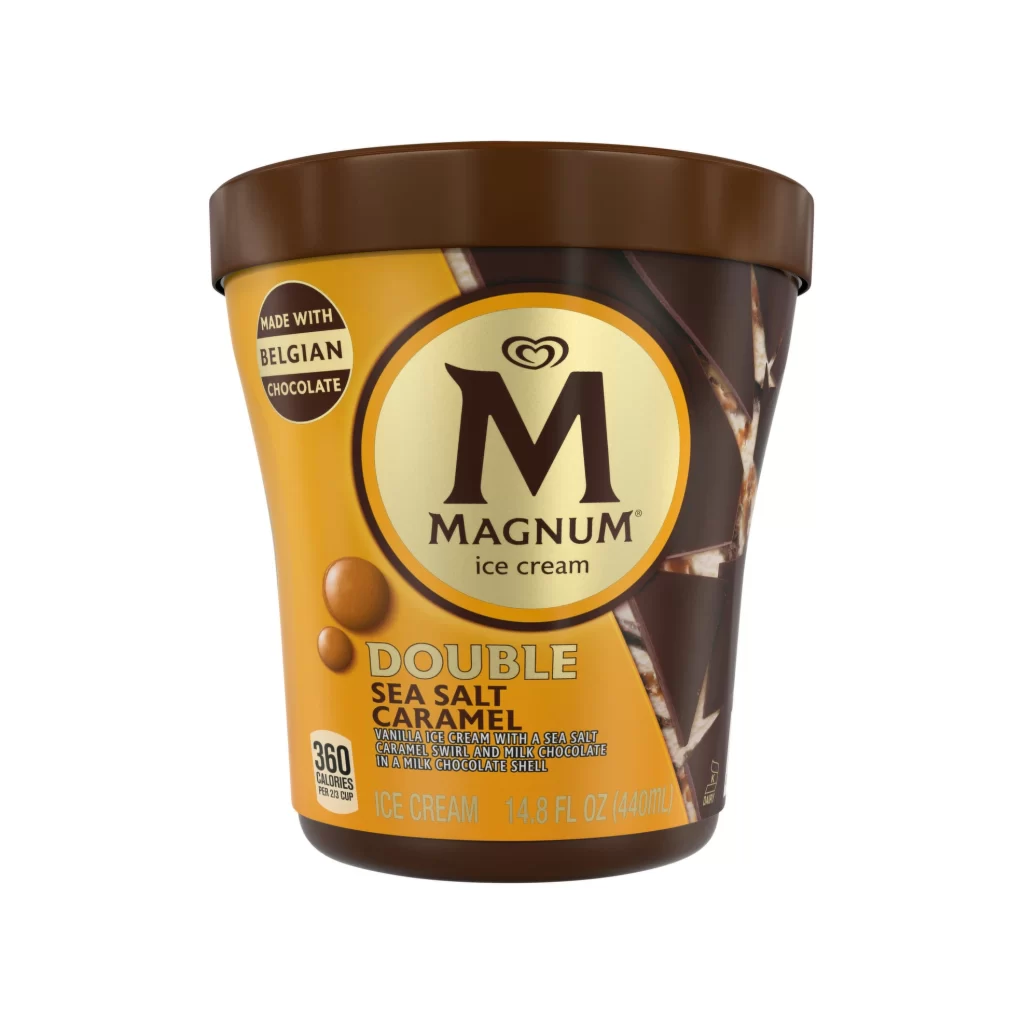
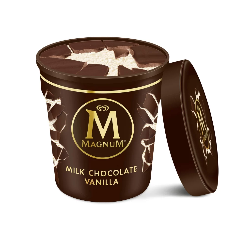
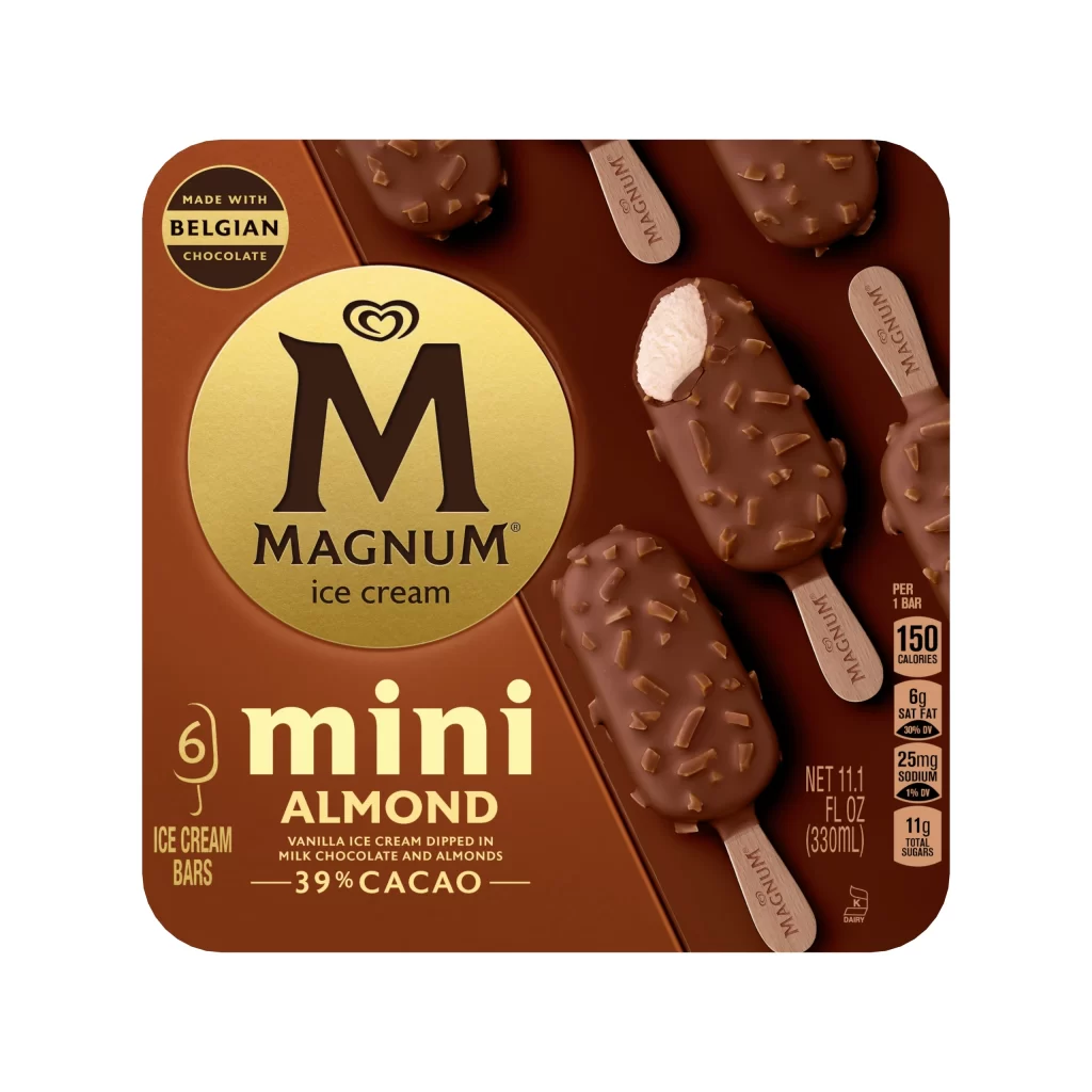
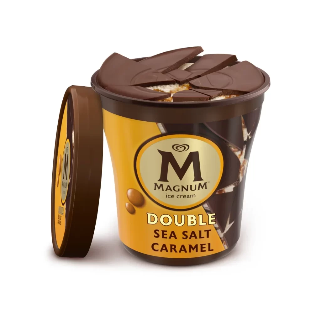
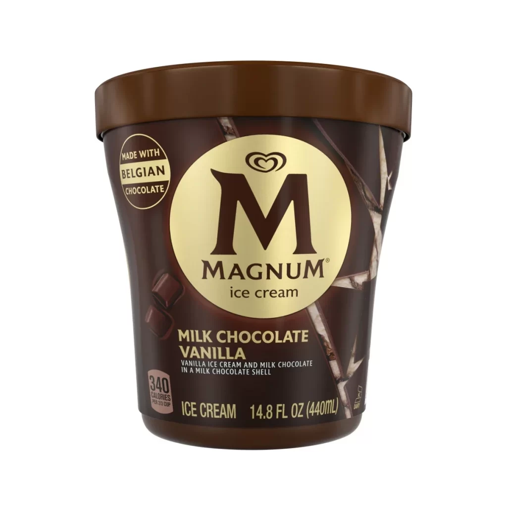
A cylindrical Magnum ice cream tub features a dark brown plastic lid capping its form, with the container's surface dominated by a rich chocolate-brown background overlaid with photographic fragments of broken chocolate shells and scattered almond slivers that suggest texture and crunch. A prominent circular gold emblem anchors the composition, displaying the brand's signature 'M' and 'MAGNUM' text above 'Crackables ALMOND' lettering. The packaging sits on a white surface with nutritional information visible in the lower left corner.
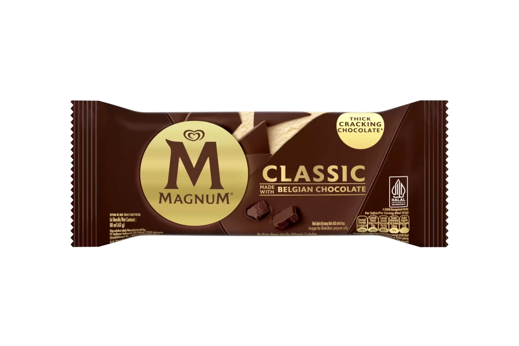
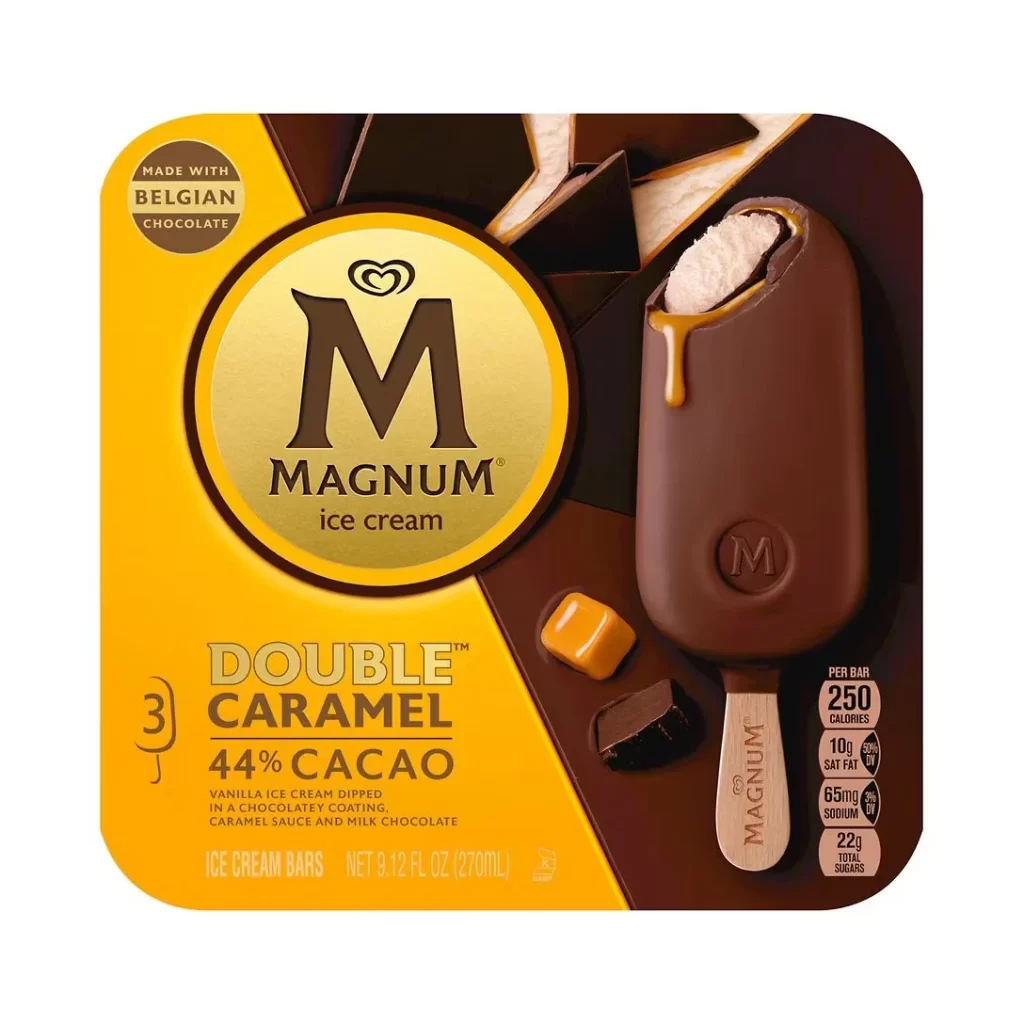
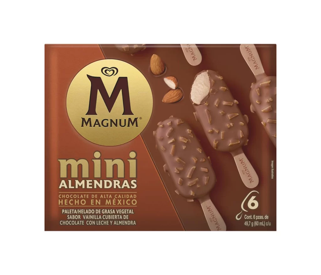
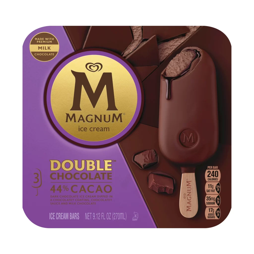
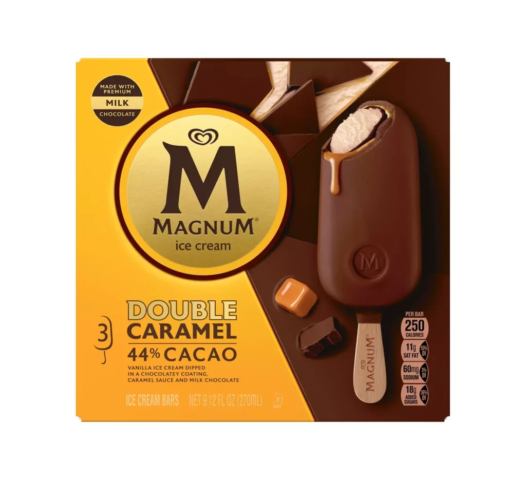
Visual distinction emerges from the interplay between metallic gold accents and matte earth tones, creating a premium confectionery aesthetic. The photographic treatment of shattered chocolate pieces across the label communicates the product’s unique textural promise, differentiating it from standard smooth-surfaced ice creams. Typography hierarchy skillfully balances the authoritative weight of the central logo with the delicate, almost handwritten quality of the flavor descriptor, establishing clear visual priorities for consumer scanning.
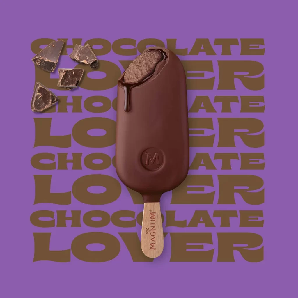
Packaging designers studying frozen dessert branding would examine this example for its effective use of material simulation through print. Food photographers might reference the lighting approach on reflective gold elements and translucent chocolate shards. Marketing teams developing premium private-label products could analyze how color psychology—specifically the combination of brown, gold, and orange—signals indulgence and nutty flavor profiles to shoppers.