Cherry Tomato Juice Bottle Advertisement
Topics
Details
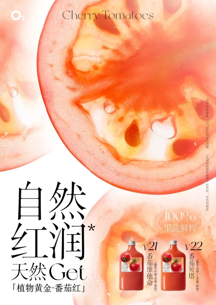
The advertisement features a large, macro-photographed cross-section of a cherry tomato dominating the upper half, showcasing its juicy interior and seeds. Below the fruit imagery, bold Chinese characters read '自然红润' (Natural Rosy) and '天然Get' (Naturally Get), accompanied by the English text 'Cherry Tomatoes' at the top. Two glass bottles of red juice are positioned in the lower right corner, labeled with prices of ¥21 and ¥22 and product names like '番茄维他命' (Tomato Vitamin) and '番茄贝塔' (Tomato Beta).
The layout employs a clean, minimalist aesthetic with ample white space that draws immediate focus to the vibrant orange-red tones of the tomato slice. Typography varies significantly between the elegant serif font used for the English header and the heavy, modern sans-serif style applied to the primary Chinese slogans. Photography utilizes high-key lighting to create a fresh, translucent quality in the fruit, while soft water droplets add a sense of crisp hydration to the overall visual composition.
Graphic designers often examine such layouts to understand how scale and negative space can emphasize product freshness without clutter. Marketing students analyze the specific color psychology involved in using 'tomato red' to evoke health and natural vitality. Packaging teams reference the bottle labeling and pricing placement strategies shown here when planning retail point-of-sale displays for premium juice brands.