Pepsi Chinese Design Can
Topics
Details
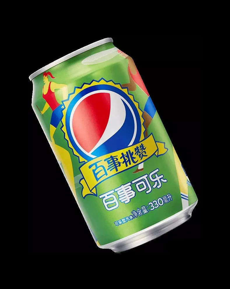
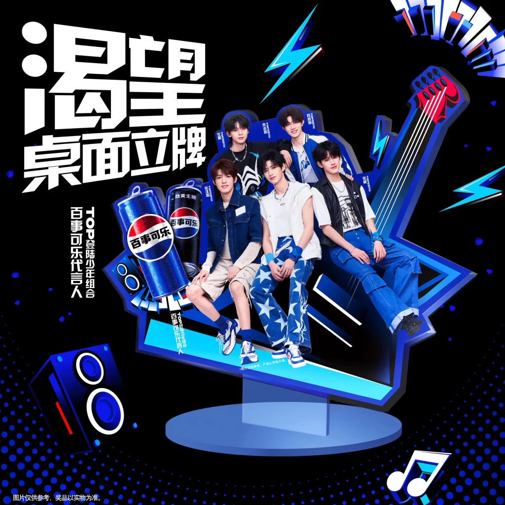
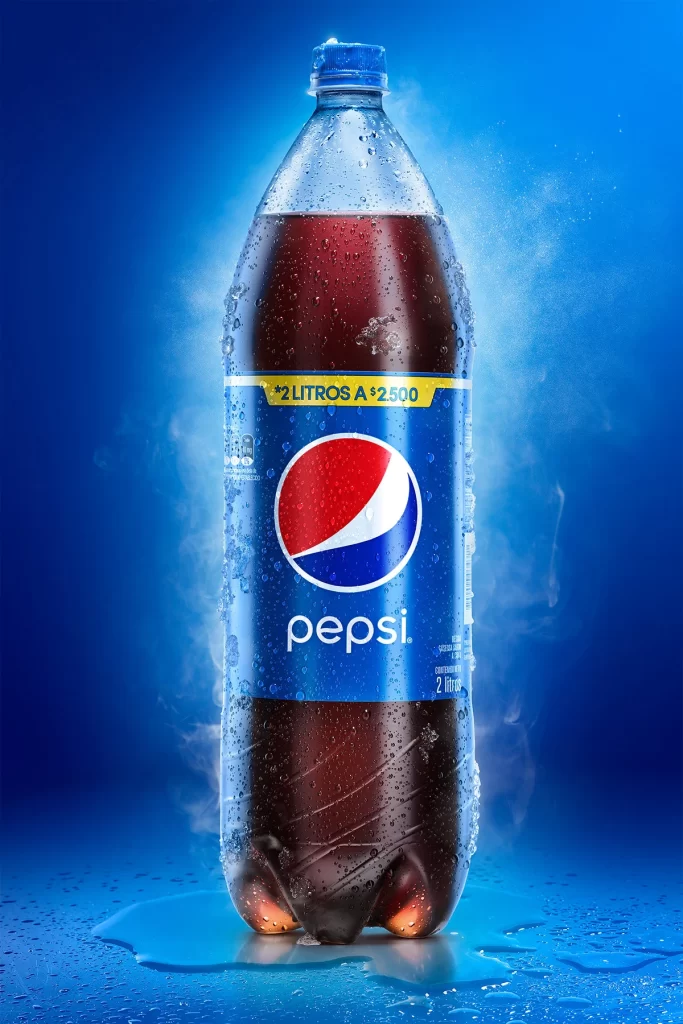
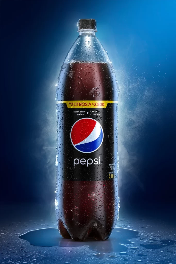
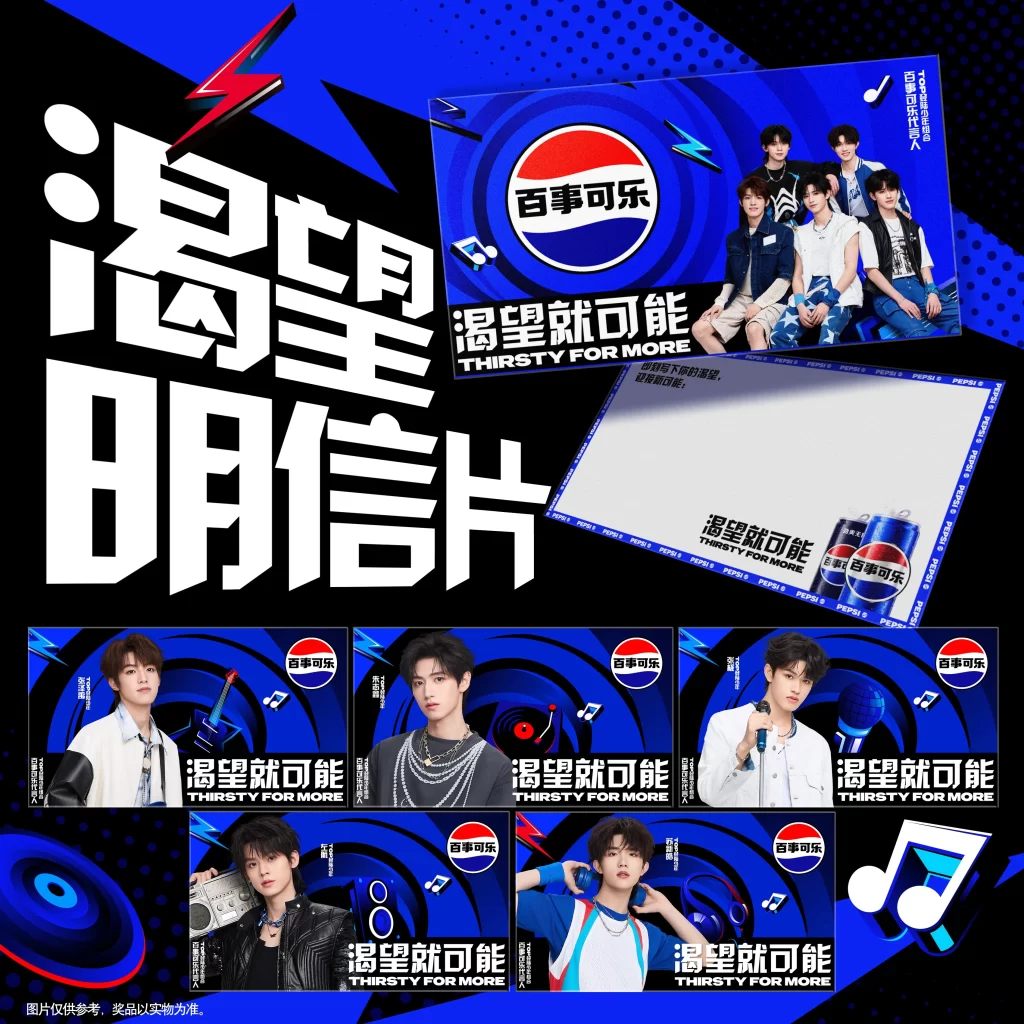
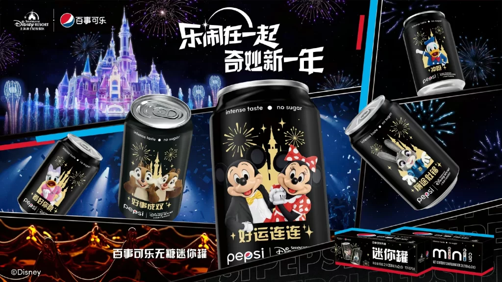
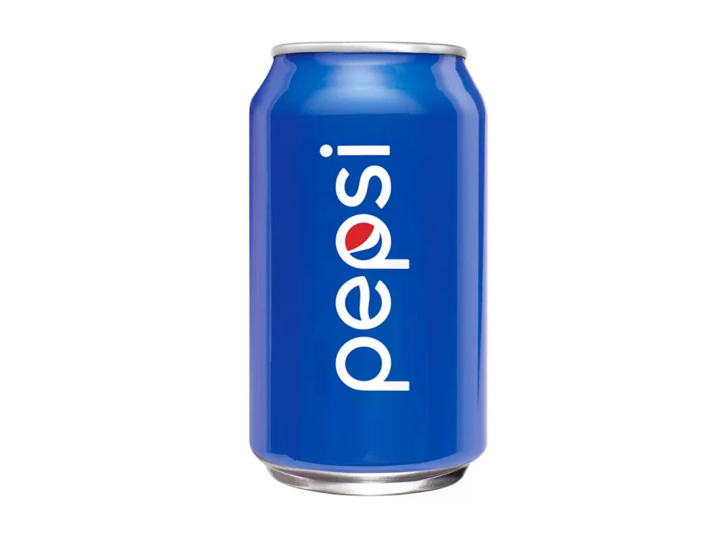
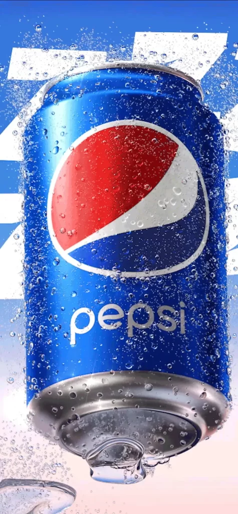
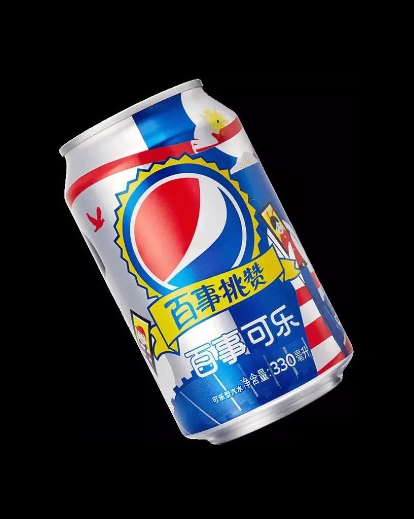
A standard aluminum Pepsi can is displayed at a slight angle against a solid black background, featuring the iconic red, white, and blue circular logo centered on the surface. The packaging incorporates Chinese text, specifically the characters for "Pepsi Challenge" displayed on a yellow ribbon above the larger "Pepsi-Cola" product name. The design utilizes a vibrant color palette of primary blues, reds, and whites, accented with yellow graphical elements and small illustrative details like birds and figures.
The layout employs a dynamic diagonal composition with bold stripes that wrap around the cylinder, creating a sense of movement and energy. Typography choices feature strong, legible Chinese characters that integrate seamlessly with the global brand identity, while the illustration style leans towards a flat, graphic aesthetic with clean lines. Color blocking is used effectively to separate the brand mark from the promotional messaging, ensuring high visibility and immediate recognition.
Marketing professionals and packaging engineers often examine such visuals to understand how global brands adapt their identities for specific regional markets without losing core equity. Graphic designers utilize these examples when studying label hierarchy and the balance between illustration and typography in confined spaces. Brand strategists reference this type of work to analyze how color psychology and localized messaging combine to drive consumer engagement.