Pepsi Bottle Zero Sugar Beverage Packaging
Topics
Details
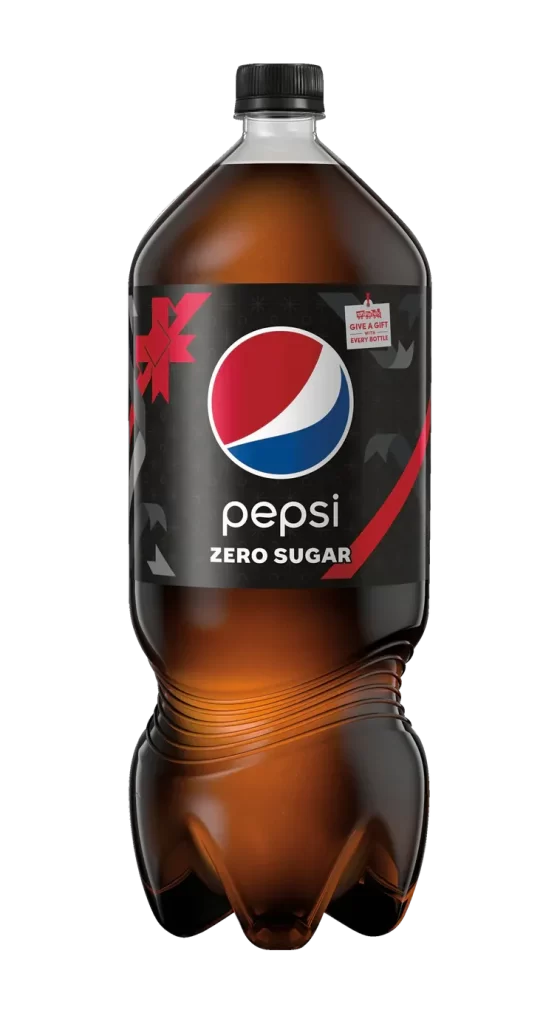
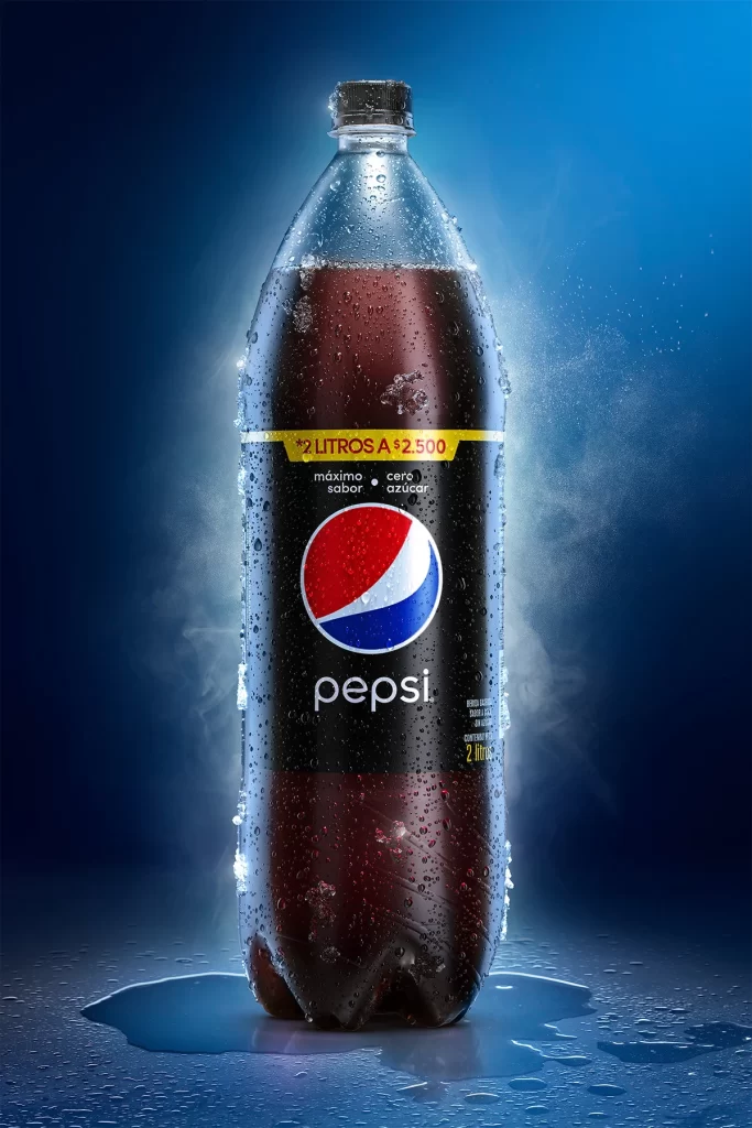
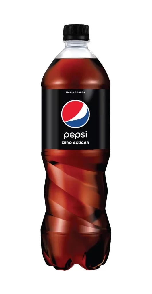
A contoured plastic bottle filled with deep, translucent cola liquid darkens toward its base and is sealed by a black screw cap. The solid black label displays the iconic red, white, and blue circular logo above bold white typography reading 'pepsi' and 'ZERO AÇÚCAR', with smaller text stating 'MÁXIMO SABOR' positioned above the brand mark. The entire package appears on a clean white background.
Visual emphasis is placed on the high-contrast label design, where the black field makes the vibrant logo pop with intensity. The Portuguese text indicates this is a localized variant, specifically targeting markets where sugar-free options are marketed under the ‘Zero Açúcar’ nomenclature rather than the standard English ‘Zero Sugar’. Such packaging demonstrates how global brands adapt their visual identity for regional consumers while maintaining core color codes and typographic hierarchy.
Brand analysts might examine this artifact to study how multinational corporations modify labeling for specific linguistic regions without altering their fundamental visual equity. Packaging engineers could reference the bottle’s structural curves to understand how grip ergonomics are integrated into large-format beverage containers. Marketing teams may utilize this example when developing campaigns for health-conscious demographics in Lusophone territories.