Misfit Beet Juice Less Waste
Topics
Details
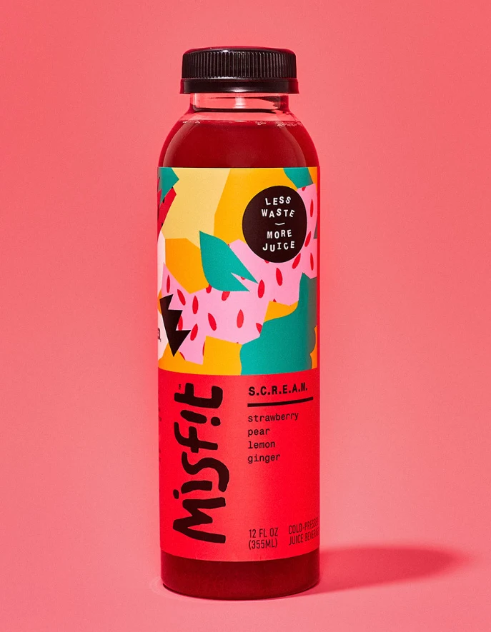
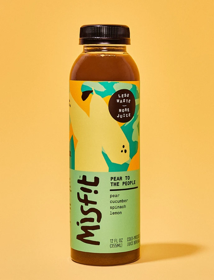
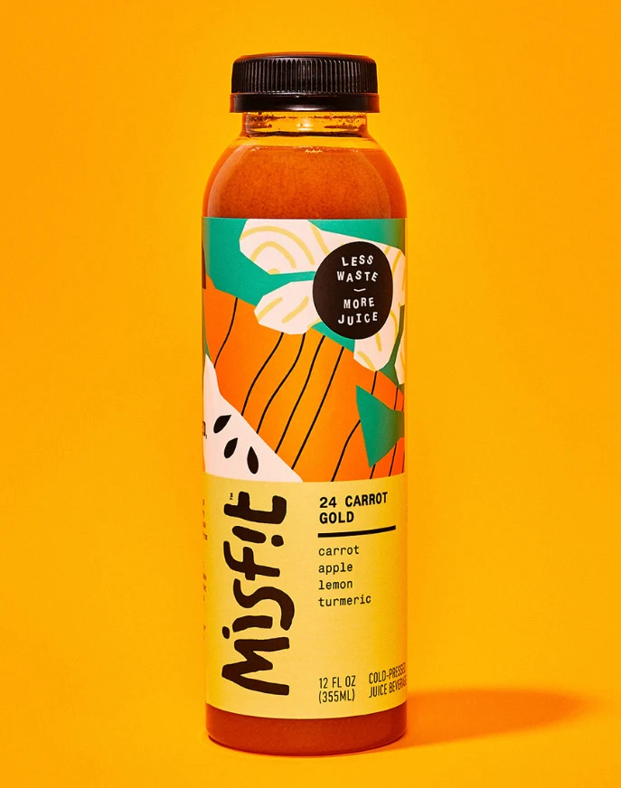
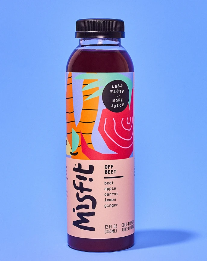
A clear plastic bottle of Misfit brand juice stands against a solid light blue background, containing a dark reddish-purple liquid sealed with a black screw cap. The label features the product name 'OFF BEET' alongside ingredients including beet, apple, carrot, lemon, and ginger. A circular badge at the top of the artwork displays the slogan 'LESS WASTE MORE JUICE' in white text on black.
The packaging employs bold, abstract vegetable illustrations in vibrant orange, red, purple, and mint green tones that wrap around the upper portion of the bottle. Hand-drawn style typography dominates the lower pink section, with 'Misfit' rendered in large, irregular black lettering that conveys an organic, approachable aesthetic. The layout balances playful artistic elements with clean informational hierarchy, using sans-serif fonts for ingredient lists and volume measurements.
Packaging designers frequently reference this image when developing sustainable beverage brands that emphasize upcycled or imperfect produce concepts. Brand identity specialists study the integration of illustration with typography to achieve a modern yet whimsical market position. Label design teams examine the color blocking and text placement strategies for cold-pressed juice categories targeting environmentally conscious consumers.