Misfit Scream Drink
Topics
Details
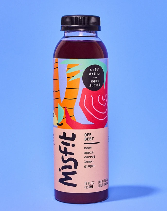
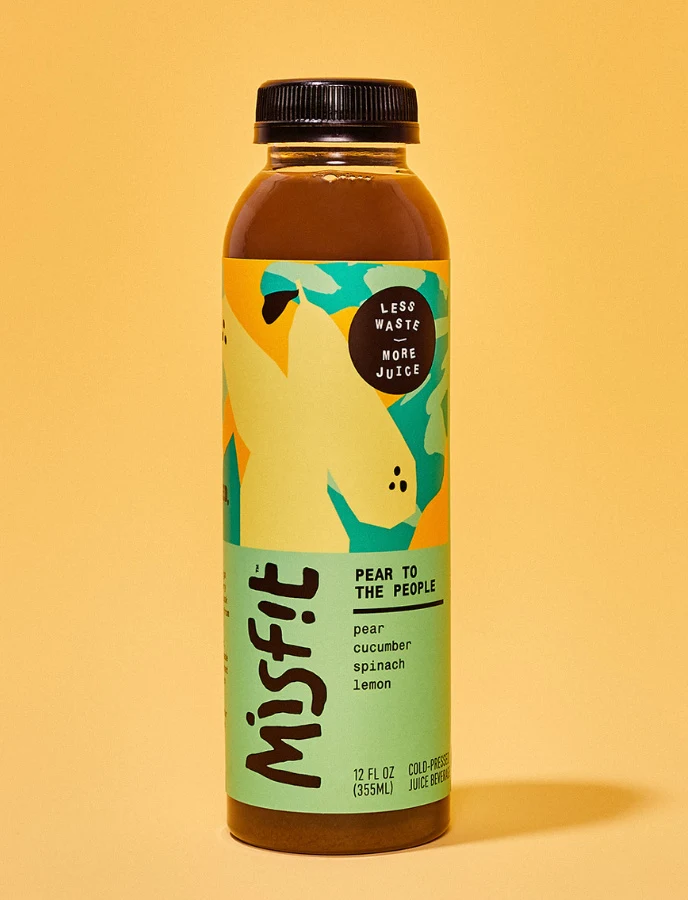
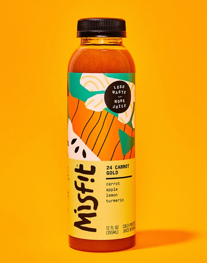
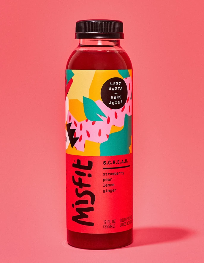
Flat pastel surfaces form a solid coral-pink background behind a single bottle of Misfit S.C.R.E.A.M. juice, which stands centered in the frame. The clear plastic container reveals a deep red liquid inside, sealed with a black screw cap, while the label features the brand name ‘Misfit’ in large black hand-drawn lettering. Below this, ‘S.C.R.E.A.M.’ and flavor ingredients (strawberry, pear, lemon, ginger) are listed in smaller text alongside a circular badge reading ‘LESS WASTE MORE JUICE’.
The packaging employs a bold two-tier layout with an abstract illustration zone at top and a solid red information block below. Vibrant geometric shapes in yellow, teal, pink, and black create a dynamic collage effect above the brand name. Typography mixes casual brush-script for the logo with clean sans-serif for product details, establishing a playful yet structured visual hierarchy.
Packaging designers frequently reference this image when developing beverage labels that balance artistic illustration with functional information architecture. Brand identity professionals use it as a case study for integrating sustainability messaging into visual design systems. Label layout specialists examine its color blocking techniques to understand how to organize complex ingredient lists without sacrificing aesthetic impact.