DID INO Olive Oil Minimal
Topics
Details
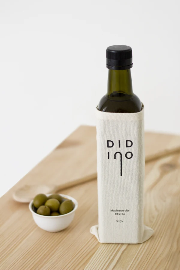
A dark green glass bottle of olive oil stands on a light wooden surface, wrapped in a textured off-white fabric sleeve. The brand name 'DID INO' appears in bold black sans-serif letters, with the vertical stroke of the 'I' extending downward as a design element. Below this, smaller text reads 'Maslinovo ulje OBLICA' and '0,5L', indicating a Serbian or Croatian language product, while a small white bowl of green olives and a wooden spoon rest in the soft-focus background.
The visual composition employs a restrained color palette of natural linen, deep forest green, and warm wood tones against a clean white backdrop. Typography features geometric letterforms with generous spacing, creating a contemporary yet artisanal feel that emphasizes the product's premium positioning. Photography utilizes soft, diffused lighting with shallow depth of field to isolate the bottle while maintaining contextual warmth through the surrounding kitchen elements.
Packaging designers frequently reference this image when developing luxury food branding that balances modern minimalism with tactile materiality. Brand identity professionals study the typographic hierarchy and sleeve construction for organic product lines requiring sophisticated visual language. Label design specialists examine how the fabric wrap integrates with glass packaging to create distinctive shelf presence without excessive ornamentation.