Bionaturae Extra Virgin Olive Oil Image 01 Packaging
Topics
Details
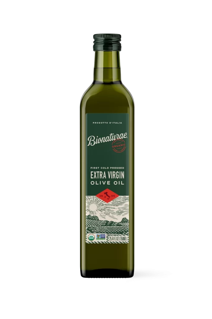
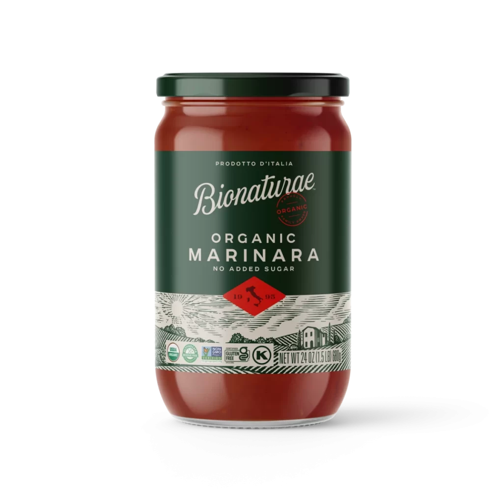
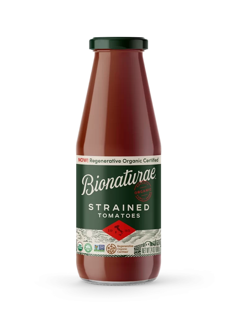
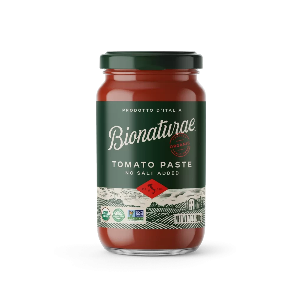
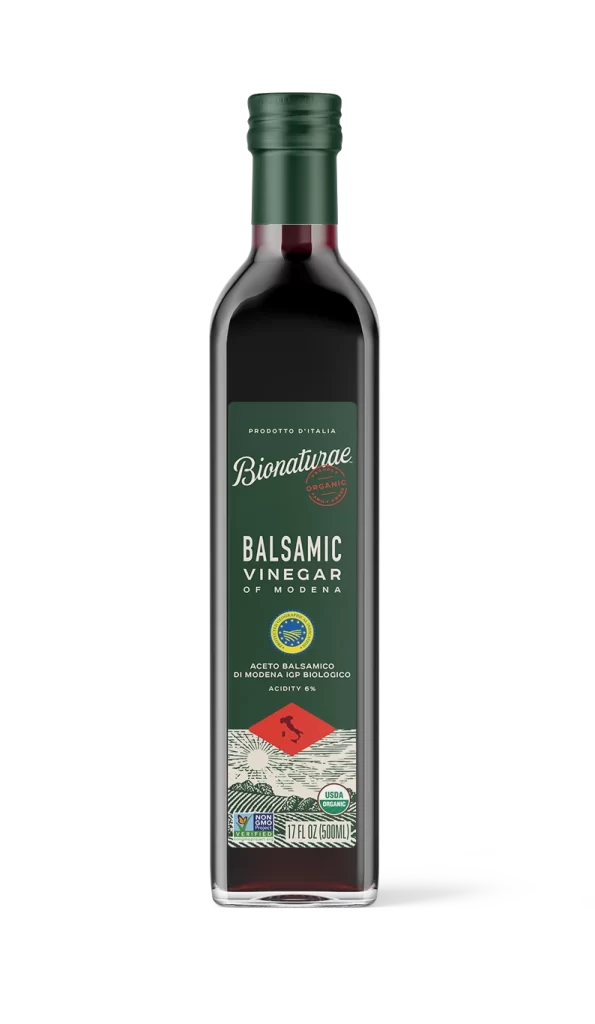
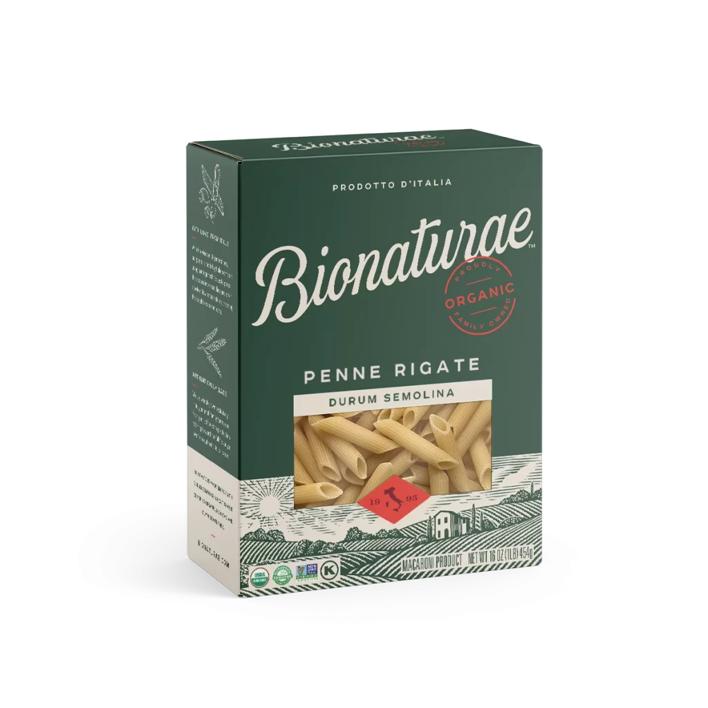
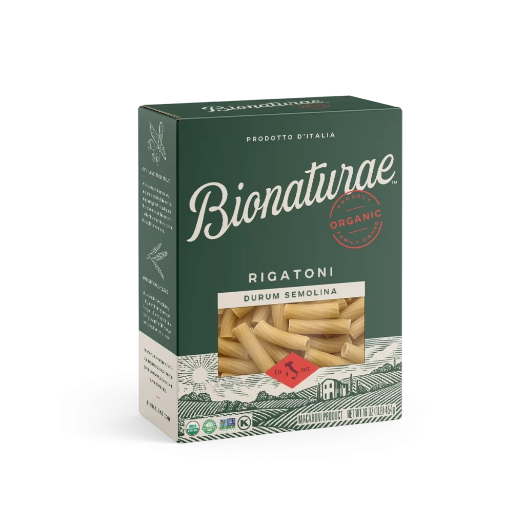
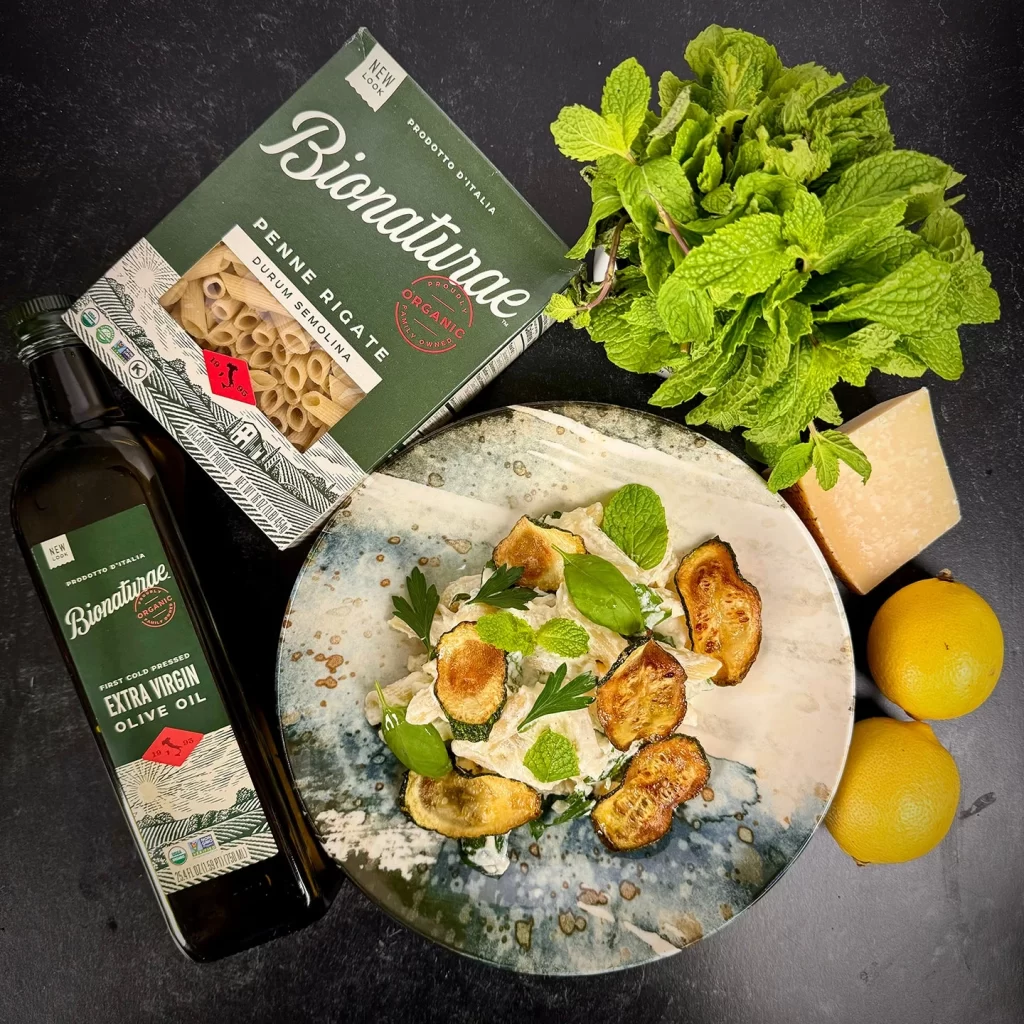
A dark forest-green glass bottle of Bionaturae Extra Virgin Olive Oil stands in crisp profile on a white surface, topped with a black ribbed screw cap. The label features a sophisticated palette of deep emerald, cream, and crimson accents, displaying 'Prodotto d'Italia' at the upper register and the brand name in elegant script.
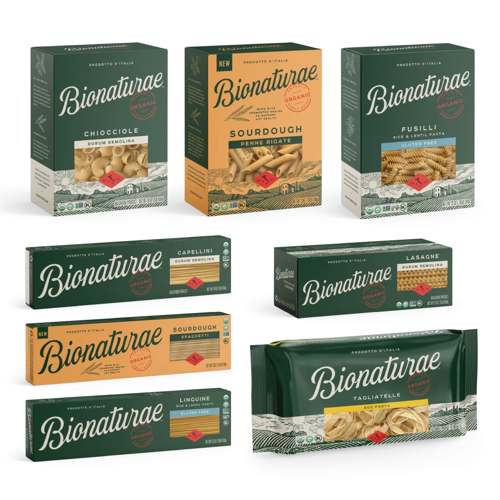
Visual distinction emerges from the label’s thoughtful juxtaposition of typographic hierarchy against artisanal graphic elements, particularly the red diamond seal containing a silhouette of Italy. The vintage-inspired linework evokes traditional Italian printmaking techniques, creating immediate authenticity that contrasts sharply with minimalist contemporary packaging trends. Such deliberate layering of organic imagery with clean modern typography establishes a premium market position through visual storytelling rather than overt luxury signaling.

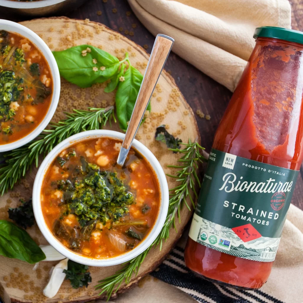
Brand strategists developing heritage food product lines would examine this composition to understand how regional iconography reinforces provenance claims without cluttering essential nutritional information. Packaging designers seeking to balance regulatory text requirements with aesthetic appeal might study the spatial distribution between the USDA Organic badge, Non-GMO verification mark, and decorative illustration. Culinary photographers could reference the lighting approach for future studio shoots requiring glass transparency while maintaining label legibility across reflective surfaces.