Bionaturae Gluten Free Rice Lentil Elbows Packaging
Topics
Details
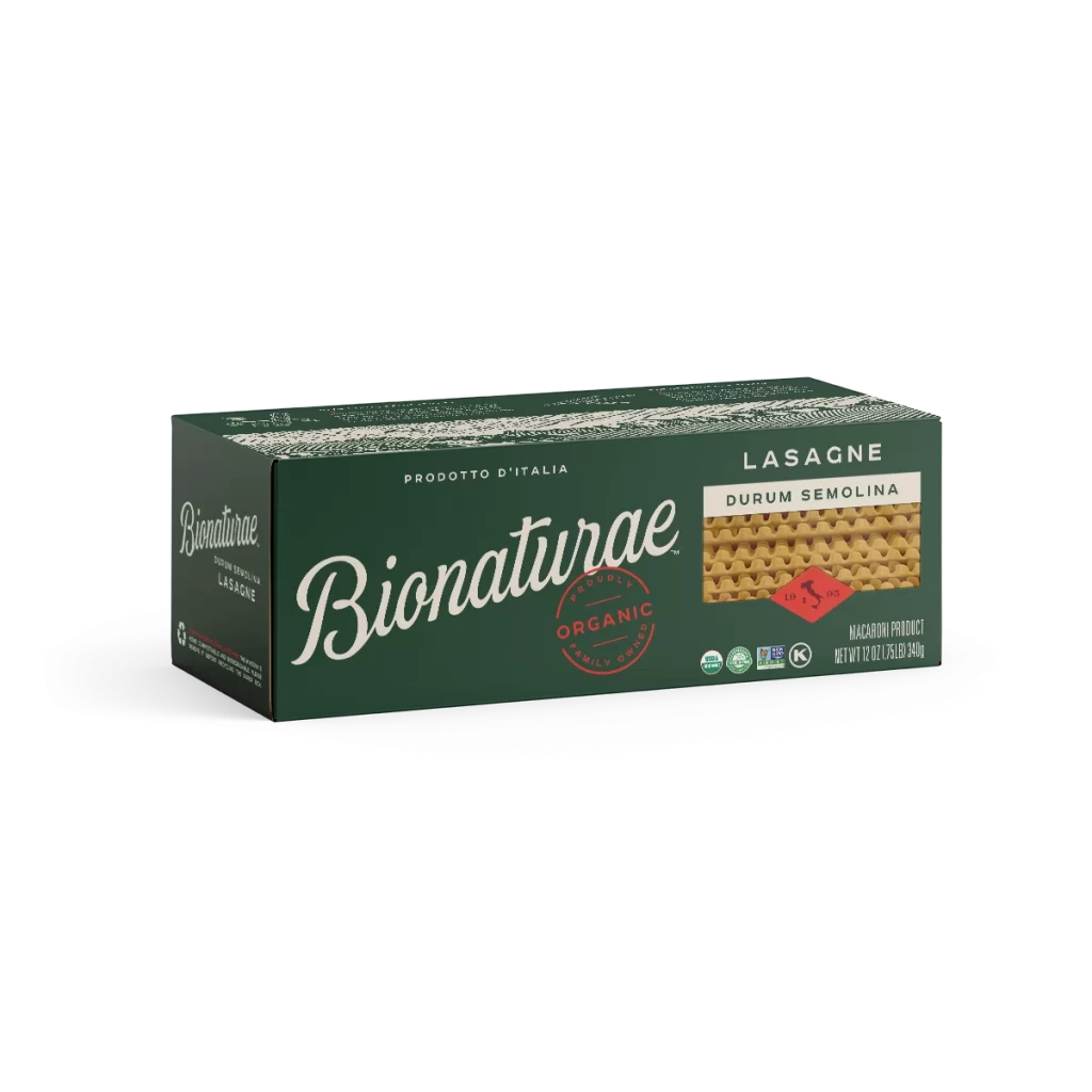
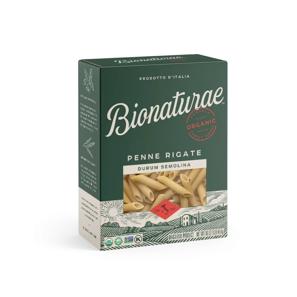
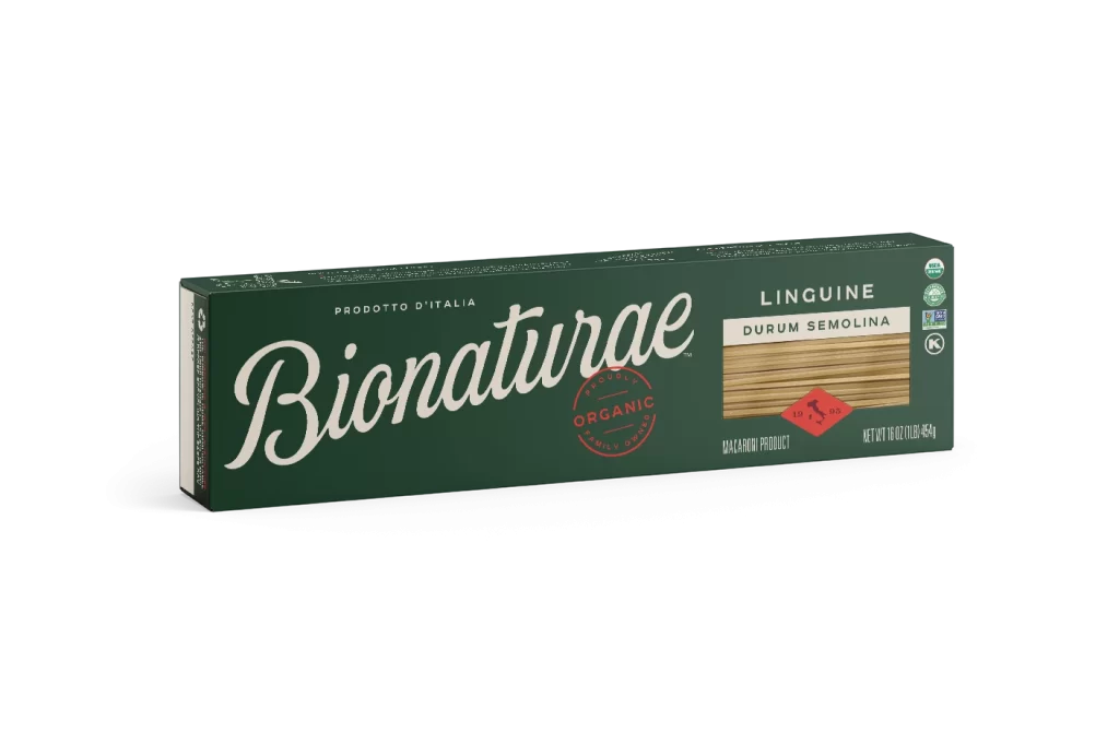
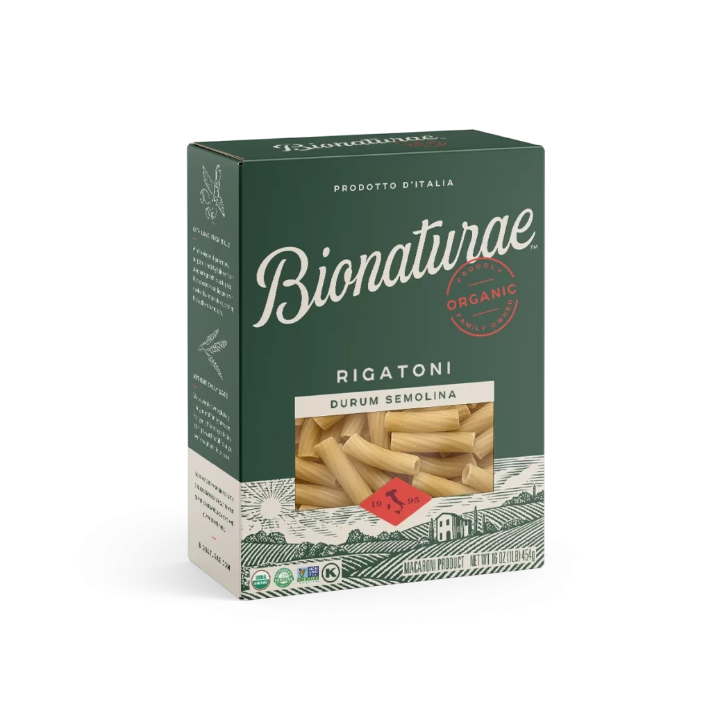
A rectangular cardboard box of Bionaturae Elbows pasta stands at a three-quarter angle, revealing its left flank and front face against a white background. Deep forest green dominates the packaging, accented by crisp white and red typography, while a central transparent window displays the pale, curved rice and lentil elbows. The lower third features a stylized pastoral landscape in muted ink tones, complete with rolling hills and a farmhouse beneath the product window.
Visual hierarchy is established through the elegant, sweeping cursive of the ‘Bionaturae’ brand name, which contrasts sharply with the utilitarian sans-serif used for product specifications. A circular red stamp indicating organic certification breaks the monochromatic green field, drawing immediate attention to quality standards. The integration of an illustrative rural scene beneath the product window adds a narrative layer of artisanal heritage to the otherwise modern, clean layout.
Brand strategists might examine this composition to understand how color blocking can effectively segregate nutritional information from brand storytelling. Packaging engineers could utilize the structural perspective to study how die-cut windows interact with printed graphic elements. Furthermore, typographers may find value in analyzing the juxtaposition of script and block lettering for achieving both approachability and clarity on shelf.