Bionaturae Whole Wheat Penne Rigate Packaging
Topics
Details
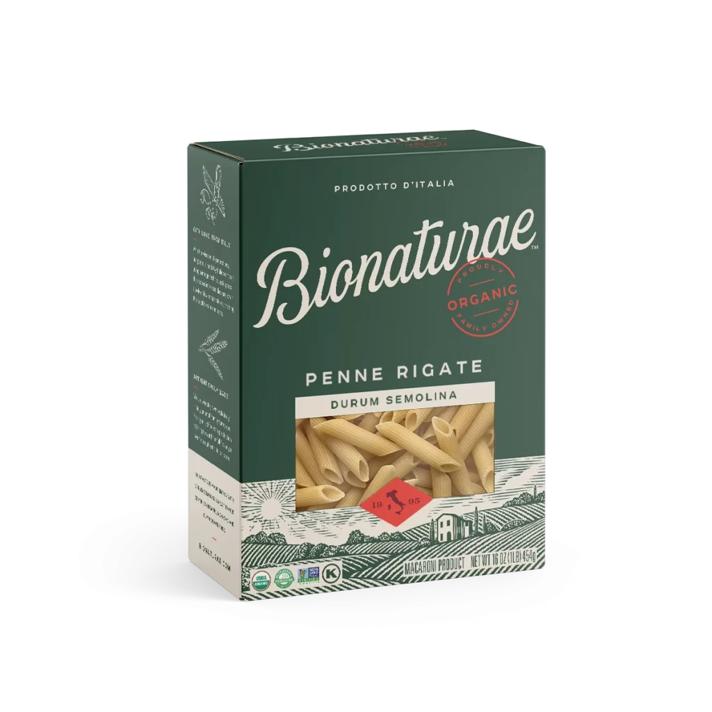
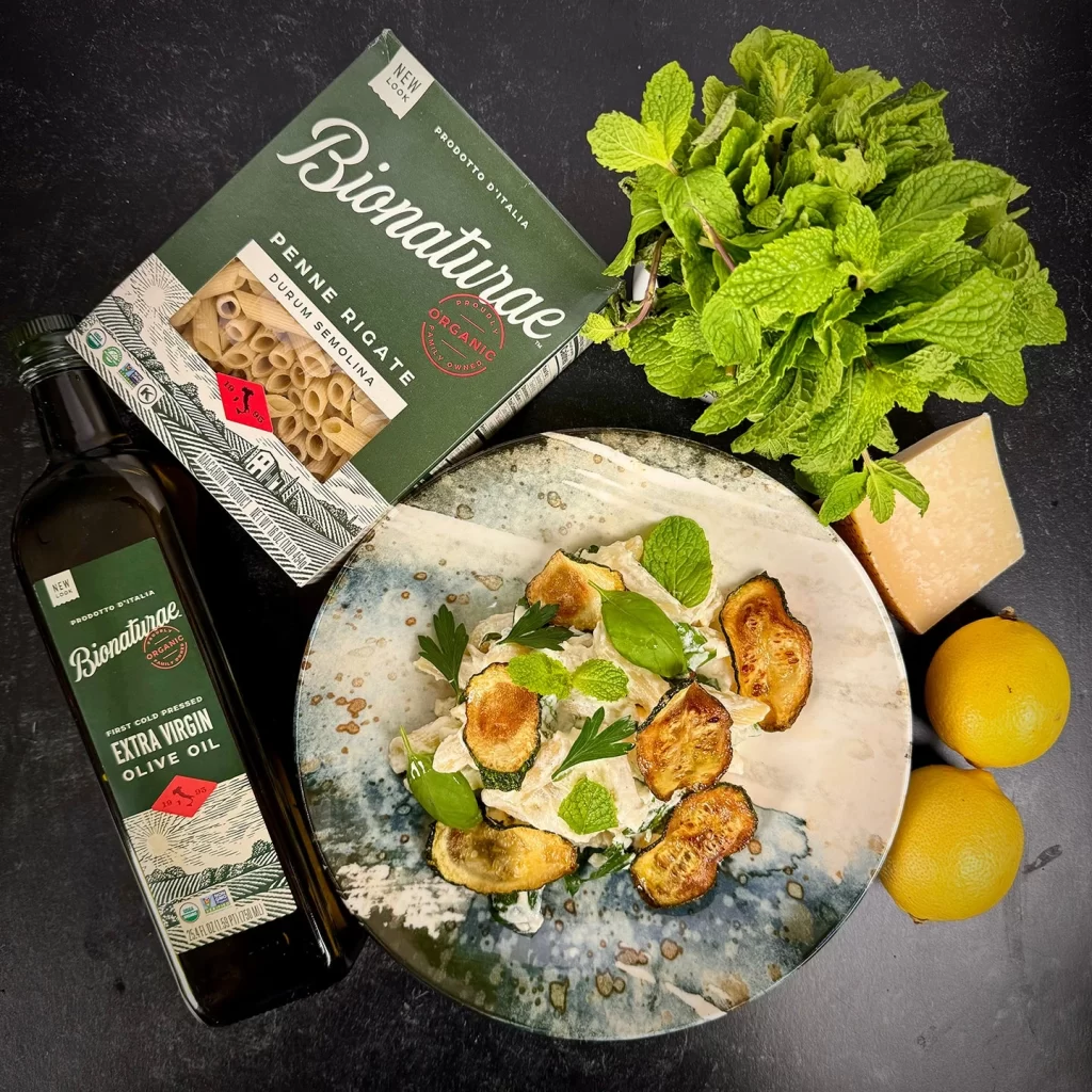
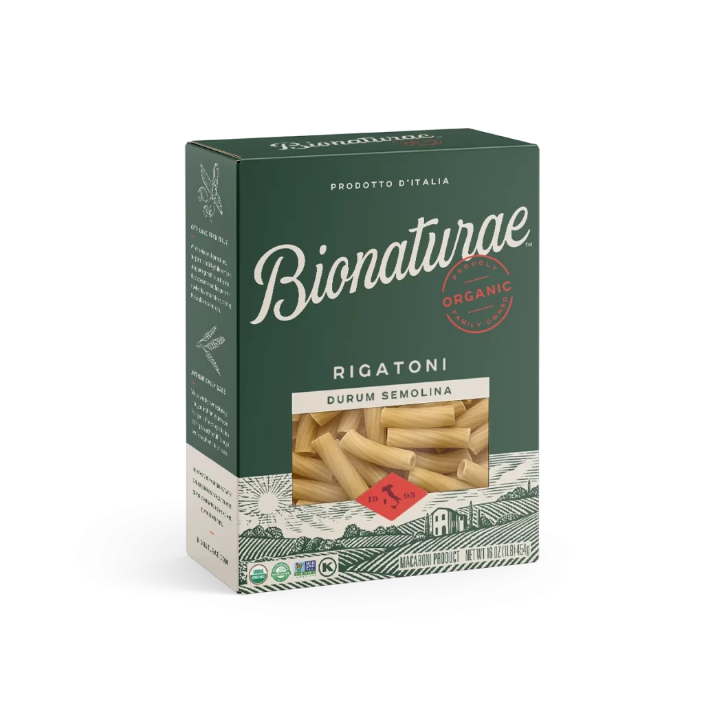
A rectangular cardboard carton of Bionaturae pasta stands in a three-quarter view, revealing its front and left side panels against a white background. Deep forest green dominates the packaging, accented by cream-colored typography and a central photographic window displaying the ridged, tan-colored penne. A red circular stamp reading 'Organic' and a smaller diamond-shaped red badge with '1905' complete the design.
Visual hierarchy is established through the elegant, sweeping cursive of the brand name, which dominates the upper half of the box and immediately draws the eye. The integration of realistic product photography within the graphic landscape illustration creates a compelling bridge between artisanal tradition and modern organic labeling. Furthermore, the meticulous arrangement of certification logos along the bottom border reinforces the brand’s commitment to quality without cluttering the primary aesthetic.


Brand strategists might examine this composition to understand how heritage cues, such as the Italian origin claim and vintage-style graphics, effectively communicate premium positioning in the health-food sector. Packaging engineers could utilize this example when studying how die-cut windows interact with printed background patterns to enhance shelf appeal. Additionally, color theorists will find the specific balance between the dark green substrate and the warm wheat tones instructive for creating appetizing yet wholesome visual identities.