Bionaturae Durum Semolina Penne Rigate Image 03 Packaging
Topics
Details
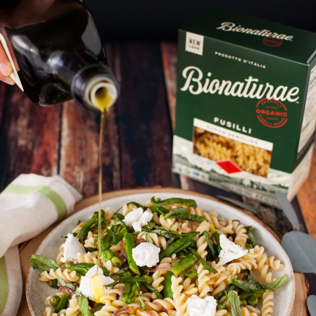
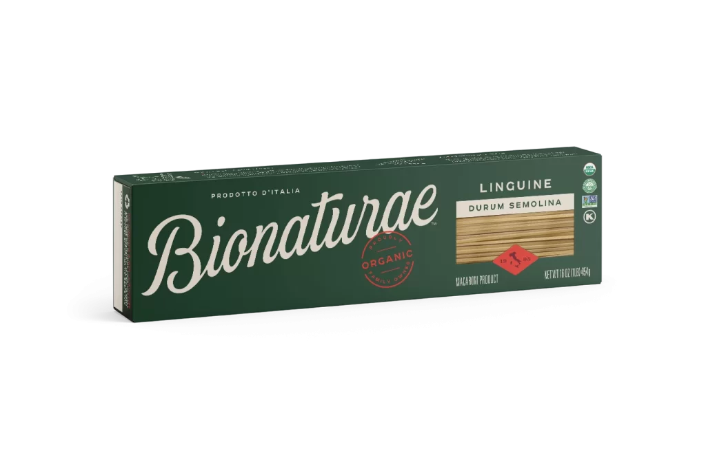
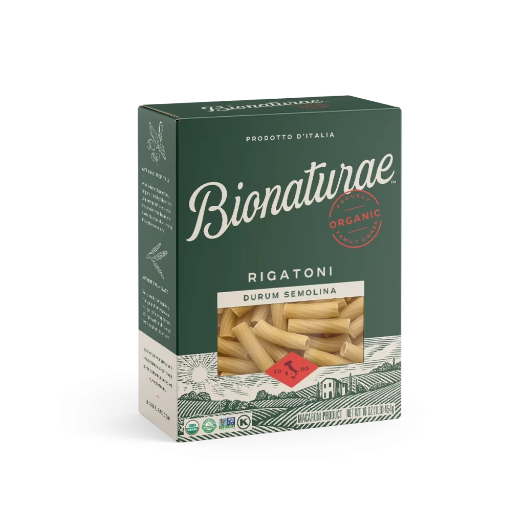
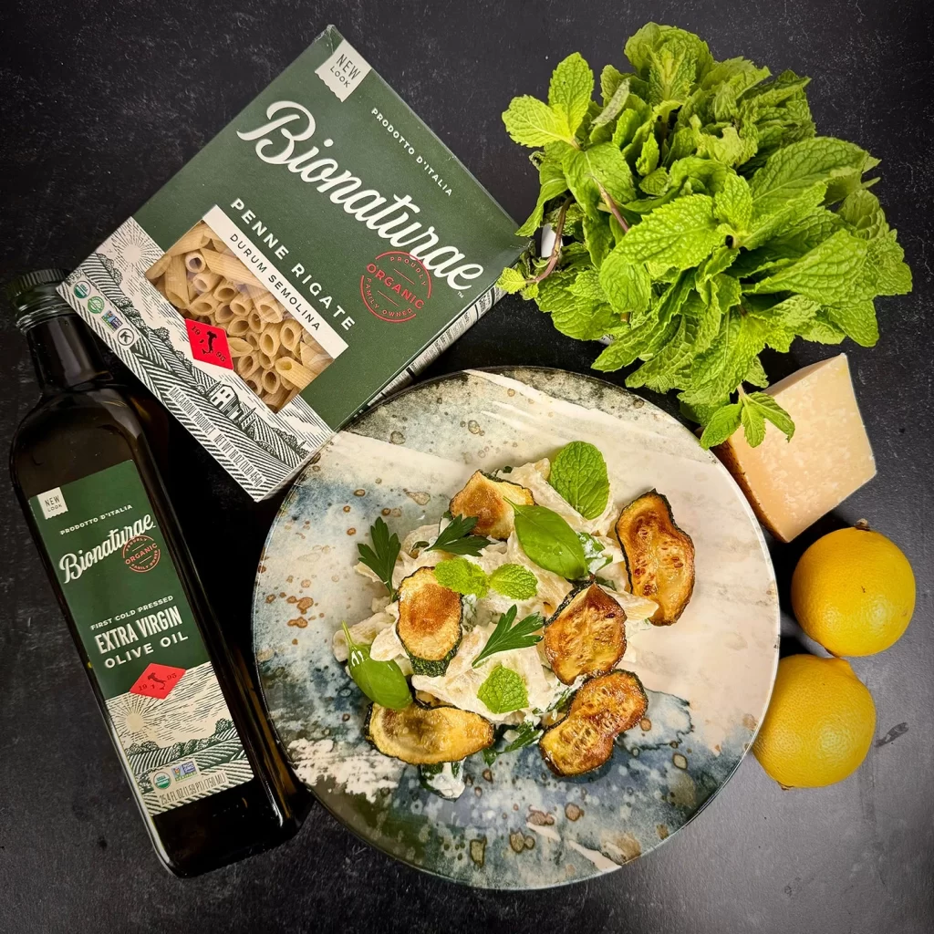
A deep forest-green Bionaturae Penne Rigate box occupies the upper left quadrant of the composition, its cardstock featuring white serif typography, an organic certification seal, and a transparent window revealing pale durum pasta within. A dark glass bottle of the brand's extra virgin olive oil sits parallel to the packaging, sharing the same green label design and organic certification badges. A ceramic plate with a mottled blue-and-white glaze holds a prepared dish of penne topped with seared zucchini rounds and fresh mint leaves, while a bunch of vibrant mint, a wedge of hard cheese, and two lemons complete the arrangement on a matte charcoal surface.
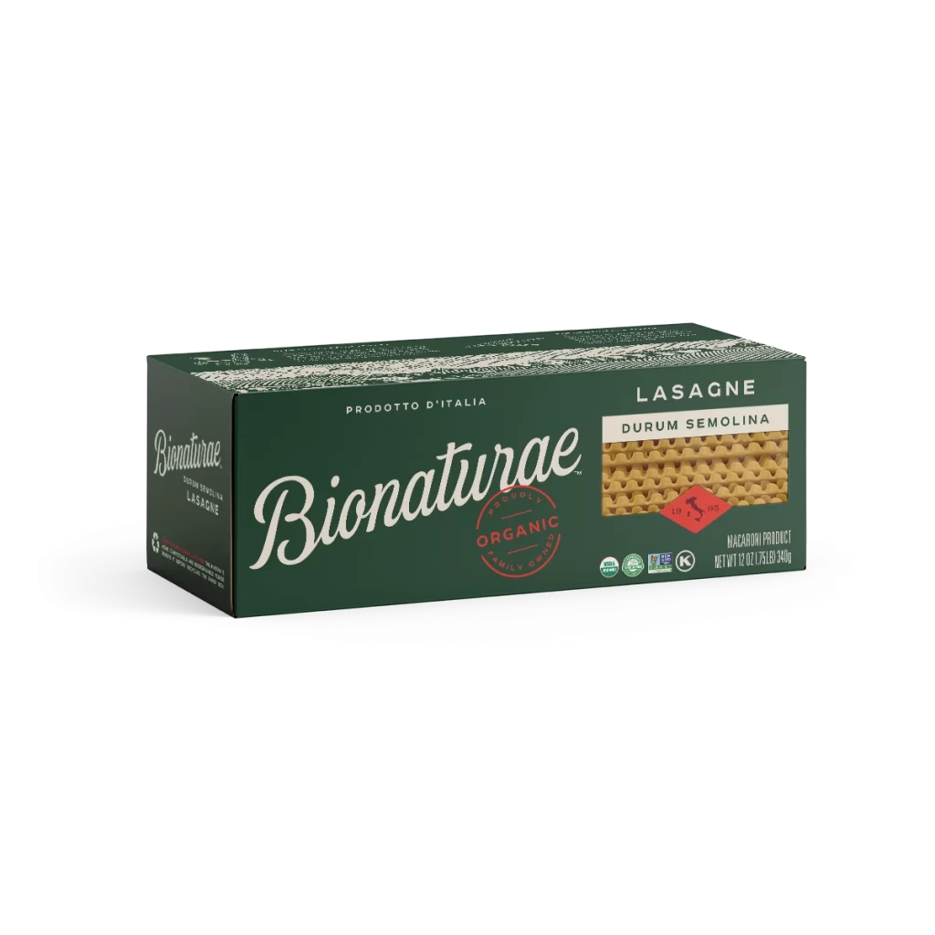
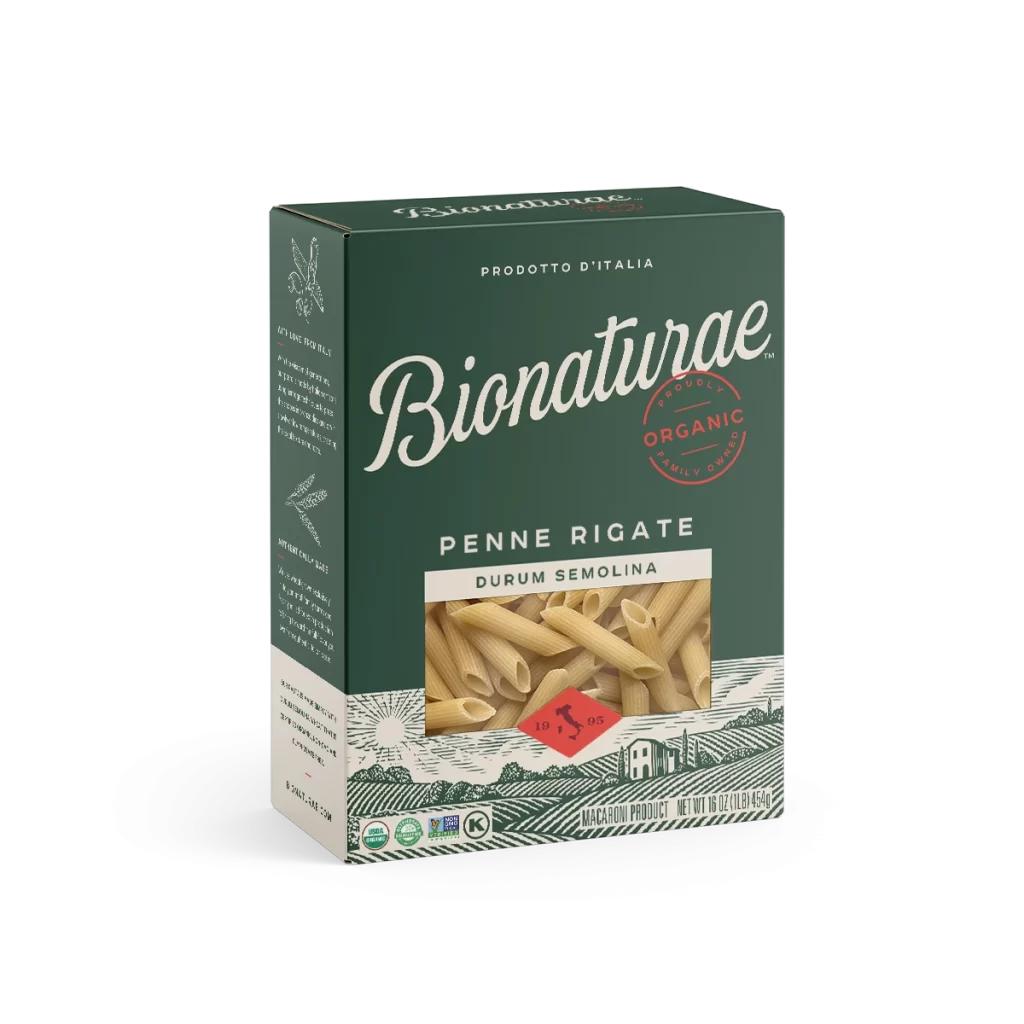
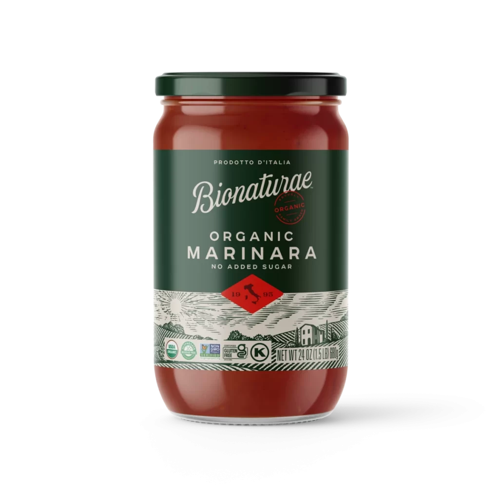
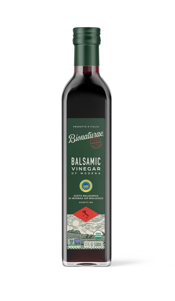
The packaging design distinguishes itself through a sophisticated two-tone green system that communicates organic provenance without relying on clichéd earth-tone stereotypes. Typographic hierarchy is established through the elegant italicized script of the brand name contrasted against the clean sans-serif product specifications, while the red circular organic seal provides a strategic chromatic interruption that draws the eye. This particular iteration of the box features updated “New Look” labeling and detailed line-art illustrations of agricultural landscapes along the edges, suggesting a refined brand evolution aimed at premium market positioning.

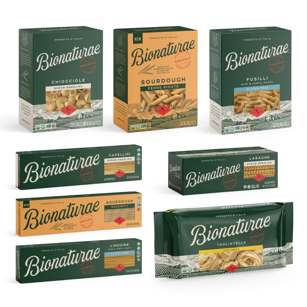
Food photographers studying overhead flat-lay compositions would benefit from analyzing how the ceramic plate’s organic glaze pattern creates visual texture against the dark background. Brand managers evaluating package redesigns could reference how the green-white-red color triad maintains visual cohesion across different product formats while allowing each item to remain distinct. Culinary stylists might examine the interplay between the raw ingredients and the finished dish to understand how prop placement guides consumer perception of recipe authenticity and freshness.