Bionaturae Durum Semolina Lasagne Packaging
Topics
Details
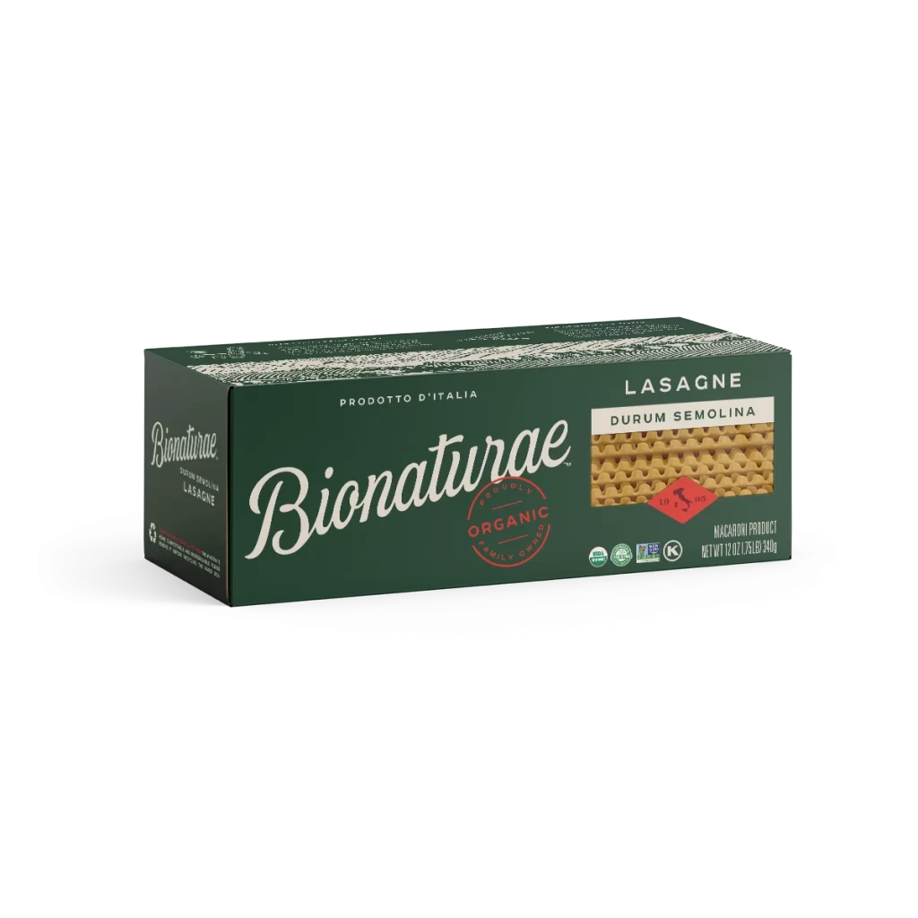
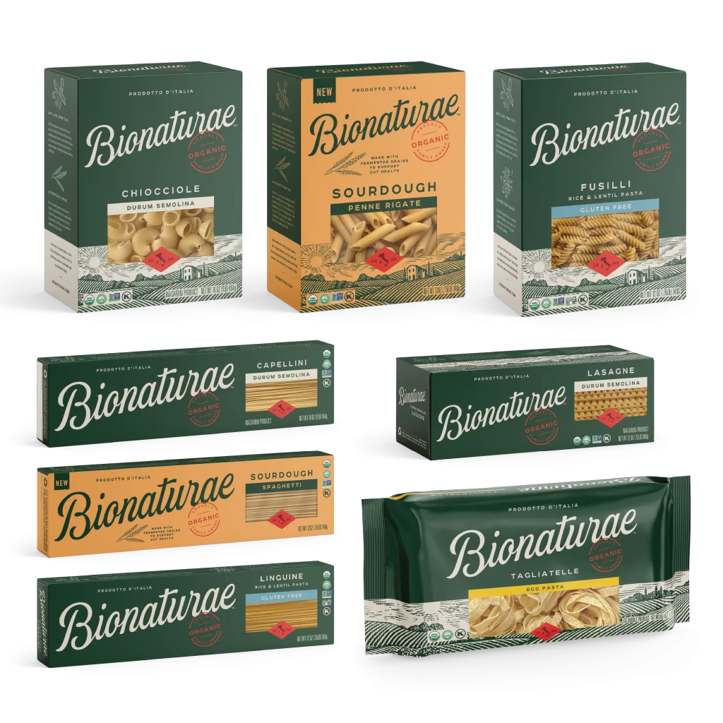
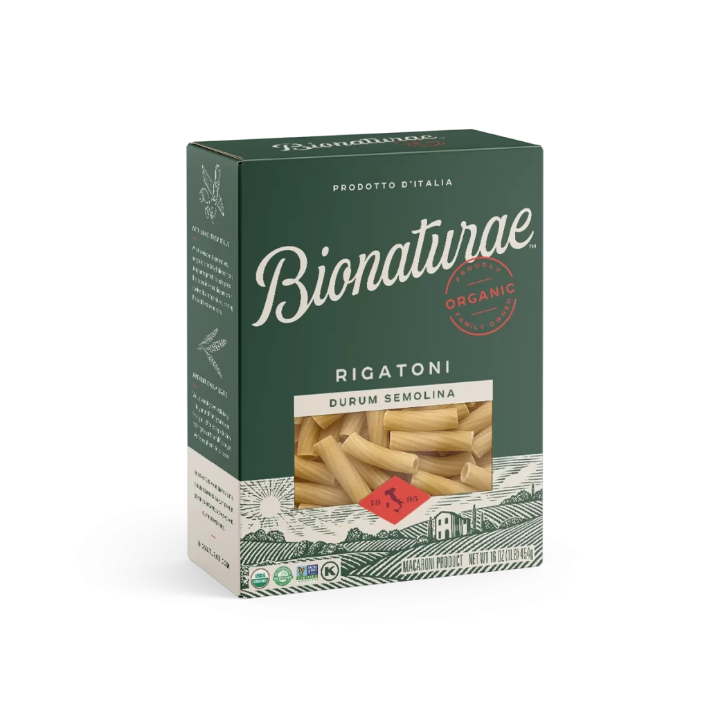
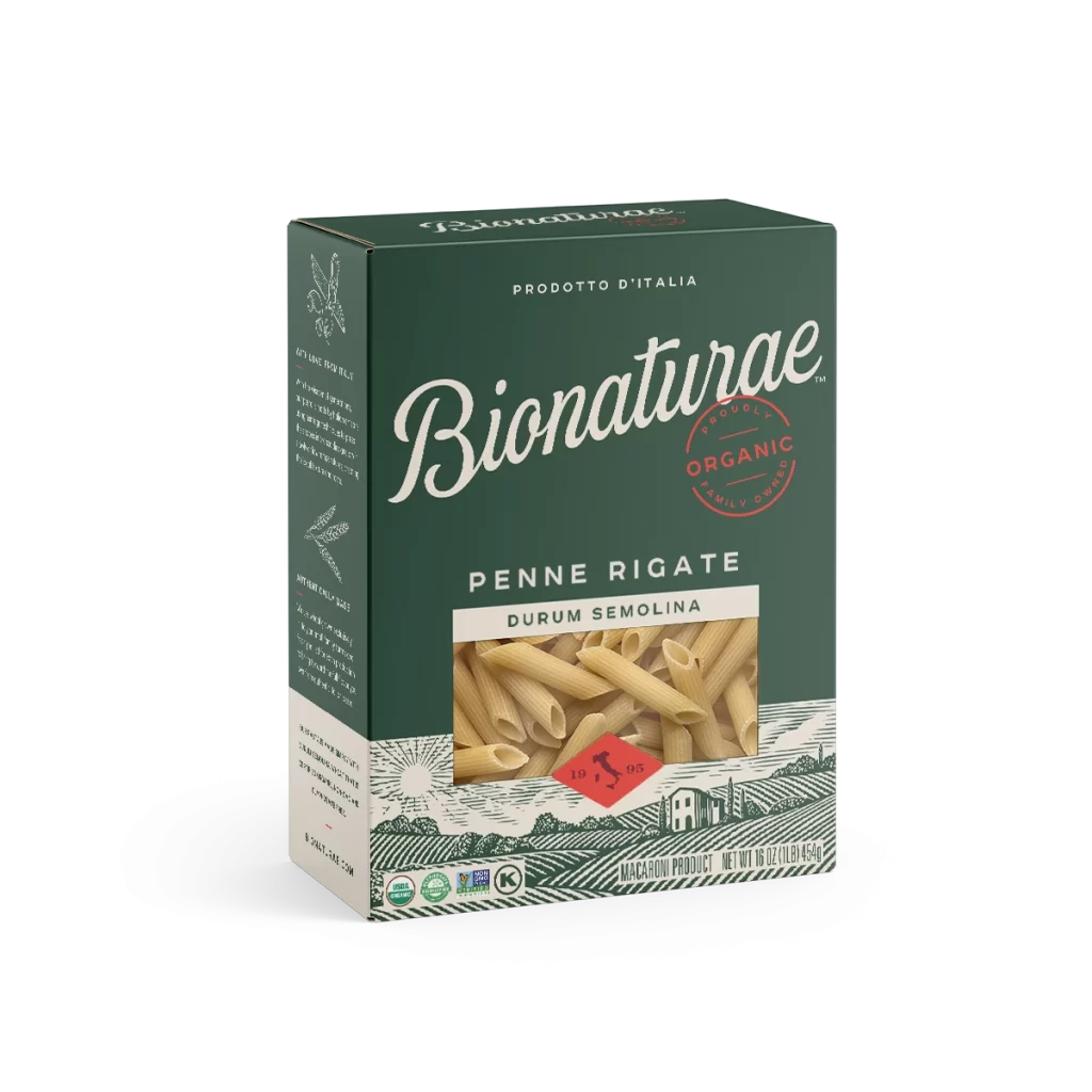
A rectangular carton of Bionaturae organic lasagne sits at a three-quarter angle, revealing its front and left side panels against a white background. Deep forest green dominates the packaging, accented by crisp white and red typography that spells out the brand name in an elegant, flowing script. A small window on the right displays the textured, wavy surface of the durum semolina pasta inside.

Visual hierarchy is established through the contrast between the sophisticated cursive logo and the utilitarian sans-serif text used for product specifications. The inclusion of a circular red ‘Organic’ stamp and various certification logos adds a layer of institutional trust to the artisanal aesthetic. Furthermore, the choice of a dark, earthy background color effectively differentiates this item from typical bright yellow pasta packaging found on retail shelves.
Brand strategists might examine this composition to understand how premium Italian food products utilize color psychology to convey authenticity. Packaging engineers could study the structural layout of the information hierarchy to optimize their own label designs for similar dry goods. Additionally, art directors working on culinary photography projects could use this as a benchmark for lighting and shadow placement on matte cardboard surfaces.