Bionaturae Fruit Spread Apricot Packaging
Topics
Details
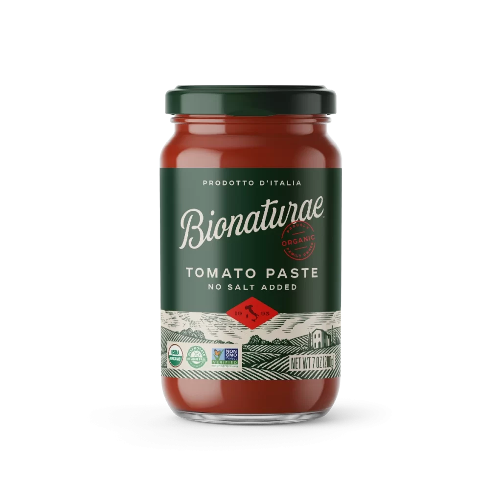
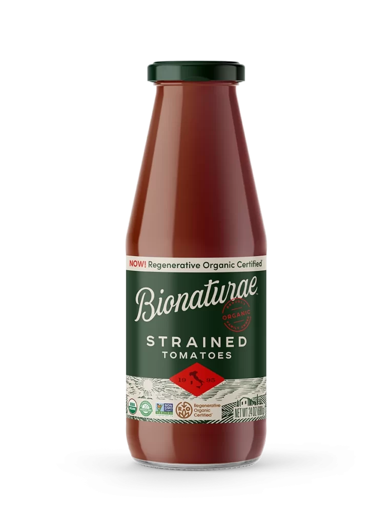
A cylindrical glass jar filled with warm, translucent orange apricot fruit spread stands on a white surface, sealed with a dark green metal lid. A dark forest-green label wraps around the vessel's midsection, displaying 'PRODOTTO D'ITALIA' at the top, the brand name 'Bionaturae' in elegant white cursive script, and a red circular organic seal above bold sans-serif typography announcing the flavor as APRICOT FRUIT SPREAD. The lower portion of the label features an illustrated pastoral landscape with rolling hills and a farmhouse beneath a red diamond containing the number 19, alongside USDA Organic and Non-GMO Project Verified certification marks.
Visual hierarchy commands attention through the sophisticated contrast between the organic orange hue of the spread and the deep, authoritative green of the paper label. The typographic interplay—mixing flowing script with clean, modern letterforms—establishes a premium artisanal aesthetic that bridges traditional Italian craftsmanship and contemporary organic branding. Subtle details like the red diamond seal containing Italy’s silhouette and the intricate woodcut-style landscape at the bottom add textural depth that distinguishes this from conventional supermarket packaging.
Brand strategists developing premium food product lines will find valuable direction in how this package balances heritage cues with modern minimalism. Packaging designers tasked with creating organic or European-inspired consumer goods can study the effective use of color blocking and illustrative elements to convey authenticity without clutter. Marketing teams preparing e-commerce photography briefs might reference the clean isolation technique and lighting approach to ensure their own products photograph with similar clarity and appetizing appeal.