Bionaturae Organic Apricot Nectar Packaging
Topics
Details
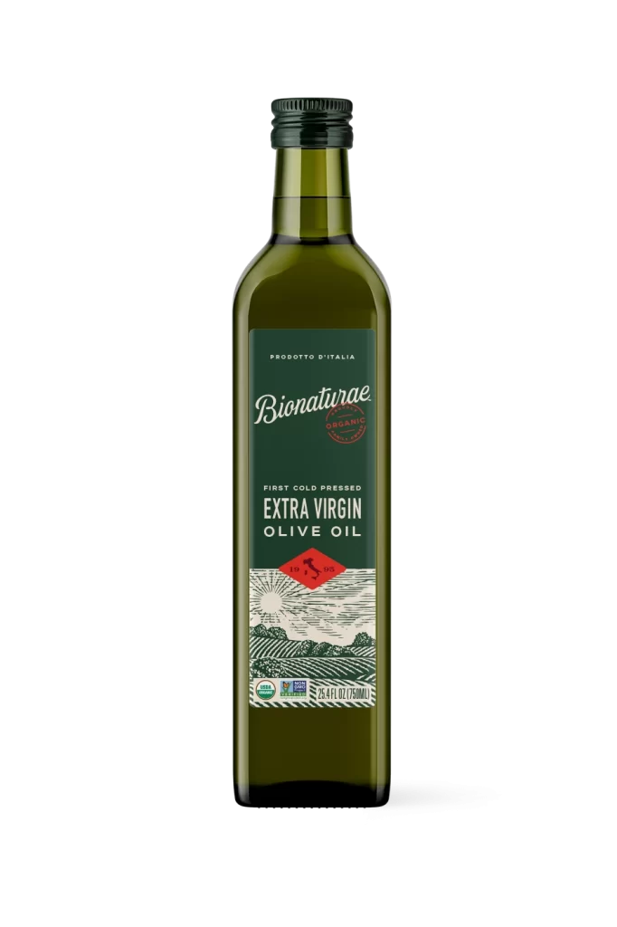
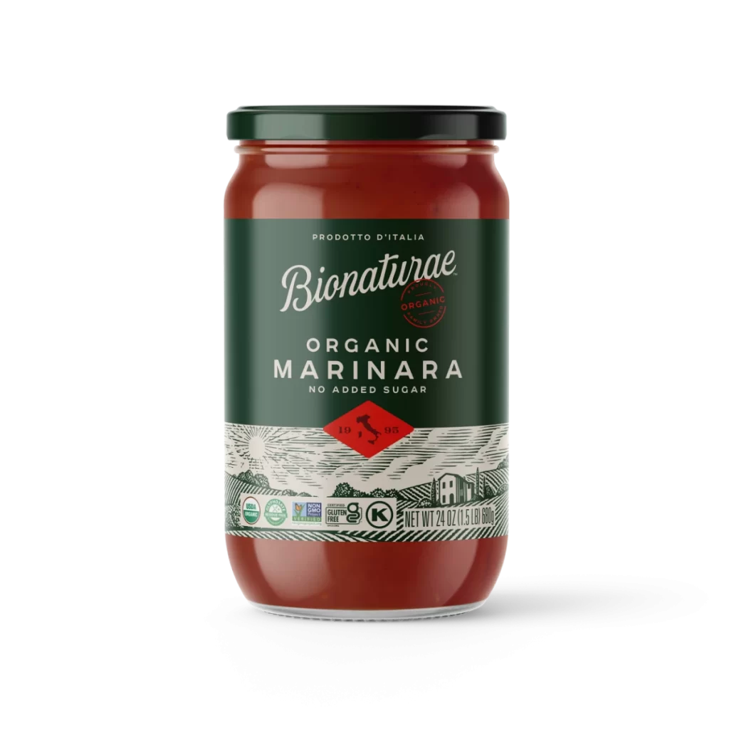
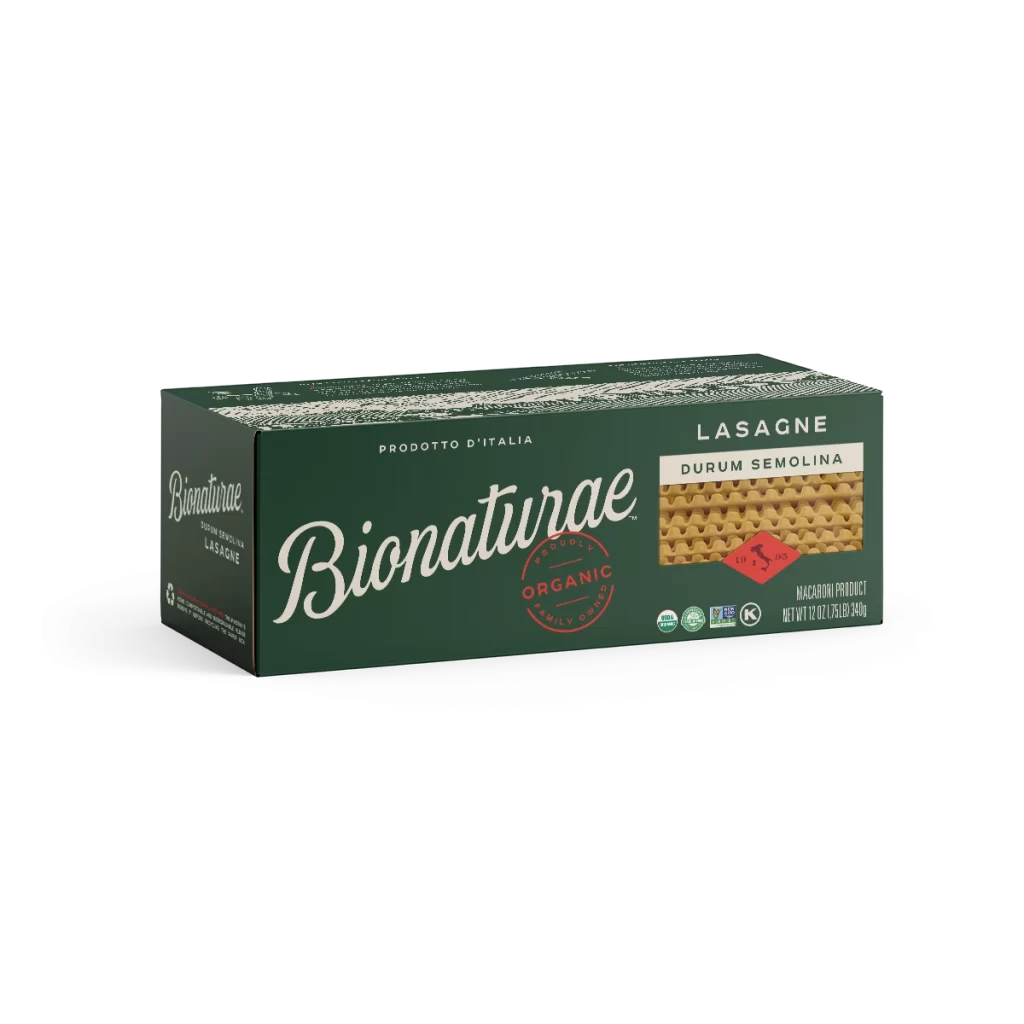
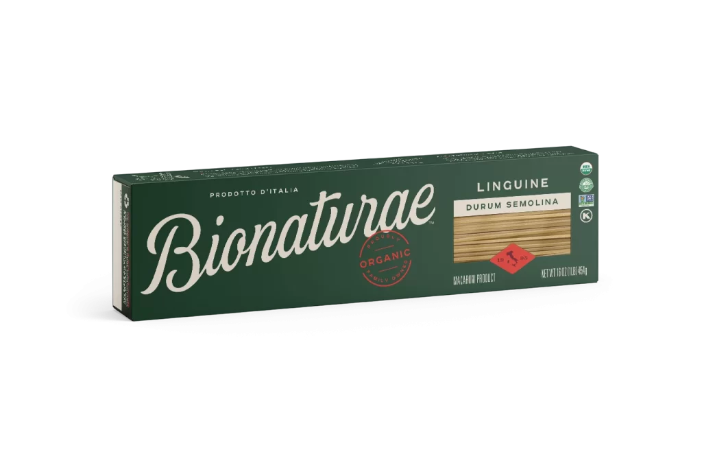
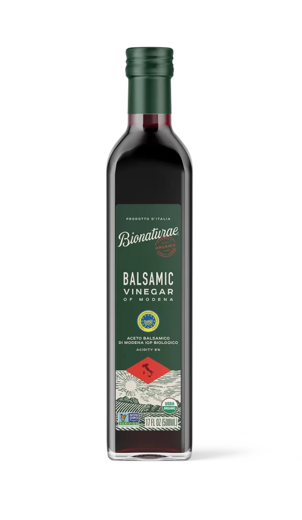
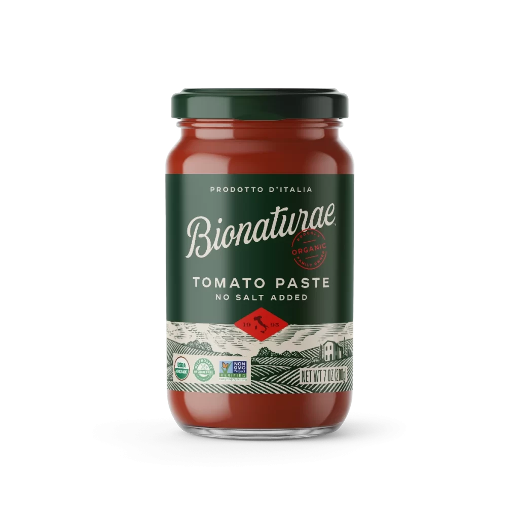
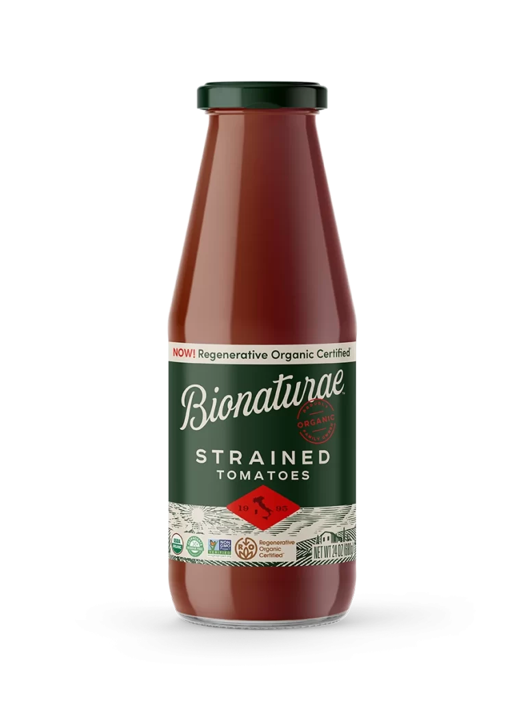
A glass bottle filled with translucent amber liquid dominates the frame with its cylindrical body tapering into a narrow neck sealed by a dark forest-green screw cap. A deep emerald label wraps around the midsection, displaying the brand name 'Bionaturae' in an elegant white script with 'APRICOT NECTAR' set below in clean capital letters, all set against a white background.

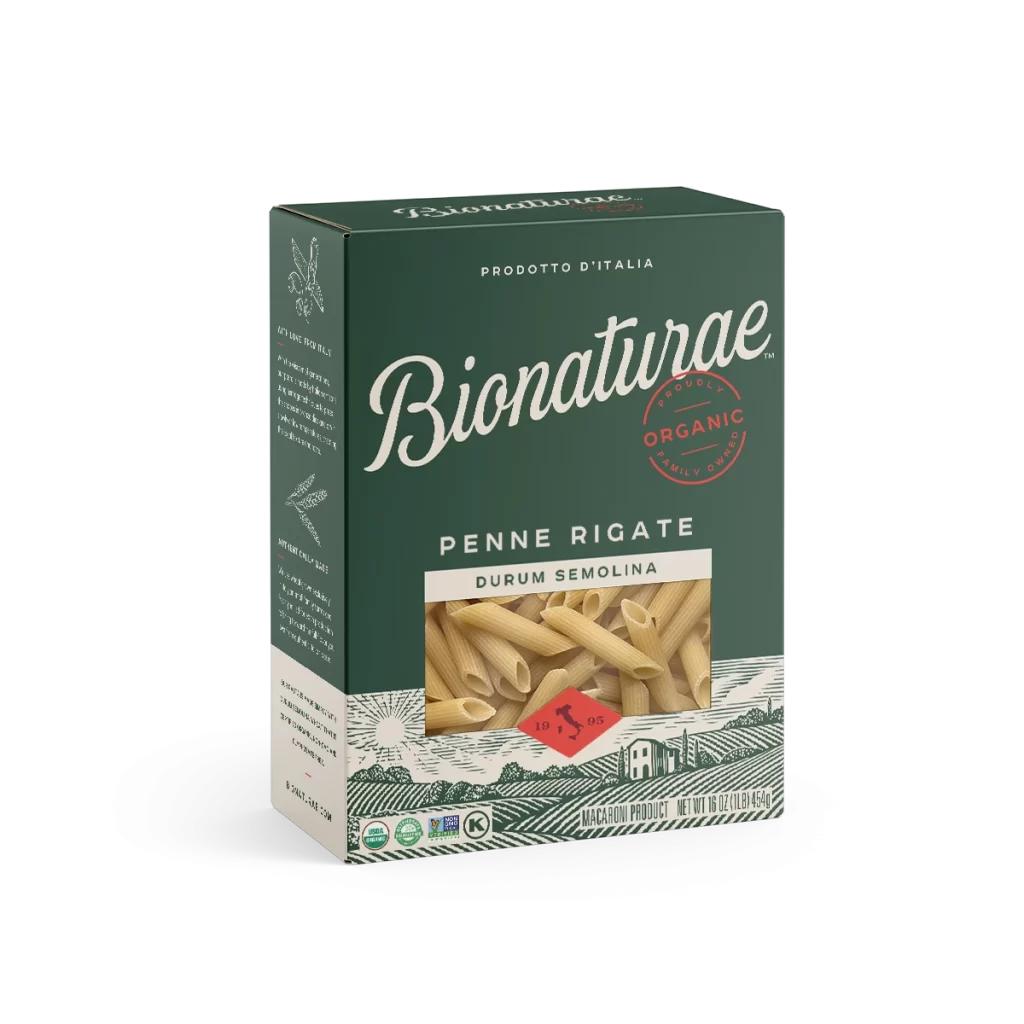
Visual hierarchy is established through the stark contrast between the organic fluidity of the cursive logo and the rigid geometry of the product designation. The inclusion of the Italian map within a crimson geometric shape serves as a potent signifier of provenance, anchoring the artisanal aesthetic. Furthermore, the intricate linework of the landscape etching adds textural depth that balances the flat color fields of the upper label, creating a sophisticated interplay between modern minimalism and traditional craftsmanship.
Brand strategists might examine this composition to understand how heritage markers influence consumer perception of premium food products. Packaging engineers could analyze the specific proportions of the label-to-glass ratio to optimize shelf presence. Additionally, illustrators studying this reference would benefit from observing how monochromatic line art can effectively communicate terroir without overwhelming the primary typographic information.