Bionaturae Durum Semolina Linguine Packaging
Topics
Details
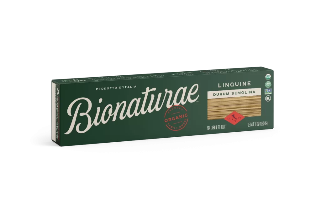
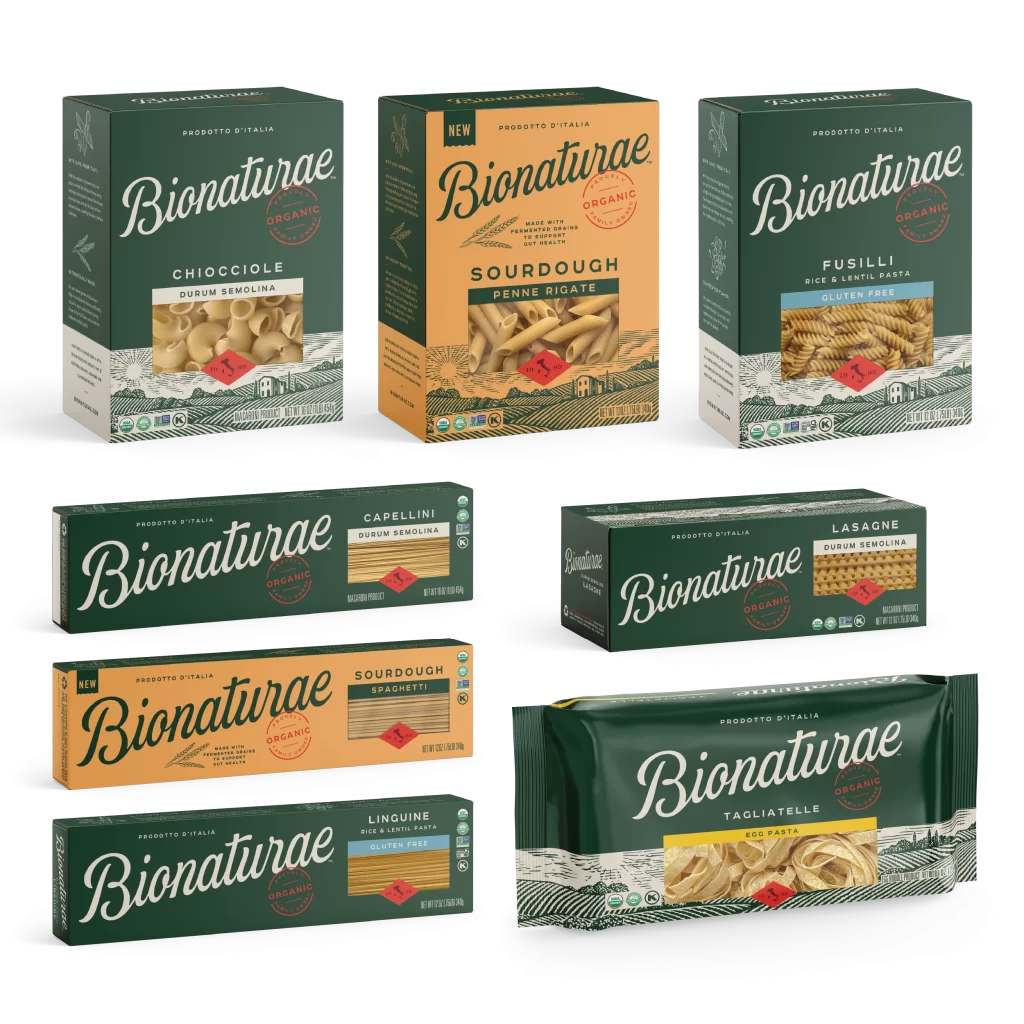
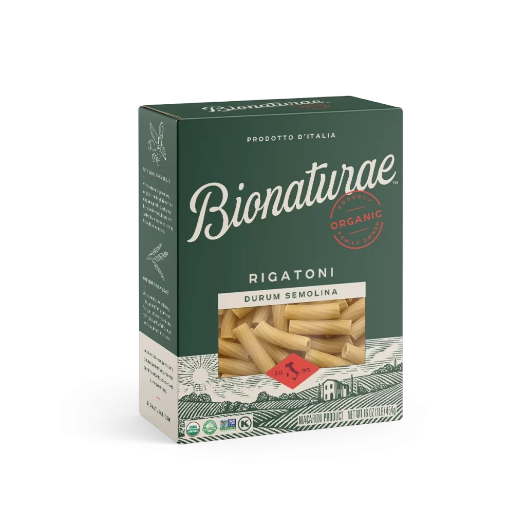
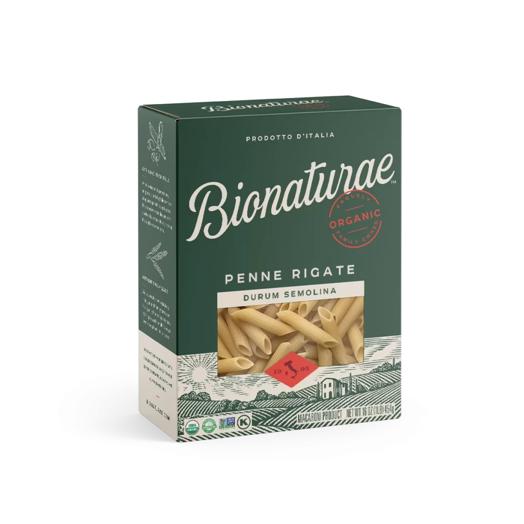
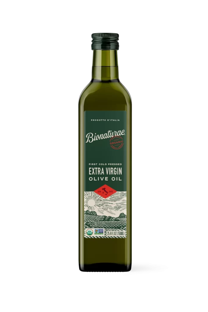
A rectangular dark forest-green carton sits at a slight three-quarter angle, exposing its left side panel and top edge against a white background. The front face displays the brand name 'Bionaturae' in an elegant, flowing white script, positioned above a circular red 'ORGANIC' stamp and beneath the smaller uppercase text 'PRODOTTO D'ITALIA'. To the right, the product type 'LINGUINE DURUM SEMOLINA' appears above a window showing pale golden pasta strands and a small red diamond-shaped seal.

Visual hierarchy on this package relies on the stark contrast between the deep matte green substrate and the crisp white and red typography, creating immediate legibility from a distance. The inclusion of a literal product photograph within a framed box provides tactile authenticity, distinguishing it from purely typographic designs. Furthermore, the combination of Italian heritage labeling with modern certification badges bridges traditional artisanal cues with contemporary health-conscious consumer expectations.
Brand strategists analyzing premium organic food packaging would examine this layout to understand how color psychology communicates natural quality without relying on overt earth tones. Packaging engineers could reference the spatial allocation between branding elements and mandatory regulatory information to optimize their own label designs. Additionally, retail merchandisers might study the three-dimensional presentation angle to determine how this specific orientation affects shelf visibility and customer engagement in physical store environments.