Title

Bionaturae Durum Semolina Rigatoni Image 01 Packaging


Topics

BionaturaePasta

Details

Uploaded user: Leo

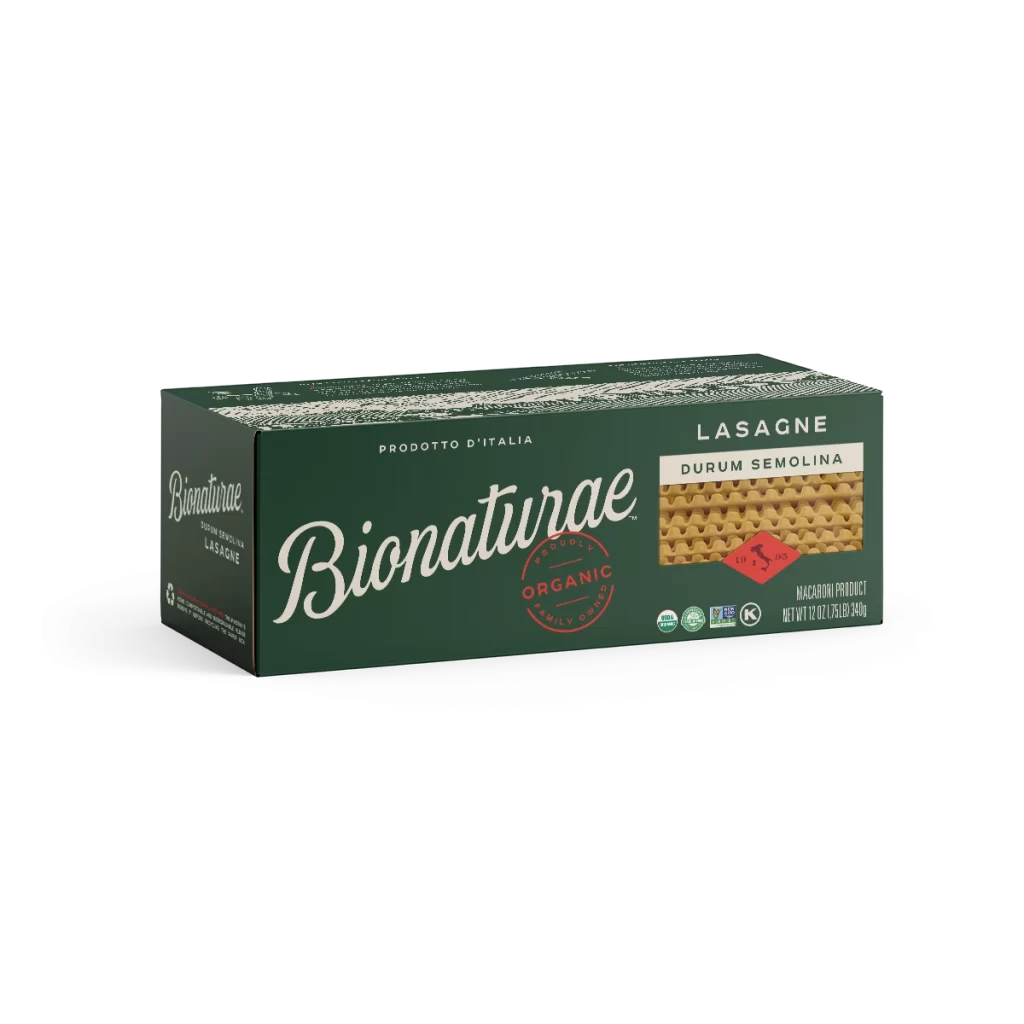
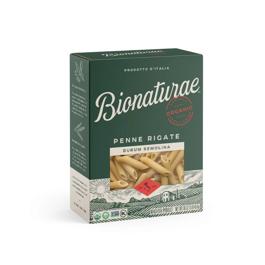
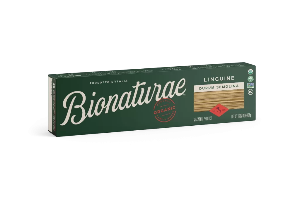
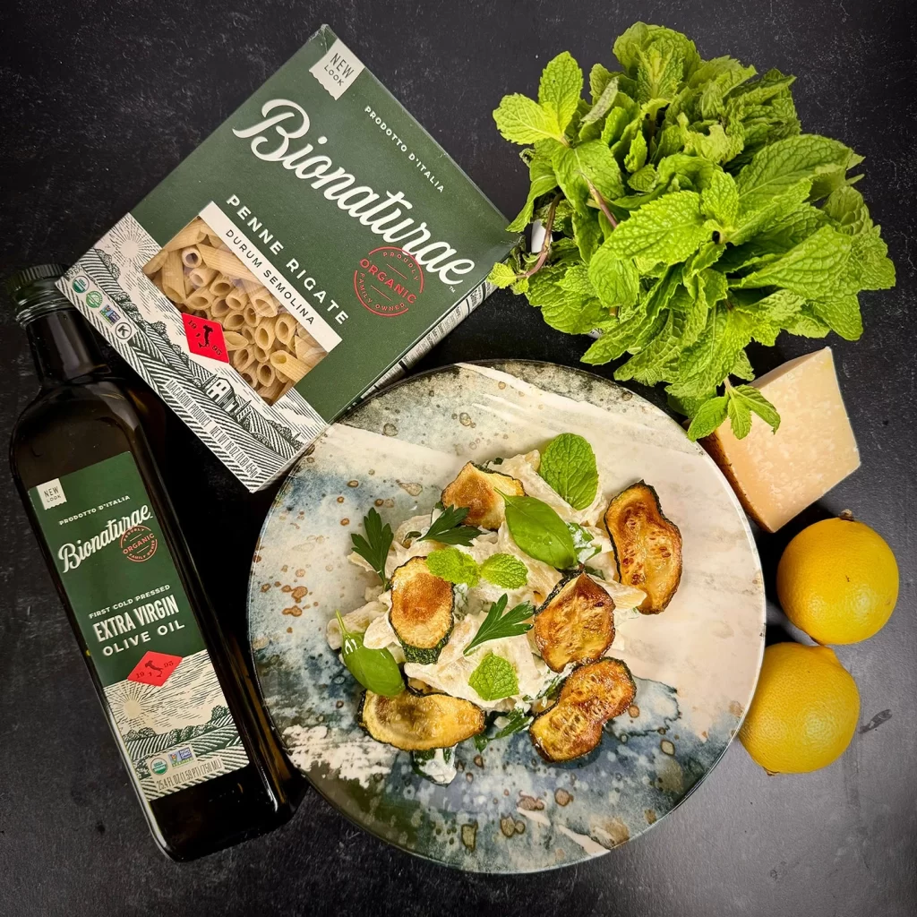
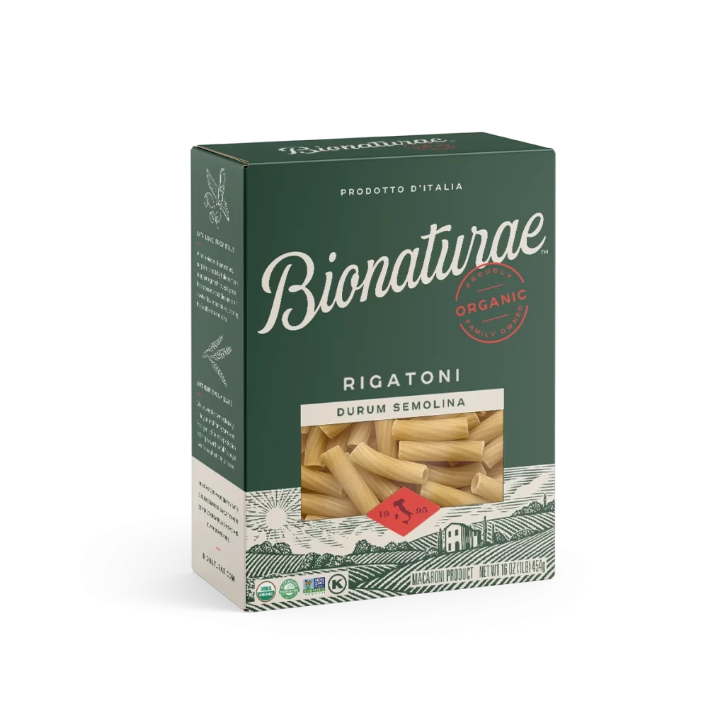
A dark forest-green cardboard carton stands at a slight three-quarter angle, revealing its front and left side panels against a white backdrop. The packaging features the brand name 'Bionaturae' in an elegant, white cursive script positioned above the product type 'RIGATONI' and 'DURUM SEMOLINA' in clean sans-serif capitals. A rectangular transparent window displays the pale golden rigatoni pasta inside, while the lower portion showcases an illustrated pastoral landscape with rolling hills, a farmhouse, and a red diamond containing the year 1905.

Visual distinction arises from the sophisticated color palette, which pairs deep hunter green with off-white and terracotta accents to evoke an artisanal, European aesthetic. The typography creates a compelling hierarchy by mixing fluid, traditional lettering for the brand identity with rigid, modern fonts for technical specifications. Furthermore, the inclusion of detailed line-art illustrations of wheat stalks on the side panel adds textural depth that contrasts with the photographic realism of the pasta visible through the die-cut window.

Brand strategists might examine this composition to understand how premium organic food products utilize heritage-inspired graphics to convey authenticity and quality. Packaging engineers could reference the structural layout to study how transparency elements are integrated into solid-color designs without compromising visual balance. Additionally, illustrators may find value in the stylized landscape motif as a case study for applying vintage engraving techniques to contemporary consumer goods.