Title

Bionaturae Organic Sourdough Spaghetti Packaging


Topics

BionaturaePasta

Details

Uploaded user: Leo

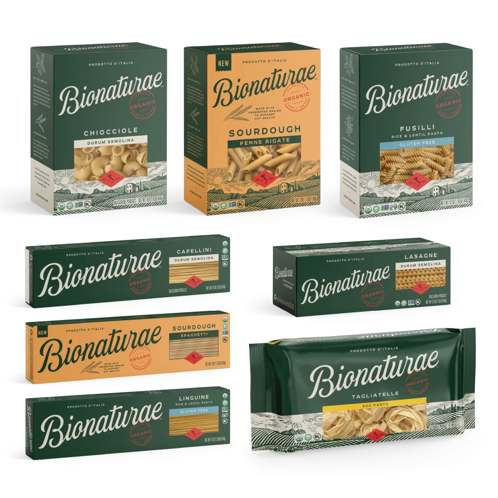
A rectangular cardboard box of Bionaturae Organic Sourdough Spaghetti sits at a slight three-quarter angle, revealing its left side panel and front face against a white background. The packaging features a warm, matte orange base color that contrasts with the dark forest green typography used for the brand name and the solid cap running along the top edge. Soft, diffused studio lighting illuminates the product.

Visual interest is generated through the sophisticated interplay between the rustic, hand-drawn quality of the ‘Bionaturae’ script font and the clean, sans-serif block lettering used for the product type. The inclusion of a realistic photographic window of the spaghetti adds a tactile element that breaks up the flat graphic design, while the strategic placement of the wheat stalk illustration anchors the lower-left quadrant. This specific iteration balances traditional Italian heritage cues, such as the ‘Prodotto d’Italia’ text, with modern health-conscious labeling like the fermented grains claim.

Brand strategists analyzing premium food market trends would utilize this visual to study how artisanal cues are integrated into mass-market packaging layouts. Packaging engineers might examine the structural composition and the placement of nutritional information versus branding elements to optimize their own shelf-ready designs. Furthermore, color theorists could reference the specific orange and green palette to understand how earthy tones are effectively employed to signal organic and natural product qualities to consumers.