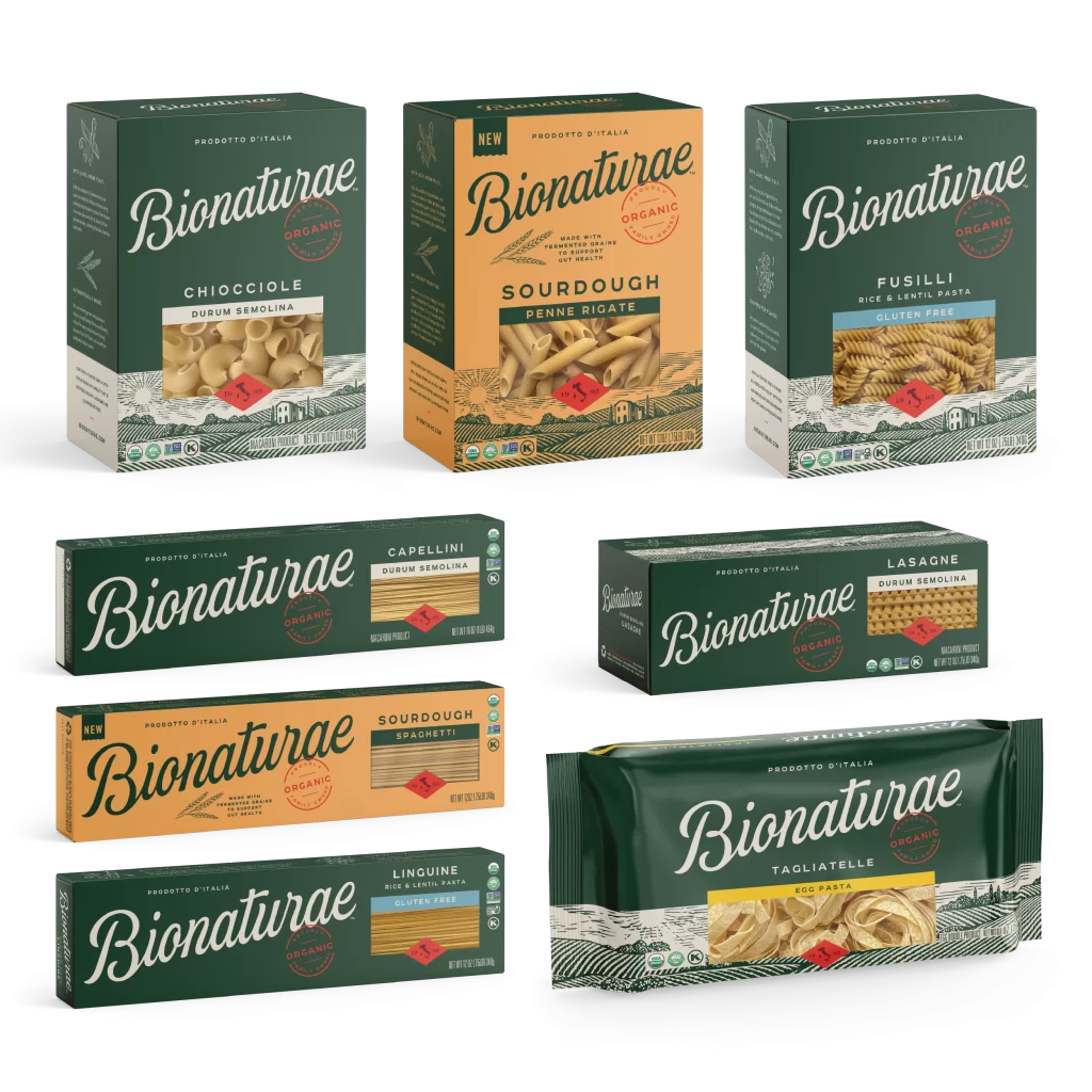
Bionaturae Durum Semolina Capellini Image 01 Packaging
Topics
Details
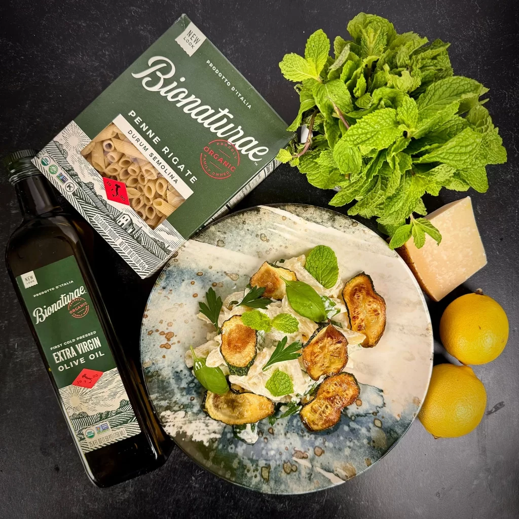
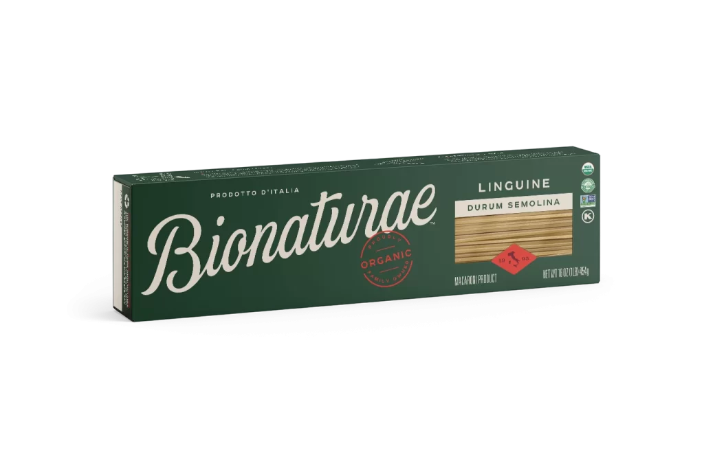
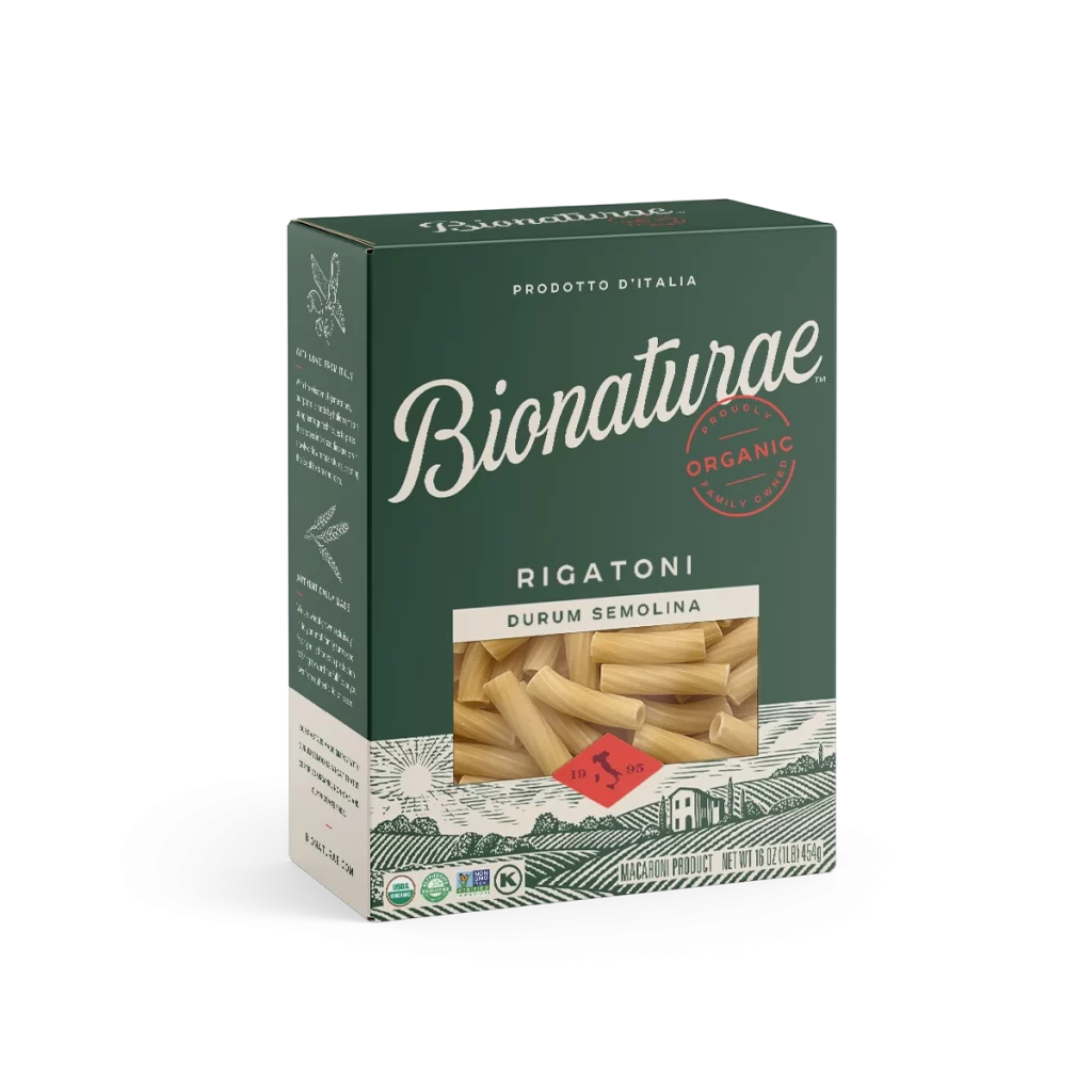
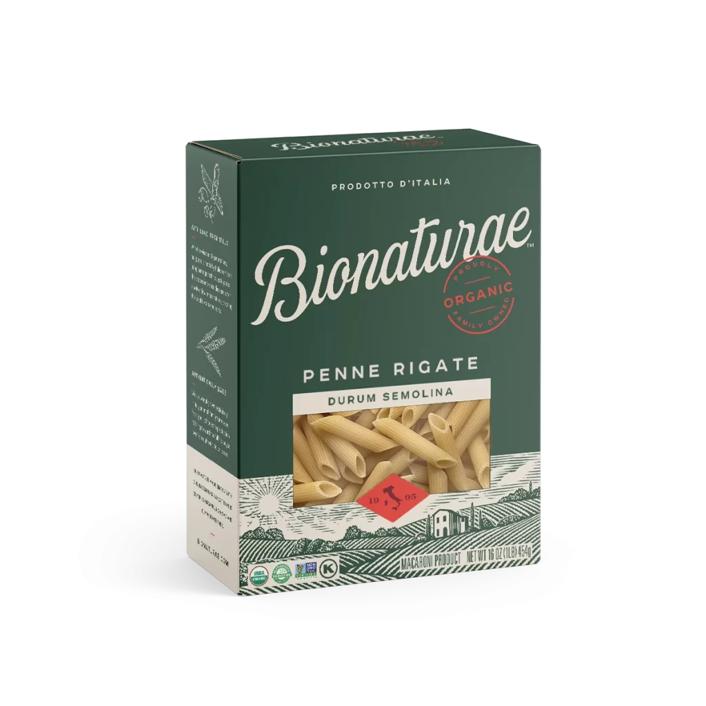
A rectangular dark forest-green pasta box sits at a slight three-quarter angle, revealing its front face and left side panel on a white surface. The packaging features the brand name 'Bionaturae' in large, elegant cream-colored cursive script, positioned above a circular red stamp that reads 'ORGANIC' and 'FAMILY OWNED.' To the right, the product
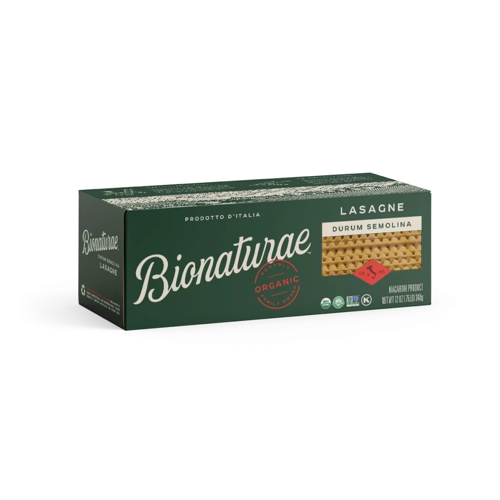
Visual distinction emerges from the sophisticated contrast between the deep hunter-green substrate and the warm ivory typography, creating a premium organic aesthetic that stands apart from conventional bright-white pasta packaging. The red organic seal acts as a focal point that draws immediate attention to the product’s ethical positioning, while the realistic texture rendering of the durum semolina strands provides tactile visual cues about the actual contents. Balanced asymmetry in the layout—placing heavy branding on the left and product specifics on the right—guides the eye naturally across the surface without feeling cluttered.


Brand strategists developing eco-conscious food packaging could analyze this composition to understand how earth-tone palettes communicate sustainability without sacrificing elegance. Packaging engineers might reference the spatial arrangement of regulatory symbols versus marketing copy when planning compliance-friendly designs for imported goods. Retail merchandisers evaluating shelf presence could study how the three-quarter perspective reveals dimensional information while maintaining clear brand recognition from a distance.