Bionaturae Tomato Paste Packaging
Topics
Details
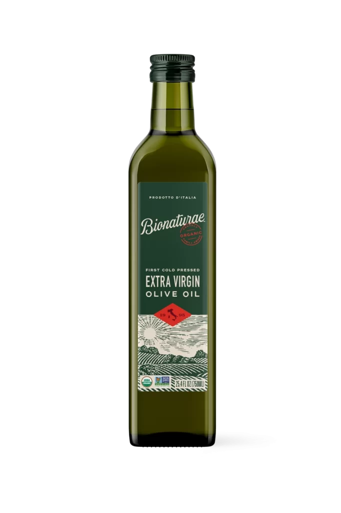
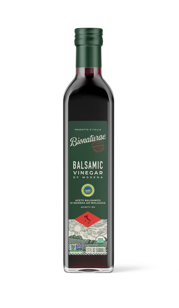
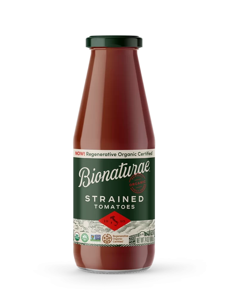
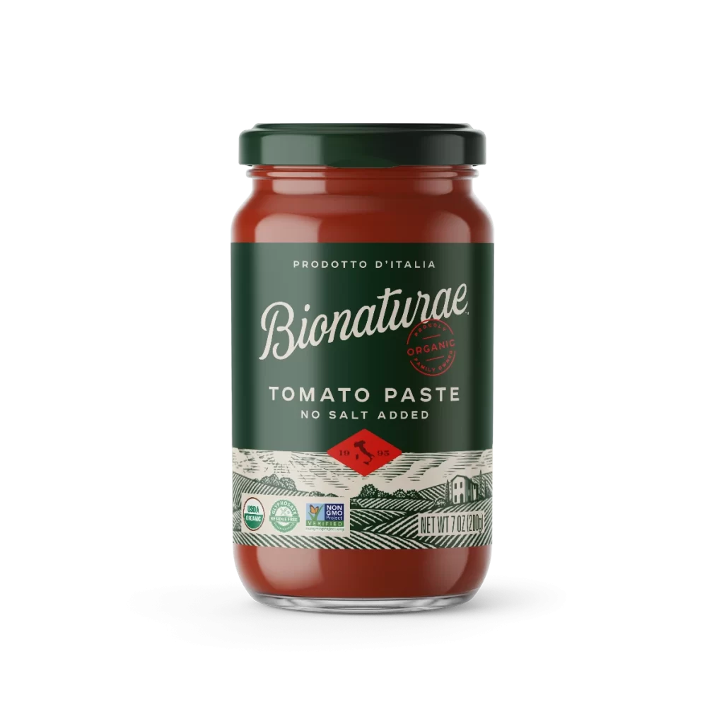
A cylindrical glass jar of Bionaturae tomato paste stands in a direct, eye-level studio shot on a white background. The container features a dark green metal lid and a deep forest-green label that contrasts sharply with the vibrant reddish-orange paste visible through the clear glass. Prominent white serif typography spells out the brand name, while a red diamond containing th
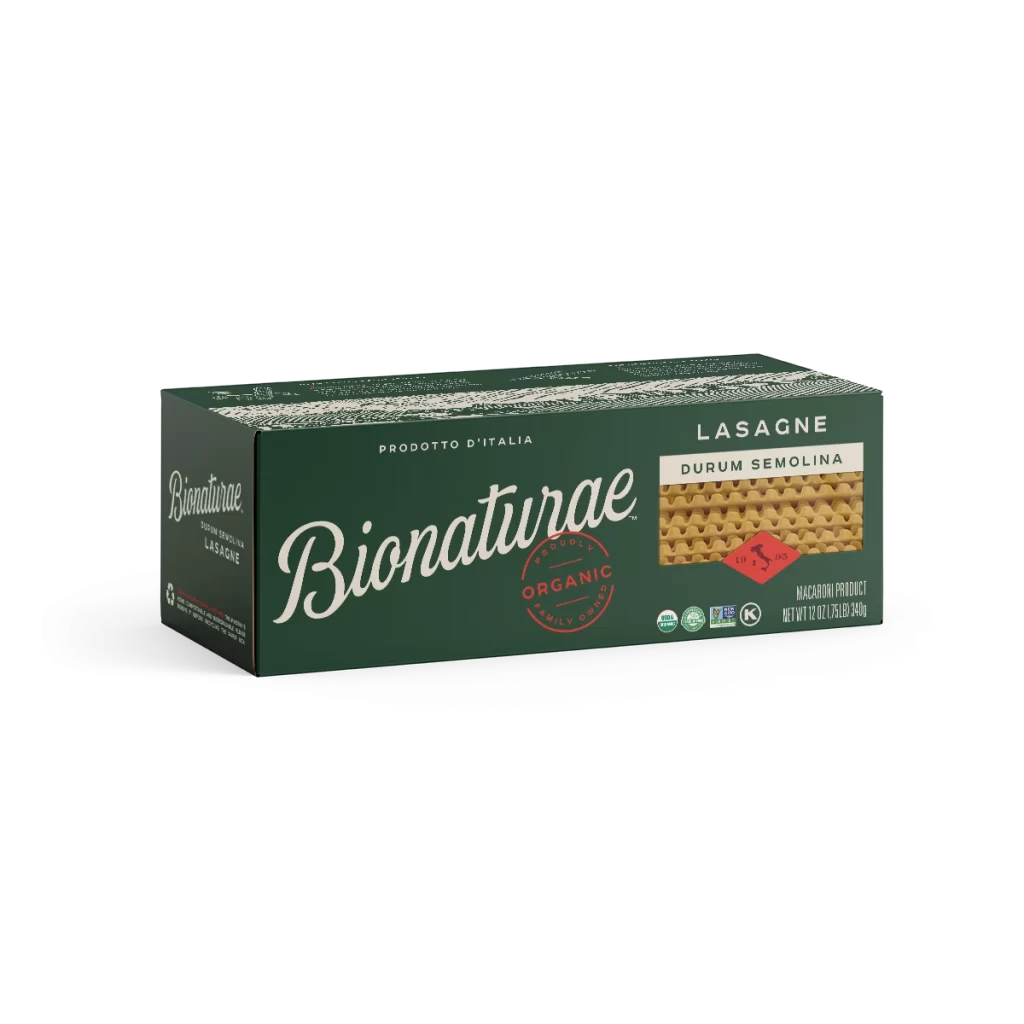
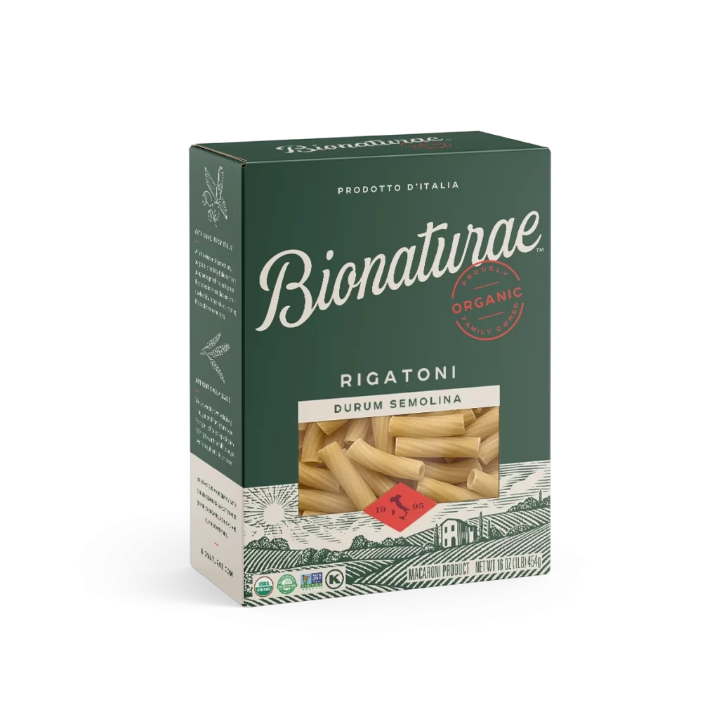
Visual distinction arises from the sophisticated interplay between the organic, hand-drawn aesthetic of the landscape illustration and the clean, authoritative placement of certification badges. The color palette deliberately evokes traditional Italian heritage through its use of forest green and crimson, while the ‘No Salt Added’ claim and USDA Organic seal provide modern functional clarity. Such a composition balances artisanal charm with the rigorous requirements of contemporary food labeling standards.
Brand strategists might examine this layout to understand how heritage cues can be integrated into minimalist packaging systems without appearing cluttered. Illustrators could study the linework of the pastoral scene to inform their own work on food-related iconography or vintage-style packaging motifs. Additionally, packaging engineers may reference the spatial arrangement of regulatory seals to optimize their own label designs for both aesthetic appeal and legal compliance.