Title

Bionaturae Durum Semolina Fusilli Image 01 Packaging


Topics

BionaturaePasta

Details

Uploaded user: Leo

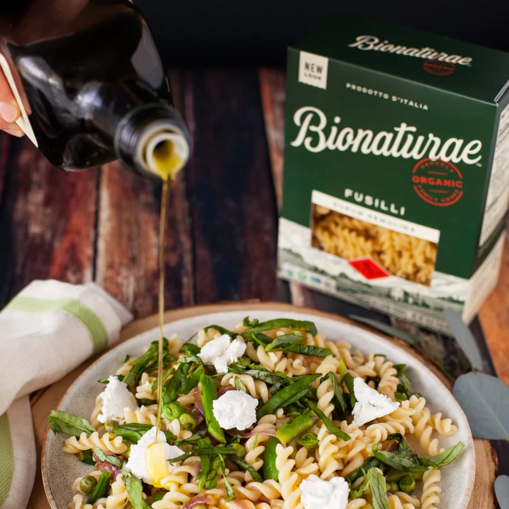
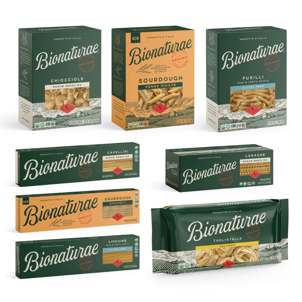
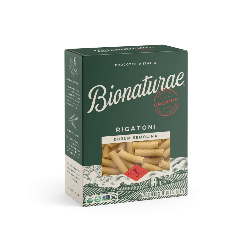
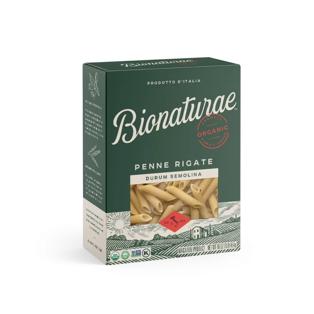
A rectangular cardboard carton of Bionaturae Fusilli stands in a three-quarter perspective that reveals both the front face and the left side panel against a white background. Deep forest green dominates the packaging, punctuated by cream-colored typography and a circular red stamp declaring the product as organic. A transparent window bisects the lower half, offering a view of the golden durum semolina fusilli pasta within.

Visual hierarchy is established through the elegant, flowing script of the brand name, which contrasts sharply with the utilitarian sans-serif used for the product specifications below. The integration of the transparent die-cut window serves a dual purpose: it breaks up the solid color field while simultaneously providing tactile proof of the contents’ quality and texture. Furthermore, the juxtaposition of modern certification logos at the bottom against the vintage-style agricultural engraving creates a compelling narrative bridge between traditional craftsmanship and contemporary organic standards.

Brand strategists and packaging engineers might examine this composition to understand how color psychology and typographic pairing influence consumer perception of premium organic goods. Art directors working on food photography campaigns could utilize this angle to plan their own studio setups, noting how soft, diffused lighting eliminates harsh shadows on matte cardboard surfaces. Additionally, illustrators studying the intricate line work of the landscape graphic could find inspiration for creating authentic, heritage-driven visual identities within the sustainable foods sector.