Bionaturae Organic Extra Virgin Olive Oil 3l Packaging
Topics
Details
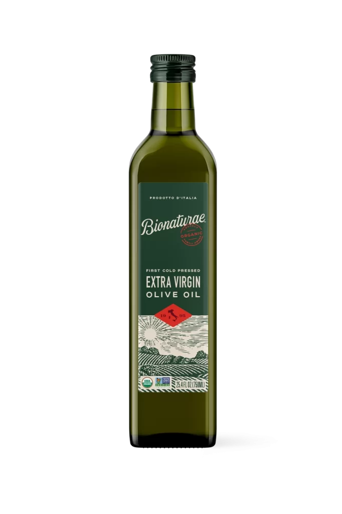
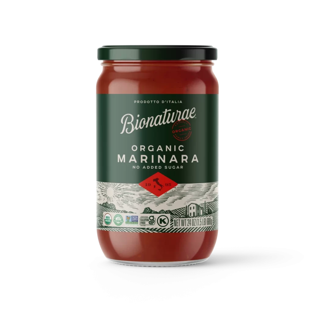
A tall rectangular metal tin stands in a three-quarter view, showcasing its deep forest green upper half and cream-colored lower section on a white surface. The packaging features elegant white typography, with the brand name 'Bionaturae' rendered in a flowing script font above bold sans-serif text announcing 'First Cold Pressed Extra Virgin Olive Oil.' A red circular organic seal appears to the right of the brand name, while a red diamond containing a rooster silhouette sits above an etched landscape illustration of rolling fields and a sun at the bottom.
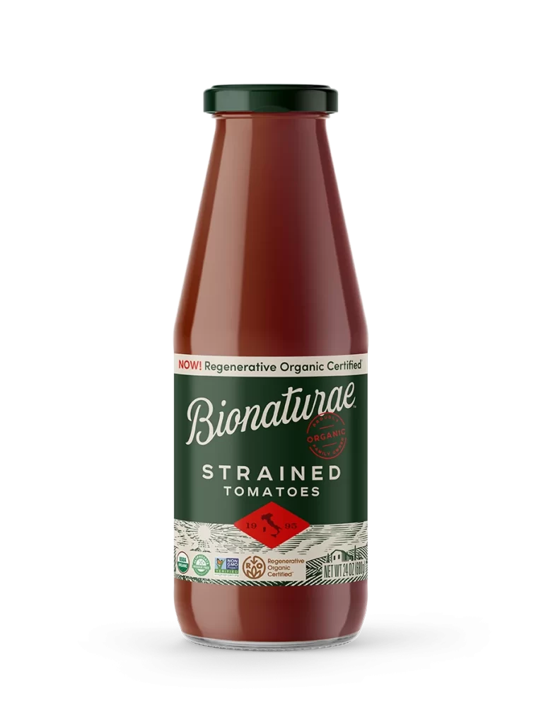
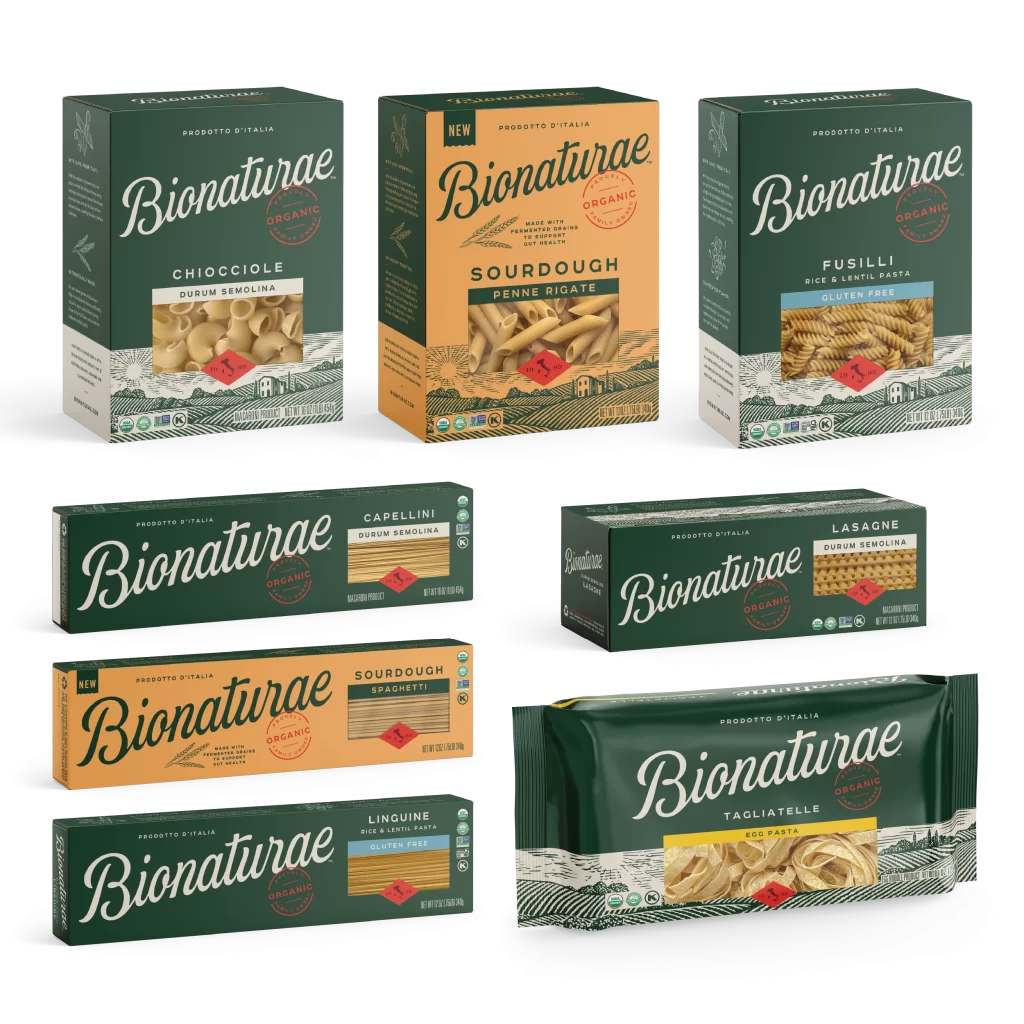
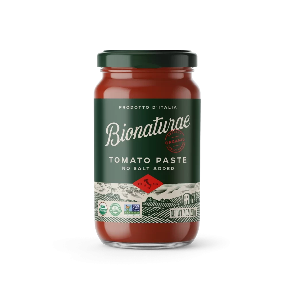
Visual interest stems from the sophisticated interplay between the matte metallic finish and the vintage-inspired graphic elements that evoke traditional Italian printmaking techniques. The color palette creates strong contrast between the dark hunter green and the off-white base, making the intricate line art of the olive branch on the side panel and the pastoral landscape particularly striking. This specific iteration balances modern minimalism with rustic charm through its clean layout and thoughtful use of negative space around the certification badges.

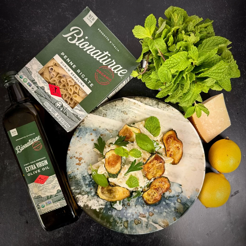
Packaging designers studying sustainable container solutions would find this tin format valuable for understanding how premium food brands communicate quality through material choice and illustration style. Brand identity professionals could analyze the typographic hierarchy and color psychology used to convey organic authenticity without relying on overtly ‘natural’ visual clichés. Illustrators interested in contemporary applications of traditional engraving methods might reference the textural details in the landscape rendering for their own commercial work.