Bionaturae Strained Tomatoes Image 02 Packaging
Topics
Details
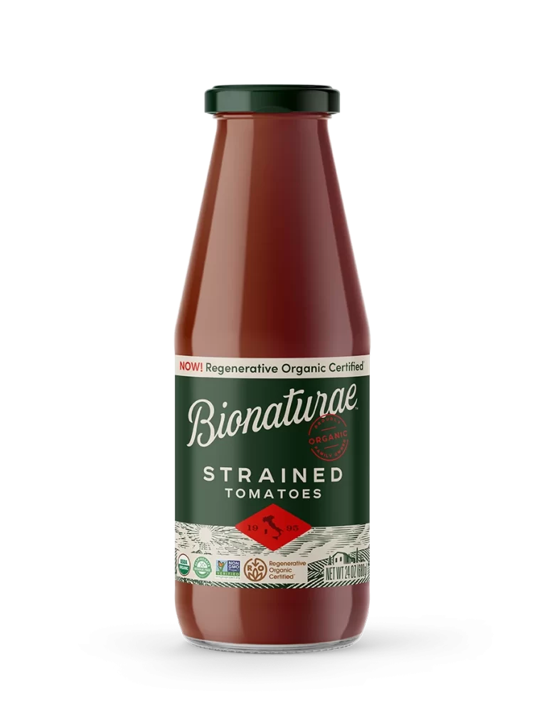
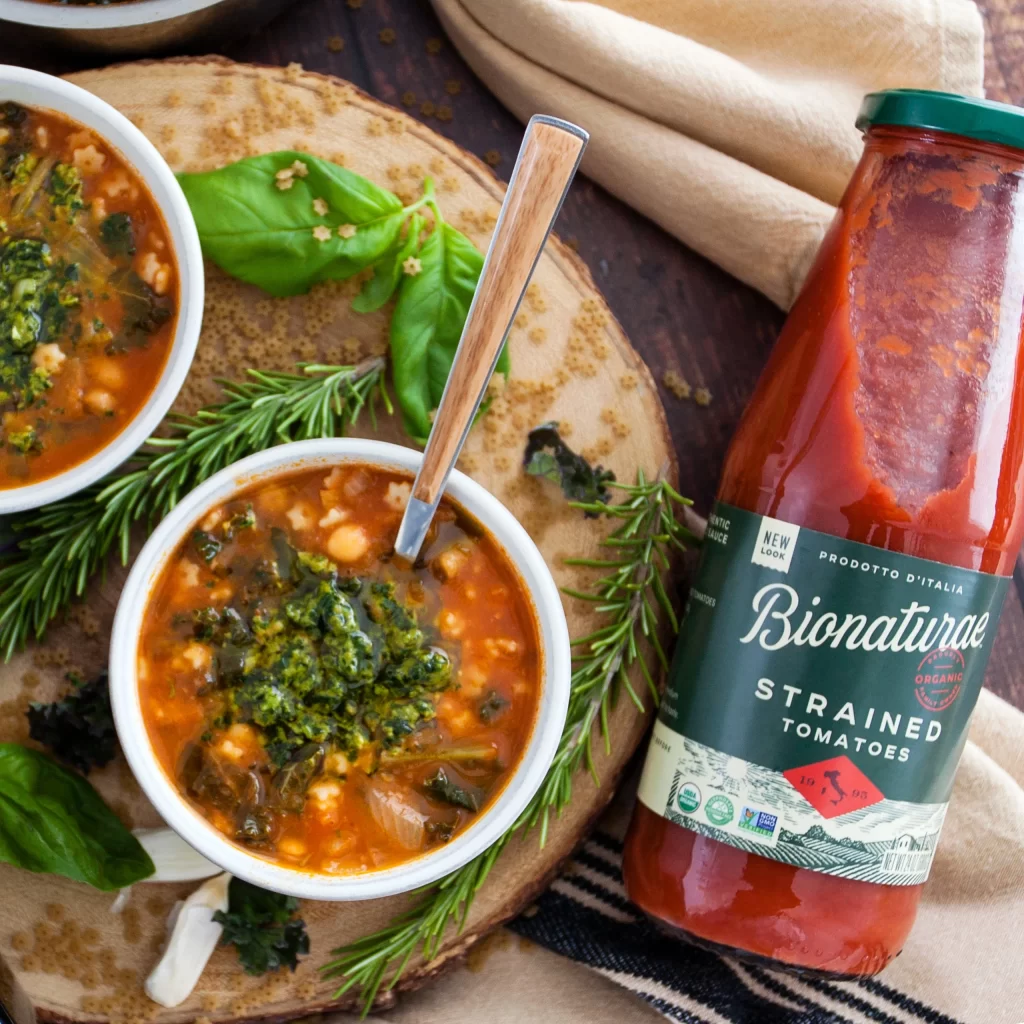
From a slightly elevated perspective, the composition centers on a tall glass bottle of Bionaturae Strained Tomatoes, its deep green label featuring elegant white cursive script and bold sans-serif text. The bottle's transparent glass reveals the vibrant red contents within, sealed by a dark green metal cap, while the label displays 'Prodotto d'Italia' and organic certification marks. Surrounding this focal point are two white ceramic bowls filled with a hearty orange-red soup garnished with green pesto, resting on a rustic wooden board alongside fresh basil leaves, rosemary sprigs, and a folded beige linen napkin.
The packaging design distinguishes itself through its sophisticated color palette of forest green and cream against the product's natural red hue, creating strong visual contrast that draws immediate attention to the brand name. Typography choices blend traditional Italian aesthetics with modern clarity, where the flowing script of 'Bionaturae' balances the utilitarian block letters below. This particular labeling approach emphasizes artisanal quality while maintaining shelf presence through strategic use of negative space and hierarchical information placement.
Food photographers studying prop arrangement and color theory will find valuable guidance in how warm tomato tones interact with cool green botanical elements and neutral ceramic surfaces. Brand designers analyzing premium organic packaging can reference the label's layout structure, font pairing decisions, and certification badge integration for similar product categories. Recipe developers documenting ingredient styling might examine the lighting techniques used to highlight liquid transparency and texture without creating harsh reflections on curved glass surfaces.