Bionaturae Organic Pear Nectar Packaging
Topics
Details
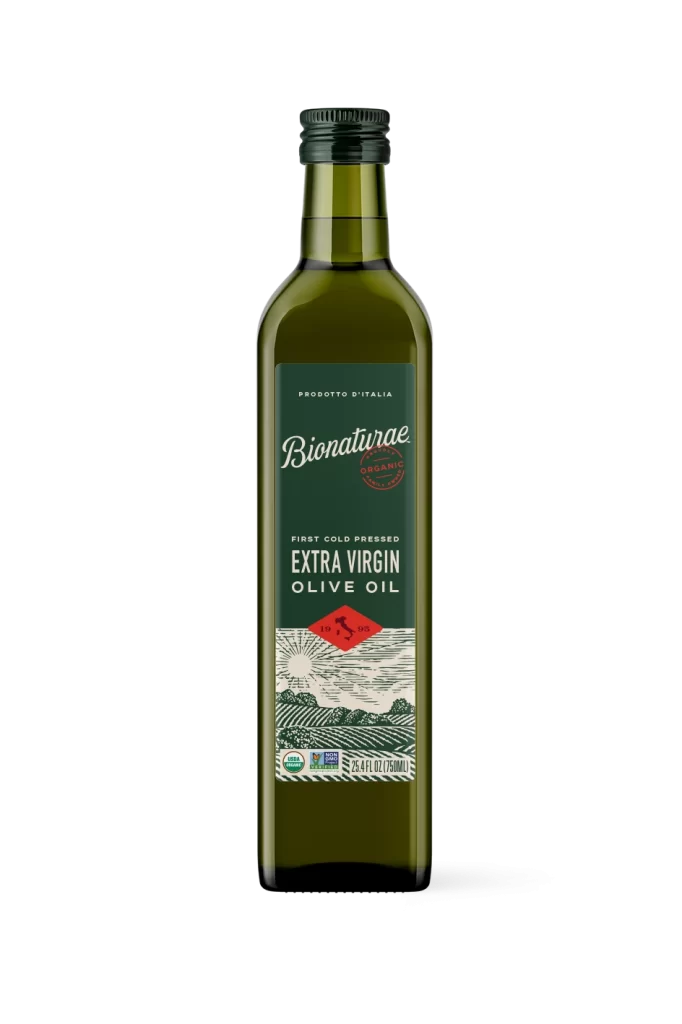
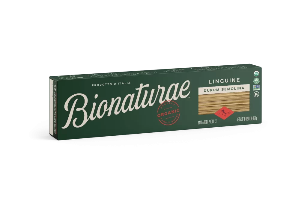
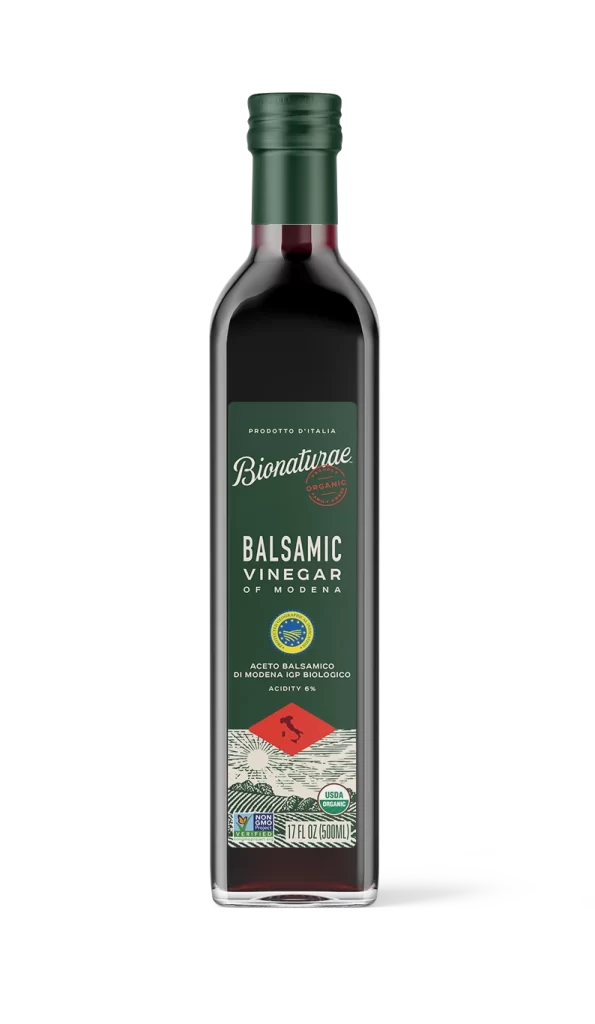
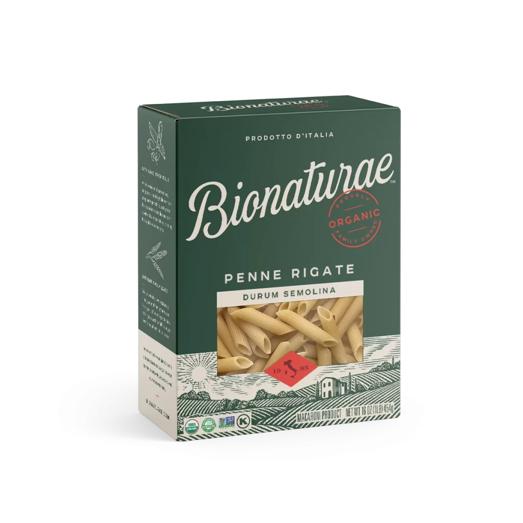
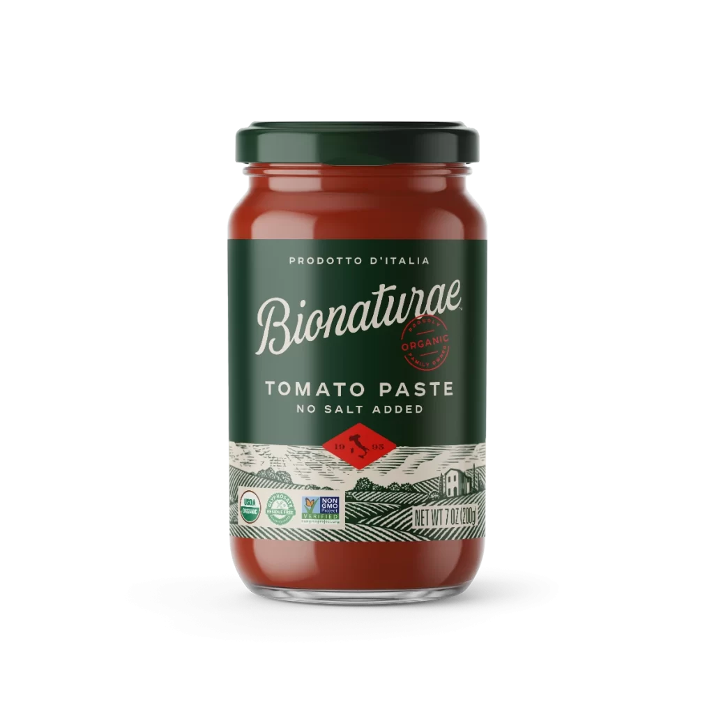
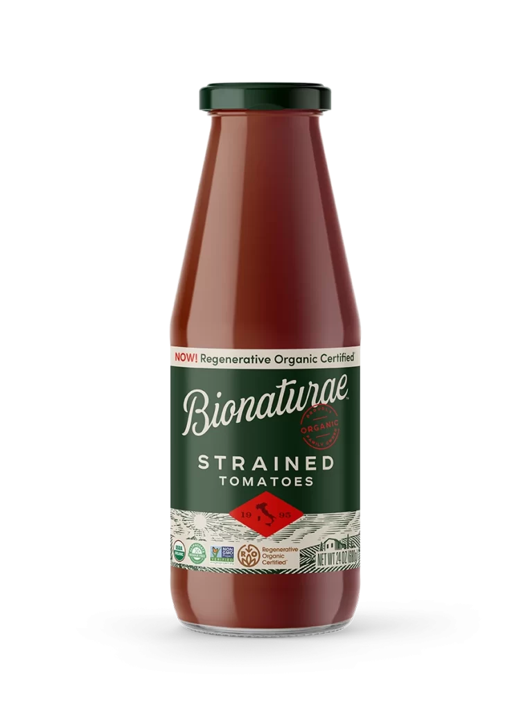
A clear glass bottle filled with pale, creamy yellow liquid stands as the sole subject of the composition. A dark forest-green label wraps around the vessel's midsection, featuring the brand name 'Bionaturae' in an elegant white script font positioned above the bold, sans-serif text 'PEAR NECTAR'. The design is anchored by a red diamond emblem containing a map of Italy and the year 1905, set against a white background.
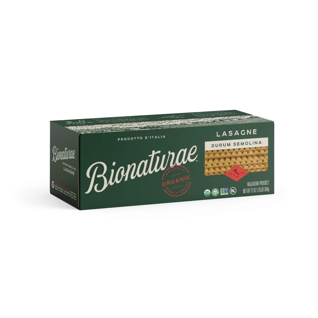
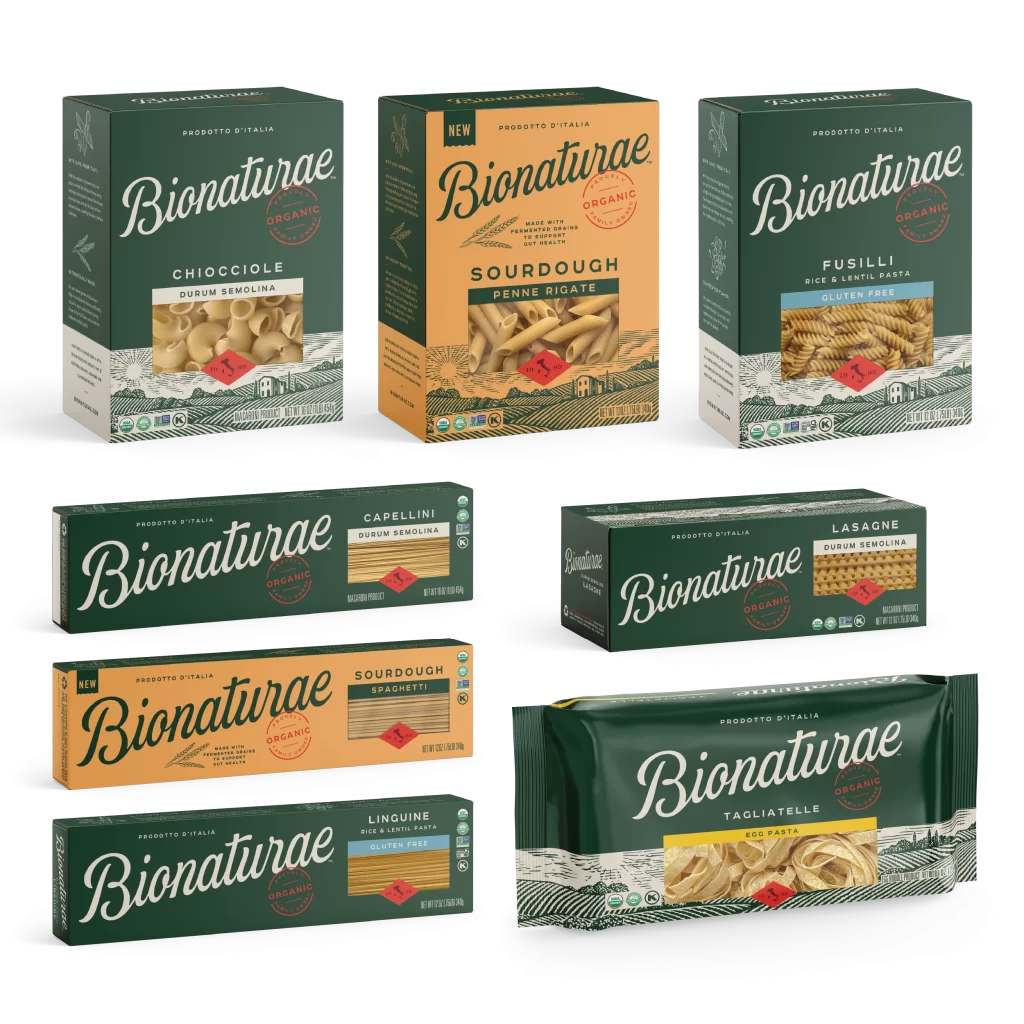
Visual interest is generated through the sophisticated interplay between the organic fluidity of the cursive typography and the rigid geometry of the red diamond emblem. The choice of a deep, earthy green background for the label creates a striking contrast that makes the white lettering pop while simultaneously evoking themes of nature and organic farming. Furthermore, the intricate woodcut-style landscape illustration at the base adds a layer of artisanal craftsmanship, distinguishing this packaging from more minimalist or purely typographic approaches commonly found on grocery shelves.
Brand strategists analyzing premium food and beverage markets would find this example particularly useful for studying how heritage cues are integrated into modern packaging layouts. Packaging engineers might examine the specific proportions of the label relative to the bottle’s shoulder to understand optimal information hierarchy for glass containers. Additionally, illustrators looking to incorporate vintage agricultural motifs into contemporary designs could study the linework density and stylistic choices used in the pastoral scene at the label’s footer.