Title

Bionaturae Organic Sourdough Penne Packaging


Topics

BionaturaePasta

Details

Uploaded user: Leo

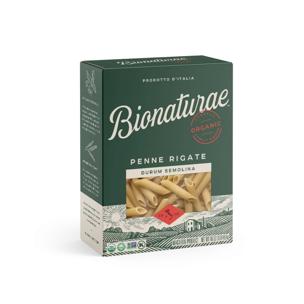
A rectangular cardboard carton of Bionaturae pasta sits at a three-quarter angle, revealing the front face and left side panel against a white background. Warm matte peach-orange dominates the front surface while deep forest green covers the top and side flaps. The brand name 'Bionaturae' appears in elegant dark green script at the center of the front panel.

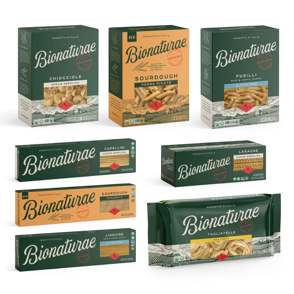
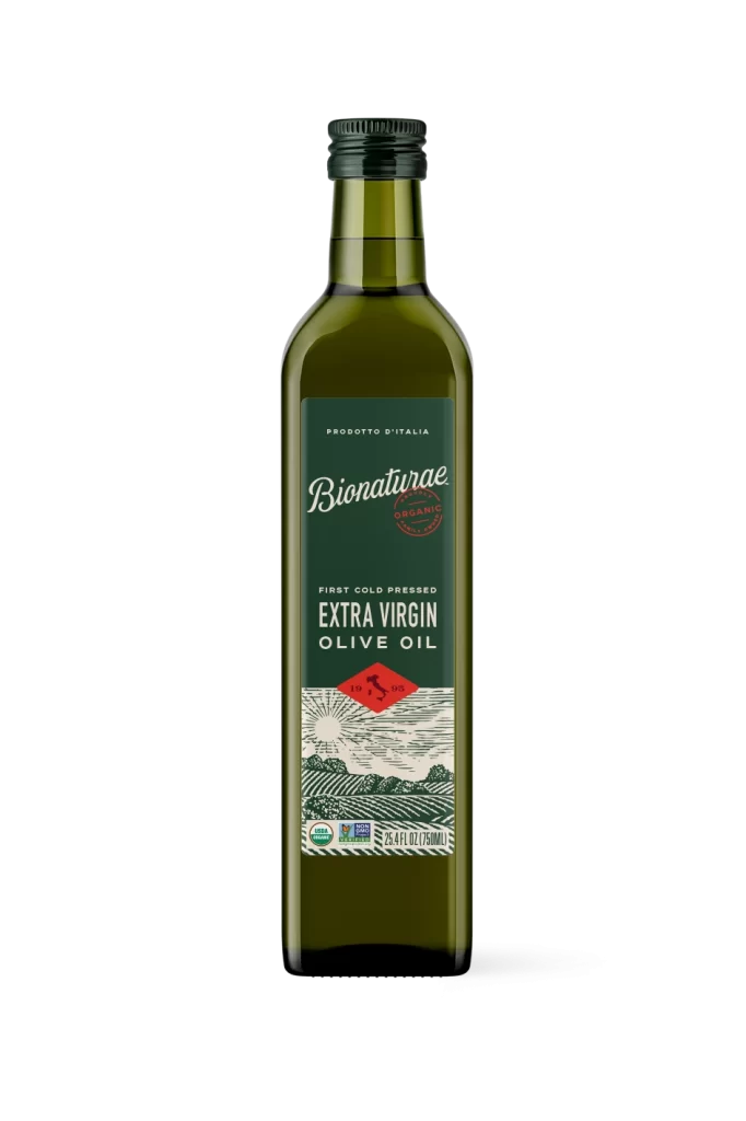
Visual hierarchy is established through the strategic interplay of typographic weights and the circular red ‘ORGANIC’ stamp, which injects a singular pop of color into the otherwise earthy scheme. The inclusion of wheat stalk iconography and the specific claim regarding fermented grains immediately signals a health-conscious, artisanal market positioning distinct from standard mass-market pasta boxes. Furthermore, the intricate etched landscape at the base provides a textural richness that balances the large expanse of solid color above it, creating a cohesive narrative that bridges traditional Italian farming with modern wellness trends.

Brand strategists might analyze this composition to understand how organic certifications are visually integrated into premium food packaging without cluttering the core identity. Packaging engineers could reference the structural layout to study how window placements interact with underlying graphic elements like the red diamond logo. Additionally, illustrators working in the food and beverage sector could utilize the linework style of the pastoral scene as a benchmark for creating vintage-inspired agricultural motifs that convey authenticity and heritage.