Bionaturae Fruit Spread Peach Image 01 Packaging
Topics
Details
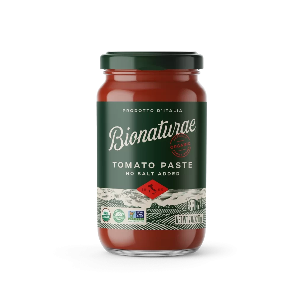
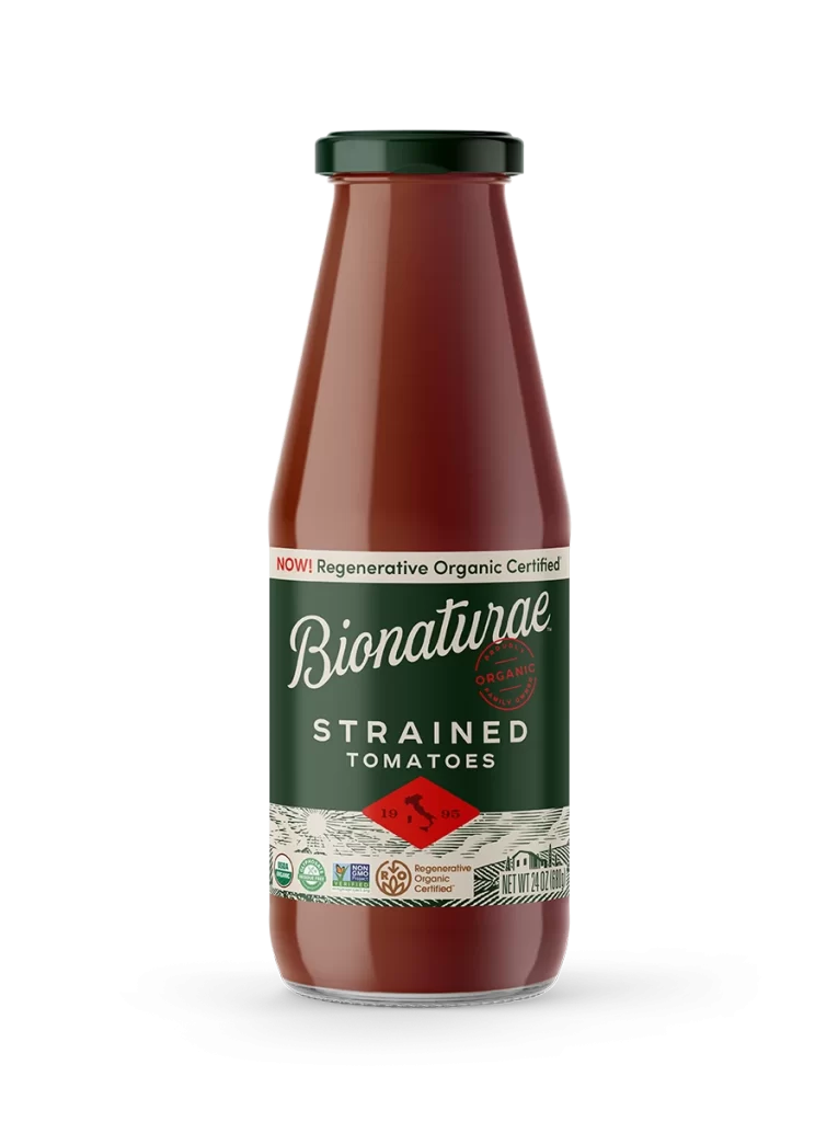
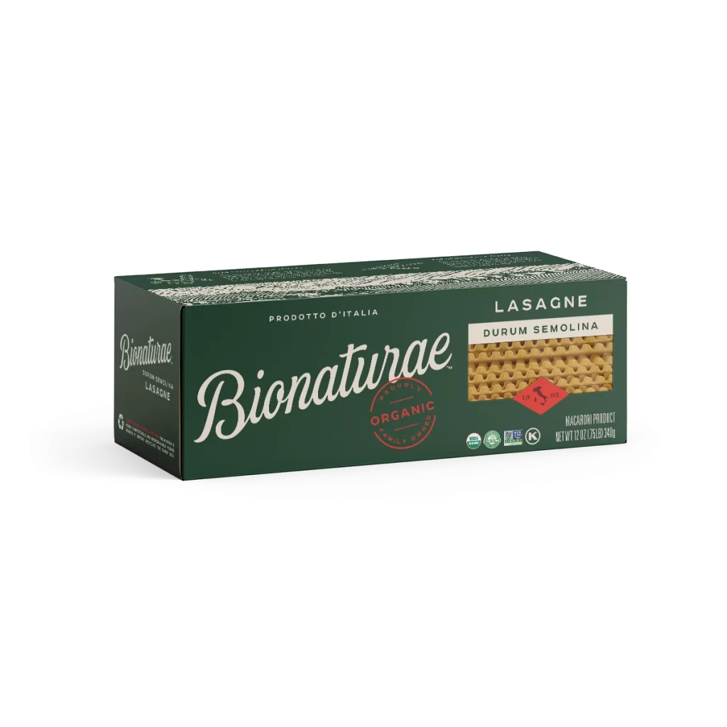
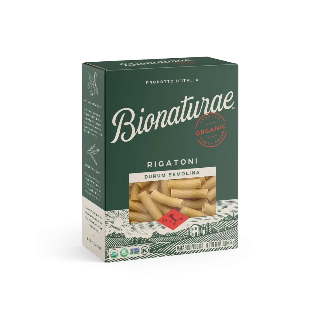
A glass jar of Bionaturae Peach Fruit Spread stands in sharp focus, its clear walls revealing amber-hued contents sealed beneath a dark forest-green metal lid. The container wears a deep emerald label featuring elegant white script for the brand name and clean sans-serif typography for the product description. Below the main text block, an illustrated pastoral landscape with rolling hills and a farmhouse anchors the design against a white backdrop.
Visual distinction emerges from the sophisticated color palette that pairs rich botanical greens with warm peach tones, creating an organic yet premium aesthetic. The typographic hierarchy skillfully balances the flowing cursive of ‘Bionaturae’ against the authoritative weight of ‘PRODOTTO D’ITALIA’ and ‘PEACH FRUIT SPREAD’, while the red diamond emblem containing 19 grams of sugar information adds a strategic pop of contrasting color. Detailed line-art imagery at the label’s base reinforces the artisanal Italian origins without overwhelming the essential nutritional and branding information.
Packaging designers studying organic food labeling trends will find valuable reference material in the spatial arrangement of certification logos versus brand identity elements. Marketing teams developing European-imported gourmet products could analyze how this layout communicates authenticity through both textual claims and illustrative storytelling. Students of commercial photography might examine the even lighting technique that eliminates glare on curved glass surfaces while maintaining accurate color representation of translucent food products.