Bionaturae Gluten Free Rice Lentil Linguine Packaging
Topics
Details
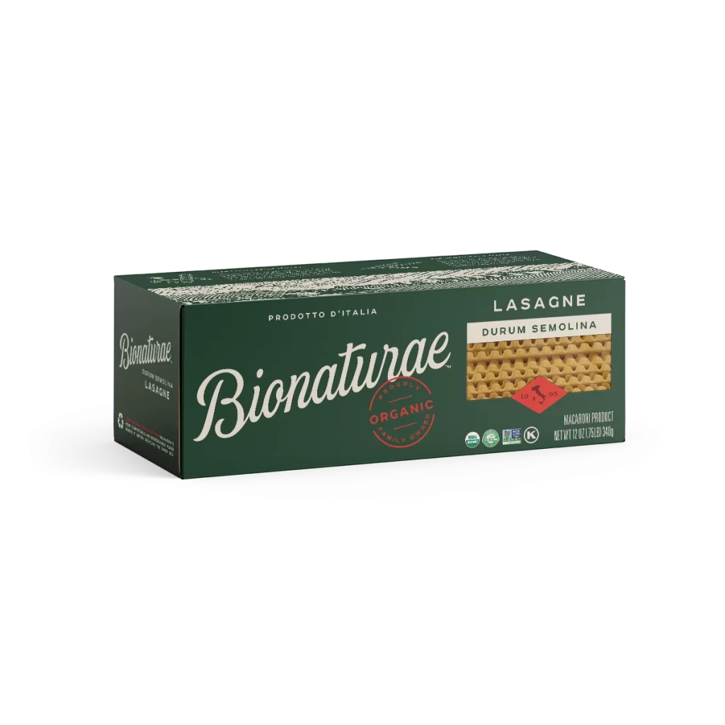
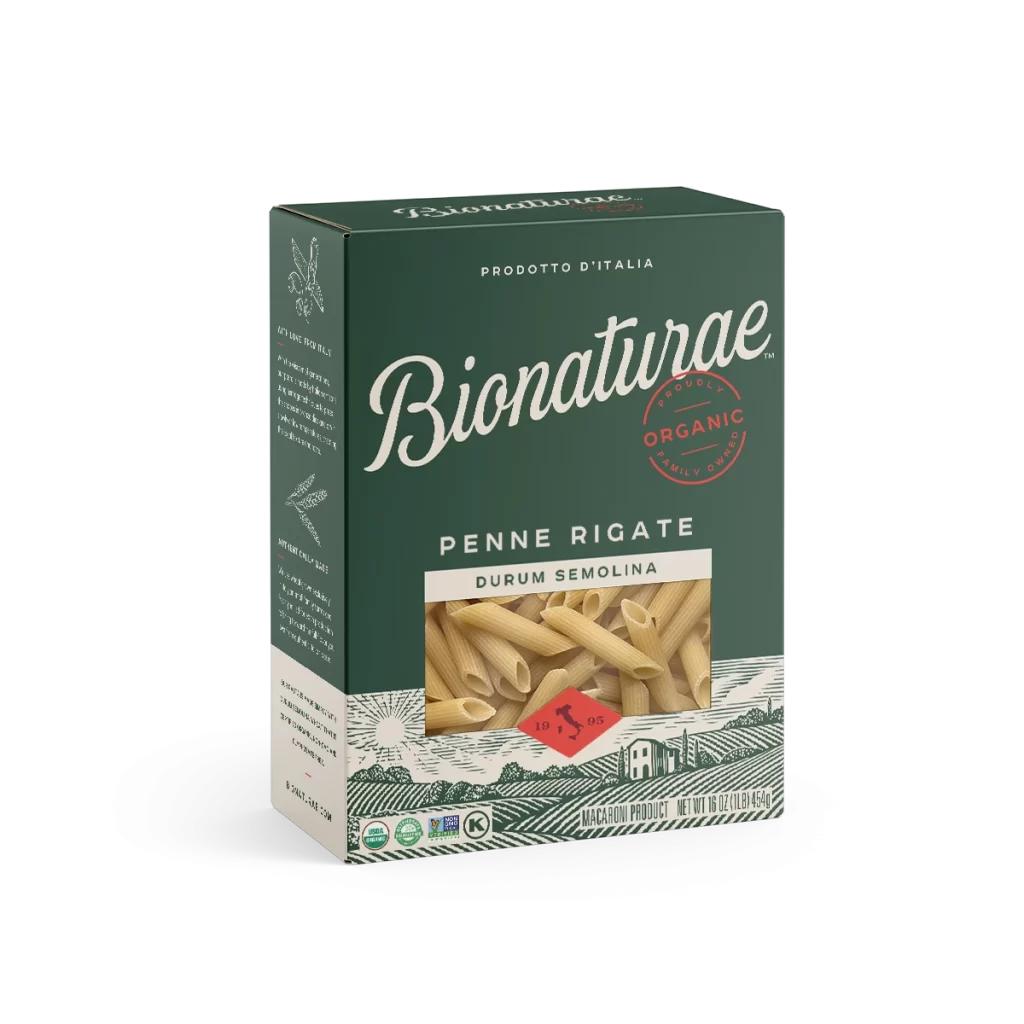
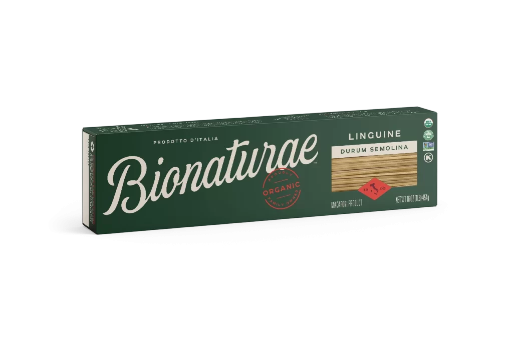
A rectangular dark forest green carton of Bionaturae pasta sits at a slight three-quarter angle, revealing its left spine and front face on a white surface. The brand name appears in an elegant, flowing cream-colored script across the center, anchored by a circular red 'ORGANIC' stamp to its right. To the far right, a photographic window displays the golden-brown rice and lentil linguine strands beneath 'GLUTEN FREE' text in light blue.

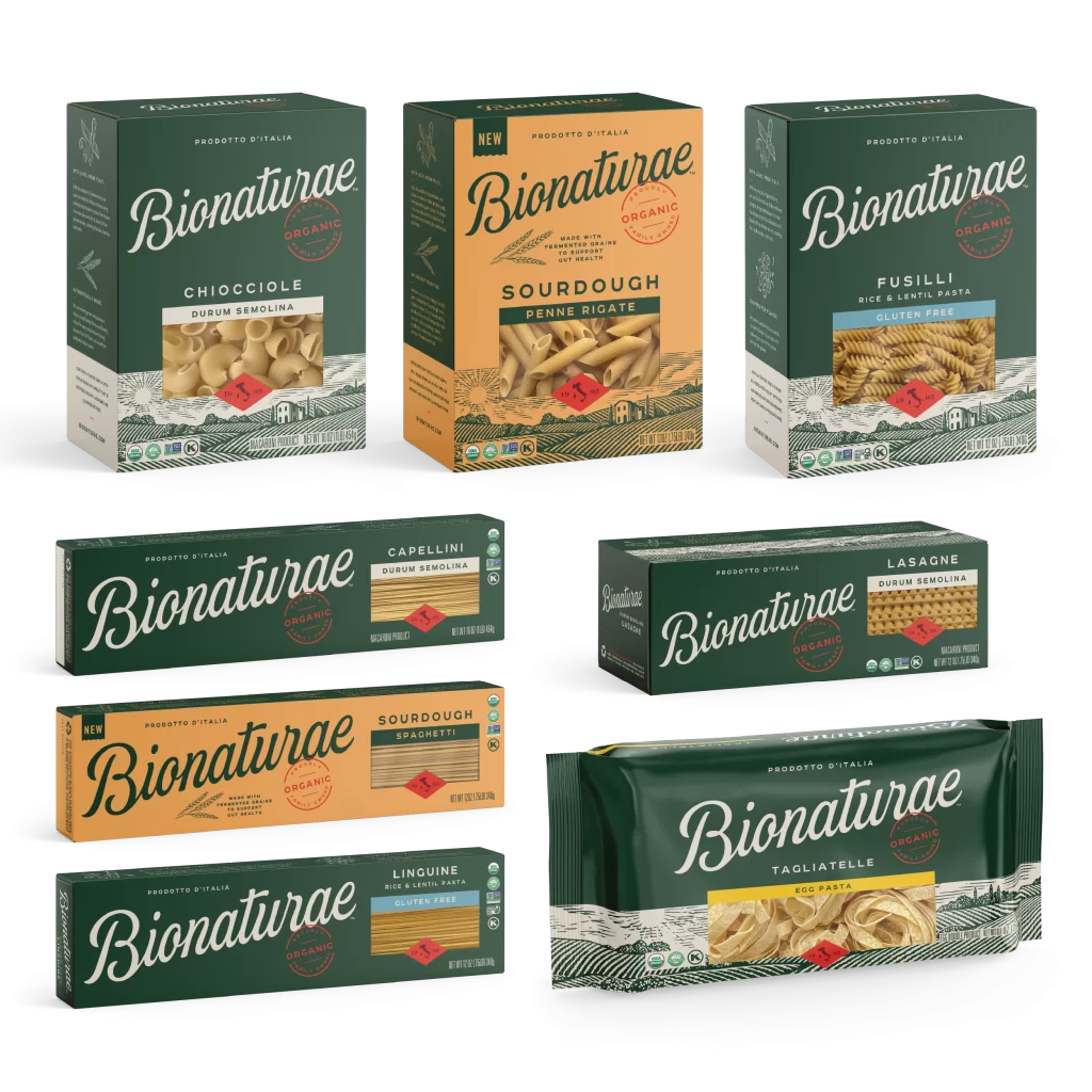
Visual hierarchy is established through the striking contrast between the deep emerald substrate and the pale typography, creating a premium organic aesthetic that feels both rustic and refined. The inclusion of multiple certification badges—USDA Organic, Non-GMO, Gluten-Free, and Kosher—alongside the specific product variant labeling demonstrates how regulatory information can be integrated without cluttering the primary brand identity. This particular iteration balances traditional European packaging sensibilities with modern dietary requirement transparency.
Brand strategists developing clean-label food products might study this composition to understand how earthy color palettes communicate natural ingredient sourcing effectively. Packaging engineers could analyze the spatial distribution of mandatory nutritional icons versus marketing copy to optimize their own shelf-ready designs. Students of visual communication might examine the typographic pairing of serif script with sans-serif technical text to learn about establishing tone through font selection.