Bionaturae Build Your Own Pasta Sauce Bundle Packaging
Topics
Details
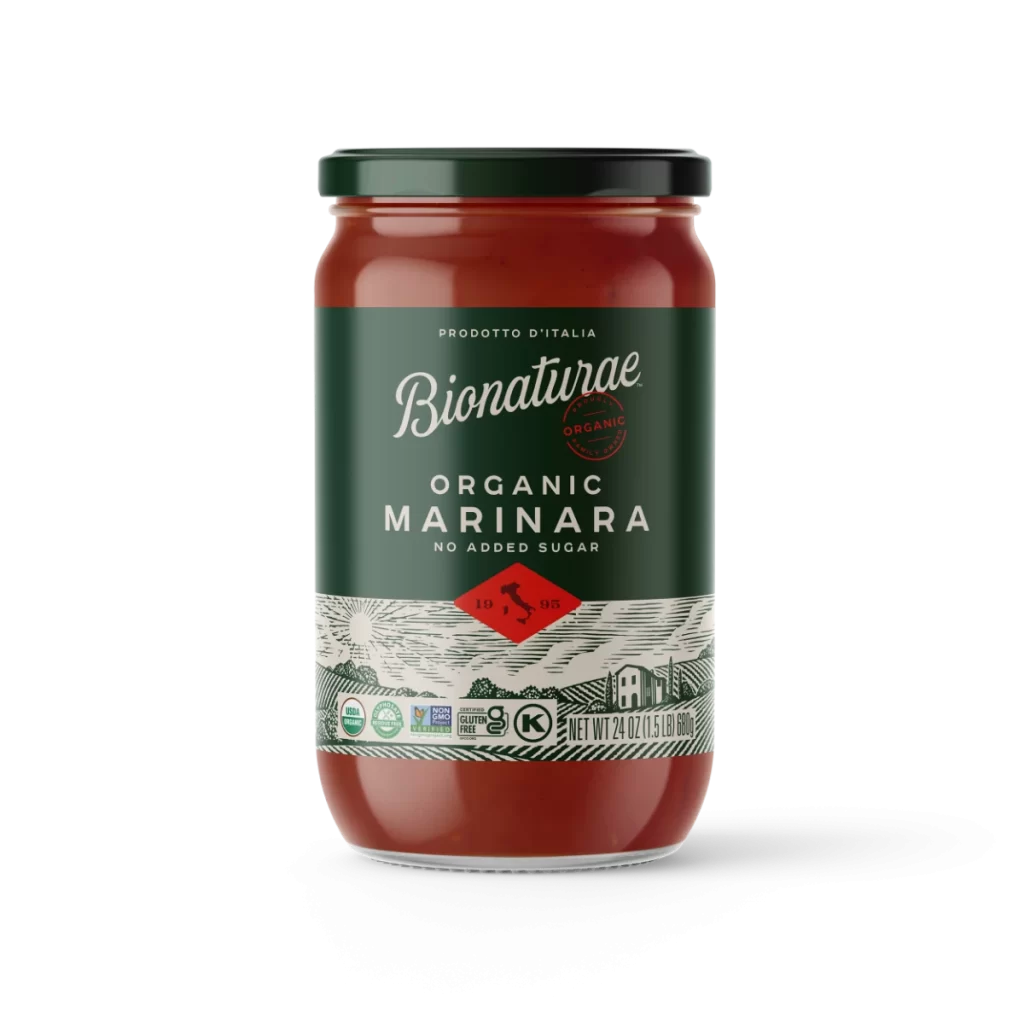
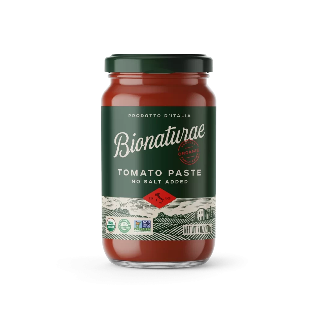
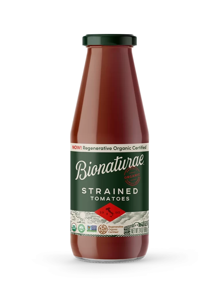
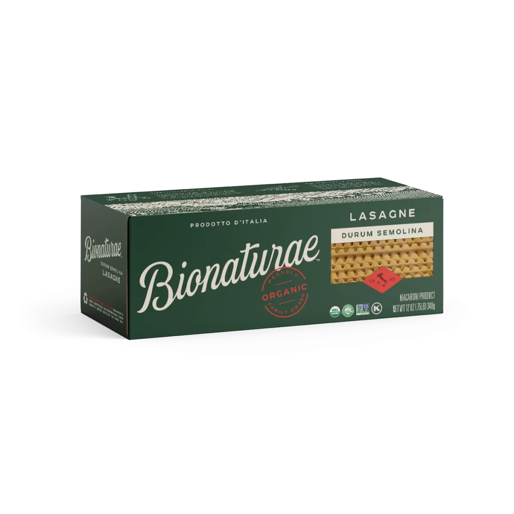
Three glass jars of Bionaturae pasta sauce stand in a precise horizontal row on a white surface, each filled with a deep, rich crimson. Dark, matte green lids seal the containers and match the primary label color, creating a sophisticated monochromatic anchor for the design. Elegant white serif typography spells out the brand name above bold, sans-serif flavor identifiers for Arrabbiata, Marinara, and Tomato Basil varieties.

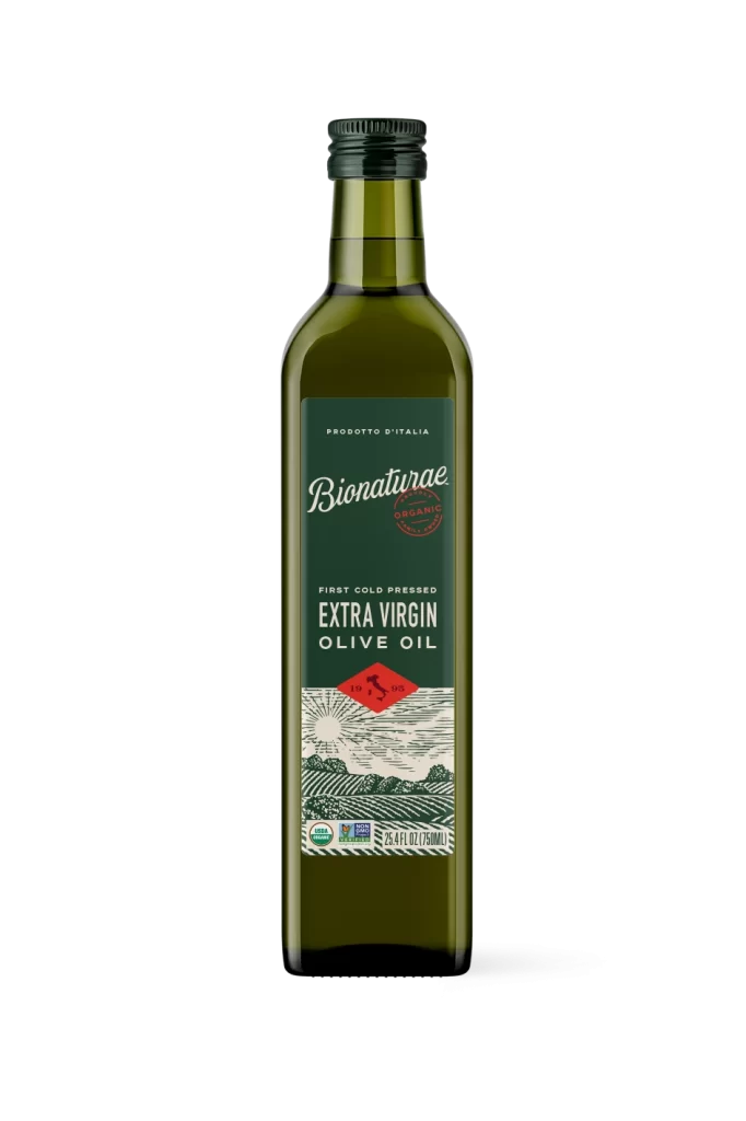
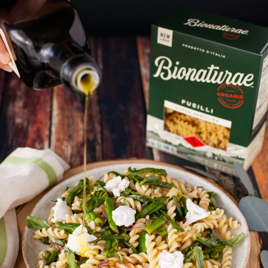
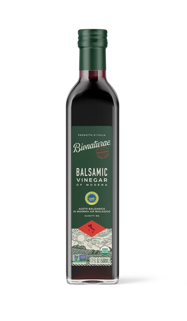
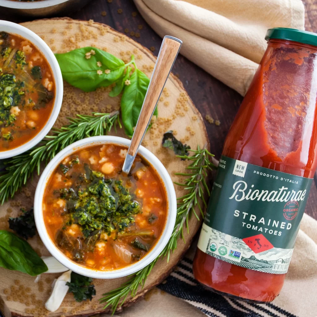
Visual hierarchy is masterfully controlled through the strategic use of a singular, vibrant red diamond placed centrally on every jar, drawing the eye immediately to the ‘No Added Sugar’ claim and the Italian origin stamp. The juxtaposition of the modern, clean typeface against the intricate, vintage-style illustration of rolling hills and farmhouses creates a compelling narrative of artisanal tradition meeting contemporary health standards. Such a cohesive system allows for instant flavor differentiation while maintaining a strong, recognizable brand family aesthetic across the entire product line.
Brand managers analyzing successful organic packaging strategies will find this arrangement particularly useful for studying how to balance premium aesthetics with clear nutritional communication. Packaging engineers can examine the specific proportions of the label real estate to understand how to effectively layer certification logos, net weight information, and origin claims without cluttering the visual field. Furthermore, marketing teams looking to launch a customizable bundle offer might utilize this specific trio layout to visualize how varied SKUs appear when presented as a curated set to the consumer.