Bionaturae Organic Diced Tomatoes Packaging
Topics
Details
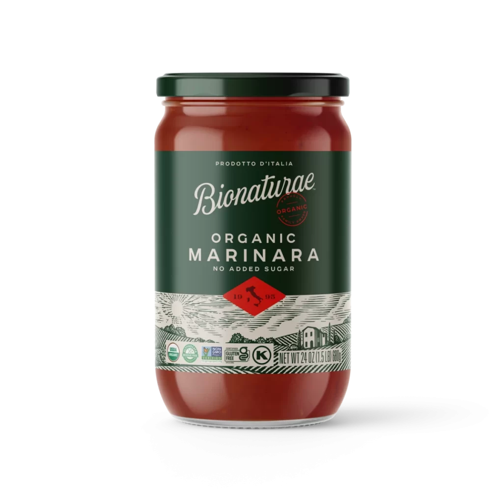
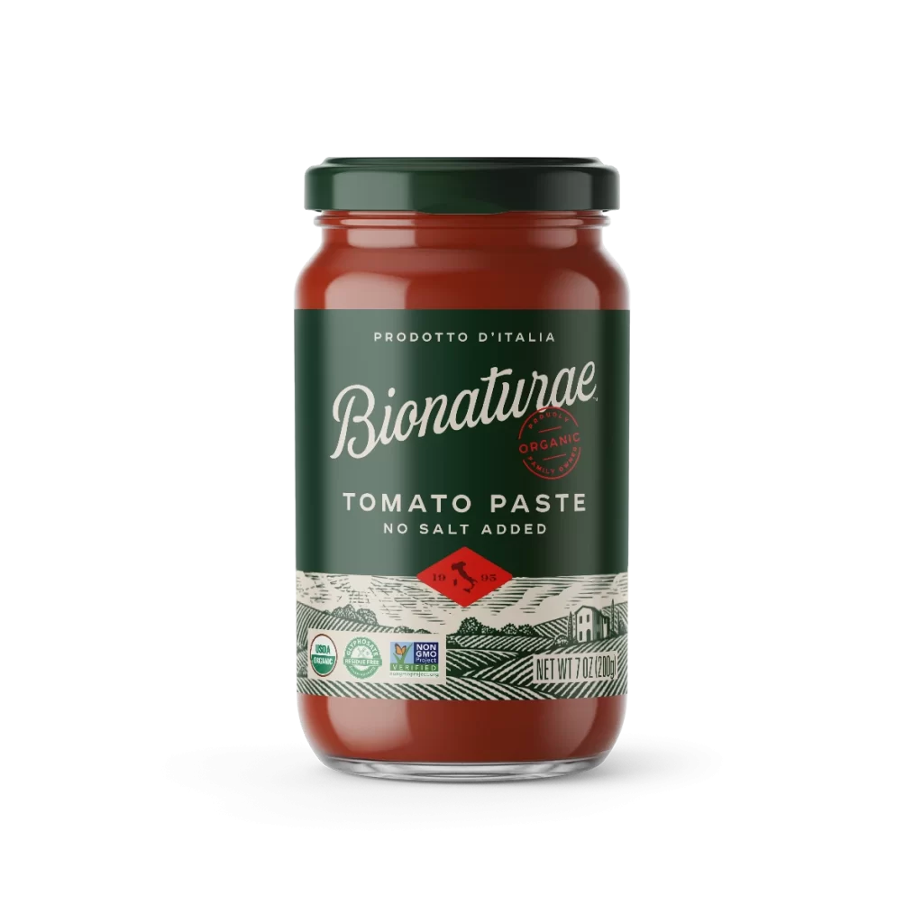
A cylindrical metal can of Bionaturae diced tomatoes stands on a white surface, its body wrapped in deep forest green with off-white bands at the top and bottom. The silver metal rim catches light from a straight-on camera angle, while prominent white script spells out the brand name above bold sans-serif text reading 'DICED TOMATOES'. A red diamond containing the silhouette of Italy and the numbers '19 95' anchors the lower portion of the label, which also features a red circular organic seal and multiple certification badges along the bottom edge.
Visual hierarchy is established through a sophisticated interplay of typography and color blocking, where the elegant cursive logo balances the utilitarian weight of the product description. A distinctive red circular stamp declaring ‘Product of Italy Organic’ adds an artisanal seal of authenticity that breaks up the solid green field. The lower portion features intricate line-art illustrations of rolling agricultural landscapes and farm buildings, lending a handcrafted, heritage feel to the mass-produced packaging.

Brand strategists analyzing premium organic food markets would examine this composition to understand how traditional European aesthetics communicate quality to health-conscious consumers. Packaging engineers might study the label’s division of space to see how certification marks like Regenerative Organic Certified and Non-GMO Project Verified are integrated without cluttering the primary brand message. Art directors developing rustic or farm-to-table visual identities could reference the specific woodcut-style illustration technique and earthy color palette for their own collateral materials.