Title

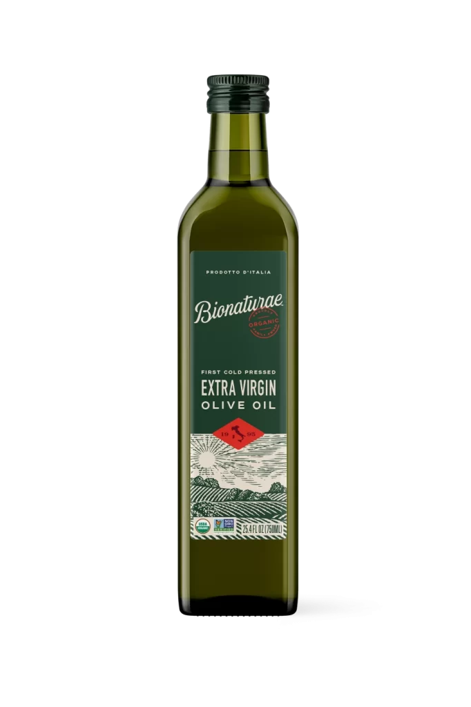
Bionaturae Extra Virgin Olive Oil 25 Oz Image 01 Packaging


Topics

BionaturaeOlive Oil

Details

Uploaded user: Leo

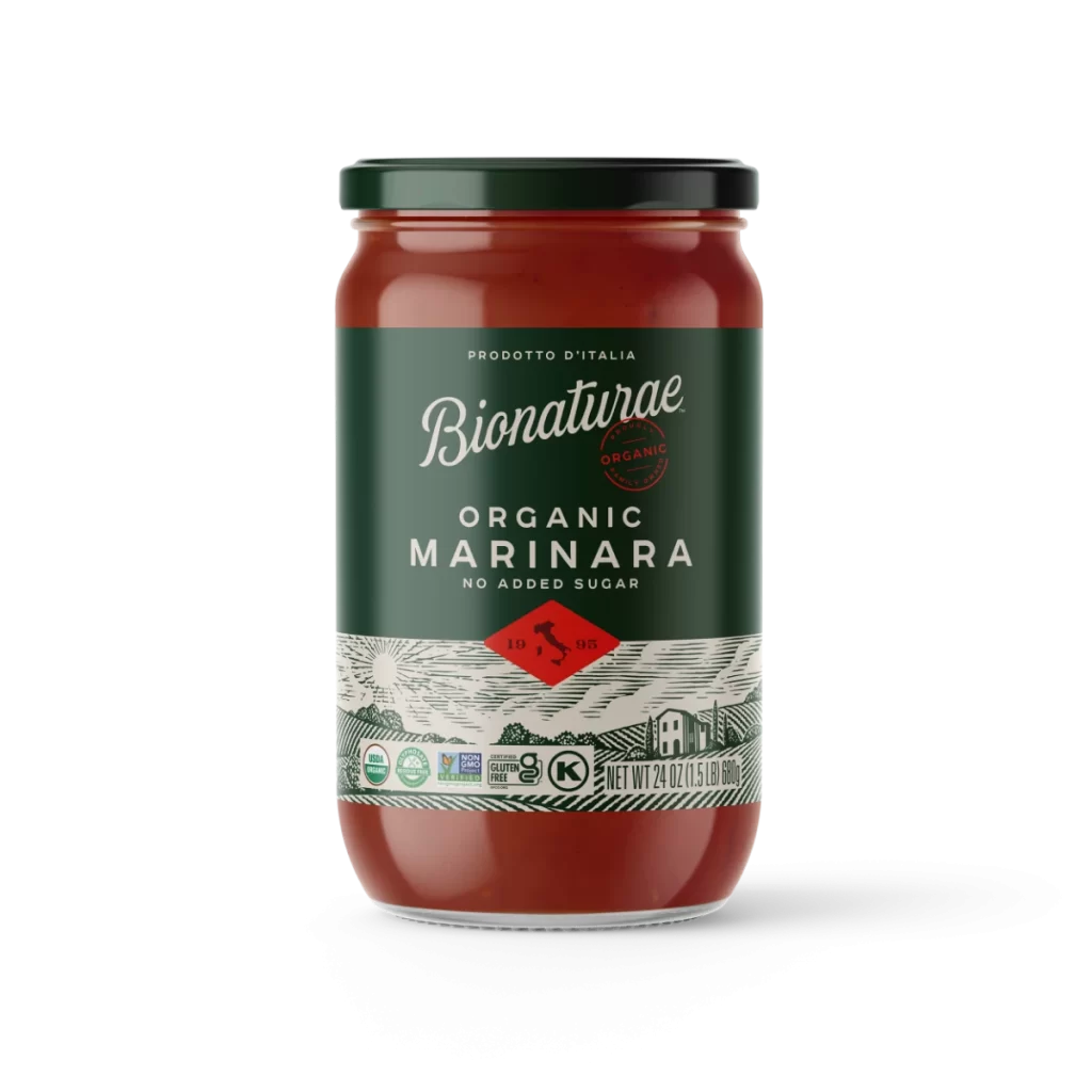
A dark green glass bottle of Bionaturae Extra Virgin Olive Oil stands upright on a white surface, viewed from a straight-on perspective that highlights its symmetrical form. The container is topped with a black ribbed screw cap and features a rectangular label dominated by deep forest green, white serif typography, and a detailed woodcut-style illustration of rolling agricultural hills beneath a radiant sun.
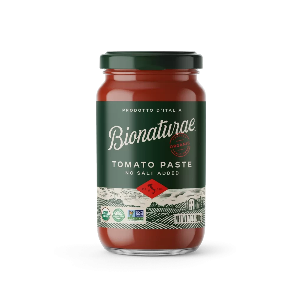
Visual distinction arises from the label’s sophisticated layering of typographic hierarchy and artisanal graphic elements, particularly the red diamond seal containing a horse silhouette that anchors the central composition. The contrast between the modern, clean lines of the brand name and the intricate, vintage-inspired linework of the landscape illustration creates a compelling tension between contemporary packaging standards and traditional Italian agricultural heritage. Organic certification badges and non-GMO verification marks are integrated discreetly into the lower portion without disrupting the overall aesthetic balance.

Brand managers analyzing premium food packaging trends would consult this visual to study how color psychology and illustration styles communicate organic quality claims to health-conscious consumers. Packaging engineers might examine the spatial distribution of mandatory regulatory information versus marketing copy to optimize their own label layouts for similar glass containers. Art directors developing campaigns for Mediterranean food products could reference the specific combination of serif fonts and woodcut imagery when briefing illustrators on mood boards for rustic yet refined brand identities.