Bionaturae Durum Semolina Fusilli Image 05 Packaging
Topics
Details
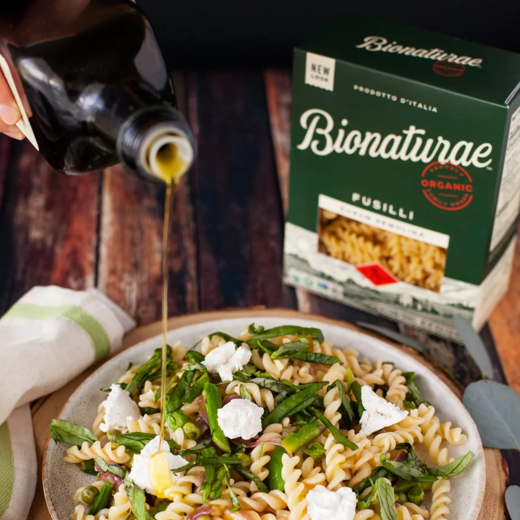
A hand grips a dark glass bottle, releasing a viscous stream of golden oil onto a ceramic plate of fusilli pasta tossed with bright green asparagus spears, fresh basil leaves, and dolloped with crumbled white cheese. The deep forest-green Bionaturae box—labeled "Fusilli" and "Organic" beneath the brand name in white script—sits softly blurred behind the dish on a surface of dark, weathered wood planks. Natural light illuminates the scene from above, highlighting the glossy oil as it cascades over the creamy rotini noodles.

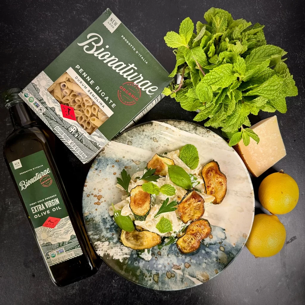
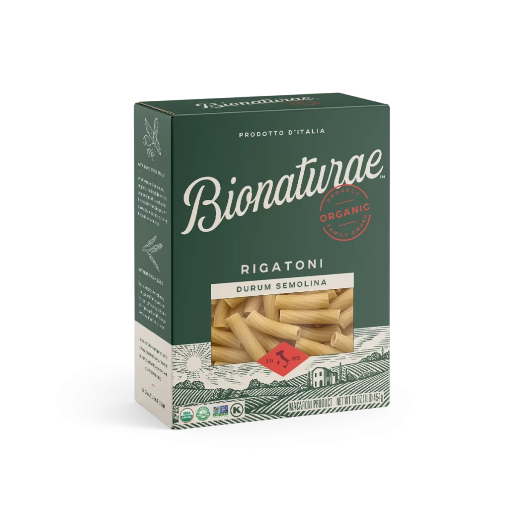
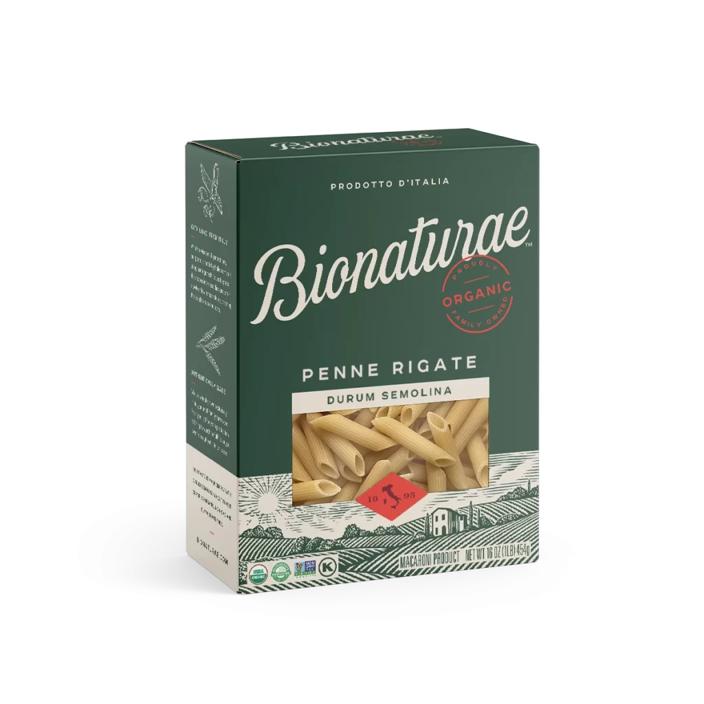
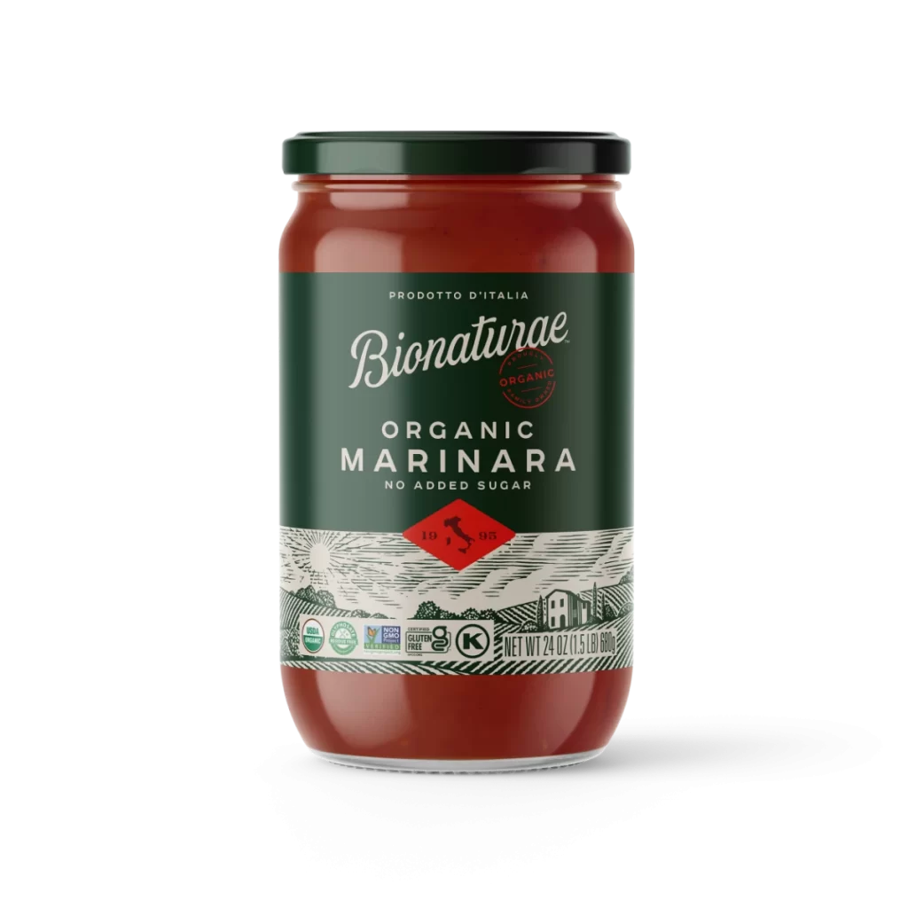
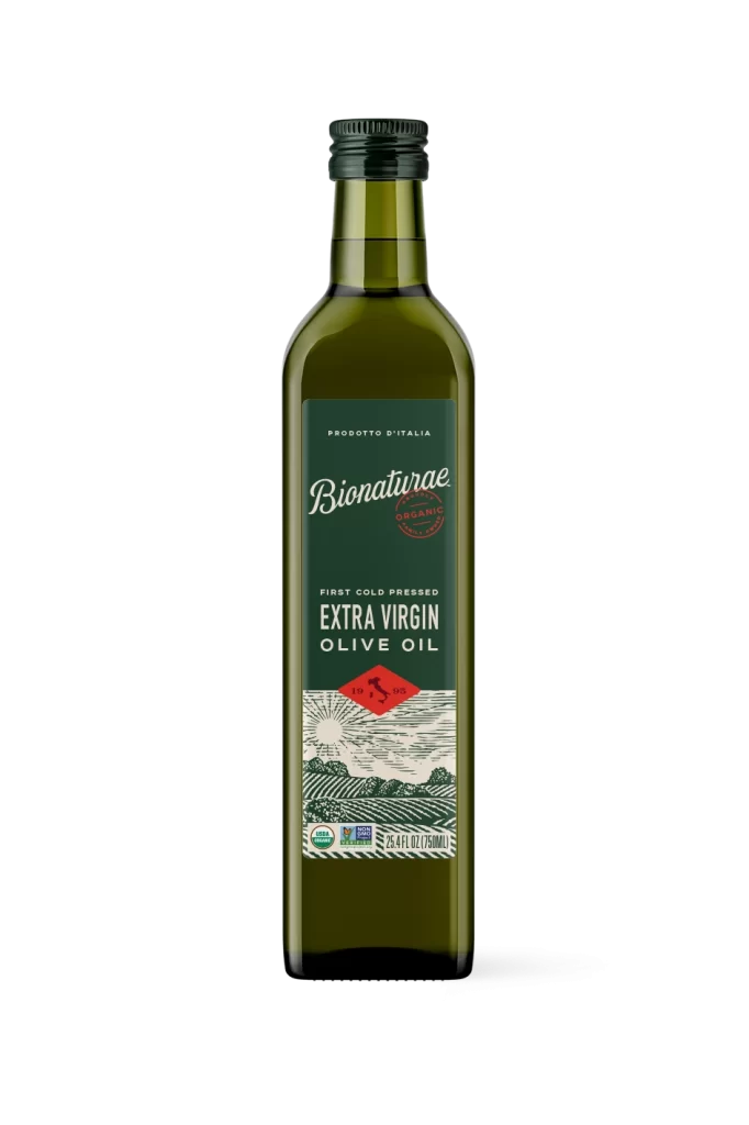
Visual interest here stems from the deliberate contrast between the rustic, artisanal food styling and the clean, authoritative graphic design of the product container. The packaging utilizes a sophisticated palette of hunter green and cream, anchored by a bold red stamp that immediately signals quality and certification to the consumer. Such a presentation effectively bridges the gap between raw agricultural ingredients and a refined dining experience, making the brand appear both traditional and premium.
Art directors developing campaigns for organic Italian imports would find this arrangement useful for planning lifestyle photography that emphasizes farm-to-table authenticity. Food stylists might study the interplay of textures—from the matte pasta to the glossy oil—to understand how to make healthy ingredients look indulgent on camera. Additionally, packaging designers could analyze how the brand’s typography holds up against complex, real-world backgrounds filled with competing colors and organic shapes.