600 Wine Bottle View
Topics
Details
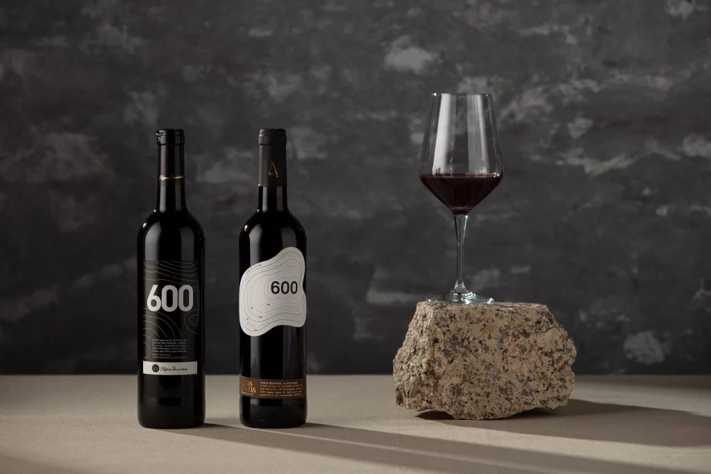
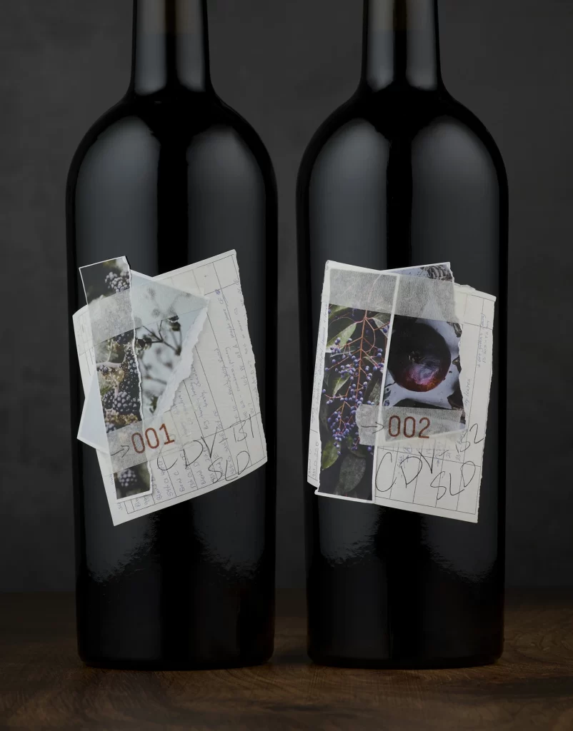
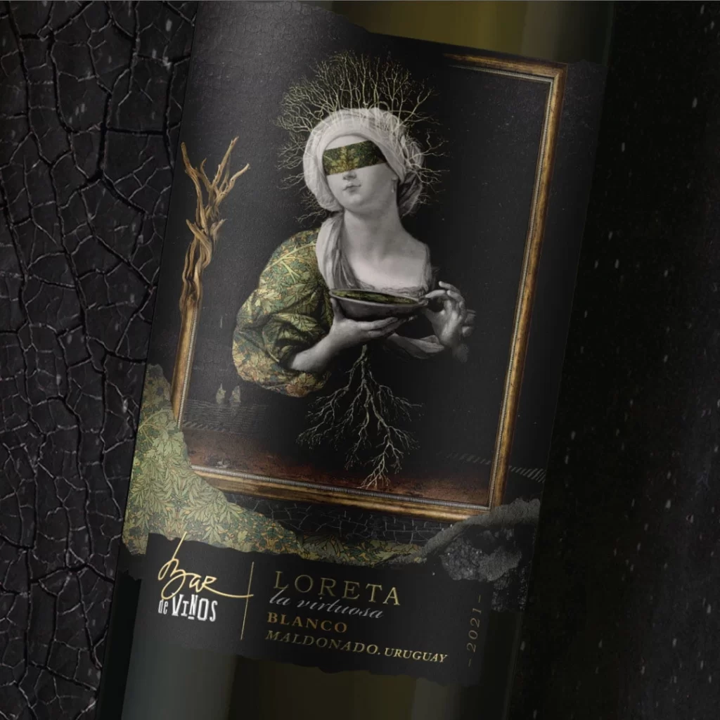
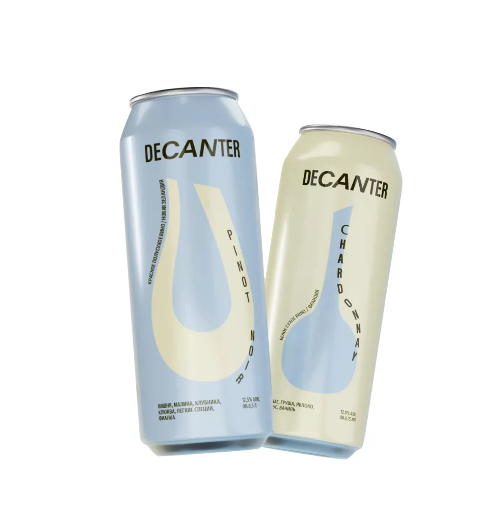
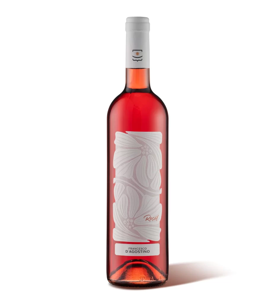
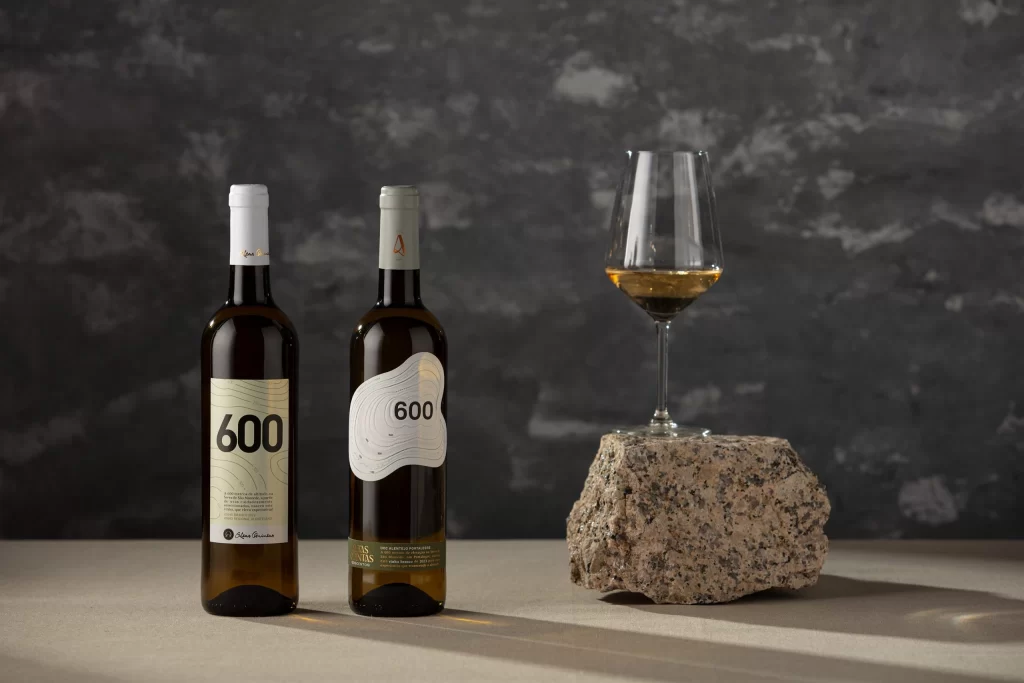
Against a dark, mottled gray backdrop that resembles weathered stone or plaster, two wine bottles stand on a light beige surface alongside a glass of white wine. The bottle on the left features a cream-colored rectangular label with the number 600 in bold black typography and subtle topographic line patterns, while its counterpart displays a white organic-shaped label with similar contour lines and the same numerical identifier. To their right, a stemmed wine glass containing pale golden liquid rests atop a rough, speckled granite rock, with soft directional lighting casting gentle shadows across the composition.
What makes this pairing particularly compelling is the deliberate contrast between geometric and fluid label designs sharing an identical numeric system, suggesting a cohesive brand identity with stylistic variation. The inclusion of natural stone elements—both as a prop for the glass and implied through the textured background—creates an earthy, terroir-driven aesthetic that bridges modern minimalism with organic authenticity. Such thoughtful staging transforms a simple product shot into a narrative about origin, craftsmanship, and sensory experience.
Packaging designers studying contemporary wine branding will find this arrangement invaluable for analyzing how typography, color palettes, and material textures communicate premium positioning across different product lines. Art directors planning lifestyle photography campaigns can reference the balance between negative space and textural details to achieve sophisticated visual hierarchies without overwhelming the subject. Additionally, those developing e-commerce visual systems might examine how the consistent '600' nomenclature functions across varying label shapes to maintain brand recognition while allowing for collection differentiation.