600 Wine Bottle
Topics
Details
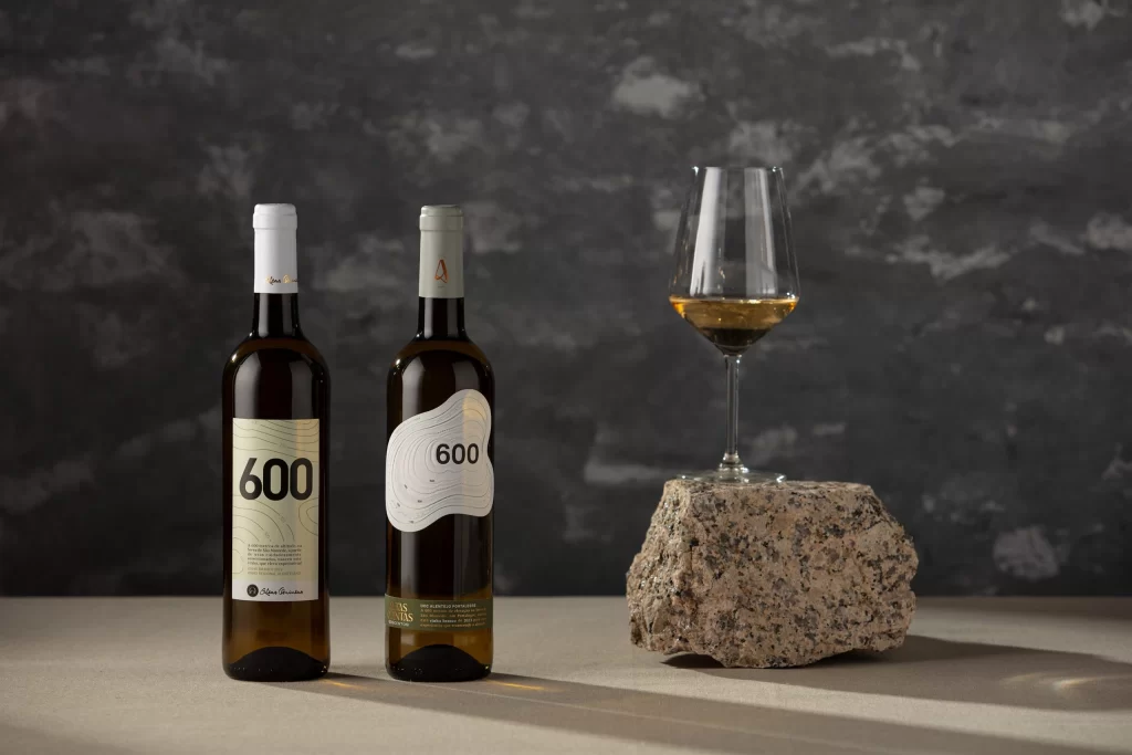
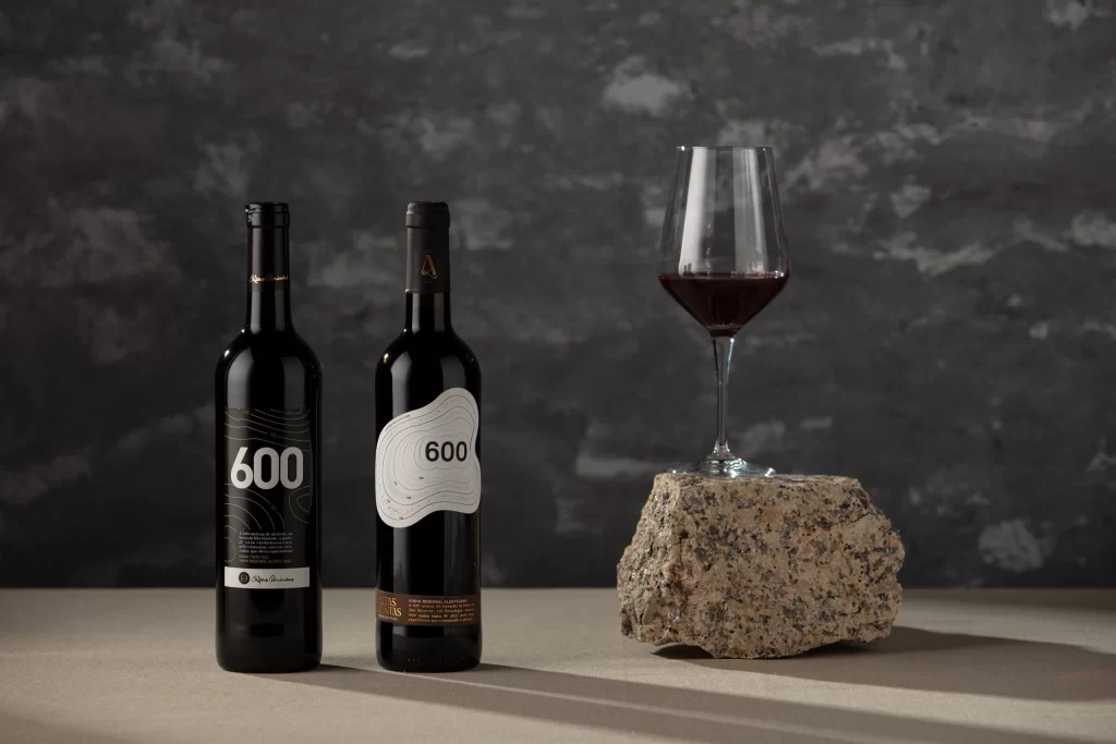
Set against a mottled charcoal-gray plaster wall, two dark glass wine bottles stand on a neutral beige surface beside a rough-hewn granite rock. The bottle on the left features a black label with white topographic contour lines and the number "600" in bold sans-serif type, while its counterpart displays a white label with similar elevation markings and the same numerical identifier. A stemmed wine glass containing a small pour of deep burgundy liquid rests atop the speckled stone, with soft directional lighting casting gentle shadows across the composition from a slightly low camera angle.
Visual distinction emerges from the deliberate contrast between the two labeling approaches—one absorptive and dark, the other reflective and light—while maintaining typographic and cartographic consistency. The topographic line work suggests altitude or terrain mapping, lending a technical, almost architectural quality to the packaging that departs from traditional viticulture imagery. This duality creates a compelling study in how identical branding elements can be inverted across different substrate colors to produce varied emotional resonances.
Packaging designers examining minimalist wine label systems will find value in analyzing how monochromatic palettes and contour graphics communicate sophistication without illustrative clutter. Art directors developing premium beverage campaigns could reference the material juxtaposition of smooth glass, textured stone, and raw plaster to understand how tactile contrasts enhance product perception. Students of visual identity might study the consistent application of the "600" numeral across divergent label designs to grasp flexible brand system construction.