Abstract Geometric Black Minimalist Typography Design
DownloadTopics
Details
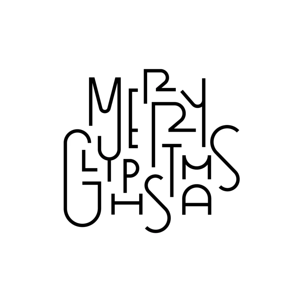
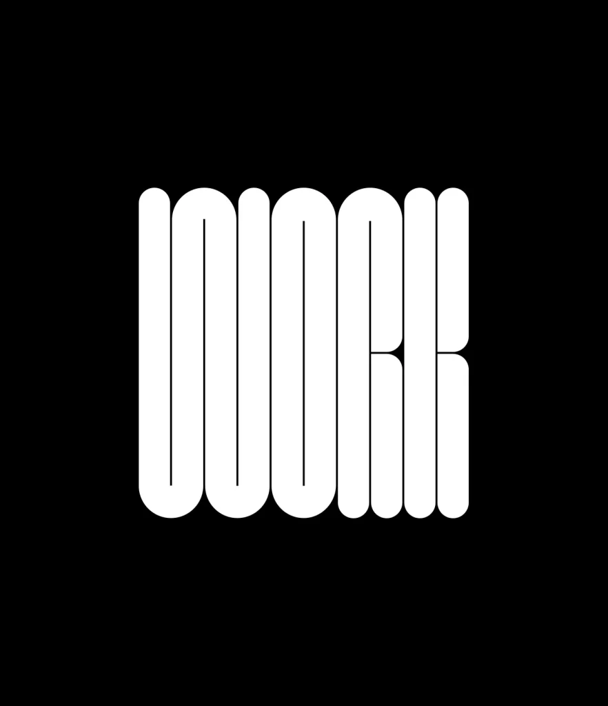
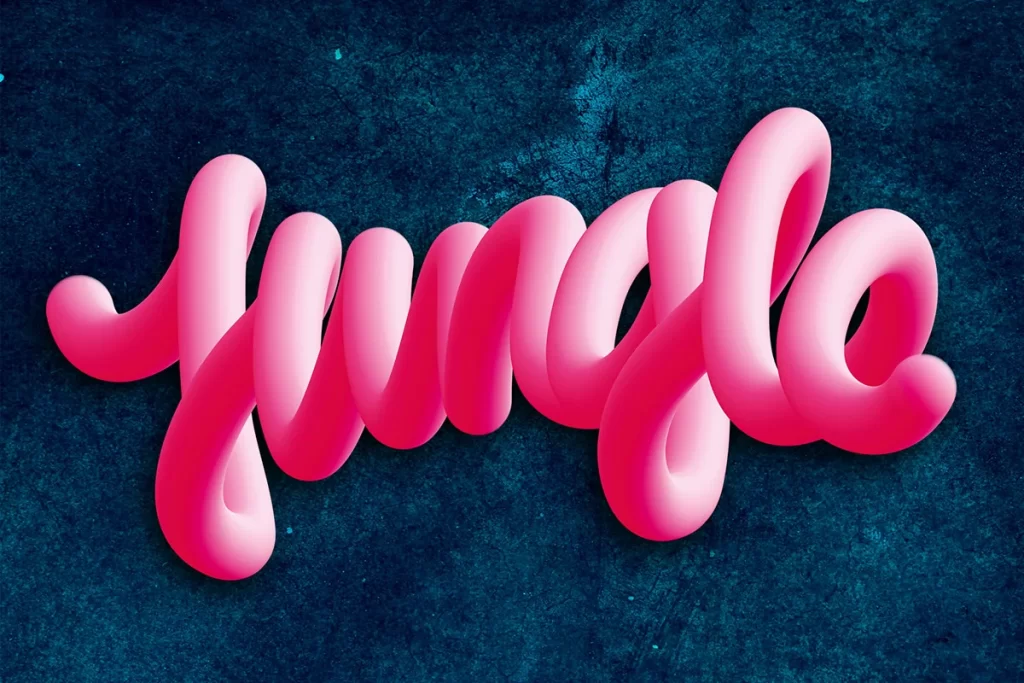
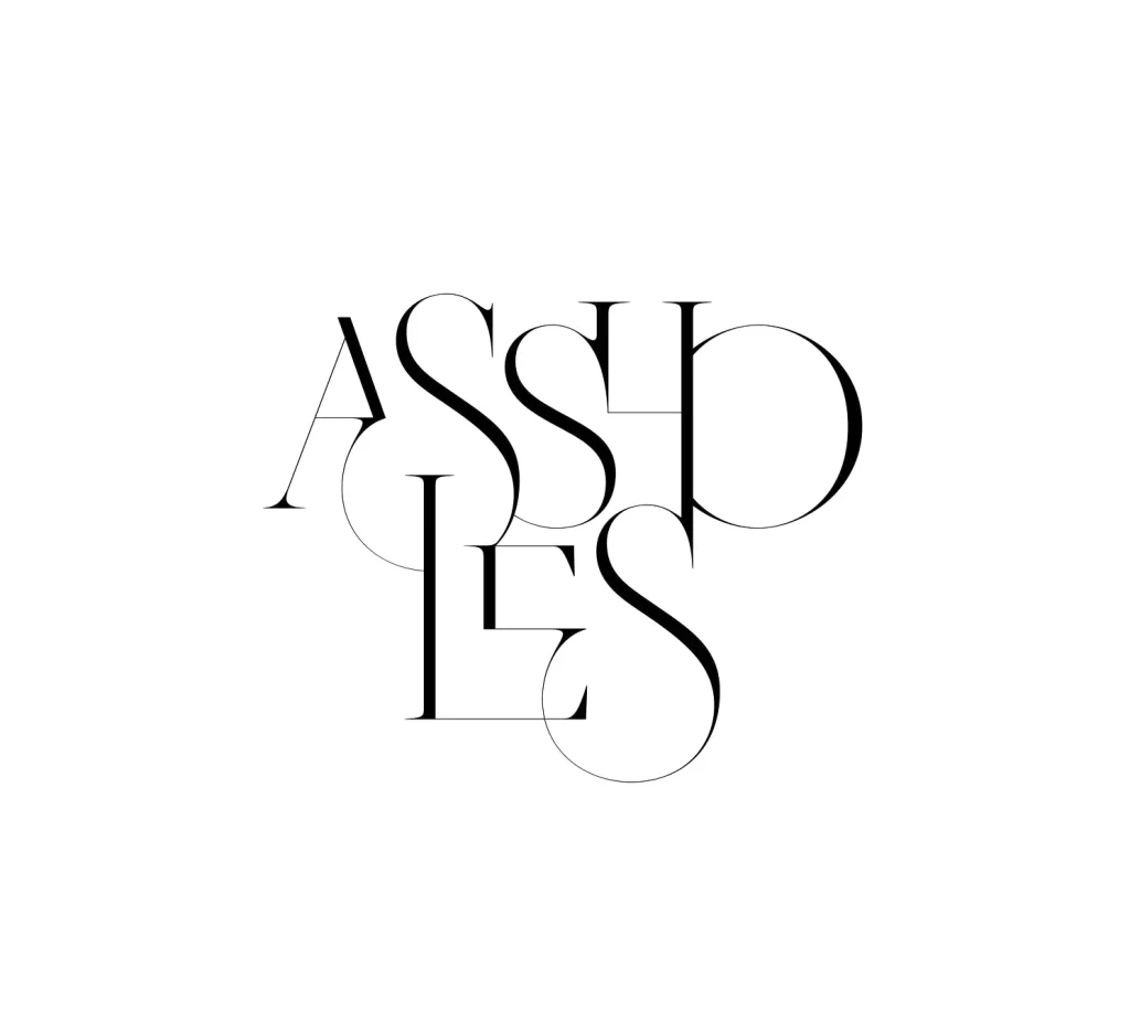
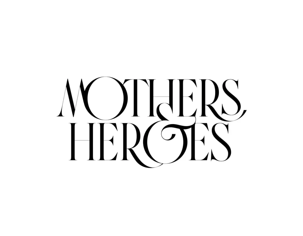
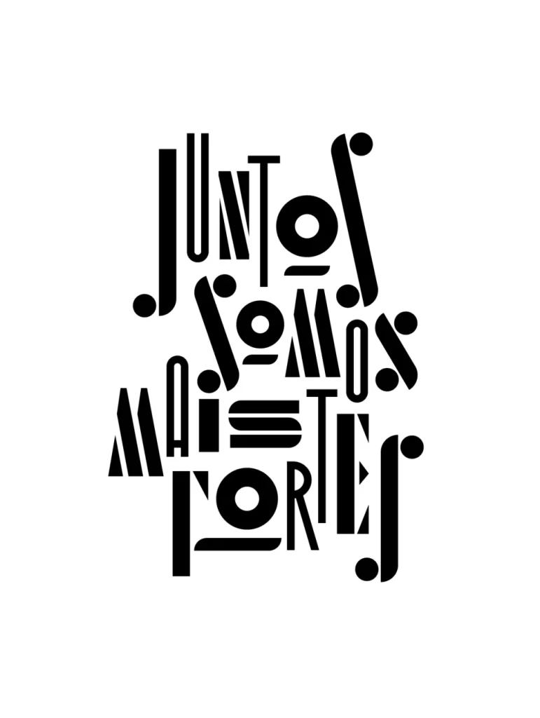
Black letterforms spelling "JUNTOS SOMOS MAIS FORTES" occupy the central frame, rendered in a highly stylized, geometric sans-serif typeface with exaggerated stroke weights and circular terminals. The composition stacks the Portuguese text in four irregular rows, where characters vary dramatically in scale and orientation to create a dense, interlocking typographic block. A light, neutral backdrop provides high contrast for the solid black ink, while the flat, frontal perspective eliminates any sense of depth or shadow.
Visual tension arises from the deliberate distortion of standard letter proportions, as certain glyphs stretch vertically while others compress horizontally within the same word. The rhythmic placement of dot-like terminals acts as punctuation that guides the eye through the otherwise chaotic arrangement of thick bars and circular counters. Designers can access the full-resolution source file at no cost to study the precise vector construction of these custom letterforms.
Typography instructors might employ this specimen to demonstrate how cultural messaging can be encoded through aggressive formal manipulation rather than traditional legibility. Brand strategists working on activist campaigns could reference the structural logic here when developing visual identities that require both impact and linguistic specificity. Print studios producing large-format posters would find the bold weight distribution particularly useful for testing ink coverage on textured substrates.