Geometric Stylized Primary Colors Bold Outline Typography Design
DownloadTopics
Details
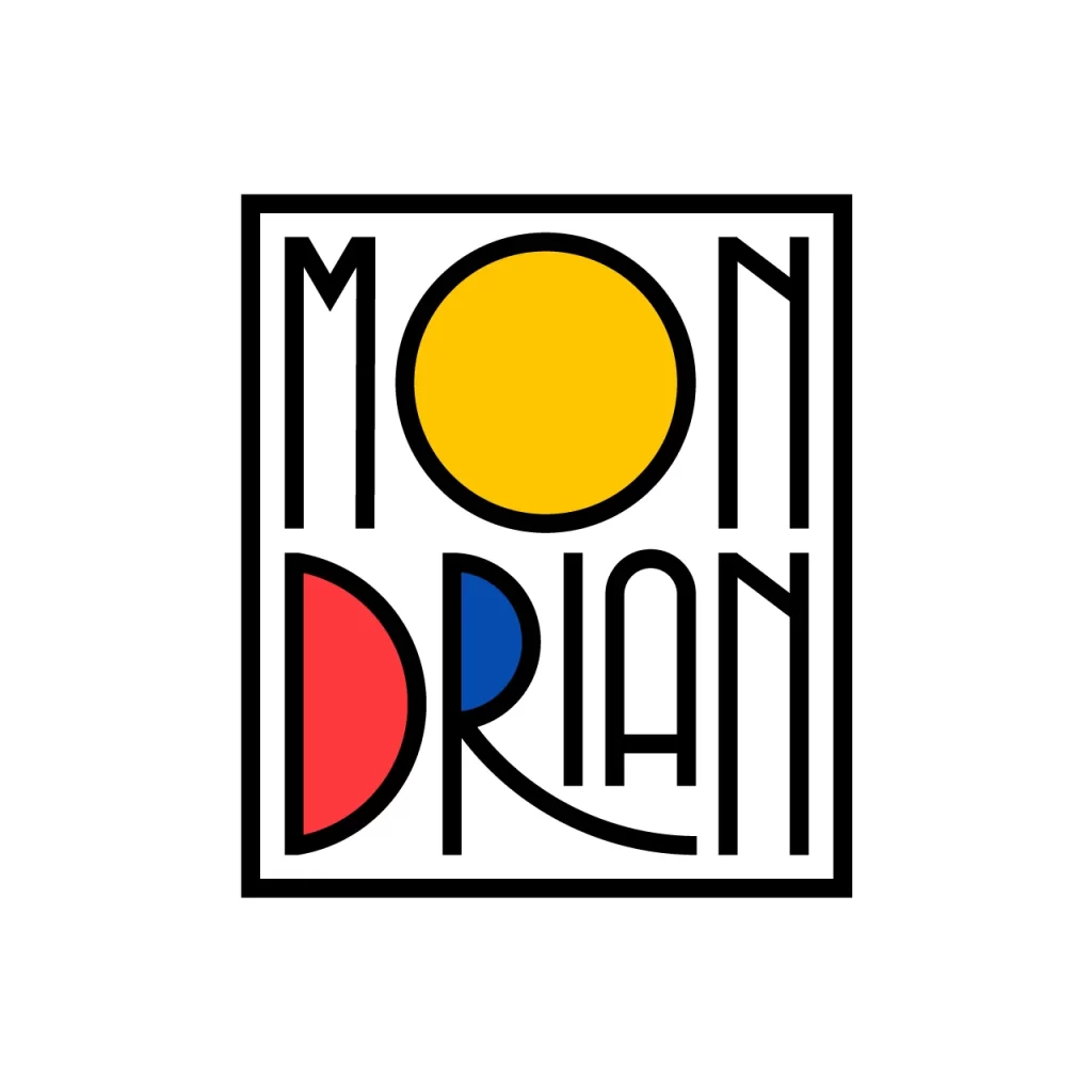
Thick black lines frame a square composition containing the word "MONDRIAN" split across two rows, with the letter O in the top row replaced by a solid yellow circle and the D in the bottom row rendered as a red semicircle. The counter of the R holds a smaller blue circle, while the remaining letters—M, N, I, A, N—appear as tall, slender geometric forms with uniform stroke weight. Everything sits on an uncluttered white field with no shadows or gradients, presenting the graphic as pure vector-like form.
What distinguishes this typographic treatment is its clever integration of De Stijl color theory directly into the letterforms rather than treating them as separate decorative elements. The primary palette of red, yellow, and blue occupies negative space within the characters themselves, creating a visual pun that references Piet Mondrian's grid-based compositions while maintaining legibility through the bold outline system. Designers seeking to study this interplay of geometry and type can access the full-resolution source file without cost from our asset library.
Art directors developing branding for modernist architecture firms or contemporary art galleries would find this mark particularly useful as a starting point for identity systems that balance historical reference with current design sensibilities. Typography instructors might employ it when teaching students about modular letter construction or how to embed symbolic meaning within wordmarks without sacrificing readability. The clean, high-contrast execution also serves print production teams needing reliable reference material for spot-color separation tutorials.