Pasta Packaging Vibrant Bold Colorful Modern
DownloadTopics
Details
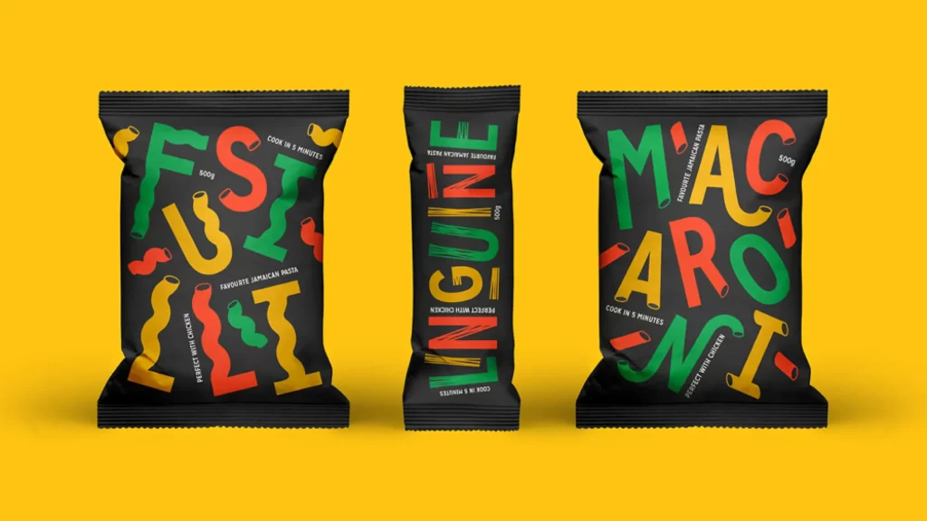
Three matte black pasta pouches stand in a row against a saturated yellow field, their surfaces covered in oversized, wobbly typography that spells out Fusilli, Linguine, and Macaroni. The letterforms themselves mimic the shapes of the pasta they represent, rendered in alternating strokes of forest green, coral red, and golden yellow, while smaller white text notes cooking times and serving suggestions like "Perfect with Chicken" or "Favourite Jamaican Pasta." Soft directional lighting from the upper left casts gentle shadows beneath each bag, emphasizing the crinkled texture of the sealed edges and the slight three-dimensional puff of the packaging.
What makes this packaging concept immediately arresting is the way the product identity becomes the primary graphic element, eliminating traditional food photography in favor of typographic playfulness. The irregular, hand-drawn quality of each character gives the brand an approachable, artisanal personality that contrasts sharply with the sleek black substrate, creating visual tension that draws the eye across every surface. Designers studying this composition will notice how color repetition across different bag sizes maintains brand cohesion even as the word lengths vary dramatically.
Brand strategists developing snack or dry-goods lines could mine this reference for techniques on making ingredient names feel celebratory rather than purely informational, while packaging engineers might study how vertical versus horizontal orientations affect text hierarchy. Students learning about color theory in commercial contexts will find the tri-color palette particularly instructive for maintaining legibility against dark backgrounds without resorting to white type. Anyone needing to examine the fine print or texture details can grab the full-resolution file at no cost directly from the resource section.