Apple Card Mastercard Jetblue Flight Gate
Topics
Details
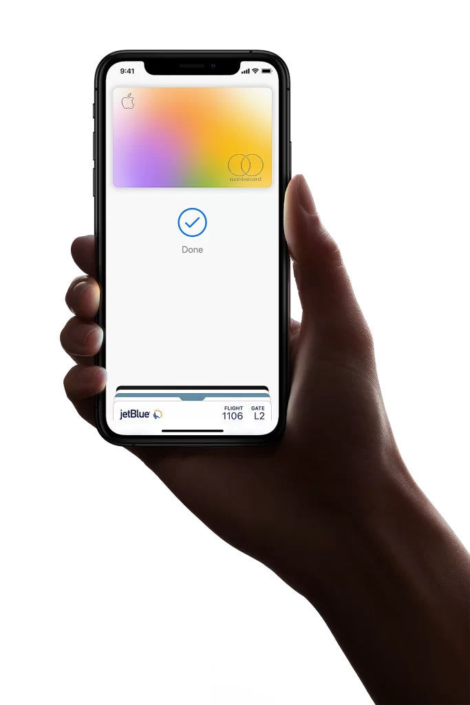
A hand with deep skin tones grips the edges of a black smartphone, its screen glowing with the Apple Card's signature gradient that shifts from warm peach through yellow to soft lavender and mint green. The digital card displays the Apple logo in the upper left corner and two overlapping circles near the right edge, while a blue checkmark icon sits above the word "Done" in gray text. Below, a boarding pass strip shows "jetBlue" alongside a small circular logo, flight number 1106, and gate L2 against a clean white interface background.
What distinguishes this particular composition is the dual-layer presentation of financial and travel credentials within a single mobile wallet view, creating a rare visual juxtaposition of payment and transit information. The rainbow-hued card gradient commands attention through its smooth color transitions, contrasting sharply with the utilitarian black-and-white typography of the airline ticket data beneath it. This layered arrangement demonstrates how modern digital wallets consolidate multiple identity documents into one cohesive screen experience.
UX researchers studying mobile banking interfaces might examine this reference to understand how users perceive the visual hierarchy between payment cards and secondary passes. Product designers working on travel applications could analyze the spatial relationship between the colorful card element and the monochrome flight details to inform their own layout decisions. Marketing teams developing promotional materials for contactless payment systems might draw upon this image to illustrate seamless integration between commerce and transportation ecosystems.