Blue Squares Gradient Shadow Digital
Topics
Details
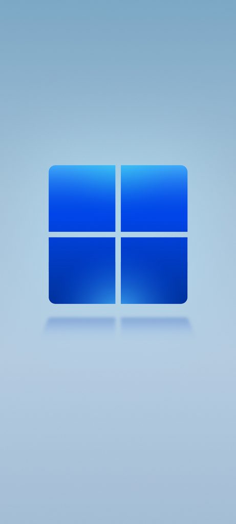
Four rounded-corner squares in varying shades of azure and cobalt blue form a symmetrical 2x2 grid, each quadrant displaying a smooth vertical gradient that transitions from lighter tones at the top to deeper saturations toward the bottom. A soft, diffused reflection appears beneath the composition, suggesting a polished surface or subtle ambient lighting that grounds the geometric form. The entire arrangement sits upon a uniform pale cerulean backdrop, viewed from a straight-on perspective that emphasizes the clean lines and balanced proportions of the digital icon.
Visual interest emerges from the interplay between the matte-finish gradients within each pane and the glossy shadow effect underneath, creating a sense of depth without relying on heavy three-dimensional rendering. The subtle color variations across the four quadrants—ranging from sky-blue highlights to navy undertones—add complexity to what might otherwise be a flat graphic element. This particular execution balances minimalist geometry with just enough atmospheric detail to feel contemporary rather than sterile.
UI designers studying modern operating system aesthetics could analyze the lighting ratios and corner-radius specifications when crafting their own application icons or system branding elements. Digital artists working on abstract compositions might reference the specific gradient values and reflection falloff to achieve similar material qualities in vector or raster work. Anyone building a mood board for tech-focused visual identities would find this useful as a baseline example of how simple shapes can convey sophistication through controlled color transitions.