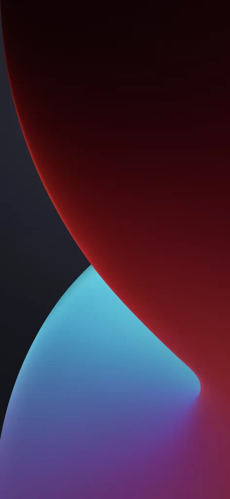
iOS 14 Wallpaper Dark Grey Gradient
Topics
Details
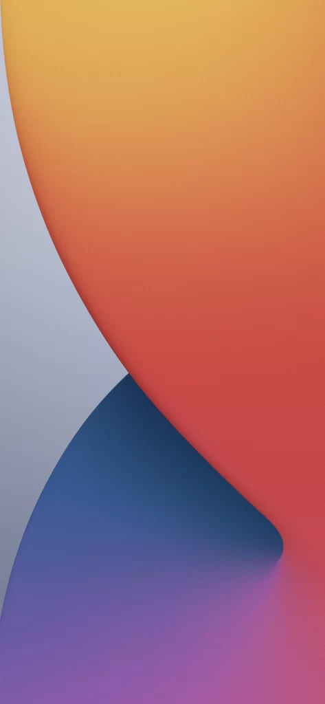
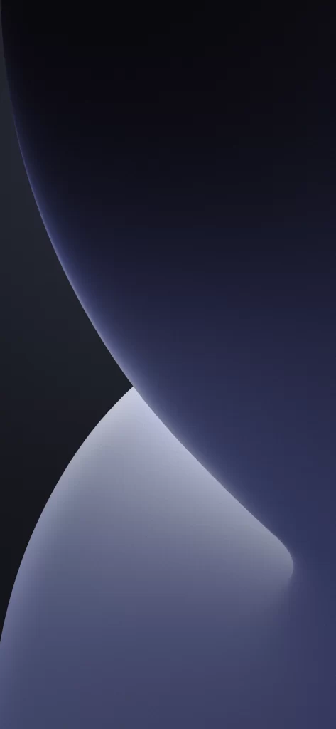
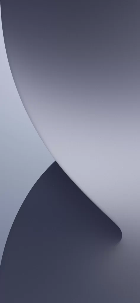
Deep charcoal and slate tones dominate the composition, where a broad, sweeping curve of matte grey intersects with a darker, shadowed form below. The surface exhibits a soft, diffused sheen suggesting brushed metal or frosted glass, with light falling from the upper left to create subtle tonal gradations across the smooth planes. No text or interface elements interrupt the abstract geometry, which fills the frame from edge to edge in a tightly cropped vertical orientation.
Visual interest emerges from the precise interplay between the two curved volumes and the way light wraps around their seamless edges. The restrained palette relies entirely on value contrast rather than hue variation to define depth, making it particularly effective for testing display calibration. Its minimalist abstraction avoids distraction while maintaining enough structural complexity to remain engaging during extended viewing sessions.
Interface designers might employ this as a neutral backdrop for prototyping dark-mode applications, where its subtle gradients prevent UI elements from visually competing with the background. Color theorists could reference the specific grey values when establishing monochromatic scale systems for branding projects. Photographers studying product lighting would find the soft falloff useful for understanding how diffuse sources render on curved metallic surfaces.