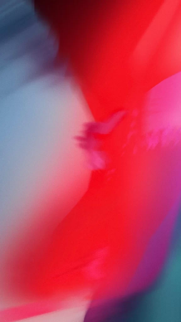
iOS 12 Wallpaper Red Pink Abstract
Topics
Details
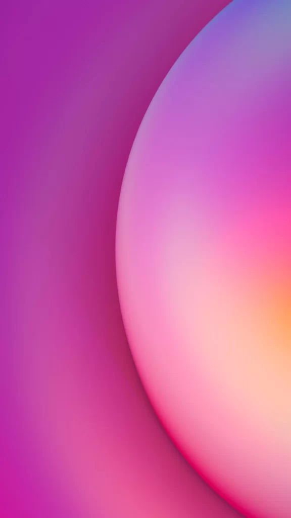
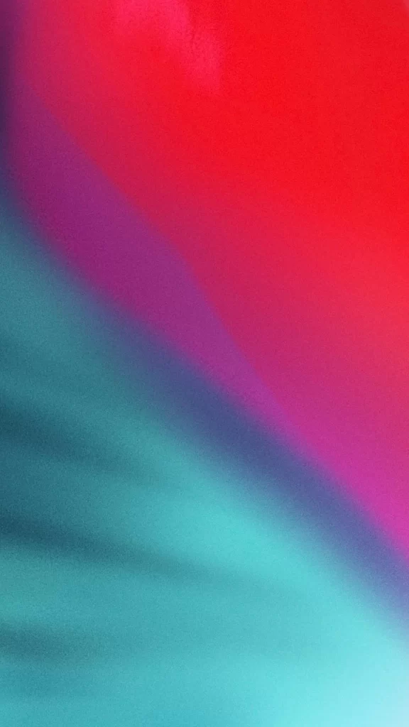
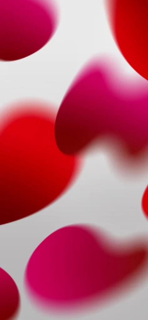
Dominating the frame with an intense, saturated crimson, this composition bleeds into softer magenta and pale lavender gradients along its right edge. A cool, desaturated blue-grey mass anchors the left side, creating a stark temperature contrast against the warm reds that occupy the majority of the visual field. The entire surface exhibits a soft-focus blur with subtle chromatic aberration, suggesting either rapid motion during capture or a deliberate diffusion of light across a glossy, non-reflective material.
Visual tension arises from the abrupt boundary where the cool neutral tones meet the aggressive red saturation, creating a sense of depth without defined edges. The absence of sharp focal points forces the eye to wander across color transitions rather than settle on specific details, resulting in an atmospheric quality that feels both digital and organic. Such intentional ambiguity allows the abstraction to function as pure emotional color rather than representational form.
Mobile interface designers might employ this as a dynamic lock screen background that maintains legibility for overlaid text and icons while providing vibrant visual energy. Color theorists could reference the specific hue relationships when building palettes for branding projects requiring bold yet harmonious contrasts. Additionally, motion graphics artists might study the gradient falloff and blur characteristics to replicate similar atmospheric effects in digital compositing work.